Contents A) 1. BASICS SUPPORT AND RESISTANCE BASIC The Basics Trendlines Round Numbers
|
|
|
- Lesley Ross
- 6 years ago
- Views:
Transcription
1 TRADING GUIDE V1
2 Contents A) 1. BASICS SUPPORT AND RESISTANCE BASIC The Basics Trendlines Round Numbers Moving Averages Other Indicators The Bottom Line PRICE ACTION TRADING Support & Resistance Dynamic Support & Resistance Impulse & Corrective move The 4 stages of the markets every serious trader must know How to tell when the market is trending How to tell when the market is ranging How to read the price action of any markets (and determine the strength and weakness of it) Stop memorizing candlestick patterns, you only need to know these 4 things Advanced candlestick knowledge (that nobody talks about) Price action patterns Rising three method Price action patterns Wide range candles Price action patterns Narrow range candles A price action trading strategy that works B) 2. INDICATORS TOOLS ON BALANCE VOLUME Introduction Breaking Down the Theory Smart Money MOVING AVERAGES What is a 'Moving Average - MA' BREAKING DOWN 'Moving Average - MA' Moving Averages: How To Use Them C) 3. DEFINATIONS TRENDLINE... 61
3 3.1.1 What is a 'Trendline' BREAKING DOWN 'Trendline' Fundamental vs. Technical Analysis Creating Trendlines CUP AND HANDLE DEFINATION What is a 'Cup and Handle' BREAKING DOWN 'Cup and Handle' Cup and Handle Characteristics Trading the Cup and Handle Cup and Handle Stops and Targets IMPULSE WAVE PATTERN DEFINATION DEFINITION of 'Impulse Wave Pattern' BREAKING DOWN 'Impulse Wave Pattern' FIBONACCI RETRACEMENT DEFINATION What is a 'Fibonacci Retracement' D) 4. TRENDS THE UTILITY OF TRENDLINES Trendline Trendline Basics Support and Resistance Drawing Your Own Trendlines The Bottom Line IDENTIFYING MARKET TRENDS Basics Secular Trends Intermediate-Trends Long-Term Trends The Bottom Line E) 5. CANDLESTICKS INTRODUCTION TO CANDLESTICKS History Formation Long Versus Short Bodies Long Versus Short Shadows... 76
4 5.1.5 Doji Doji and Trend Long-Legged Doji Dragonfly and Gravestone Doji Bulls Versus Bears What Candlesticks Don't Tell You Candlestick Positioning Long Shadow Reversals Blending Candlesticks SHOOTING STAR CANDLESTICKS BASICS INVERTED HAMMER CANDLE VOLUME Introduction Calculation Candlestick Reversals Breakout Validation Conclusions F) 6. Patterns RECTANGLES AND PENNANTS FLAGS AND PENNANTS G) 7. INDICATORS IN AUTONIO PLATFORM ACCUMLATION DISTRIBUTION LINE (ADL) Introduction Calculation Interpretation Trend Confirmation Divergences Disconnect with Prices Conclusions Using with SharpCharts Suggested Scans AVERAGE DIRECTIONAL INDEX (ADI) Introduction
5 7.2.2 Calculation Indicator Calculation Wilder's Smoothing Techniques Interpretation Trend Strength Trend Direction and Crossovers Conclusions Using with SharpCharts Suggested Scans AVERAGE TRUE RANGE (ATR) Introduction True Range Calculation Absolute ATR Conclusions Suggested Scans BOLLINGER BANDS (BB) Introduction SharpCharts Calculation Signal: W-Bottoms Signal: M-Tops Signal: Walking the Bands Conclusions Using with Sharp Charts Suggested Scans Bearish Bollinger Band Crossover COMMODITY CHANNEL INDEX (CCI) Introduction Calculation Interpretation New Trend Emerging Overbought/Oversold Bullish Bearish Divergences Conclusions
6 7.5.8 Using with SharpCharts Suggested Scans FORCE INDEX (FI) Introduction Calculation Interpretation Trend Identification Divergences Identifying Corrections Conclusions Using with SharpCharts Suggested Scans KNOW SURE THINGS (KST) Introduction SharpCharts Calculation Interpretation Divergences Strong Trends Timeframes Further Tweaks Conclusions Using with SharpCharts Suggested Scans MOVING AVERAGES CONVERGENCE DEVERGANCE (MACD) Introduction Calculation Interpretation Signal Line Crossover Centerline Crossovers Divergences Conclusions Using with SharpCharts Suggested Scans ON BALANCE VOLUME (0BV)
7 7.9.1 Introduction Calculation Interpretation Divergences Trend Confirmation Conclusions Using with SharpCharts Suggested Scans PARABOLIC STOP AND REVERSAL (PSAR) Introduction Calculation Interpretation Step Increments Maximum Step Conclusions Using with SharpCharts Suggested Scans RATE OF CHANGE (ROC) Introduction Calculation Interpretation Trend Identification Overbought/Oversold Extremes Conclusions Using with SharpCharts Suggested Scans RELATIVE STRENGTH INDEX (RSI) Introduction Calculation Parameters Overbought-Oversold Divergences Failure Swings Trend ID
8 Positive-Negative Reversals Conclusions Using with SharpCharts Suggested Scans SIMPLE MOVING AVERAGES (SMA) Introduction Simple Moving Average Calculation Exponential Moving Average Calculation The Weighting Multiplier EMA Accuracy The Lag Factor Simple vs Exponential Moving Averages Lengths and Timeframes Trend Identification Double Crossovers Price Crossovers Support and Resistance Conclusions Using with SharpCharts Suggested Scans STOCHASTIC OSCILLATOR (KD) Introduction Calculation Interpretation Fast, Slow or Full Overbought Oversold Bull Bear Divergences Bull Bear Set-ups Conclusions Using with SharpCharts Suggested Scans TRIPLE EXPONENTIALLY SMOOTHED AVERAGE (TRIX) Introduction Calculation
9 Interpretation Signal Line Crossovers Centerline Crossovers Divergences Conclusions Using with SharpCharts Suggested Scans TRIX Bearish Signal Line Cross VOLUME WEIGHTED AVERAGE PRICE (VMAP) Introduction Tick versus Minute Calculation Characteristics Uses for VWAP Conclusions Using with SharpCharts EXPONENTIAL MOVING AVERAGE (EMA) What is an 'Exponential Moving Average - EMA' BREAKING DOWN 'Exponential Moving Average - EMA' Interpreting the EMA Common Uses of the EMA WEIGHTED MOVING AVERAGES (WMA) DESCRIPTION FORMULA WILDER SMOOTHING (SMOOTHED MOVING AVERAGE,WEMA) introduction How To Calculate Wilder s Smoothing: Wilder s Smoothing Excel File Test Results ) WILLIAM sr (W%R) Introduction Calculation Interpretation Overbought/Oversold
10 Momentum Failure Conclusions Using with SharpCharts Suggested Scans H) 8. Other important trading info: All the content of this file, has been taken from investopedia.com, stockchart.com and other trading websites. Link to website is also given below content. Consider visiting those website for more trading guide and information. Thank you
11 1. BASICS 1.1 SUPPORT AND RESISTANCE BASIC The concepts of support and resistance are undoubtedly two of the most highly discussed attributes of technical analysis and they are often regarded as a subject that is complex by those who are just learning to trade. This article will attempt to clarify the complexity surrounding these concepts by focusing on the basics of what traders need to know. You'll learn that these terms are used by traders to refer to price levels on charts that tend to act as barriers from preventing the price of an asset from getting pushed in a certain direction. At first the explanation and idea behind identifying these levels seems easy, but as you'll find out, support and resistance can come in various forms and it is much more difficult to master than it first appears The Basics Most experienced traders will be able to tell many stories about how certain price levels tend to prevent traders from pushing the price of an underlying asset in a certain direction. For example, assume that Jim was holding a position in Amazon.com (AMZN) stock between March and November 2006 and that he was expecting the value of the shares to increase. Let's imagine that Jim notices that the price fails to get above $39 several times over the past several months, even though it has gotten very close to moving above it. In this case, traders would call the price level near $39 a level of resistance. As you can see from the chart below, resistance levels are also regarded as a ceiling because these price levels prevent the market from moving prices upward Figure 1
12 On the other side of the coin, we have price levels that are known as support. This terminology refers to prices on a chart that tend to act as a floor by preventing the price of an asset from being pushed downward. As you can see from the chart below, the ability to identify a level of support can also coincide with a good buying opportunity because this is generally the area where market participants see good value and start to push prices higher again. Figure Trendlines In the examples above, you've seen a constant level prevent an asset's price from moving higher or lower. This static barrier is one of the most popular forms of support/resistance, but the price of financial assets generally trends upward or downward so it is not uncommon to see these price barriers change over time. This is why understanding the concepts of trending and trendlines is important when learning about support and resistance. When the market is trending to the upside, resistance levels are formed as the price action slows and starts to pull back toward the trendline. This occurs as a result of profit taking or near-term uncertainty for a particular issue or sector. The resulting price action undergoes a "plateau" effect or slight drop-off in stock price, creating a short-term top. Many traders will pay close attention to the price of a security as it falls toward the broader support of the trendline because historically, this has been an area that has prevented the price of the asset from moving substantially lower. For example, as you can see from the Newmont Mining Corp (NEM) chart below, a trendline can provide support for an asset for several years. In this case, notice how the trendline propped up the price of Newmont's shares for an extended period of time.
13 Figure 3 On the other hand, when the market is trending to the downside, traders will watch for a series of declining peaks and will attempt to connect these peaks together with a trendline. When the price approaches the trendline, most traders will watch for the asset to encounter selling pressure and may consider entering a short position because this is an area that has pushed the price downward in the past The support/resistance of an identified level, whether discovered with a trendline or through any other method, is deemed to be stronger the more times that the price has historically been unable to move beyond it. Many technical traders will use their identified support and resistance levels to choose strategic entry/exit prices because these areas often represent the prices that are the most influential to an asset's direction. Most traders are confident at these levels in the underlying value of the asset so the volume generally increases more than usual, making it much more difficult for traders to continue driving the price higher or lower Round Numbers Another common characteristic of support/resistance is that an asset's price may have a difficult time moving beyond a round price level such as $50. Most inexperienced traders tend to buy/sell assets when the price is at a whole number because they are more likely to feel that a stock is fairly valued at such levels. Most target prices/stop orders set by either retail investors or large investment banks are placed at round price levels rather than at prices such as $ Because so many orders are placed at the same level, these round numbers tend to act as strong price barriers. If all the clients of an investment bank put in sell orders at a suggested target of, for example, $55, it would take an extreme number of purchases to absorb these sales and, therefore, a level of resistance would be created.
14 1.1.4 Moving Averages Most technical traders incorporate the power of various technical indicators, such as moving averages, to aid in predicting future short-term momentum, but these traders never fully realize the ability these tools have for identifying levels of support and resistance. As you can see from the chart below, a moving average is a constantly changing line that smooths out past price data while also allowing the trader to identify support and resistance. Notice how the price of the asset finds support at the moving average when the trend is up, and how it acts as resistance when the trend is down. Most traders will experiment with different time periods in their moving averages so that they can find the one that works best for this specific task. Figure Other Indicators In technical analysis, many indicators have been developed to identify barriers to future price action. These indicators seem complicated at first and it often takes practice and experience to use them effectively. Regardless of an indicator's complexity, however, the interpretation of the identified barrier should be consistent to those achieved through simpler methods. For example, the Fibonacci retracement tool is a favorite among many short-term traders because it clearly identifies levels of potential support/resistance. The reasoning behind how this indicator calculates the various levels of support and resistance is beyond the scope of this article, but notice in Figure 5 how the identified levels (dotted lines) are barriers to the short-term direction of the price.
15 Figure The Bottom Line Determining future levels of support can drastically improve the returns of a short-term investing strategy because it gives traders an accurate picture of what price levels should prop up the price of a given security in the event of a correction. Conversely, foreseeing a level of resistance can be advantageous because this is a price level that could potentially harm a long position because it signifies an area where investors have a high willingness to sell the security. As mentioned above, there are several different methods to choose when looking to identify support/resistance, but regardless of the method, the interpretation remains the same - it prevents the price of an underlying from moving in a certain direction. Link: Support and Resistance

16 1.2 PRICE ACTION TRADING Price Action Trading Support & Resistance are the best levels to trade on your chart Here are 4 things you must know: 1. Support & Resistance 2. Previous Support turns Resistance 3. Dynamic Support & Resistance 4. Trending & Retracement move Let s begin Support & Resistance Support An area on the chart, with potential buying pressure, to push the price higher. Resistance An area on the chart, with potential selling pressure, to push price lower. Here re a few examples:
17 Remember Support & Resistance is not a single line, but an area on the chart Next If price breaks below support, previous support becomes resistance. If price breaks above resistance, previous resistance becomes support.
18 Here s what I mean Now: You ve just learnt what are Support & Resistance, and their role reversal with one another. These are static Support & Resistance, where their areas are fixed on the chart. But wait that s not all Dynamic Support & Resistance Because Support & Resistance can move along with price, which is called Dynamic Support & Resistance.
19 Dynamic support occurs in an uptrend and dynamic resistance in a downtrend. They can be identified using moving averages. (I use 20 & 50 EMA). This is what I mean You re wondering: Rayner, is there anything special about 20 & 50 EMA? The answer is no. I use it because it fits my trading style. Ultimately you need to find something that suits you. Indicators are simply trading tools. It s how you use them that make a difference.
20 1.2.3 Impulse & Corrective move Here s what I mean: Impulse move Longer leg on the chart, which points the direction of the trend. Candlestick size is usually larger, signalling momentum behind the move. Corrective move Shorter leg on the chart, which is against the current trend. Candlestick size is usually smaller because of traders taking profits, without strong selling pressure. If you want to learn more, go read Impulse & Corrective move written by Chris Capre. Here re a few examples: Here s a tip for you You can trade pullback on a corrective move, and breakout on the impulse move. Depending on your trading style, both approaches let you get on board the trend. Now, let s move onto to the next section
21 1.2.4 The 4 stages of the markets every serious trader must know The markets are always changing. It moves from a period of a trend to a range, and range to trend. You can break it down further into 4 stages: Accumulation Advancing Distribution Declining Accumulation phase Accumulation usually occurs after a fall in prices and looks like a consolidation period. Characteristics of accumulation phase: It usually occurs when prices have fallen over the last 6 months or more It looks like long period of consolidation during a downtrend The 200-day moving average tends to flatten out after a price decline Price tends to whip back and forth around the 200-day moving average It looks something like this: Advancing phase After price breaks out of the accumulation phase, it goes into an advancing phase (an uptrend). Characteristics of advancing phase: It usually occurs after price breaks out of accumulation phase Price forms a series of higher highs and higher lows Short term moving averages are above long-term moving averages (e.g. 50 above 200-day ma) The 200-day moving average is pointing higher Price is above the 200-day moving average
22 It looks something like this Distribution phase Distribution usually occurs after a rise in prices and looks like a consolidation period. Characteristics of distribution phase: It usually occurs when prices have risen over the last 6 months or more It looks like long period of consolidation during an uptrend The 200-day moving average tends to flatten out after a price decline Price tends to whip back and forth around the 200-day moving average It looks something like this: Declining phase

23 After price breaks down of the distribution phase, it goes into a declining phase (a downtrend) and consists of lower highs and lows. This is the stage where traders who do not cut their loss become long-term investors. Characteristics of declining phase: It usually occurs after price breaks out of distribution phase Price forms a series of lower highs and lower lows Short term moving averages are below long term moving averages (e.g. 50 below 200-day ma) The 200-day moving average is pointing lower Price is below the 200-day moving average It looks something like this So, you ve learnt what are the 4 stages of the market, and the key characteristics to look out for. Now, let s move onto the next section How to tell when the market is trending There s a famous Wall Street saying that goes like this Question: What is the trend of the market? Answer: What is your time frame? You re wondering: What does it mean? This means there are trends on different time frames. You can have a downtrend on 5 minutes chart and an uptrend on a daily chart. Here s an example
24 So, you ve understood that trends can exist in different time frames. Now let s learn how to define a trend objectively. There are two ways you can go about it: Structure of the markets Moving average Structure of the markets The market is in an uptrend when there s series of higher highs and higher lows.
25 Likewise, in a downtrend, there s a series of lower highs and lower lows. Moving Average Alternatively, you can use a moving average to define the trend. Here s how you can do it: 20 ma Short term trend 100 ma Medium-term trend 200 ma Long term trend If 20 ma is pointing higher, and the price is above it, then the short term trend is up. If 100 ma is pointing higher, and the price is above it, then the medium-term trend is up.


26 If 200 ma is pointing higher, and the price is above it, then the long-term trend is up. Let s look at a few examples: Let s look at a few examples:

27 If you want to learn more, go watch the training video below Link: Now, let s learn how to identify a range market How to tell when the market is ranging A range market is contained between Support & Resistance. A textbook example looks something like this: Now, before the light bulb in your head goes off with buy low and sell high, I want you to see the reality of trade range markets. Because in the real world, you get variations like: Range expansion Range contraction Range Expansion This occurs when the market does a false breakout and trades back into the range. Thus, expanding the space between Support & Resistance. Selling at resistance would get you stopped out, as price breaks above the resistance, only to trade back into the range. An example:

28 Range Contraction This occurs when the market enters a period of low volatility, usually due to an impending major news release. Looking to buy low sell high would put you on the sidelines as the markets went into a tighter consolidation. Here s what I mean:
 Here are the things I look out for: Slope of impulse moves getting flatter Candlestick bodies getting")
29 Personally, I find range expansion and contraction one of the hardest markets to trade, and I usually stay out of it. Now, let s move onto something interesting How to read the price action of any markets (and determine the strength and weakness of it) Here are the things I look out for: Slope of impulse moves getting flatter Candlestick bodies getting smaller on impulse move Slope of corrective move getting steeper Candlestick bodies getting larger on corrective move Slope of impulse moves getting flatter Candlestick bodies getting smaller on impulse move
30 Slope of corrective move getting steeper
31 Candlestick bodies getting larger on corrective move Here re a few examples to walk you through Example 1 a Impulse move higher which looks normal in an uptrend b Corrective move lower, but candle bodies size are increasing compared to previous corrective move. This is something unusual c Impulse move which is short lived. Possible complex pullback setting up d Corrective move tested the previous low e Impulse move higher which should lead to the resumption of trend f A false breakout. The corrective move has large bodied candles and is getting steeper. This doesn t look good g A weak attempt by the bulls to regain control
32 Overall: The uptrend is getting weak. Support comes in around 175 which is a strong line of defence for the bulls. I will look to long or stay on the sidelines. No shorting at this point. A break and close below 175 would be bearish with the completion of a head & shoulders pattern. If it happens, I ll look to short or remain on the sidelines. Example 2: a Impulse move lower with a huge spike down (possibly due to news event). Price continues trading towards the low b Corrective pullback with small bodied candles, which looks normal in a downtrend c Weak impulse move lower. Where did the sellers go? d Strong corrective move higher with large bodied candles. The trend is possibly over and could transit into a range market e Sellers came in and tried to push price lower. If it breaks below the previous low, the trend could resume. But it couldn t f Bulls taking control once more at attempt towards the resistance area Overall: Bulls and bears are in equilibrium at the moment as both bullish and bearish candles are of similar size. I ll look to short or stay on the side. No longs at this point.
33 If price breaks above the resistance area at , then I ll look for longs or stay on the side. Example 3 a Impulse move higher which broke and close above resistance. Candle bodies are large showing strong bullish momentum. Expecting the trend to continue b False breakout as price trades back into the range. Candle bodies are large showing strong bearish momentum. It doesn t look good here. The last line of defence comes in at support area c A weak attempt by the bulls to push the price higher. The small bodied candles show the lack of strength by the bulls d Bears regain control and push price lower, breaking support (this is an impulse move lower). Large bodied candles show signs of strength by the bears e A weak attempt by the bulls to push the price higher. Again it shows lack of strength, with small bodied candles and flatter slope f One bearish candle wiped out the gains of the last 14 candles, with previous support now turned resistance Overall: The bears are clearly in control now and I m looking to short or stay on the sides. No longs for me at this point. For further readings, I would recommend the works of Lance Beggs. Now, let s move onto the topic of candlesticks Stop memorizing candlestick patterns, you only need to know these 4 things They are:
34 Wick Length of the wick Size of the body Close of the candle Wick The wick of the candle represents price rejection. If you see a longer wick, it represents greater price rejection. Here s what I mean Length of the wick In general When you see wicks flying all over your charts, you re probably in a choppy condition (usually in a range market).
35 And when you get little to no wicks, you re probably in a cleaner condition (usually in a strong trending market). Size of the candle The easiest way to identify momentum in the markets is, to look at the size of the body. A large body shows greater momentum, and a small body shows a lack of momentum. An example:

36 Close of the body To identify who s currently in control, you d want to see where the candle closes. If it closes near the highs, the bulls are in control. If it closes near the middle, the market is undecided. If it closes near the lows, the bears are in control.
 I used to get excited when I spot a candlestick pattern that I memorised. Look, a shooting star! The market is heading lower for sure!")
37 So, are you pumped right now? Because you re going to learn something really cool Advanced candlestick knowledge (that nobody talks about) I used to get excited when I spot a candlestick pattern that I memorised. Look, a shooting star! The market is heading lower for sure! And it rallied 300 points. Now Instead of copy-pasting what individual candlestick means, I ll go deeper into it. I ll explain to you how not to trade them, how to trade them, and other variations of it. Here`s what you ll learn: Pinbar Pinbar Inside bar Rising three method Wide range candles Narrow range candles A Pinbar is a reversal pattern, which was first introduced by Victor Sperandeo, in his book, Trader Vic: Methods of a Wall Street Master. The key takeaway about this pattern is price rejection. Bullish Pinbar A small bodied candle with a long lower wick, showing rejection of lower prices. Bearish Pinbar A small bodied candle with a long upper wick, showing rejection of higher prices.
38 Now: Just because you see a bearish Pinbar, doesn t mean price is going to trade lower. In fact, it s usually just a retracement within a trend. Here s what I mean:
39 Do not blindly go short when you see a bearish Pinbar or go long when you see a bullish Pinbar. Chances are, it s a retracement within a trend. Here s what you should do instead: In an uptrend, only trade bullish Pinbar at an area of support In a downtrend, only trade bearish Pinbar at an area of resistance Following these simple rules, you ll greatly increase the odds of your trade working out. Look at this:
40 Recall: The Pinbar shows price rejection on the charts. But, there are more than one ways to show price rejection, and it may not come in the form of Pinbar. So if you re only focusing on Pinbar trading setups, then you ll miss trading opportunities like these
41 Below is a training video that explains, why the Pinbar trading strategy is losing you money: Link: In case, you haven t realised Another variation of Pinbar is the Engulfing pattern. If you think about it, Pinbar is actually an Engulfing pattern on a lower time frame.


42 Image from Tradciety Remember Price rejection can come in many forms. You should focus on price, not the pattern. Inside bar It can be both a continuation and reversal pattern (I ll focus on continuation pattern). The key takeaway about this pattern is low volatility. Thus, you can get an entry with tight stops on this pattern (and improve your risk to reward). Inside bar Small candle contained within the previous bar highs and lows
.")
43 How not to trade it? Most traders would trade the break of the Inside bar, hoping to capture a quick profit. But In a choppy market, the lack of momentum usually results in many losses (so it s best to avoid choppy markets). Here s an example: The best Inside bar setups occur when: Price breaks out of a range with strong momentum It s a strong trending market Trading in the direction of the trend Here s what I mean
44 Another variation of the Inside bar is coined the Fakey, by Nial Fuller. It s when the Inside bar breaks out in one direction, only to reverse and close in the opposite direction (otherwise known as a false breakout). Here re a couple of examples:
45 Moving on Price action patterns Rising three method This pattern was first introduced by Steve Nison, in his book, Japanese Candlestick Charting Techniques. The main idea of this pattern is trend continuation. Rising three method This is a bullish trend continuation move, with three bearish candles as a retracement in an existing trend. Then a bearish candle closes lower, signalling the bears are back in control. Falling three method This is a bearish trend continuation move, with three bullish candles as a retracement in an existing trend. Then a bullish candle closes higher, signalling the bulls are back in control.
46 Here s the thing: By waiting for this precise pattern to occur, you ll not get many trading setups (following an exact 3 candles pullback). So what other patterns can you trade? If you think about it, another variation of this pattern is the flag or pennant formation. Here s what I mean:
47 Next Price action patterns Wide range candles A wide range candle is formed due to an imbalance of buying/selling pressure. This represents hidden Support & Resistance in the markets (known as Supply & Demand by Sam Seiden) Here s what I mean:
48 There are traders who swear by Supply & Demand, and some who do just fine, with Support & Resistance. Here s the thing You don t want to trade them in isolation, but use them with other technical tools, that add confluence to your trades Price action patterns Narrow range candles If there is a sudden range expansion in a market that has been trading narrowly, human nature is to try and fade that price move. When you get range expansion, the market is sending you a very loud, clear signal that the market is getting ready to move in the direction of that expansion. Paul Tudor Jones You re wondering:
49 What does it mean? Simply put, when you get series of narrow range candles (volatility contraction), get ready for an explosive move. (These findings can be validated by the works of Adam Grimes, Tony Crabel, and Mark Minervini.) Here re a few examples: So, what s the best way to enter such trades? You can look to trade the initial breakout or the pullback after the breakout. The last thing you d want to do is trade against the breakout. Let s move on A price action trading strategy that works Here s what you need to do:


50 1. Mark your areas of Support & Resistance (SR) 2. Wait for a directional move into SR 3. Wait for price rejection at SR 4. Enter on the next candle with stop loss beyond the swing high/low 5. Take profits at the swing high/low Here s an example Mark your areas of Support & Resistance Wait for a directional move into Support or Resistance area

51 Wait for price rejection at Support or Resistance area Enter on next candle with stop loss above the swing high Take profits at the swing low You can consider taking half your position off at the nearest swing low, and the remaining at the further swing low. This depends on your trade management.

52 This is important You must understand the trading strategy isn t the holy grail. In fact, you re going to have both winners and losers. And the only thing that will keep you in this game is proper risk management. My advice is to risk no more than 1% of your account on each trade. Here are more examples of the price action trading strategy:
53 So, what s next? You ve just learned what price action trading is all about, and how you can use it and to get a feel for the markets. If you learn it well, it will improve your entries, exits and trade management. Now it s time to put these techniques into practice. Link: ACTION TRADING
54 2. INDICATORS TOOLS 2.1 ON BALANCE VOLUME Introduction On-balance volume (OBV), a momentum indicator that measures positive and negative volume flow, was developed by Joseph Granville and introduced in 1963 to the technical community inside the pages of his book, "Granville's New Key to Stock Market Profits." Granville felt that volume was the driving force behind the markets, and designed OBV to project when major moves in the markets would occur. In his book, he described the increase or decrease of his indicator, setting new highs or lows, as "a spring being wound tightly." (For more on OBV, check out our Exploring Oscillators and Indicators Tutorial.) Breaking Down the Theory Granville went on to explain his theory by stating that when volume increased or decreased dramatically without any significant change in the issue's price, then at some point the price would "spring" upward or downward. It appears that as institutions (pension funds, investment funds and large trading houses) begin to buy into an issue that retail investors are still selling, volume increases as the price is still slightly falling or leveling out. Over a period of time, volume begins to drive the price upward and the converse then begins to take over as the institutions begin to sell their position and the retail investors begin again to accumulate their positions Smart Money Thus, the term "smart money" begins to appear crystal clear - the institutions are buying the stock of the "average Joe" at the bottom and then selling it back to him at or near the top. You can also see how OBV can suggest major trendline turnarounds. Here is an easy formula explaining OBV: If today's close is greater than yesterday's close, then today's volume is added to yesterday's OBV, and is considered up volume. If today's close is less than yesterday's close, then today's volume is subtracted from yesterday's OBV and it is considered down volume. And if today's close is equal to yesterday's close then today's OBV is equal to yesterday's OBV.

55 Figure: On-Balance Volume Chart Created with Tradestation Conclusion: It is very plain to see the dramatic change in trends in this chart of the Dow Jones Industrial Index from Dec 2000 to Oct The trends were reversed abruptly and with conviction, as the turmoil of the political and corporate environment lead the the news headlines that year
56 2.2 MOVING AVERAGES What is a 'Moving Average - MA' A widely used indicator in technical analysis that helps smooth out price action by filtering out the noise from random price fluctuations. A moving average (MA) is a trend-following or lagging indicator because it is based on past prices. The two basic and commonly used MAs are the simple moving average (SMA), which is the simple average of a security over a defined number of time periods, and the exponential moving average (EMA), which gives bigger weight to more recent prices. The most common applications of MAs are to identify the trend direction and to determine support and resistance levels. While MAs are useful enough on their own, they also form the basis for other indicators such as the Moving Average Convergence Divergence (MACD) BREAKING DOWN 'Moving Average - MA' As an SMA example, consider a security with the following closing prices over 15 days: Week 1 (5 days) 20, 22, 24, 25, 23 Week 2 (5 days) 26, 28, 26, 29, 27 Week 3 (5 days) 28, 30, 27, 29, 28 A 10-day MA would average out the closing prices for the first 10 days as the first data point. The next data point would drop the earliest price, add the price on day 11 and take the average, and so on as shown below.

57 As noted earlier, MAs lag current price action because they are based on past prices; the longer the time period for the MA, the greater the lag. Thus a 200-day MA will have a much greater degree of lag than a 20-day MA because it contains prices for the past 200 days. The length of the MA to use depends on the trading objectives, with shorter MAs used for short-term trading and longer-term MAs more suited for long-term investors. The 200-day MA is widely followed by investors and traders, with breaks above and below this moving average considered to be important trading signals. MAs also impart important trading signals on their own, or when two averages cross over. A rising MA indicates that the security is in an uptrend, while a declining MA indicates that it is in a downtrend. Similarly, upward momentum is confirmed with a bullish crossover, which occurs when a short-term MA crosses above a longer-term MA. Downward momentum is confirmed with a bearish crossover, which occurs when a short-term MA crosses below a longer-term MA Moving Averages: How To Use Them Some of the primary functions of a moving average are to identify trends and reversals, measure the strength of an asset's momentum and determine potential areas where an asset will find support or resistance. In this section we will point out how different time periods can monitor momentum and how moving averages can be beneficial in setting stop-losses. Furthermore, we will address some of the capabilities and limitations of moving averages that one should consider when using them as part of a trading routine. Trend
58 Identifying trends is one of the key functions of moving averages, which are used by most traders who seek to "make the trend their friend". Moving averages are lagging indicators, which means that they do not predict new trends, but confirm trends once they have been established. As you can see in Figure 1, a stock is deemed to be in an uptrend when the price is above a moving average and the average is sloping upward. Conversely, a trader will use a price below a downward sloping average to confirm a downtrend. Many traders will only consider holding a long position in an asset when the price is trading above a moving average. This simple rule can help ensure that the trend works in the traders' favor. Momentum Many beginner traders ask how it is possible to measure momentum and how moving averages can be used to tackle such a feat. The simple answer is to pay close attention to the time periods used in creating the average, as each time period can provide valuable insight into different types of momentum. In general, short-term momentum can be gauged by looking at moving averages that focus on time periods of 20 days or less. Looking at moving averages that are created with a period of 20 to 100 days is generally regarded as a good measure of medium-term momentum. Finally, any moving average that uses 100 days or more in the calculation can be used as a measure of long-term momentum. Common sense should tell you that a 15-day moving average is a more appropriate measure of short-term momentum than a 200-day moving average. One of the best methods to determine the strength and direction of an asset's momentum is to place three moving averages onto a chart and then pay close attention to how they stack up in relation to one another. The three moving averages that are generally used have varying time frames in an attempt to represent short-term, medium-term and long-term price movements. In Figure 2, strong upward momentum is seen when shorterterm averages are located above longer-term averages and the two averages are diverging. Conversely, when the shorter-term averages are located below the longer-term averages, the momentum is in the downward direction.

59 Figure Moving Averages Support Another common use of moving averages is in determining potential price supports. It does not take much experience in dealing with moving averages to notice that the falling price of an asset will often stop and reverse direction at the same level as an important average. For example, in Figure 3 you can see that the 200-day moving average was able to prop up the price of the stock after it fell from its high near $32. Many traders will anticipate a bounce off of major moving averages and will use other technical indicators as confirmation of the expected move. Resistance Once the price of an asset falls below an influential level of support, such as the 200-day moving average, it is not uncommon to see the average act as a strong barrier that prevents investors from pushing the price back above that average. As you can see from the chart below, this resistance is often used by traders as a sign to take profits or to close out any existing long positions. Many short sellers will also use these averages as entry

60 points because the price often bounces off the resistance and continues its move lower. If you are a investor who is holding a long position in an asset that is trading below major moving averages, it may be in your best interest to watch these levels closely because they can greatly affect the value of your investment Stop-Losses The support and resistance characteristics of moving averages make them a great tool for managing risk. The ability of moving averages to identify strategic places to set stop-loss orders allows traders to cut off losing positions before they can grow any larger. As you can see in Figure 5, traders who hold a long position in a stock and set their stop-loss orders below influential averages can save themselves a lot of money. Using moving averages to set stop-loss orders is key to any successful trading strategy. Link : Moving Averages: How To Use Them
61 3. DEFINATIONS 3.1 TRENDLINE What is a 'Trendline' A trendline is a line drawn over pivot highs or under pivot lows to show the prevailing direction of price. Trendlines are a visual representation of support and resistance in any timeframe. Trendlines are used to show direction and speed of price, and also describe patterns during periods of price contraction BREAKING DOWN 'Trendline' There are two branches of analysis in stock research: fundamental analysis and technical analysis. Fundamental analysis is used to determine what to buy, while technical analysis is used to determine when to buy it. One of the most important tools used by technical analysts is the trendline Fundamental vs. Technical Analysis The bottom line for companies is profit. A company with growth in earnings and revenues is also likely to have an increase in stock price, which is what fundamental analysts count on. This is because the market likes to assign a value to earnings. This value is represented by the market price, which is what technical analysts and chartists use to analyze the market. Instead of looking at past business performance, technical analysts look for trends in price action. At the foundation of identifying trends is a tool called the trendline. A trendline helps technical analysts determine the current direction in market prices. Technical analysts believe the trend is your friend, and identifying this trend is the first step in the process of making a good trade Creating Trendlines To create a trendline, the analysts must have at least two points on a price chart. Some analysts like to use different timeframes such as one minute or five minutes. Others look at daily charts or weekly charts. Some analysts put aside time altogether, choosing to view trends based on tick intervals rather than intervals of time. What makes trendlines so universal in usage and appeal is they can be used to help identify trends regardless of the time period, timeframe or interval used. If company A is trading at $35 and moves to $40 in two days and $45 in three days, the analyst has three points to plot on a chart, starting at $35, then moving to $40, and then moving to $45. If the analyst draws a line between all three price points, she has an upward trend. The trendline drawn has a positive slope and is therefore telling the analyst to buy in the direction of the trend. If company A's price goes from $35 to $25, however, the trendline has a negative slope and the analyst should sell in the direction of the trend. Link: Trendline
62 3.2 CUP AND HANDLE DEFINATION What is a 'Cup and Handle' A cup and handle pattern on bar charts resembles its namesake, a cup with a handle. The cup is shaped as a "U" and the handle has a slight downward drift. The right-hand side of the pattern typically has low trading volume, and may be as short as seven weeks or as long as 65 weeks BREAKING DOWN 'Cup and Handle' As a stock forming this pattern tests old highs, it is likely to incur selling pressure from investors who previously bought at those levels; selling pressure is likely to make price consolidate with a tendency toward a downtrend trend for a period of four days to four weeks, before advancing higher. A cup and handle is considered a bullish continuation pattern and is used to identify buying opportunities. Below is an example of a cup and handle chart pattern: Cup and Handle Characteristics It is worth considering the following when detecting cup and handle patterns: Length - Generally, cups with longer and more "U" shaped bottoms provide a stronger signal. Avoid cups with a sharp "V" bottoms. Depth - Ideally, the cup should not be overly deep. Avoid handles which are overly deep also, as handles should form in the top half of the cup pattern. Volume - Volume should decrease as prices decline and remain lower than average in the base of the bowl; it should then increase when the stock
63 begins to make its move higher, back up to test the previous high. A Retest of previous resistance is not required to touch or come within several ticks of the old high; however, the further the top of the handle is away from the highs, the more significant the breakout needs to be Trading the Cup and Handle Place a stop buy order slightly above the upper trend line of the handle. Order execution only occurs if the price breaks the pattern s resistance. Traders may experience excess slippage and entering a false breakout using an aggressive entry. Alternatively, wait for the price to close above the upper trend line of the handle, subsequently place a limit order slightly below the pattern s breakout level, attempting to get an execution if the price retraces. There is a risk of missing the trade if the price continues to advance and does not pullback Cup and Handle Stops and Targets A profit target is determined by measuring the distance between the bottom of the cup and the pattern s breakout level, and extending that distance upward from the breakout. For example, if the distance between the bottom of the cup and handle breakout level is 20 points, a profit target is placed 20 points above the patterns handle. Stop loss orders may be placed either below the handle or below the cup depending on the trader s risk tolerance and market volatility. Link: Cup and Handle
64 3.3 IMPULSE WAVE PATTERN DEFINATION DEFINITION of 'Impulse Wave Pattern' A term used in the Elliott wave theory to describe the strong move in a stock's price coinciding with the main direction of the underlying trend. These impulse waves are shown in the illustration below as wave 1, wave 3 and wave 5. Impulse waves also refer to the strong downward movements in a downtrend BREAKING DOWN 'Impulse Wave Pattern' The interesting thing about the Elliott wave theory is that it is not limited to a certain time period. This allows some waves to last for several hours, several years or even decades. Regardless of the time frame used, impulse waves always run in the same direction as the primary trend. Link : Impulse Wave Pattern
65 3.4 FIBONACCI RETRACEMENT DEFINATION What is a 'Fibonacci Retracement' A Fibonacci retracement is a term used in technical analysis that refers to areas of support (price stops going lower) or resistance (price stops going higher). Fibonacci retracement levels use horizontal lines to indicate areas of support or resistance at the key Fibonacci levels before the trend continues in the original direction. These levels are created by drawing a trendline between the high and low and then dividing the vertical distance by the key Fibonacci ratios of 23.6%, 38.2%, 50%, 61.8% and 100%. Link : Fibonacci Retracement
66 4. TRENDS 4.1 THE UTILITY OF TRENDLINES Trendline Uptrends and downtrends are hot topics among technical analysts and traders, because they ensure that the underlying market conditions are working in favor of a trader's position, rather than against it. Trendlines are easily recognizable lines that traders draw on charts to connect a series of prices together. The resulting line is then used to give the trader a good idea of the direction in which an investment's value might move. In this article, you'll discover how to use this tool. It won't be long before you're drawing them on your own charts to increase your chances of making a successful trade! (For related reading, see Short-, Intermediate- And Long-Term Trends.) Trendline Basics Understanding the direction of an underlying trend is one of the most basic ways to increase the probability of making a successful trade, because it ensures that the general market forces are working in your favor. Downward sloping trendlines suggest that there is an excess amount of supply for the security, a sign that market participants have a higher willingness to sell an asset, than to buy it. As you can see in Figure 1, when a downward sloping trendline (black dotted line) is present, you should refrain from holding a long position; a gain on a move higher is unlikely, when the overall longer-term trend is heading downward. Conversely, an uptrend is a signal that the demand for the asset is greater than the supply, and is used to suggest that the price is likely to continue heading upward. Trendlines can vary drastically, depending on the time frame used and the slope of the line. For example, some securities can show aspects of uptrend/downtrends for months, days or even a few minutes, while others can become range-bound and trade within a sideways trend.
67 4.1.3 Support and Resistance Trendlines are a relatively simple tool that can be used to gauge the overall direction of a given asset, but, more importantly, they can also be used by traders to help predict areas of support and resistance. This means that trendlines are used to identify the levels on a chart beyond which the price of an asset will have a difficult time moving. This information can be very useful to traders looking for strategic entry levels or can even be used to effectively manage risk, by identifying areas to place stoploss orders. (For more insight, see Support & Resistance Basics.) Technical traders pay particularly close attention to an asset when the price approaches a trendline, because these areas often play a major role in determining the short-term direction of the asset's price. As the price nears a major support/resistance level, there are two different scenarios that can occur: The price will bounce off the trendline and continue in the direction of the prior trend, or it will maove through the trendline, which can then be used as a sign that the current trend is reversing or weakening Drawing Your Own Trendlines As mentioned earlier, trendlines are simply lines that connect a series of prices to give the trader a better idea of where the price of a particular investment is headed. The problem comes with figuring out which prices are used to create the trendline. As you may know, the open, close, low and high prices are easily obtained for most stocks, but which of these prices should be used when creating a trendline? There is no one, distinct answer to this question. Technical signals generated by the various technical patterns/indicators are very subjective and trendlines are no exception. It is entirely the trader's decision when it comes to choosing what points are used to create the line and no two traders will always agree to use the same points. Some traders will only connect closing prices while others may choose to use a mix of close, open and high prices. Regardless of the prices being connected, it is important to note that the more prices that touch the trendline the stronger and more influential the line is believed to be. In general, upward sloping trendlines are used to connect prices that act as support, while the given asset is trending upward. This means that upward sloping trendlines are mainly drawn below the price and connect either a series of closes or period lows. Conversely, a downward sloping trendline is generally used to connect a series of closing prices or period highs, that act as resistance while the given asset is trending downward. This is similar to what is shown in the chart above. We should note that it is possible to use two trendlines on the same chart. However, this method, known as a channel, goes beyond the scope of this article. (To learn more about this technique see, Channeling: Charting A Path To Success.) To illustrate the concept of drawing an ascending trendline, we have chosen to look at the trading action of AutoDesk Inc. (ADSK) between August 2004 and December As you can see in Figure 2, the trendline is drawn so that it connects the lows illustrated by the black arrows. Once a trendline is established, traders would expect to see the price of the asset to continue to climb until the price closes below the newly formed support.
68 As time goes on, we can see in Figure 3, that the price tested the support of the trendline again in August This is important because the more times the price touches the trendline, the more influential the line is said to be. The price action illustrated by the arrow on the far right, would be used by traders as confirmation that the trendline is valid. In this case, traders would look to enter a long position as close to the trendline as possible. Once a technical trader has entered a position near the trendline, he or she would keep the position open until the price moved below the support of the trendline. Most traders will constantly adjust their stop-loss orders by moving them higher, as the trendline continues to slope upward. This method ensures that a trader can lock in as much of the gain as possible, without being taken out of the position too early. Keeping a stop-loss order below an influential trendline is a strategic way to ensure that the asset has adequate room to fluctuate, without getting whipsawed. In this case, using the ascending trendline as a guide of an expected move higher, would result in a very profitable trade, as you can see in Figure 4.
69 4.1.5 The Bottom Line Trendlines are used commonly by traders who seek to ensure that the underlying trend of an asset is working in favor of their position. Trendlines can be used effectively by traders to gauge potential areas of support/resistance, which can help to determine the likelihood that the trend will continue. This strategic advantage is available to any trader willing to take the time to learn how to draw a basic trendline and incorporate it into his or her trading strategy. Although many traders will argue over what prices to use when creating the trendline, remember that all will agree that the strength of the trendline increases as more prices test the support/resistance. Link : The Utility Of Trendlines

70 4.2 IDENTIFYING MARKET TRENDS Basics Simply put, short-, intermediate- and long-term trends are the three kinds of trends that we see each day in our study of technical analysis. "A trend is your friend," is just one of the sayings that have come out of the study of primary as well as secular trends. Given the understanding that the psychology of the markets actually moves the markets, we can acknowledge that psychology develops and ends the trends we are going to look at today. Learning how to identify the trend should be the first order of business for any student of technical analysis. Most investors, once invested in an uptrend, will stay there looking for any weakness in the ride up, which is the indicator needed to jump off and take the profit. Primary Markets The bull and bear markets are also known as primary markets; history has shown us that the length of these markets generally lasts from one to three years in duration. Chart Created with Tradestation You can see in the chart that the bull market preceding the most recent three-year slide lasted much longer than the average trend duration of which I spoke above; certain economic factors don't soon resolve themselves, the bear market may be somewhat longer than most would like to see Secular Trends A secular trend, one that can last for one to three decades, holds within its parameters many primary trends, and, for the most part, is easy to recognize because of the time frame. The price-action chart, for a period of 25 years or so, would appear to be nothing more than a number of straight lines moving

71 gradually up or down. Have a look for a moment at the chart of the S&P 500 below. I have taken the chart back to early the 1980s to show you the rise of the market leading up to the turn of the century. Chart Created with Tradestation Intermediate-Trends Within all primary trends are intermediate trends, which keep the business journalists and market analysts constantly searching for the answers for why an issue or a market suddenly turns and heads in the direction opposite to that of yesterday or last week. Sudden rallies and directional turnarounds make up the intermediate trends and, for the most part, are the results of some kind of economic or political action and its subsequent reaction. History tells us that the rallies in bull markets are strong and that the reactions are somewhat weak. The flip side of the coin shows us that bear-market reactions are strong and that the rallies are short. Hindsight also shows us that each bull and bear market will have at least three intermediate cycles. Each intermediate cycle could last as little as two weeks or as long as six to eight weeks Long-Term Trends To determine the long-term trends that appear on the charts of their favorite stocks, veteran analysts will use a stochastics indicator. My favorite, however, is the momentum indicator called the rate of change (ROC) (which you can read about in Rate of Change): The normal time frame for ROC measurement is 10 days. The ratio to build the ROC indicator is as follows: Rate of Change = 100 (Y/Yx)
72 "Y" represents the most recent closing price, and Yx represents the closing price a specific number of days ago. So, if the price of a stock closes higher today than it did 10 days ago, the ROC value point will be above the equilibrium, thus indicating to chartists that prices are rising in that particular issue. Conversely, if the price in today's session closes lower than it did 10 trading days ago, the value point will be below the equilibrium, indicating that prices are falling off. It is safe to say that if the ROC is rising, it gives a short-term bullish signal, and a bearish sign would have the ROC falling. Chartists pay great attention to the time period in the calculation of ROC. Long-term views of the market or a specific sector or stock, will use perhaps a 26- to 52-week time period for Yx and a shorter view would use 10 days to six months or so. You can see that, by changing the number of days or weeks as a time frame, the chartist can better determine the direction and duration of the trend The Bottom Line Markets are made up of several different kinds of trends, and it is the recognition of these trends that will largely determine the success or failure of your long and short-term investing. Link : Identifying Market Trends
73 5. CANDLESTICKS 5.1 INTRODUCTION TO CANDLESTICKS History The Japanese began using technical analysis to trade rice in the 17th century. While this early version of technical analysis was different from the US version initiated by Charles Dow around 1900, many of the guiding principles were very similar: The what (price action) is more important than the why (news, earnings, and so on). All known information is reflected in the price. Buyers and sellers move markets based on expectations and emotions (fear and greed). Markets fluctuate. The actual price may not reflect the underlying value. According to Steve Nison, candlestick charting first appeared sometime after Much of the credit for candlestick development and charting goes to a legendary rice trader named Homma from the town of Sakata. It is likely that his original ideas were modified and refined over many years of trading eventually resulting in the system of candlestick charting that we use today Formation In order to create a candlestick chart, you must have a data set that contains open, high, low and close values for each time period you want to display. The hollow or filled portion of the candlestick is called the body (also referred to as the real body ). The long thin lines above and below the body represent the high/low range and are called shadows (also referred to as wicks and tails ). The high is marked by the top of the upper shadow and the low by the bottom of the lower shadow. If the stock closes higher than its opening price, a hollow candlestick is drawn with the bottom of the body representing the opening price and the top of the body representing the closing price. If the stock closes lower than its opening price, a filled candlestick is drawn with the top of the body representing the opening price and the bottom of the body representing the closing price.
74 Compared to traditional bar charts, many traders consider candlestick charts more visually appealing and easier to interpret. Each candlestick provides an easy-to-decipher picture of price action. Immediately a trader can compare the relationship between the open and close as well as the high and low. The relationship between the open and close is considered vital information and forms the essence of candlesticks. Hollow candlesticks, where the close is greater than the open, indicate buying pressure. Filled candlesticks, where the close is less than the open, indicate selling pressure.

75 5.1.3 Long Versus Short Bodies Generally speaking, the longer the body is, the more intense the buying or selling pressure. Conversely, short candlesticks indicate little price movement and represent consolidation.
76 Long white candlesticks show strong buying pressure. The longer the white candlestick is, the further the close is above the open. This indicates that prices advanced significantly from open to close and buyers were aggressive. While long white candlesticks are generally bullish, much depends on their position within the broader technical picture. After extended declines, long white candlesticks can mark a potential turning point or support level. If buying gets too aggressive after a long advance, it can lead to excessive bullishness. Long black candlesticks show strong selling pressure. The longer the black candlestick is, the further the close is below the open. This indicates that prices declined significantly from the open and sellers were aggressive. After a long advance, a long black candlestick can foreshadow a turning point or mark a future resistance level. After a long decline, a long black candlestick can indicate panic or capitulation. Even more potent long candlesticks are the Marubozu brothers, Black and White. Marubozu do not have upper or lower shadows and the high and low are represented by the open or close. A White Marubozu forms when the open equals the low and the close equals the high. This indicates that buyers controlled the price action from the first trade to the last trade. Black Marubozu form when the open equals the high and the close equals the low. This indicates that sellers controlled the price action from the first trade to the last trade Long Versus Short Shadows The upper and lower shadows on candlesticks can provide valuable information about the trading session. Upper shadows represent the session high and lower shadows the session low. Candlesticks with short shadows indicate that most of the trading action was confined near the open and close. Candlesticks with long shadows show that prices extended well past the open and close.
77 Candlesticks with a long upper shadow and short lower shadow indicate that buyers dominated during the session, and bid prices higher. However, sellers later forced prices down from their highs, and the weak close created a long upper shadow. Conversely, candlesticks with long lower shadows and short upper shadows indicate that sellers dominated during the session and drove prices lower. However, buyers later resurfaced to bid prices higher by the end of the session and the strong close created a long lower shadow. Candlesticks with a long upper shadow, long lower shadow, and small real body are called spinning tops. One long shadow represents a reversal of sorts; spinning tops represent indecision. The small real body (whether hollow or filled) shows little movement from open to close, and the shadows indicate that both bulls and bears were active during the session. Even though the session opened and closed with little change, prices moved significantly higher and lower in the meantime. Neither buyers nor sellers could gain the upper hand and the result was a standoff. After a long advance or long white candlestick, a spinning top indicates weakness among the bulls and a potential change or interruption in trend. After a long decline or long black candlestick, a spinning top indicates weakness among the bears and a potential change or interruption in trend.
78 5.1.5 Doji Doji are important candlesticks that provide information on their own and as components of in a number of important patterns. Doji form when a security's open and close are virtually equal. The length of the upper and lower shadows can vary and the resulting candlestick looks like a cross, inverted cross or plus sign. Alone, doji are neutral patterns. Any bullish or bearish bias is based on preceding price action and future confirmation. The word Doji refers to both the singular and plural form. Ideally, but not necessarily, the open and close should be equal. While a doji with an equal open and close would be considered more robust, it is more important to capture the essence of the candlestick. Doji convey a sense of indecision or tug-of-war between buyers and sellers. Prices move above and below the opening level during the session, but close at or near the opening level. The result is a standoff. Neither bulls nor bears were able to gain control and a turning point could be developing. Different securities have different criteria for determining the robustness of a doji. A $20 stock could form a doji with a 1/8 point difference between open and close, while a $200 stock might form one with a 1 1/4 point difference. Determining the robustness of the doji will depend on the price, recent volatility, and previous candlesticks. Relative to previous candlesticks, the doji should have a very small body that appears as a thin line. Steven Nison notes that a doji that forms among other candlesticks with small real bodies would not be considered important. However, a doji that forms among candlesticks with long real bodies would be deemed significant.
79 5.1.6 Doji and Trend The relevance of a doji depends on the preceding trend or preceding candlesticks. After an advance, or long white candlestick, a doji signals that the buying pressure is starting to weaken. After a decline, or long black candlestick, a doji signals that selling pressure is starting to diminish. Doji indicate that the forces of supply and demand are becoming more evenly matched and a change in trend may be near. Doji alone are not enough to mark a reversal and further confirmation may be warranted. After an advance or long white candlestick, a doji signals that buying pressure may be diminishing and the uptrend could be nearing an end. Whereas a security can decline simply from a lack of buyers, continued buying pressure is required to sustain an uptrend. Therefore, a doji may be more significant after an uptrend or long white candlestick. Even after the doji forms, further downside is required for bearish confirmation. This may come as a gap down, long black candlestick, or decline below the long white candlestick's open. After a long white candlestick and doji, traders should be on the alert for a potential evening doji star.
80 After a decline or long black candlestick, a doji indicates that selling pressure may be diminishing and the downtrend could be nearing an end. Even though the bears are starting to lose control of the decline, further strength is required to confirm any reversal. Bullish confirmation could come from a gap up, long white candlestick or advance above the long black candlestick's open. After a long black candlestick and doji, traders should be on the alert for a potential morning doji star. Long-Legged Doji Long-legged doji have long upper and lower shadows that are almost equal in length. These doji reflect a great amount of indecision in the market. Long-legged doji indicate that prices traded well above and below the session's opening level, but closed virtually even with the open. After a whole lot of yelling and screaming, the end result showed little change from the initial open.
81 5.1.7 Dragonfly and Gravestone Doji Dragonfly Doji Dragonfly doji form when the open, high and close are equal and the low creates a long lower shadow. The resulting candlestick looks like a T with a long lower shadow and no upper shadow. Dragonfly doji indicate that sellers dominated trading and drove prices lower during the session. By the end of the session, buyers resurfaced and pushed prices back to the opening level and the session high. The reversal implications of a dragonfly doji depend on previous price action and future confirmation. The long lower shadow provides evidence of buying pressure, but the low indicates that plenty of sellers still loom. After a long downtrend, long black candlestick, or at support, a dragonfly doji could signal a potential bullish reversal or bottom. After a long uptrend, long white candlestick or at resistance, the long lower shadow could foreshadow a potential bearish reversal or top. Bearish or bullish confirmation is required for both situations. Gravestone Doji Gravestone doji form when the open, low and close are equal and the high creates a long upper shadow. The resulting candlestick looks like an upside down T with a long upper shadow and no lower shadow. Gravestone doji indicate that buyers dominated trading and drove prices higher during the session. However, by the end of the session, sellers resurfaced and pushed prices back to the opening level and the session low. As with the dragonfly doji and other candlesticks, the reversal implications of gravestone doji depend on previous price action and future confirmation. Even though the long upper shadow indicates a failed rally, the intraday high provides evidence of some buying pressure. After a long downtrend, long black candlestick, or at support, focus turns to the evidence of buying pressure and a potential bullish reversal. After a long uptrend, long white candlestick or at resistance, focus turns to the failed rally and a potential bearish reversal. Bearish or bullish confirmation is required for both situations. Before turning to the single and multiple candlestick patterns, there are a few general guidelines to cover.
82 5.1.8 Bulls Versus Bears A candlestick depicts the battle between Bulls (buyers) and Bears (sellers) over a given period of time. An analogy to this battle can be made between two football teams, which we can also call the Bulls and the Bears. The bottom (intra-session low) of the candlestick represents a touchdown for the Bears and the top (intra-session high) a touchdown for the Bulls. The closer the close is to the high, the closer the Bulls are to a touchdown. The closer the close is to the low, the closer the Bears are to a touchdown. While there are many variations, I have narrowed the field to 6 types of games (or candlesticks): 5. Long white candlesticks indicate that the Bulls controlled the ball (trading) for most of the game. 6. Long black candlesticks indicate that the Bears controlled the ball (trading) for most of the game. 7. Small candlesticks indicate that neither team could move the ball and prices finished about where they started. 8. A long lower shadow indicates that the Bears controlled the ball for part of the game, but lost control by the end and the Bulls made an impressive comeback. 9. A long upper shadow indicates that the Bulls controlled the ball for part of the game, but lost control by the end and the Bears made an impressive comeback. 10. A long upper and lower shadow indicates that the both the Bears and the Bulls had their moments during the game, but neither could put the other away, resulting in a standoff.
83 5.1.9 What Candlesticks Don't Tell You Candlesticks do not reflect the sequence of events between the open and close, only the relationship between the open and the close. The high and the low are obvious and indisputable, but candlesticks (and bar charts) cannot tell us which came first. With a long white candlestick, the assumption is that prices advanced most of the session. However, based on the high/low sequence, the session could have been more volatile. The example above depicts two possible high/low sequences that would form the same candlestick. The first sequence shows two small moves and one large move: a small decline off the open to form the low, a sharp advance to form the high, and a small decline to form the close. The second sequence shows three rather sharp moves: a sharp advance off the open to form the high, a sharp decline to form the low, and a sharp advance to form the close. The first sequence portrays strong, sustained buying pressure, and would be considered more bullish. The second sequence reflects more volatility and some selling pressure. These are just two examples, and there are hundreds of potential combinations that could result in the same candlestick. Candlesticks still offer valuable information on the relative positions of the open, high, low and close. However, the trading activity that forms a particular candlestick can vary. Prior Trend In his book, Candlestick Charting Explained, Greg Morris notes that for a pattern to qualify as a reversal pattern, there should be a prior trend to reverse. Bullish reversals require a preceding downtrend and bearish reversals require a prior uptrend. The direction of the trend can be determined using trend lines, moving averages, peak/trough analysis or other aspects of technical analysis. A downtrend might exist as long as the security was trading below its down trend line, below its previous reaction high or below a specific moving average. The length and duration will depend on individual preferences. However, because candlesticks are short-term in nature, it is usually best to consider the last 1-4 weeks of price action.
84 Candlestick Positioning Star Position A candlestick that gaps away from the previous candlestick is said to be in star position. The first candlestick usually has a large real body, but not always, and the second candlestick in star position has a small real body. Depending on the previous candlestick, the star position candlestick gaps up or down and appears isolated from previous price action. The two candlesticks can be any combination of white and black. Doji, hammers, shooting stars and spinning tops have small real bodies, and can form in the star position. Later we will examine 2- and 3-candlestick patterns that utilize the star position. Harami Position A candlestick that forms within the real body of the previous candlestick is in Harami position. Harami means pregnant in Japanese and the second candlestick is nestled inside the first. The first candlestick
85 usually has a large real body and the second a smaller real body than the first. The shadows (high/low) of the second candlestick do not have to be contained within the first, though it's preferable if they are. Doji and spinning tops have small real bodies, and can form in the harami position as well. Later we will examine candlestick patterns that utilize the harami position Long Shadow Reversals There are two pairs of single candlestick reversal patterns made up of a small real body, one long shadow, and one short or non-existent shadow. Generally, the long shadow should be at least twice the length of the real body, which can be either black or white. The location of the long shadow and preceding price action determine the classification. The first pair, Hammer and Hanging Man, consists of identical candlesticks with small bodies and long lower shadows. The second pair, Shooting Star and Inverted Hammer, also contains identical candlesticks, except, in this case, they have small bodies and long upper shadows. Only preceding price action and further confirmation determine the bullish or bearish nature of these candlesticks. The Hammer and Inverted Hammer form after a decline and are bullish reversal patterns, while the Shooting Star and Hanging Man form after an advance and are bearish reversal patterns. Hammer and Hanging Man The Hammer and Hanging Man look exactly alike, but have different implications based on the preceding price action. Both have small real bodies (black or white), long lower shadows and short or non-existent upper shadows. As with most single and double candlestick formations, the Hammer and Hanging Man require confirmation before action. The Hammer is a bullish reversal pattern that forms after a decline. In addition to a potential trend reversal, hammers can mark bottoms or support levels. After a decline, hammers signal a bullish revival. The low of the long lower shadow implies that sellers drove prices lower during the session. However, the strong finish indicates that buyers regained their footing to end the session on a strong note. While this may seem enough to act on, hammers require further bullish confirmation. The low of
86 the hammer shows that plenty of sellers remain. Further buying pressure, and preferably on expanding volume, is needed before acting. Such confirmation could come from a gap up or long white candlestick. Hammers are similar to selling climaxes, and heavy volume can serve to reinforce the validity of the reversal. The Hanging Man is a bearish reversal pattern that can also mark a top or resistance level. Forming after an advance, a Hanging Man signals that selling pressure is starting to increase. The low of the long lower shadow confirms that sellers pushed prices lower during the session. Even though the bulls regained their footing and drove prices higher by the finish, the appearance of selling pressure raises the yellow flag. As with the Hammer, a Hanging Man requires bearish confirmation before action. Such confirmation can come as a gap down or long black candlestick on heavy volume. Inverted Hammer and Shooting Star The Inverted Hammer and Shooting Star look exactly alike, but have different implications based on previous price action. Both candlesticks have small real bodies (black or white), long upper shadows and small or nonexistent lower shadows. These candlesticks mark potential trend reversals, but require confirmation before action.
87 The Shooting Star is a bearish reversal pattern that forms after an advance and in the star position, hence its name. A Shooting Star can mark a potential trend reversal or resistance level. The candlestick forms when prices gap higher on the open, advance during the session, and close well off their highs. The resulting candlestick has a long upper shadow and small black or white body. After a large advance (the upper shadow), the ability of the bears to force prices down raises the yellow flag. To indicate a substantial reversal, the upper shadow should relatively long and at least 2 times the length of the body. Bearish confirmation is required after the Shooting Star and can take the form of a gap down or long black candlestick on heavy volume. The Inverted Hammer looks exactly like a Shooting Star, but forms after a decline or downtrend. Inverted Hammers represent a potential trend reversal or support levels. After a decline, the long upper shadow indicates buying pressure during the session. However, the bulls were not able to sustain this buying pressure and prices closed well off of their highs to create the long upper shadow.
88 Because of this failure, bullish confirmation is required before action. An Inverted Hammer followed by a gap up or long white candlestick with heavy volume could act as bullish confirmation Blending Candlesticks Candlestick patterns are made up of one or more candlesticks and can be blended together to form one candlestick. This blended candlestick captures the essence of the pattern and can be formed using the following: The open of the first candlestick The close of the last candlestick The high and low of the pattern By using the open of the first candlestick, close of the second candlestick, and high/low of the pattern, a Bullish Engulfing Pattern or Piercing Pattern blends into a Hammer. The long lower shadow of the Hammer signals a potential bullish reversal. As with the Hammer, both the Bullish Engulfing Pattern and the Piercing Pattern require bullish confirmation.
89 Blending the candlesticks of a Bearish Engulfing Pattern or Dark Cloud Cover Pattern creates a Shooting Star. The long, upper shadow of the Shooting Star indicates a potential bearish reversal. As with the Shooting Star, Bearish Engulfing, and Dark Cloud Cover Patterns require bearish confirmation. More than two candlesticks can be blended using the same guidelines: open from the first, close from the last and high/low of the pattern. Blending Three White Soldiers creates a long white candlestick and blending Three Black Crows creates a long black candlestick.
90 5.2 SHOOTING STAR The Shooting Star candlestick formation is viewed as a bearish reversal candlestick pattern that typically occurs at the top of uptrends. The Shooting formation is created when the open, low, and close are roughly the same price. Also, there is a long upper shadow, generally defined as at least twice the length of the real body. When the low and the close are the same, a bearish Shooting Star candlestick is formed and it is considered a stronger formation because the bears were able to reject the bulls completely plus the bears were able to push prices even more by closing below the opening price. The Shooting Star formation is considered less bearish, but nevertheless bearish when the open and low are roughly the same. The bears were able to counteract the bulls, but were not able to bring the price back to the price at the open Link: Shooting star
 Bearish Candle: When the close is lower than the open (usually red or black) There")
91 5.3 CANDLESTICKS BASICS Candlestick charts are an effective way of visualizing price movements. candlesticks: There are two basic Bullish Candle: When the close is higher than the open (usually green or white) Bearish Candle: When the close is lower than the open (usually red or black) There are three main parts to a candlestick: Upper Shadow: The vertical line between the high of the day and the close (bullish candle) or open (bearish candle) Real Body: The difference between the open and close; colored portion of the candlestick Lower Shadow: The vertical line between the low of the day and the open (bullish candle) or close (bearish candle) Candlestick Patterns Candlestick patterns can be made up of one candle or multiple candlesticks, and can form reversal or continuation patterns. Link : Candle sticks basics
92 5.4 INVERTED HAMMER The Inverted Hammer candlestick formation occurs mainly at the bottom of downtrends and can act as a warning of a potential reversal upward. It is important to note that the Inverted pattern is a warning of potential price change, not a signal, in and of itself, to buy. The Inverted Hammer formation, just like the Shooting Star formation, is created when the open, low, and close are roughly the same price. Also, there is a long upper shadow, which should be at least twice the length of the real body. When the low and the open are the same, a bullish Inverted Hammer candlestick is formed and it is considered a stronger bullish sign than when the low and close are the same, forming a bearish Hanging Man (the bearish Hanging Man is still considered bullish, just not as much because the day ended by closing with losses). After a long downtrend, the formation of an Inverted Hammer is bullish because prices hesitated their move downward by increasing significantly during the day. Nevertheless, sellers came back into the stock, future, or currency and pushed prices back near the open, but the fact that prices were able to increase significantly shows that bulls are testing the power of the bears. What happens on the next day after the Inverted Hammer pattern is what gives traders an idea as to whether or not prices will go higher or lower. Inverted Hammer Candlestick Chart Example The chart below of the S&P 500 Futures contract shows the Inverted Hammer foreshadowing future price increases:
93 In the chart above of e-mini future, the market began the day by gapping down. Prices moved higher, until resistance and supply was found at the high of the day. The bulls' excursion upward was halted and prices ended the day below the open. Confirmation that the dowtrend was in trouble occured the next day when the E-mini S&P 500 Futures contract gapped up the next day and continued to move upward, creating a bullish green candle. To some traders, this confirmation candle, plus the fact that the downward trendline resistance was broken, gave them a potential signal to go long. It is important to repeat, that the Inverted Hammer formation is not the signal to go long; other indicators such as a trendline break or confirmation candle should be used to generate potential buy signal. The bearish version of the Inverted Hammer is the Shooting Star formation (see: Shooting Star) that occurs after an uptrend.
94 5.5 CANDLE VOLUME Introduction As its name implies, CandleVolume charts merge volume into candlesticks. This allows chartists to analyze both price action and volume with one look at the price chart. CandleVolume charts are similar to Equivolume charts, but offer more information because candlesticks are used instead of high-low boxes. This means chartists can see the open and close for each period, as well as the high and the low. CandleVolume charts can be used just like normal charts. Chartists can look for candlestick patterns as well as classical chart patterns, such as triangles and wedges, to generate signals Calculation A CandleVolume candlestick consists of five components: open, high, low, close and volume. As with normal candlesticks, the open and close form the body of the candlestick, while the high and low form the upper and lower shadows. Volume determines the width of the candlestick. Wide candlesticks form when volume is high, while narrow candlesticks form when volume is low. The example below shows basic black and white (filled and hollow) candlesticks based on CandleVolume. Wide and hollow candlesticks form when the close is well above the open and volume is high. Wide and filled candlesticks form when the close is well below the open and volume is high. Narrow candlesticks form when volume is relatively low.
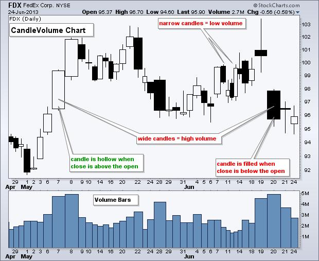
95

96 Chartists can also colorize candlesticks and volume bars to identify up periods and down periods. The second chart shows a colorized version of the same stock (FDX) over the same period. Just below the chart, in the Chart Attributes section, chartists can check the Color Prices box and Color Volume box to colorize. A hollow candlestick still means the close was above the open, and a filled candlestick means the close was below the open. The red candlestick means the close was below the prior close, while a black candlestick means the close was above the prior close. The same applies to the red and green volume bars. When calculating CandleVolume charts, note that volume is normalized to show it as a percentage of the look-back period. For a four month daily chart, each day's volume would be divided by total volume for the look-back period (four months). As such, the width of each box represents the percentage of total volume for the look-back period. Big volume days take up more space on the X-axis (horizontal) than low volume days. With varying width, this means the date axis is usually not uniform on CandleVolume charts. Some weeks will extend longer because of wide candlesticks, while others will be shorter because of narrow candlesticks. The first chart below shows Pfizer (PFE) with normal candlesticks and a normal X-axis. The second chart shows how CandleVolume changes the X-axis because volume was much higher in June than in prior months.


97 5.5.3 Candlestick Reversals CandleVolume charts can be used to validate candlestick reversal patterns. A candlestick reversal pattern on high volume carries more weight than a candlestick reversal pattern on low volume. The first chart below shows Transocean (RIG) forming a wide hammer in mid-april. The second chart shows RIG forming a wide bearish engulfing in mid-may. The third chart shows price action after these patter
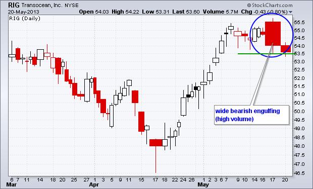
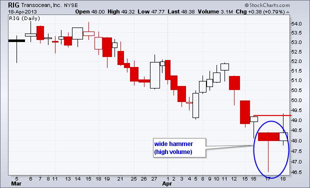
98

 on the breakout.")
99 5.5.4 Breakout Validation Volume is an important part of chart analysis, especially for validating support and resistance breaks. An upside breakout on high volume is more bullish than a breakout on low volume because volume is fuel. An upside breakout on high volume shows strong demand that is less likely to fade away. The chart below shows Google (GOOG) with a CandleVolume chart ending on April 19th. Notice how the stock broke above resistance with a wide hollow candlestick. This shows high volume (strong demand) on the breakout. The second chart shows what happened next. Not all setups work out this well but CandleVolume can help separate the pretenders from the contenders.

100 5.5.5 Conclusions CandleVolume charts put price action and volume together for easy visual analysis. Because these candlesticks share the same features as normal candlesticks, chartists can use them to validate candlestick patterns. CandleVolume charts can also be used to affirm a support test or validate a resistance level. A bounce off support with a wide candlestick is stronger than a bounce with a narrow candlestick. The same is true for a decline from resistance. Basically, almost anything done on normal candlestick charts can be applied to CandleVolume charts. Link : CandleVolume

101 6. Patterns 6.1 RECTANGLES AND PENNANTS A flag is defined in most major textbooks as a parallelogram that lines up with the current trend. In almost all cases, flags show the chartist a very short pause in the trading activity of the prevailing trend. Flags will last only a few weeks, while pennants though quite similar, will often represent as few as seven to 10 trading days. A pennant is often more symmetrical in design and somewhat horizontal in shape. History has shown us that the direction of the trend continues after the formation of the pennant has been completed. Both are examples of continuation patterns. If you were to sit down and study a number of charts today, you would be able to see quite a number of flags and pennants. The beauty of hindsight is that it is always 20/20. The key is to be able to spot the formation of the patterns as they are developing. Imagine for purposes of this study, a dramatic day of trading that produces a long straight-line price bar that resembles a flagpole. In order for the market to catch up to this bold move, the next few days of trading will form a flag or a pennant, as the investors settle in to this new price range. If these next few days witness the stock trading in a narrow range with the highs and lows in a similar price pattern, then a Pennant is formed. If the highs and lows are falling off slightly in the opposite direction of the prevailing trend, then a flag is formed. A key to the recognition of both these patterns is that the volume will diminish dramatically. You can see in this chart of Nortel Networks of Jan 2000 that a flag was formed over a six-day period followed by the continuation of the prevailing trend. The volume, although not shown in this example,

102 diminished each day and did not pick up again until the next sharp upward movement of the stock on the seventh day from the initial development of the flagpole. It is important to understand how we measure the flags and pennants. If we are to look closely at the "flagpole," the sharp increase or decrease in price action during one trading day, the next week or two will see the trading action fall off, creating lower lows and lower highs, until the next major move in the prevailing trend. It is understood that the trading action, as the flag is developed, will give back almost everything the flagpole acquired on that one day of the sharp increase or decrease. With respect to flags and pennants in a downtrending market, the time it takes to develop will be dramatically shorter as investors tend to panic sell. One would merely have to chart the dotcoms during their crash to witness this statement. (Chart Created with Tradestation) Click on chart for larger version The Bottom Line Both flags and pennants are preceded by a flagpole, one day of dramatic trading with heavy volume. They last a period of one to three weeks in time and the prevailing trend then continues. Because the setup time is so short, you will only be able to witness flags and pennants in daily charting. Link: Continuation Patterns: Rectangles and Pennants
103 6.2 FLAGS AND PENNANTS The flag and pennant patterns are two continuation patterns that closely resemble each other, differing only in their shape during the pattern's consolidation period. This is the reason the terms flag and pennant are often used interchangeably. A flag is a rectangular shape, while the pennant looks more like a triangle. These two patterns are formed when there is a sharp price movement followed by generally sideways price movement, which is the flag or pennant. The pattern is complete when there is a price breakout in the same direction of the initial sharp price movement. The following move will see a similarly sharp move in the same direction as the prior sharp move. The complete move of the chart pattern - from the first sharp move to the last sharp move - is referred to as the flag pole. The flag or pennant is considered to be flying at half-mast, as the distance of the initial price movement is thought to be roughly equal to the proceeding price move. The reason these patterns form is that after a large price movement, the market consolidates, or pauses, before resuming the initial trend. The Flag The flag pattern forms what looks like a rectangle. The rectangle is formed by two parallel trendlines that act as support and resistance for the price until the price breaks out. In general, the flag will not be perfectly flat but will have its trendlines sloping.
104 Figure 1: The flag pattern In general, the slope of the flag should move in the opposite direction of the initial sharp price movement; so if the initial movement were up, the flag should be downward sloping. The buy or sell signal is formed once the price breaks through the support or resistance level, with the trend continuing in the prior direction. This breakthrough should be on heavier volume to improve the signal of the chart pattern. The Pennant The pennant forms what looks like a symmetrical triangle, where the support and resistance trendlines converge towards each other. The pennant pattern does not need to follow the same rules found in triangles, where they should test each support or resistance line several times. Also, the direction of the pennant is not as important as it is in the flag; however, the pennant is generally flat. Figure 2: The Pennant General Ideas While the construct of the pause in the trend is different for the flag and pennant, the attributes of the chart patterns themselves are similar. It is vital that the price movement prior to the flag or pennant be a strong, sharp move. Typically, these patterns take less time to form during downtrends than in uptrends. In terms of pattern length, they are generally short-term patterns lasting one to three weeks, but can be formed over longer periods. The volume, as with most breakout signals, should be seen as strong during the breakout to confirm the signal. Upon breakout, the initial price objective is equal to the distance of the prior move added to the breakout point. For example, if a prior sharp up movement was from $30 to $40, then the resulting price objective from a price breakout of $38 would be $48 ($38+$10).
105 7. INDICATORS IN AUTONIO PLATFORM 7.1 ACCUMLATION DISTRIBUTION LINE (ADL) Introduction Developed by Marc Chaikin, the Accumulation Distribution Line is a volume-based indicator designed to measure the cumulative flow of money into and out of a security. Chaikin originally referred to the indicator as the Cumulative Money Flow Line. As with cumulative indicators, the Accumulation Distribution Line is a running total of each period's Money Flow Volume. First, a multiplier is calculated based on the relationship of the close to the high-low range. Second, the Money Flow Multiplier is multiplied by the period's volume to come up with a Money Flow Volume. A running total of the Money Flow Volume forms the Accumulation Distribution Line. Chartists can use this indicator to affirm a security's underlying trend or anticipate reversals when the indicator diverges from the security price Calculation 1. Money Flow Multiplier = [(Close - Low) - (High - Close)] / (High - Low) 2. Money Flow Volume = Money Flow Multiplier x Volume for the Period 3. ADL = Previous ADL + Current Period's Money Flow Volume The Money Flow Multiplier fluctuates between +1 and -1. As such, it holds the key to the Money Flow Volume and the Accumulation Distribution Line. The multiplier is positive when the close is in the upper half of the high-low range and negative when in the lower half. This makes perfect sense. Buying pressure is stronger than selling pressure when prices close in the upper half of the period's range (and vice versa). The Accumulation Distribution Line rises when the multiplier is positive and falls when the multiplier is negative

106 The multiplier adjusts the amount of volume that ends up in the Money Flow Volume. Volume is in effect reduced unless the Money Flow Multiplier is at its extremes (+1 or -1). The multiplier is +1 when the close is on the high and -1 when the close is on the low. All volume is positive when +1 and all volume is negative when -1. At.50, only half of the volume translates into the period's Money Flow Volume. The table below shows the Money Flow Multipliers, Money Flow Volume and Accumulation Distribution Line for Research-in-Motion (RIMM). Notice how the multiplier is between.50 and 1 when the close is strong and between -.50 and -1 when the close is weak.

107 7.1.3 Interpretation The Accumulation Distribution Line is a cumulative measure of each period's volume flow, or money flow. A high positive multiplier combined with high volume shows strong buying pressure that pushes the indicator higher. Conversely, a low negative number combined with high volume reflects strong selling pressure that pushes the indicator lower. Money Flow Volume accumulates to form a line that either confirms or contradicts the underlying price trend. In this regard, the indicator is used to either reinforce the underlying trend or cast doubts on its sustainability. An uptrend in prices with a downtrend in the Accumulation Distribution Line suggests underlying selling pressure (distribution) that could foreshadow a bearish reversal on the price chart. A downtrend in prices with an uptrend in the Accumulation Distribution Line indicate underlying buying pressure (accumulation) that could foreshadow a bullish reversal in prices. ADL versus OBV The Accumulation Distribution Line and On Balance Volume (OBV) are cumulative volume-based indicators that sometimes move in opposite directions because their basic formulas are different. Joe Granville developed On Balance Volume (OBV) as a cumulative measure of positive and negative

108 volume flow. OBV adds a period's total volume when the close is up and subtracts it when the close is down. A cumulative total of this positive and negative volume flow forms the OBV line. This line can then be compared with the price chart of the underlying security to look for divergences or confirmation. As the formula above shows, Chaikin took a different approach by completely ignoring the change from one period to the next. Instead, the Accumulation Distribution Line focuses on the level of the close relative to the high-low range for a given period (day, week, month). With this formula, a security could gap down and close significantly lower, but the Accumulation Distribution Line would rise if the close were above the midpoint of the high-low range. The chart above shows Clorox (CLX) with a big gap down and a close near the top of the day's high-low range. OBV moved sharply lower

109 because the close was below the prior close. The Accumulation Distribution Line moved higher because the close was near the high of the day Trend Confirmation Trend confirmation is a pretty straight-forward concept. An uptrend in the Accumulation Distribution Line reinforces an uptrend on the price chart and vice versa. The chart below shows Freeport McMoran (FCX) and the Accumulation Distribution Line advancing in February-March, declining from April to June and then advancing from July to January. The Accumulation Distribution Line confirmed each of these price trends.

110 7.1.5 Divergences Bullish and bearish divergences are where it starts getting interesting. A bullish divergence forms when price moves to new lows, but the Accumulation Distribution Line does not confirm these lows and moves higher. A rising Accumulation Distribution Line shows, well, accumulation. Think of this as basically stealth buying pressure. Based on the theory that volume precedes price, chartists should be on alert for a bullish reversal on the price chart. The chart above shows Nordstrom (JWN) with the Accumulation Distribution Line. Notice how it is easy to compare price action when the indicator is placed behind the price plot. The indicator (pink) and the price trend moved in unison from February to June. Signs of accumulation emerged as the indicator bottomed in early July and started moving higher. JWN moved to a new low in late August. Even though the indicator showed signs of buying pressure, it was important to wait for a bullish catalyst or confirmation on the price chart. This catalyst came as the stock gapped up and surged on big volume. A bearish divergence forms when price moves to new highs, but the Accumulation Distribution Line does not confirm and moves lower. This shows distribution or underlying selling pressure that can foreshadow a bearish reversal on the price chart.

111 The chart above shows Southwest Airlines (LUV) with the Accumulation Distribution Line peaking two months ahead of prices. The indicator not only peaked, but it also moved lower in March and April, which reflected some selling pressure. LUV confirmed weakness with a support break on the price chart and RSI moved below 40 shortly afterward. RSI often trades in bull zones (40-80) and bear zones (20-60). RSI held in the bull zone until early May and then moved into a bear zone Disconnect with Prices The Accumulation Distribution Line is an indicator based on a derivative of price and volume. This makes it at least two steps removed from the actual price of the underlying security. Moreover, the Money Flow Multiplier does not take into account price changes from period to period. As such, it cannot be expected to always affirm price action or successfully predict price reversals with divergences. Sometimes there is a disconnect between prices and the indicator. Sometimes the Accumulation Distribution Line simply doesn't work. This is why it vitally important to use the

112 Accumulation Distribution Line, and all indicators for that matter, in conjunction with price/trend analysis and/or other indicators Conclusions The Accumulation Distribution Line can be used to gauge the general flow of volume. An uptrend indicates that buying pressure is prevailing on a regular basis, while a downtrend indicates that selling pressure is prevailing. Bullish and bearish divergences serve as alerts for a potential reversal on the price chart. As with all indicators, it is important to use the Accumulation Distribution Line in conjunction with other aspects of technical analysis, such as momentum oscillators and chart patterns. It is not a standalone indicator Using with SharpCharts The Accumulation Distribution Line is available in SharpCharts as an indicator. After selecting, the indicator can be positioned above, below or behind the price of the underlying security. Positioning


113 behind price makes it easy to compare with the underlying security. Chartists can also add a moving average to the indicator by using the advanced options Suggested Scans Bullish Divergence in OBV and ADL This scan starts with a base of stocks that are averaging at least $10 in price and 100,000 daily volume over the last 60 days. Potential bullish divergences are found by looking for stocks where price is BELOW the 65-day SMA and 20-day SMA, but OBV and the Accumulation Distribution Line are ABOVE the 65-day SMA and 20-day SMA. [type = stock] AND [country = US] AND [Daily SMA(60,Daily Volume) > ]
114 AND [Daily SMA(60,Daily Close) > 10] AND [Daily Close < Daily SMA(65,Daily Close)] AND [Daily AccDist > Daily AccDist Signal (65)] AND [Daily OBV > Daily OBV Signal(65)] AND [Daily Close < Daily SMA(20,Daily Close)] AND [Daily AccDist > Daily AccDist Signal (20)] AND [Daily OBV > Daily OBV Signal(20)] Bearish divergence in OBV and ADL This scan starts with a base of stocks that are averaging at least $10 in price and 100,000 daily volume over the last 60 days. Potential bearish divergences are found by looking for stocks where price is ABOVE the 65-day SMA and 20-day SMA, but OBV and the Accumulation Distribution Line are BELOW the 65-day SMA and 20-day SMA. [type = stock] AND [country = US] AND [Daily SMA(60,Daily Volume) > ] AND [Daily SMA(60,Daily Close) > 10] AND [Daily Close > Daily SMA(65,Daily Close)] AND [Daily AccDist < Daily AccDist Signal (65)] AND [Daily OBV < Daily OBV Signal(65)] AND [Daily Close > Daily SMA(20,Daily Close)] AND [Daily AccDist < Daily AccDist Signal (20)] AND [Daily OBV < Daily OBV Signal(20)] For more details on the syntax to use for Accumulation Distribution Line scans, please see our Scanning Indicator Reference in the Support Center. Note: For the purposes of scanning, daily volume data is incomplete during the trading day. When running scans with volume-based indicators like Accumulation/Distribution, be sure to base the scan on the Last Market Close. Examples of other volume-based indicators include Chaikin Money Flow, On Balance Volume, and the PVO.
115 7.2 AVERAGE DIRECTIONAL INDEX (ADI) Introduction The Average Directional Index (ADX), Minus Directional Indicator (-DI) and Plus Directional Indicator (+DI) represent a group of directional movement indicators that form a trading system developed by Welles Wilder. Although Wilder designed his Directional Movement System with commodities and daily prices in mind, these indicators can also be applied to stocks. Positive and negative directional movement form the backbone of the Directional Movement System. Wilder determined directional movement by comparing the difference between two consecutive lows with the difference between their respective highs. The Plus Directional Indicator (+DI) and Minus Directional Indicator (-DI) are derived from smoothed averages of these differences, and measure trend direction over time. These two indicators are often referred to collectively as the Directional Movement Indicator (DMI). The Average Directional Index (ADX) is in turn derived from the smoothed averages of the difference between +DI and -DI, and measures the strength of the trend (regardless of direction) over time. Using these three indicators together, chartists can determine both the direction and strength of the trend. Wilder features the Directional Movement indicators in his 1978 book, New Concepts in Technical Trading Systems. This book also includes details on Average True Range (ATR), the Parabolic SAR system, and RSI. Despite being developed before the computer age, Wilder's indicators are incredibly detailed in their calculation and have stood the test of time Calculation Directional movement is calculated by comparing the difference between two consecutive lows with the difference between their respective highs. Directional movement is positive (plus) when the current high minus the prior high is greater than the prior low minus the current low. This so-called Plus Directional Movement (+DM) then equals the
 when the prior low minus the current low is greater than the current high minus the prior high.")
116 current high minus the prior high, provided it is positive. A negative value would simply be entered as zero. Directional movement is negative (minus) when the prior low minus the current low is greater than the current high minus the prior high. This so-called Minus Directional Movement (-DM) equals the prior low minus the current low, provided it is positive. A negative value would simply be entered as zero. The chart above shows four calculation examples for directional movement. The first pairing shows a big positive difference between the highs for a strong Plus Directional Movement (+DM). The second pairing shows an outside day with Minus Directional Movement (-DM) getting the edge. The third pairing shows a big difference between the lows for a strong Minus Directional Movement (-DM). The final pairing shows an inside day, which amounts to no directional movement (zero). Both Plus Directional Movement (+DM) and Minus Directional Movement (-DM) are negative and revert to zero, so they cancel each other out. All inside days will have zero directional movement.
117 7.2.3 Indicator Calculation The calculation steps for the Average Directional Index (ADX), Plus Directional Indicator (+DI), and Minus Directional Indicator (-DI) are based on the Plus Directional Movement (+DM) and Minus Directional Movement (-DM) values calculated above, as well as the Average True Range. Smoothed versions of +DM and -DM are divided by a smoothed version of the Average True Range to reflect the true magnitude of the move. Note: Average True Range (ATR) is not described because there is an entire ChartSchool article for this. Basically, ATR is Wilder's version of the two-period trading range. The calculation example below is based on a 14-period indicator setting, as recommended by Wilder. 1) Calculate the True Range (TR), Plus Directional Movement (+DM) and Minus Directional Movement (- DM) for each period. 2) Smooth these periodic values using Wilder's smoothing techniques. These are explained in detail in the next section 3) Divide the 14-day smoothed Plus Directional Movement (+DM) by the 14-day smoothed True Range to find the 14-day Plus Directional Indicator (+DI14). Multiply by 100 to move the decimal point two places. This +DI14 is the green Plus Directional Indicator line (+DI) that is plotted along with the ADX line 4) Divide the 14-day smoothed Minus Directional Movement (-DM) by the 14-day smoothed True Range to find the 14-day Minus Directional Indicator (-DI14). Multiply by 100 to move the decimal point two places. This -DI14 is the red Minus Directional Indicator line (-DI) that is plotted along with the ADX line. 5) The Directional Movement Index (DX) equals the absolute value of +DI14 less -DI14 divided by the sum of +DI14 and -DI14. Multiply the result by 100 to move the decimal point over two places. 6) After all these steps, it is time to calculate the Average Directional Index (ADX) line. The first ADX value is simply a 14-day average of DX. Subsequent ADX values are smoothed by multiplying the previous 14-day ADX value by 13, adding the most recent DX value, and dividing this total by 14.

118 Above is a spreadsheet example with all the calculations involved. There is a 119-day calculation gap because approximately 150 periods are required to absorb the smoothing techniques. ADX/DMI enthusiasts can click here to download this spreadsheet and see the gory details. The chart below shows an example of ADX with +DI and -DI using the Nasdaq 100 ETF (QQQQ).

119 7.2.4 Wilder's Smoothing Techniques As seen in the ADX, +DI, and -DI calculations, there is a lot of smoothing involved and it is important to understand the effects. Because of Wilder's smoothing techniques, it can take around 150 periods of data to get true ADX values. Wilder uses similar smoothing techniques with his RSI and Average True Range calculations. ADX values using only 30 periods of historical data will not match ADX values using 150 periods of historical data. ADX values with 150 days or more of data will remain consistent. The first technique is used to smooth each period's +DM1, -DM1, and TR1 values over 14 periods. As with an exponential moving average, the calculation has to start somewhere so the first value is simply the sum of the first 14 periods. As shown below, smoothing starts with the second 14-period calculation and continues throughout. First TR14 = Sum of first 14 periods of TR1 Second TR14 = First TR14 - (First TR14/14) + Current TR1
120 Subsequent Values = Prior TR14 - (Prior TR14/14) + Current TR1 The second technique is used to smooth each period's DX value to finish with the Average Directional Index (ADX). First, calculate an average for the first 14 days as a starting point. The second and subsequent calculations use the smoothing technique below: First ADX14 = 14 period Average of DX Second ADX14 = ((First ADX14 x 13) + Current DX Value)/14 Subsequent ADX14 = ((Prior ADX14 x 13) + Current DX Value)/ Interpretation The Average Directional Index (ADX) is used to measure the strength or weakness of a trend, not the actual direction. Directional movement is defined by +DI and -DI. In general, the bulls have the edge when +DI is greater than -DI, while the bears have the edge when -DI is greater. Crosses of these directional indicators can be combined with ADX for a complete trading system. Before looking at some signals with examples, keep in mind that Wilder was a commodity and currency trader. The examples in his books are based on these instruments, not stocks. This does not mean his indicators cannot be used with stocks. Some stocks have price characteristics similar to commodities, which tend to be more volatile with short and strong trends. Stocks with low volatility may not generate signals based on Wilder's parameters. Chartists will likely need to adjust the indicator settings or the signal parameters according to the characteristics of the security Trend Strength At its most basic, the Average Directional Index (ADX) can be used to determine if a security is trending or not. This determination helps traders choose between a trend-following system or a nontrend-following system. Wilder suggests that a strong trend is present when ADX is above 25 and no trend is present when below 20. There appears to be a gray zone between 20 and 25. As noted above, chartists may need to adjust the settings to increase sensitivity and signals. ADX also has a fair amount of lag because of all the smoothing techniques. Many technical analysts use 20 as the key level for ADX.

121 The chart above shows Nordstrom (JWN) with the 50-day SMA and 14-day Average Directional Index (ADX). The stock moved from a strong uptrend to a strong downtrend in April-May, but ADX remained above 20 because the strong uptrend quickly changed into a strong downtrend. There were two non-trending periods as the stock formed a bottom in February and August. A strong trend emerged after the August bottom as ADX moved above 20 and remained above Trend Direction and Crossovers Wilder put forth a simple system for trading with these directional movement indicators. The first requirement is for ADX to be trading above 25. This ensures that prices are trending. Many traders, however, use 20 as the key level. A buy signal occurs when +DI crosses above -DI. Wilder based the initial stop on the low of the signal day. The signal remains in force as long as this low holds, even if +DI crosses back below -DI. Wait for this low to be penetrated before abandoning the signal. This bullish signal is reinforced if/when ADX turns up and the trend strengthens. Once the trend develops and becomes profitable, traders will have to incorporate a stop-loss and trailing stop should the trend continue. A sell signal triggers when -DI crosses above +DI. The high on the day of the sell signal becomes the initial stop-loss.

122 The chart above shows Medco Health Solutions with the three directional movement indicators. Note that 20 is used instead of 25 to qualify ADX signals. A lower setting means more possible signals. The green dotted lines show the buy signals and the red dotted lines show the sell signals. Wilder's initial stops were not incorporated in order to focus on the indicator signals. As the chart clearly shows, there are plenty of +DI and -DI crosses. Some occur with ADX above 20 to validate signals. Others occur to invalidate signals. As with most such systems, there will be whipsaws, great signals, and bad signals. The key, as always, is to incorporate other aspects of technical analysis. For example, the first group of whipsaws in September 2009 occurred during a consolidation. Moreover, this consolidation looked like a flag, which is a bullish consolidation that forms after an advance. It would have been prudent to ignore bearish signals with a bullish continuation pattern taking shape. The June 2010 buy signal occurred near a resistance zone marked by broken support and the 50-62% retracement zone. It would have been prudent to ignore a buy signal so close to this resistance zone.

123 The chart above shows AT&T (T) with three signals over a 12-month period. These three signals were pretty good, provided profits were taken and trailing stops were used. Wilder's Parabolic SAR could have been used to set a trailing stop-loss. Notice that there was no sell signal between the March and July buy signals. This is because ADX was not above 20 when -DI crossed above +DI in late April Conclusions The Directional Movement System indicator calculations are complex, interpretation is straightforward, and successful implementation takes practice. +DI and -DI crossovers are quite frequent and chartists need to filter these signals with complementary analysis. Setting an ADX requirement will reduce signals, but this uber-smoothed indicator tends to filter as many good signals as bad. In other words, chartists might consider moving ADX to the back burner and focusing on the Directional Movement Indicators (+DI and -DI) to generate signals. These crossover signals will be similar to those generated using momentum oscillators. Therefore, chartists need to look elsewhere for confirmation help. Volume-based indicators, basic trend analysis, and chart patterns can help
 from the indicator dropdown list.")
124 distinguish strong crossover signals from weak crossover signals. For example, chartists can focus on +DI buy signals when the bigger trend is up and -DI sell signals when the bigger trend is down Using with SharpCharts SharpCharts users can plot these three directional movement indicators by selecting Average Directional Index (ADX) from the indicator dropdown list. By default, the ADX line will be in black, the Plus Directional Indicator (+DI) in green and the Minus Directional Indicator (-DI) in red. This makes it easy to identify directional indicator crosses. While ADX can be plotted above, below or behind the main price plot, it is recommended to plot above or below because there are three lines involved. A horizontal line can be added to help identify ADX moves. The chart example below also shows the 50- day SMA and Parabolic SAR plotted behind the price plot. The moving average is used to filter signals. Only buy signals are used when trading above the 50-day moving average. Once initiated, the Parabolic SAR can be used to set stops. Click here for a live example of ADX.

125 Suggested Scans Overall Uptrend with +DI Crossing above -DI This scan starts with stocks that average 100,000 shares daily volume and have an average closing price above 10. An uptrend is present when trading above the 50-day SMA. A buy signal is possible when ADX is above 20. This signal materializes when +DI moves above -DI. [type = stock] AND [country = US] AND [Daily SMA(20,Daily Volume) > ] AND [Daily SMA(60,Daily Close) > 10] AND [Daily ADX Line(14) > 20] AND [Daily Plus DI(14) crosses Daily Minus DI(14)] AND [Daily Close > Daily SMA(50,Daily Close)] Overall Downtrend with -DI Crossing above +DI This scan starts with stocks that average 100,000 shares daily volume and have an average closing price above 10. A downtrend is present when trading below the 50-day SMA. A sell signal is possible when ADX is above 20. This signal materializes when -DI moves above +DI.
126 [type = stock] AND [country = US] AND [Daily SMA(20,Daily Volume) > ] AND [Daily SMA(60,Daily Close) > 10] AND [Daily ADX Line(14) > 20] AND [Daily Minus DI(14) crosses Daily Plus DI(14)] AND [Daily Close < Daily SMA(50,Daily Close)] For more details on the syntax to use for Average Directional Index, Plus DI and Minus DI scans, please see ou r Scanning Indicator Reference in the Support Center. Link: AVERAGE DIRECTIONAL INDEX (ADI)
127 7.3 AVERAGE TRUE RANGE (ATR) Introduction Developed by J. Welles Wilder, the Average True Range (ATR) is an indicator that measures volatility. As with most of his indicators, Wilder designed ATR with commodities and daily prices in mind. Commodities are frequently more volatile than stocks. They were are often subject to gaps and limit moves, which occur when a commodity opens up or down its maximum allowed move for the session. A volatility formula based only on the high-low range would fail to capture volatility from gap or limit moves. Wilder created Average True Range to capture this missing volatility. It is important to remember that ATR does not provide an indication of price direction, just volatility. Wilder features ATR in his 1978 book, New Concepts in Technical Trading Systems. This book also includes the Parabolic SAR, RSI and the Directional Movement Concept (ADX). Despite being developed before the computer age, Wilder's indicators have stood the test of time and remain extremely popular True Range Wilder started with a concept called True Range (TR), which is defined as the greatest of the following: Method 1: Current High less the current Low Method 2: Current High less the previous Close (absolute value) Method 3: Current Low less the previous Close (absolute value) Absolute values are used to ensure positive numbers. After all, Wilder was interested in measuring the distance between two points, not the direction. If the current period's high is above the prior period's high and the low is below the prior period's low, then the current period's high-low range will be used as the True Range. This is an outside day that would use Method 1 to calculate the TR. This is pretty straightforward. Methods 2 and 3 are used when there is a gap or an inside day. A gap occurs when the previous close is greater than the current high (signaling a potential gap down or limit move) or the
128 previous close is lower than the current low (signaling a potential gap up or limit move). The image below shows examples of when methods 2 and 3 are appropriate. Example A: A small high/low range formed after a gap up. The TR equals the absolute value of the difference between the current high and the previous close. Example B: A small high/low range formed after a gap down. The TR equals the absolute value of the difference between the current low and the previous close. Example C: Even though the current close is within the previous high/low range, the current high/low range is quite small. In fact, it is smaller than the absolute value of the difference between the current high and the previous close, which is used to value the TR Calculation Typically, the Average True Range (ATR) is based on 14 periods and can be calculated on an intraday, daily, weekly or monthly basis. For this example, the ATR will be based on daily data. Because there must be a beginning, the first TR value is simply the High minus the Low, and the first 14-day ATR is the average of the daily TR values for the last 14 days. After that, Wilder sought to smooth the data by incorporating the previous period's ATR value. Current ATR = [(Prior ATR x 13) + Current TR] / 14 - Multiply the previous 14-day ATR by Add the most recent day's TR value.
 equals the High minus the Low (yellow cells). The first 14-day ATR value (.56)) was calculated by finding the average of the first 14 True Range values (blue cell).")
129 - Divide the total by 14 Click here for an Excel Spreadsheet showing the start of an ATR calculation for QQQ In the spreadsheet example, the first True Range value (.91) equals the High minus the Low (yellow cells). The first 14-day ATR value (.56)) was calculated by finding the average of the first 14 True Range values (blue cell). Subsequent ATR values were smoothed using the formula above. The spreadsheet values correspond with the yellow area on the chart below. Notice how ATR surged as QQQ plunged in May with many long candlesticks.

130 For those trying this at home, a few caveats apply. First, just like with Exponential Moving Averages (EMAs), ATR values depend on how far back you begin your calculations. The first True Range value is simply the current High minus the current Low and the first ATR is an average of the first 14 True Range values. The real ATR formula does not kick in until day 15. Even so, the remnants of these first two calculations linger to slightly affect subsequent ATR values. Spreadsheet values for a small subset of data may not match exactly with what is seen on the price chart. Decimal rounding can also slightly affect ATR values. On our charts, we calculate back at least 250 periods (typically much further), to ensure a much greater degree of accuracy for our ATR values Absolute ATR ATR is based on the True Range, which uses absolute price changes. As such, ATR reflects volatility as absolute level. In other words, ATR is not shown as a percentage of the current close. This means lowpriced stocks will have lower ATR values than high price stocks. For example, a $20-30 security will have much lower ATR values than a $ security. Because of this, ATR values are not comparable. Even large price movements for a single security, such as a decline from 70 to 20, can make long-term


131 ATR comparisons impractical. Chart 4 shows Google with double-digit ATR values and chart 5 shows Microsoft with ATR values below 1. Despite different values, their ATR lines have similar shapes.

132 7.3.5 Conclusions Listed as Average True Range, ATR is on the Indicators drop-down menu. The parameters box to the right of the indicator contains the default value, 14, for the number of periods used to smooth the data. To adjust the period setting, highlight the default value and enter a new setting. Wilder often used an 8-period ATR. SharpCharts also allows users to position the indicator above, below, or behind the price plot. A moving average can be added to identify upturns or downturns in ATR. Click advanced options to add a moving average as an indicator overlay. Click here for a live example of ATR Suggested Scans Weeding Out High Volatility The Average True Range indicator can be used in scans to weed out securities with extremely high volatility. This simple scan searches for S&P 600 stocks that are in an uptrend. The final scan clause excludes high volatility stocks from the results. Note that the ATR is converted to a percentage of sorts so that the ATR of different stocks can be compared on the same scale. [group is SP600] AND [Daily EMA(50,close) > Daily EMA(200,close)] AND [ATR(250) / SMA(20,Close) * 100 < 4] For more details on the syntax to use for ATR scans, please see our Scanning Indicator Reference in the Support Center
133 7.4 BOLLINGER BANDS (BB) Introduction Developed by John Bollinger, Bollinger Bands are volatility bands placed above and below a moving average. Volatility is based on the standard deviation, which changes as volatility increases and decreases. The bands automatically widen when volatility increases and narrow when volatility decreases. This dynamic nature of Bollinger Bands also means they can be used on different securities with the standard settings. For signals, Bollinger Bands can be used to identify M-Tops and W-Bottoms or to determine the strength of the trend. Signals derived from narrowing BandWidth are discussed in the ChartSchool article on BandWidth. Note: Bollinger Bands is a registered trademark of John Bollinger SharpCharts Calculation * Middle Band = 20-day simple moving average (SMA) * Upper Band = 20-day SMA + (20-day standard deviation of price x 2) * Lower Band = 20-day SMA - (20-day standard deviation of price x 2)
134 Click here to download this spreadsheet example. Bollinger Bands consist of a middle band with two outer bands. The middle band is a simple moving average that is usually set at 20 periods. A simple moving average is used because the standard deviation formula also uses a simple moving average. The lookback period for the standard deviation is the same as for the simple moving average. The outer bands are usually set 2 standard deviations above and below the middle band.

135 Settings can be adjusted to suit the characteristics of particular securities or trading styles. Bollinger recommends making small incremental adjustments to the standard deviation multiplier. Changing the number of periods for the moving average also affects the number of periods used to calculate the standard deviation. Therefore, only small adjustments are required for the standard deviation multiplier. An increase in the moving average period would automatically increase the number of periods used to calculate the standard deviation and would also warrant an increase in the standard deviation multiplier. With a 20-day SMA and 20-day Standard Deviation, the standard deviation multiplier is set at 2. Bollinger suggests increasing the standard deviation multiplier to 2.1 for a 50-period SMA and decreasing the standard deviation multiplier to 1.9 for a 10-period SMA Signal: W-Bottoms W-Bottoms were part of Arthur Merrill's work that identified 16 patterns with a basic W shape. Bollinger uses these various W patterns with Bollinger Bands to identify W-Bottoms. A W-Bottom

136 forms in a downtrend and involves two reaction lows. In particular, Bollinger looks for W-Bottoms where the second low is lower than the first but holds above the lower band. There are four steps to confirm a W-Bottom with Bollinger Bands. First, a reaction low forms. This low is usually, but not always, below the lower band. Second, there is a bounce towards the middle band. Third, there is a new price low in the security. This low holds above the lower band. The ability to hold above the lower band on the test shows less weakness on the last decline. Fourth, the pattern is confirmed with a strong move off the second low and a resistance break. Chart 2 shows Nordstrom (JWN) with a W-Bottom in January-February First, the stock formed a reaction low in January (black arrow) and broke below the lower band. Second, there was a bounce back above the middle band. Third, the stock moved below its January low and held above the lower band. Even though the 5-Feb spike low broke the lower band, Bollinger Bands are calculated using closing prices so signals should also be based on closing prices. Fourth, the stock surged with

137 expanding volume in late February and broke above the early February high. Chart 3 shows Sandisk with a smaller W-Bottom in July-August Signal: M-Tops M-Tops were also part of Arthur Merrill's work that identified 16 patterns with a basic M shape. Bollinger uses these various M patterns with Bollinger Bands to identify M-Tops. According to Bollinger, tops are usually more complicated and drawn out than bottoms. Double tops, head-andshoulders patterns, and diamonds represent evolving tops.

138 In its most basic form, an M-Top is similar to a double top. However, the reaction highs are not always equal. The first high can be higher or lower than the second high. Bollinger suggests looking for signs of non-confirmation when a security is making new highs. This is basically the opposite of the W-Bottom. A non-confirmation occurs with three steps. First, a security creates a reaction high above the upper band. Second, there is a pullback towards the middle band. Third, prices move above the prior high but fail to reach the upper band. This is a warning sign. The inability of the second reaction high to reach the upper band shows waning momentum, which can foreshadow a trend reversal. Final confirmation comes with a support break or bearish indicator signal. Chart 4 shows Exxon Mobil (XOM) with an M-Top in April-May The stock moved above the upper band in April. There was a pullback in May and then another push above 90. Even though the stock moved above the upper band on an intraday basis, it did not CLOSE above the upper band. The M-Top was confirmed with a support break two weeks later. Also, notice that MACD formed a bearish divergence and moved below its signal line for confirmation
, the stock moved to a higher high above 17. Despite this new high for the move, price did not exceed the upper band.")
139 Chart 5 shows Pulte Homes (PHM) within an uptrend in July-August Price exceeded the upper band in early September to affirm the uptrend. After a pullback below the 20-day SMA (middle Bollinger Band), the stock moved to a higher high above 17. Despite this new high for the move, price did not exceed the upper band. This flashed a warning sign. The stock broke support a week later and MACD moved below its signal line. Notice that this M-top is more complex because there are lower reaction highs on either side of the peak (blue arrow). This evolving top formed a small head-andshoulders pattern Signal: Walking the Bands Moves above or below the bands are not signals per se. As Bollinger puts it, moves that touch or exceed the bands are not signals, but rather tags. On the face of it, a move to the upper band shows strength, while a sharp move to the lower band shows weakness. Momentum oscillators work much the same way. Overbought is not necessarily bullish. It takes strength to reach overbought levels and

140 overbought conditions can extend in a strong uptrend. Similarly, prices can walk the band with numerous touches during a strong uptrend. Think about it for a moment. The upper band is 2 standard deviations above the 20-period simple moving average. It takes a pretty strong price move to exceed this upper band. An upper band touch that occurs after a Bollinger Band confirmed W-Bottom would signal the start of an uptrend. Just as a strong uptrend produces numerous upper band tags, it is also common for prices to never reach the lower band during an uptrend. The 20-day SMA sometimes acts as support. In fact, dips below the 20-day SMA sometimes provide buying opportunities before the next tag of the upper band. Chart 6 shows Air Products (APD) with a surge and close above the upper band in mid-july. First, notice that this is a strong surge that broke above two resistance levels. A strong upward thrust is a sign of strength, not weakness. Trading turned flat in August and the 20-day SMA moved sideways. The Bollinger Bands narrowed, but APD did not close below the lower band. Prices and the 20-day SMA turned up in September. Overall, APD closed above the upper band at least five times over a four month period. The indicator window shows the 10-period Commodity Channel Index (CCI). Dips below -100 are deemed oversold and moves back above -100 signal the start of an oversold bounce (green dotted line). The upper band tag and breakout started the uptrend. CCI then identified tradable pullbacks with dips below This is an example of combining Bollinger Bands with a momentum oscillator for trading signals.

141 Chart 7 shows Monsanto (MON) with a walk down the lower band. The stock broke down in January with a support break and closed below the lower band. From mid-january until early May, Monsanto closed below the lower band at least five times. Notice that the stock did not close above the upper band once during this period. The support break and initial close below the lower band signaled a downtrend. As such, the 10-period Commodity Channel Index (CCI) was used to identify short-term overbought situations. A move above +100 is overbought. A move back below +100 signals a resumption of the downtrend (red arrows). This system triggered two good signals in early Conclusions Bollinger Bands reflect direction with the 20-period SMA and volatility with the upper/lower bands. As such, they can be used to determine if prices are relatively high or low. According to Bollinger, the bands should contain 88-89% of price action, which makes a move outside the bands significant.t echnically, prices are relatively high when above the upper band and relatively low when below the

142 lower band. However, relatively high should not be regarded as bearish or as a sell signal. Likewise, relatively low should not be considered bullish or as a buy signal. Prices are high or low for a reason. As with other indicators, Bollinger Bands are not meant to be used as a stand-alone tool. Chartists should combine Bollinger Bands with basic trend analysis and other indicators for confirmation Using with Sharp Charts Bollinger Bands can be found in Sharp Charts as a price overlay. As with a simple moving average, Bollinger Bands should be shown on top of a price plot. Upon selecting Bollinger Bands, the default setting will appear in the parameters window (20,2). The first number (20) sets the periods for the simple moving average and the standard deviation. The second number (2) sets the standard deviation multiplier for the upper and lower bands. These default parameters set the bands 2 standard deviations above/below the simple moving average. Users can change the parameters to suit their charting needs. Bollinger Bands (50,2.1) can be used for a longer timeframe or Bollinger Bands (10,1.9) can be used for a shorter timeframe. Click here for a live example Suggested Scans Bullish Bollinger Band Crossover This scan finds stocks that have just moved above their upper Bollinger Band line. This scan is just a starting point. Further refinement and analysis are required [type = stock] AND [country = US] AND [Daily SMA (20,Daily Volume) > 40000]
143 AND [Daily SMA (60,Daily Close) > 5] AND [Daily Close x Daily Upper BB(20,2.0)] Bearish Bollinger Band Crossover This scan finds stocks that have just moved below their lower Bollinger Band line. This scan is just a starting point. Further refinement and analysis are required. [type = stock] AND [country = US] AND [Daily SMA(20,Daily Volume) > 40000] AND [Daily SMA(60,Daily Close) > 5] AND [Daily Lower BB(20,2.0) x Daily Close] For more details on the syntax to use for Bollinger Band scans, please see our Scanning Indicator Reference in the Support Center. Link: BOLLINGER BANDS
144 7.5 COMMODITY CHANNEL INDEX (CCI) Introduction Developed by Donald Lambert and featured in Commodities magazine in 1980, the Commodity Channel Index (CCI) is a versatile indicator that can be used to identify a new trend or warn of extreme conditions. Lambert originally developed CCI to identify cyclical turns in commodities, but the indicator can be successfully applied to indices, ETFs, stocks, and other securities. In general, CCI measures the current price level relative to an average price level over a given period of time. CCI is relatively high when prices are far above their average. CCI is relatively low when prices are far below their average. In this manner, CCI can be used to identify overbought and oversold levels Calculation The example below is based on a 20-period Commodity Channel Index (CCI) calculation. The number of CCI periods is also used for the calculations of the simple moving average and Mean Deviation. CCI = (Typical Price - 20-period SMA of TP) / (.015 x Mean Deviation) Typical Price (TP) = (High + Low + Close)/3 Constant =.015 There are four steps to calculating the Mean Deviation: First, subtract the most recent 20-period average of the typical price from each period's typical price. Second, take the absolute values of these numbers. Third, sum the absolute values. Fourth, divide by the total number of periods (20). Lambert set the constant at.015 to ensure that approximately 70 to 80 percent of CCI values would fall between -100 and This percentage also depends on the look-back period. A shorter CCI (10 periods) will be more volatile with a smaller percentage of values between +100 and Conversely, a longer CCI (40 periods) will have a higher percentage of values between +100 and -100

145 Click here for a CCI calculation in an Excel Spreadsheet.

146 7.5.3 Interpretation CCI measures the difference between a security's price change and its average price change. High positive readings indicate that prices are well above their average, which is a show of strength. Low negative readings indicate that prices are well below their average, which is a show of weakness. The Commodity Channel Index (CCI) can be used as either a coincident or leading indicator. As a coincident indicator, surges above +100 reflect strong price action that can signal the start of an uptrend. Plunges below -100 reflect weak price action that can signal the start of a downtrend. As a leading indicator, chartists can look for overbought or oversold conditions that may foreshadow a mean reversion. Similarly, bullish and bearish divergences can be used to detect early momentum shifts and anticipate trend reversals.
147 7.5.4 New Trend Emerging As noted above, the majority of CCI movement occurs between -100 and A move that exceeds this range shows unusual strength or weakness that can foreshadow an extended move. Think of these levels as bullish or bearish filters. Technically, CCI favors the bulls when positive and the bears when negative. However, using a simple zero line crossovers can result in many whipsaws. Although entry points will lag more, requiring a move above +100 for a bullish signal and a move below -100 for a bearish signal reduces whipsaws. The chart below shows Caterpillar (CAT) with 20-day CCI. There were four trend signals within a seven-month period. Obviously, a 20-day CCI is not suited for long-term signals. Chartists need to use weekly or monthly charts for long-term signals. The stock peaked on 11-Jan and turned down. CCI moved below -100 on 22-January (8 days later) to signal the start of an extended move. Similarly, the stock bottomed on 8-February and CCI moved above +100 on 17-February (6 days later) to signal the start of an extended advance. CCI does not catch the exact top or bottom, but it can help filter out insignificant moves and focus on the larger trend.

148 CCI triggered a bullish signal when CAT surged above 60 in June. Some traders may have considered the stock overbought and the reward-to-risk ratio unfavorable at these levels. With the bullish signal in force, the focus would have been on bullish setups with a good reward-to-risk ratio. Notice that the stock retraced around 62% of the prior advance and formed a falling flag by the end of June. The subsequent surge above the flag trend line provided another bullish signal with CCI still in bull mode.

149 7.5.5 Overbought/Oversold Identifying overbought and oversold levels can be tricky with the Commodity Channel Index (CCI), or any other momentum oscillator for that matter. First, CCI is an unbound oscillator. Theoretically, there are no upside or downside limits. This makes an overbought or oversold assessment subjective. Second, securities can continue moving higher after an indicator becomes overbought. Likewise, securities can continue moving lower after an indicator becomes oversold. The definition of overbought or oversold varies for the Commodity Channel Index (CCI). ±100 may work in a trading range, but more extreme levels are needed for other situations. ±200 is a much harder level to reach and more representative of a true extreme. Selection of overbought/oversold levels also depends on the volatility of the underlying security. The CCI range for an index ETF, such as SPY, will usually be smaller than for most stocks, such as Google. The chart above shows Google (GOOG) with CCI(20). Horizontal lines at ±200 were added using the advanced indicators options. From early February to early October (2010), Google exceeded ±200 at least five times. The red dotted lines show when CCI moved back below +200 and the green dotted lines show when CCI moved back above It is important to wait for these crosses to reduce whipsaws should the trend extend. Such a system is not fool proof though. Notice how Google kept on moving higher even after CCI became overbought in mid-september and moved below -200.

150 7.5.6 Bullish Bearish Divergences Divergences signal a potential reversal point because directional momentum does not confirm price. A bullish divergence occurs when the underlying security makes a lower low and CCI forms a higher low, which shows less downside momentum. A bearish divergence forms when the security records a higher high and CCI forms a lower high, which shows less upside momentum. Before getting too excited about divergences as great reversal indicators, note that divergences can be misleading in a strong trend. A strong uptrend can show numerous bearish divergences before a top actually materializes. Conversely, bullish divergences often appear in extended downtrends. Confirmation holds the key to divergences. While divergences reflect a change in momentum that can foreshadow a trend reversal, chartists should set a confirmation point for CCI or the price chart. A bearish divergence can be confirmed with a break below zero in CCI or a support break on the price chart. Conversely, a bullish divergence can be confirmed with a break above zero in CCI or a resistance break on the price chart.
151 The chart above shows United Parcel Service (UPS) with 40-day CCI. A longer timeframe, 40 versus 20, was used to reduce volatility. There are three sizable divergences over a seven-month period, which is actually quite a few for just seven months. First, UPS raced to new highs in early May, but CCI failed to exceed its March high and formed a bearish divergence. A support break on the price chart and CCI move into negative territory confirm this divergence a few days later. Second, a bullish divergence formed in early July as the stock moved to a lower low, but CCI formed a higher low. This divergence was confirmed with a CCI break into positive territory. Also notice that UPS filled the late June gap with a surge in early July. Third, a bearish divergence formed in early September and this was confirmed when CCI dipped into negative territory. Despite a CCI confirmation, price never broke support and the divergence did not result in a trend reversal. Not all divergences produce good signals Conclusions CCI is a versatile momentum oscillator that can be used to identify overbought/oversold levels or trend reversals. The indicator becomes overbought or oversold when it reaches a relative extreme. That extreme depends on the characteristics of the underlying security and the historical range for CCI. Volatile securities are likely to require greater extremes than docile securities. Trend changes can be identified when CCI crosses a specific threshold between zero and 100. Regardless of how CCI is used, chartists should use CCI in conjunction with other indicators or price analysis. Another momentum oscillator would be redundant, but On Balance Volume (OBV) or the Accumulation Distribution Line can add value to CCI signals Using with SharpCharts CCI is available as a SharpCharts indicator that can be placed above, below or behind the price plot of the underlying security. Placing CCI directly behind the price makes it easy to compare indicator movements with price movements. The default setting is 20-periods, but this can be adjusted to suit analysis needs. A shorter timeframe makes the indicator more sensitive. A longer timeframe makes it less sensitive. Members can click the green arrow next to advanced options to add horizontal lines to mark overbought or oversold levels. Two lines can be added by separating the numbers with a comma (200,-200). Click here for a live example.
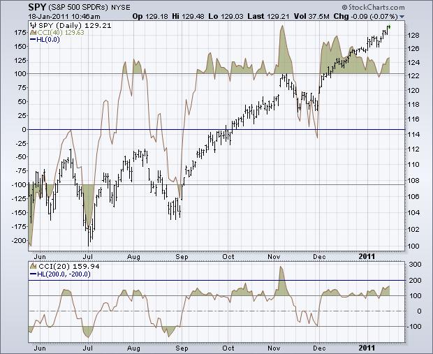
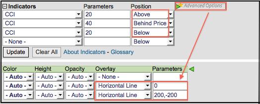
152
153 7.5.9 Suggested Scans CCI Oversold in Uptrend This scan reveals stocks that are in an uptrend with oversold CCI turning up. First, stocks must be above their 200-day moving average to be in an overall uptrend. Second, CCI must cross above -200 to show the indicator rising from oversold levels. [type = stock] AND [country = US] AND [Daily SMA(20,Daily Volume) > 40000] AND [Daily SMA(60,Daily Close) > 20] AND [Daily Close > Daily SMA(200,Daily Close)] AND [Daily CCI(20) crosses -200] CCI Overbought in Downtrend This scan reveals stocks that are in a downtrend with overbought CCI turning down. First, stocks must be below their 200-day moving average to be in an overall downtrend. Second, CCI must cross below +200 to show the indicator falling from overbought levels [type = stock] AND [country = US] AND [Daily SMA(20,Daily Volume) > 40000] AND [Daily SMA(60,Daily Close) > 20] AND [Daily Close < Daily SMA(200,Daily Close)] AND [200 crosses Daily CCI(20)] For more details on the syntax to use for CCI scans, please see our Scanning Indicator Reference in the Support Center. Link: COMMODITY CHANNEL INDEX
154 7. 6 FORCE INDEX (FI) Introduction The Force Index is an indicator that uses price and volume to assess the power behind a move or identify possible turning points. Developed by Alexander Elder, the Force Index was introduced in his classic book, Trading for a Living. According to Elder, there are three essential elements to a stock's price movement: direction, extent and volume. The Force Index combines all three as an oscillator that fluctuates in positive and negative territory as the balance of power shifts. The Force Index can be used to reinforce the overall trend, identify playable corrections or foreshadow reversals with divergences Calculation Force Index(1) = {Close (current period) - Close (prior period)} x Volume Force Index(13) = 13-period EMA of Force Index(1) Calculation of the 1-period Force Index is straightforward. Simply subtract the prior close from the current close and multiply by volume. The Force Index for more than one day is simply an exponential moving averageof the 1-period Force Index. For example, a 13-period Force Index is a 13- period EMA of the 1-period Force Index values for the last 13 periods. Three factors affect Force Index values. First, the Force Index is positive when the current close is above the prior close. The Force Index is negative when the current close is below the prior close. Second, the extent of the move determines the volume multiplier. Bigger moves warrant larger multipliers that influence the Force Index accordingly. Small moves produce small multipliers that reduce the influence. Third, volume plays a key role. A big move on big volume produces a high Force Index values. Small moves on low volume produce relatively low Force Index values. The table below shows the Force Index calculations for Pfizer (PFE). Line 27 marks the biggest move (+84 cents) and the biggest volume (162,619). This combination produces the biggest Force Index value on the table (136,600).

155 The chart above shows the Force Index in action. Notice how the 1-period Force Index fluctuates above/below the zero line and looks quite jagged. Elder recommends smoothing the indicator with a 13-period EMA to reduce the positive-negative crossovers. Chartists should experiment with different smoothing periods to determine what best suits their analytical needs.
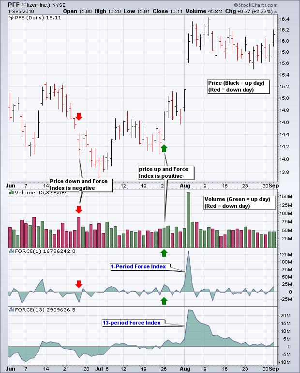
156
157 7.6.3 Interpretation As noted above, there are three elements to the Force Index. First, there is either a positive or negative price change. A positive price change signals that buyers were stronger than sellers, while a negative price change signals that sellers were stronger than buyers. Second, there is the extent of the price change, which is simply the current close less the prior close. The extent shows us just how far prices moved. A big advance shows strong buying pressure, while a big decline shows strong selling pressure. The third and final element is volume, which, according to Elder, measures commitment. Just how committed are the buyers and sellers? A big advance on heavy volume shows a strong commitment from buyers. Likewise, a big decline on heavy volume shows a strong commitment from sellers. The Force Index quantifies these three elements into one indicator that measures buying and selling pressure Trend Identification The Force Index can be used to reinforce or determine the trend. The trend in question, short-term, medium-term or long-term, depends on the Force Index parameters. While the default Force Index parameter is 13, chartists can use a higher number for more smoothing or a lower number for less smoothing. The chart below shows Home Depot with a 100-day Force Index and a 13-day Force Index. Notice how the 13-day Force Index is more volatile and jagged. The 100-day Force Index is smoother and crosses the zero line fewer times. In this regard, the 100-day Force Index can be used to determine the medium or long-term trend. Notice how a resistance breakout on the price chart corresponds to a resistance breakout on the 100-day Force Index. The 100-day Force Index moved into positive territory and broke resistance in mid-february. The indicator remained positive during the entire uptrend and turned negative in mid-may. The early June support break on the price chart was confirmed with a support break in the Force Index.
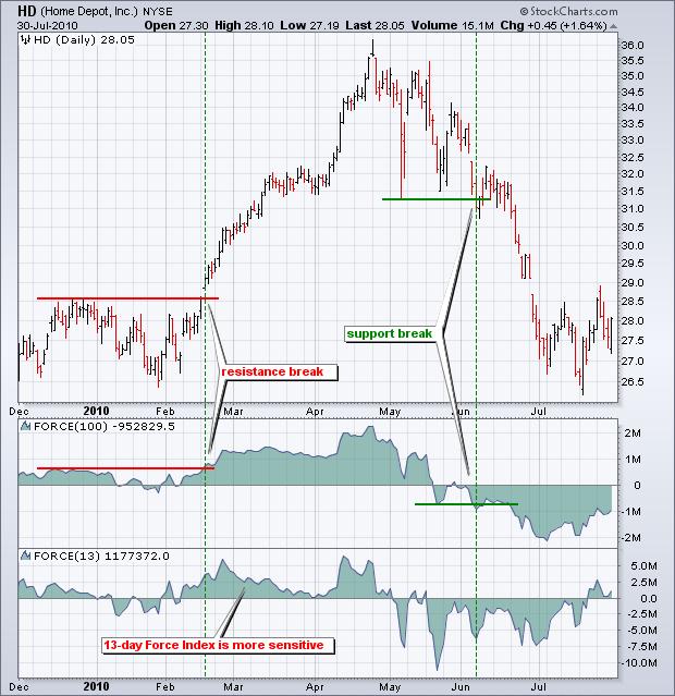
158

159 7.6.5 Divergences Bullish and bearish divergences can alert chartists of a potential trend change. Divergences are classic signals associated with oscillators. A bullish divergence forms when the indicator moves higher as the security moves lower. The indicator is not confirming weakness in price and this can foreshadow a bullish trend reversal. A bearish divergence forms when the indicator moves lower as the security moves higher. Even though the security is moving higher, the indicator shows underlying weakness by moving lower. This discrepancy can foreshadow a bearish trend reversal. Confirmation is an important part of bullish and bearish divergences. Even though the divergences signal something is amiss, confirmation from the indicator or price chart is needed. A bullish divergence can be confirmed with the Force Index moving into positive territory or a resistance breakout on the price chart. A bearish divergence can be confirmed with the Force Index moving into negative territory or a support break on the price chart. Chartists can also use candlesticks, moving average crosses, pattern breaks and other forms of technical analysis for confirmation.
160 The chart above shows Best Buy (BBY) with the Force Index (39) sporting a series of divergences. The green lines show bullish divergences, while the red lines show bearish divergences. A bullish divergence is confirmed when the Force Index (39) crosses into positive territory (green dotted lines). A bearish divergence is confirmed when the Force Index (39) crosses into negative territory (red dotted lines). Chartists can also use trendline breaks on the price chart for confirmation. This chart shows two versions of the Force Index. The Force Index (13) captures short-term fluctuations and is more sensitive. The Force Index (39) captures medium-term fluctuations and is smoother. The 39-day Force Index produces fewer zero line crossovers and these crossovers last longer. There is no right or wrong answer for these settings. It depends on trading objectives, time horizon, and analytical style Identifying Corrections The Force Index can be used in conjunction with a trend following indicator to identify short-term corrections within that trend. A pullback from overbought levels represents a short-term correction within an uptrend. An oversold bounce represents a short-term correction within a downtrend. Yes, corrections can be up or down, it depends on the direction of the bigger trend. Alexander Elder recommends using a 22-day EMA for trend identification and a 2-day Force Index to identify corrections. The trend is up when the 22-day EMA is moving higher, which means the 2-day Force Index would be used to identify short-term pullbacks for buying. The trend is down when the 22-day EMA is moving lower, which means the 2-day Force Index would be used to identify short-term bounces for selling. This is an aggressive strategy best suiting for active traders. The timeframe can be adjusted by using a longer moving average and timeframe for the Force Index. For example, mediumterm traders might experiment with a 100-day EMA and 10-day Force Index. There are two schools of thought regarding the correction play. Traders can either act as soon as the correction is evident or act when there is evidence the correction has ended. Let's look at an example with the 22-day EMA and 2-day Force Index. Keep in mind that this is designed to identify very short corrections within a bigger trend. The chart below shows Texas Instruments (TXN) with the 22-day EMA turning up in mid-september.

161 With the 22-day EMA rising, traders are looking for very short-term pullbacks when the 2-day Force Index turns negative. Traders can act when the Force Index turns negative or wait for it to move back into positive territory. Acting when negative may improve the reward-to-risk ratio, but the correction could extend a few more days. Waiting for the Force Index to turn positive again shows some strength that could signal the correction has ended. The green dotted lines show when the 2-day Force Index turns negative Conclusions The Force Index uses both price and volume to measure buying and selling pressure. The price portion covers the trend, while the volume portion determines the intensity. At its most basic, chartists can use a long-term Force Index to confirm the underlying trend. The bulls have the edge when the 100-day Force Index is positive. The bears have the edge when the 100-day Force Index is negative. Armed with this information, traders can then look for short-term setups in harmony with the larger trend, such as bullish setups in a larger uptrend or bearish setups within a larger
162 downtrend. As with all indicators, traders should use the Force Index in conjunction with other indicators and analysis techniques Using with SharpCharts The Force Index is available as an indicator for SharpCharts. Once selected, users can place the indicator above, below or behind the underlying price plot. Placing the Force Index directly on top of the price plot accentuates the movements relative to price action of the underlying security. This can make it easier to identify bullish and bearish divergences. Chartists can click advanced options to add a moving average, horizontal line, or another indicator to the Force Index.
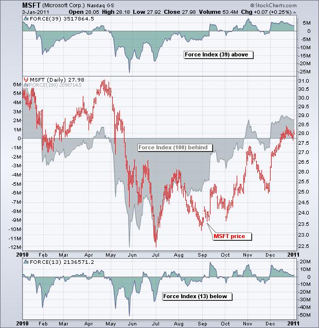
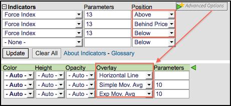
163
164 Suggested Scans Oversold in Up Trend This scan searches for stocks where the Force Index (100) is in positive territory and the Commodity Channel Index (20) is oversold. A positive Force Index establishes an overall uptrend. An oversold CCI identifies a pullback within this uptrend. This scan is meant as a starting point. Further scrutiny and adjustment is advised. [type = stock] AND [country = US] AND [Daily SMA(20,Daily Volume) > ] AND [Daily SMA(60,Daily Close) > 20] AND [Daily FORCE(100) > 0] AND [Daily CCI(20) < -100] Overbought in Down Trend This scan searches for stocks where the Force Index (100) is in negative territory and the Commodity Channel Index (20) is overbought. A negative Force Index establishes an overall downtrend. An overbought CCI identifies a corrective bounce within this downtrend. This scan is meant as a starting point. Further scrutiny and adjustment is advised [type = stock] AND [country = US] AND [Daily SMA(20,Daily Volume) > ] AND [Daily SMA(60,Daily Close) > 20] AND [Daily FORCE(100) < 0] AND [Daily CCI(20) > 100] For more details on the syntax to use for Force Index scans, please see our Scanning Indicator Reference in the Support Center
165 7.7 KNOW SURE THINGS (KST) Introduction Developed by Martin Pring, Know Sure Thing (KST) is a momentum oscillator based on the smoothed rate-of-change for four different timeframes. Pring referred to this indicator as the Summed Rate of Change (KST) in a 1992 article in Stocks & Commodities magazine. In short, KST measures price momentum for four different price cycles. It can be used just like any momentum oscillator. Chartists can look for divergences, overbought/oversold readings, signal line crossovers and centerline crossovers. Pring frequently applied trend lines to KST. Although trend line signals do not occur often, Pring notes that such breaks reinforce signal line crossovers SharpCharts Calculation Even though the formula for KST looks complicated, it is a rather straightforward indicator. It is simply a weighted average of four different rate-of-change values that have been smoothed. For example, calculate the 10-period rate-of-change and then smooth it with a 10-period simple moving average. The chart below shows the four different rate-of-change indicators with the appropriate moving averages for smoothing.
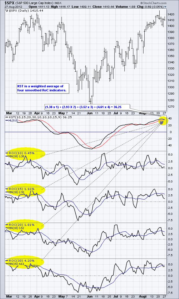
166
167 The formula box below shows the four different combinations with their default settings. These combinations are then weighted and summed. The shortest timeframe carries the least weight (1) and the longest timeframe carries the most weight (4). A 9-period simple moving average is added as a signal line. RCMA1 = 10-Period SMA of 10-Period Rate-of-Change RCMA2 = 10-Period SMA of 15-Period Rate-of-Change RCMA3 = 10-Period SMA of 20-Period Rate-of-Change RCMA4 = 15-Period SMA of 30-Period Rate-of-Change KST = (RCMA1 x 1) + (RCMA2 x 2) + (RCMA3 x 3) + (RCMA4 x 4) Signal Line = 9-period SMA of KST The default parameters are as follows: KST(10,15,20,30,10,10,10,15,9). The first four numbers represent the rate-of-change settings, the second four represent the moving averages for these rateof-change indicators and the last number is the signal line moving average.
168 Click here to download this spreadsheet example and try it at home.

169 7.7.3 Interpretation KST fluctuates above/below the zero line. At its most basic, momentum favors the bulls when KST is positive and the bears when KST is negative. A positive reading means the weighted and smoothed rate-of-changevalues are mostly positive and prices are moving higher. A negative reading indicates that prices are moving lower. After basic centerline crossovers, chartists can look for signal line crossovers and gauge general direction. KST is generally rising when above its signal line and falling when below its signal line. A rising and negative KST line indicates that downside momentum is waning. Conversely, a falling and positive KST line indicates that upside momentum is waning.

170 Even though there are many different signals possible with KST, the basic centerline and signal line crossovers are usually the most robust. Unlike RSI and the Stochastic Oscillator, KST does not have upper or lower limits. This makes it relatively ill-suited for overbought and oversold signals Divergences Bullish and bearish divergences are also possible for signals, but chartists need to be selective when using these. Most divergences in the basic rate-of-change indicator do not result in price reversals. Similarly, divergences in MACD and RSI are also prone to failure. It is probably best to use divergences when there is a large and blatant divergence. The example below shows BroadCom (BRCM) with a large bearish divergence and a large bullish divergence. These divergences were finalized with subsequent signal line crossovers (red and green arrows).

171 7.7.5 Strong Trends Chartists should be careful with bearish signal line crossovers in strong uptrends and bullish signal line crossovers in strong downtrends. KST can move into positive territory and remain in positive territory for an extended period during a strong uptrend. The indicator will reach a relatively high level and then turn down, but never move into negative territory. This simply signals that upside momentum is slowing. Upside momentum is still stronger than downside momentum, but upside momentum is not a strong as in previous periods. The example below shows Sherwin Williams (SHW) with a strong uptrend from November 2011 to August Even though KST fluctuated up and down, it never broke below zero and remained in positive territory the entire time. The bearish signal line crossovers simply indicated a slowing in upside momentum, not a trend change Timeframes Short-term Daily = KST(10,15,20,30,10,10,10,15,9)
172 Medium-term Weekly = KST(10,13,15,20,10,13,15,20,9) Long-term Monthly = KST(9,12,18,24,6,6,6,9,9) As noted in Pring's articles, KST can be used on a short-term, medium-term or long-term timeframe. Instead of just shifting between daily, weekly and monthly charts, Pring suggested changing the settings to suit each timeframe. KST is even smoother when using the weekly and monthly settings. This means chartists should use signal line crossovers to detect directional changes in price. The lag for centerline crossovers is often too great. The table below shows the rate-of-change settings and moving average settings for the short-term, medium-term and long-term studies.
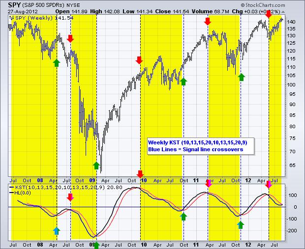
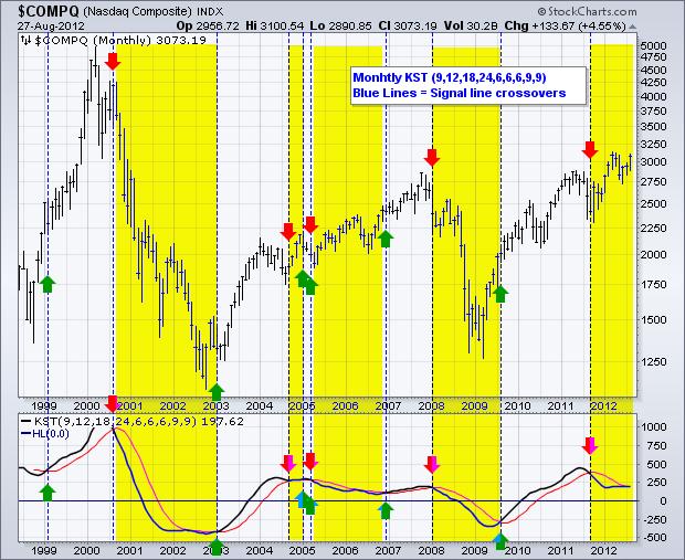
173

174 7.7.7 Further Tweaks Pring is the first to admit that KST is not a perfect indicator. There is no such thing. KST does, however, have its uses and Pring encourages chartists to try different settings because one size does not fit all. Utility and consumer staples are less volatile and may require more sensitive settings. Technology stocks are more volatile and may require less sensitive settings. Chartists can also mix and match the rate-of-change settings and the moving average settings. The chart below shows the default KST in the first indicator window and a KST weighted in favor of the short-term rate-of-change in the second window. Instead of KST(10,15,20,30,10,10,10,15,9) the second window shows KST(30,20,15,10,10,10,10,10,9). The first rate-of-change setting carries the least weight and the fourth one carries the most weight. Note that the first four numbers represent the rate-of-change settings. The second four numbers represent the moving averages to smooth these four rate-of-change indicators. The final number is the signal line Conclusions Know Sure Thing (KST) is a momentum oscillator based on the smoothed rate-of-change over four different time periods. In this regard, it is designed to capture four different price cycles. KST can be used like other unbound momentum oscillators, such as MACD, the Percent Price Oscillator, and TRIX. In fact, KST closely resembles TRIX. Because it is unbound, KST is not well suited for identifying


175 overbought and oversold conditions. Martin Pring, the creator, favored signal line crossovers and trend line breaks for signals. As with all indicators, KST should be used in combination with other analysis techniques Using with SharpCharts KST is available as an indicator for SharpCharts. Once selected, users can place the indicator above, below or behind the underlying price plot. Placing KST directly behind the price plot accentuates the movements relative to the price action of the underlying security. Users can apply advanced options to add a horizontal line. Adjusting the numbers in the parameters box will change the settings Suggested Scans Bullish KST Signal Line Cross
176 This scan reveals stocks where KST is in positive territory. A bullish signal is triggered when KST crosses above its signal line. [type = stock] AND [country = US] AND [Daily SMA(20,Daily Volume) > 40000] AND [Daily SMA(60,Daily Close) > 20] AND [KST > 0] AND [KST x KST Signal] Bearish KST Signal Line Cross This scan reveals stocks where KST is in negative territory. A bearish signal is triggered when KST crosses below its signal line. [type = stock] AND [country = US] AND [Daily SMA(20,Daily Volume) > 40000] AND [Daily SMA(60,Daily Close) > 20] AND [KST < 0] AND [KST Signal x KST] For more details on the syntax to use for KST scans, please see our Scanning Indicator Reference in the Support Center.

177 7.8 MOVING AVERAGES CONVERGENCE DEVERGANCE (MACD) Introduction Developed by Gerald Appel in the late seventies, the Moving Average Convergence/Divergence oscillator (MACD) is one of the simplest and most effective momentum indicators available. The MACD turns two trend-following indicators, moving averages, into a momentum oscillator by subtracting the longer moving average from the shorter moving average. As a result, the MACD offers the best of both worlds: trend following and momentum. The MACD fluctuates above and below the zero line as the moving averages converge, cross and diverge. Traders can look for signal line crossovers, centerline crossovers and divergences to generate signals. Because the MACD is unbounded, it is not particularly useful for identifying overbought and oversold levels. Note: MACD can be pronounced as either Mac-Dee or M-A-C-D. Here is an example chart with the MACD indicator in the lower panel: Click the chart to see a live example.
178 7.8.2 Calculation MACD Line: (12-day EMA - 26-day EMA) Signal Line: 9-day EMA of MACD Line MACD Histogram: MACD Line - Signal Line The MACD Line is the 12-day Exponential Moving Average (EMA) less the 26-day EMA. Closing prices are used for these moving averages. A 9-day EMA of the MACD Line is plotted with the indicator to act as a signal line and identify turns. The MACD Histogram represents the difference between MACD and its 9-day EMA, the Signal line. The histogram is positive when the MACD Line is above its Signal line and negative when the MACD Line is below its Signal line. The values of 12, 26 and 9 are the typical setting used with the MACD, however other values can be substituted depending on your trading style and goals Interpretation As its name implies, the MACD is all about the convergence and divergence of the two moving averages. Convergence occurs when the moving averages move towards each other. Divergence occurs when the moving averages move away from each other. The shorter moving average (12-day) is faster and responsible for most MACD movements. The longer moving average (26-day) is slower and less reactive to price changes in the underlying security. The MACD Line oscillates above and below the zero line, which is also known as the centerline. These crossovers signal that the 12-day EMA has crossed the 26-day EMA. The direction, of course, depends on the direction of the moving average cross. Positive MACD indicates that the 12-day EMA is above the 26-day EMA. Positive values increase as the shorter EMA diverges further from the longer EMA. This means upside momentum is increasing. Negative MACD values indicate that the 12-day EMA is below the 26-day EMA. Negative values increase as the shorter EMA diverges further below the longer EMA. This means downside momentum is increasing.
 and the MACD moved further into negative territory as the 12-day EMA diverged further from the 26-day EMA.")
179 In the example above, the yellow area shows the MACD Line in negative territory as the 12-day EMA trades below the 26-day EMA. The initial cross occurred at the end of September (black arrow) and the MACD moved further into negative territory as the 12-day EMA diverged further from the 26-day EMA. The orange area highlights a period of positive MACD values, which is when the 12-day EMA was above the 26-day EMA. Notice that the MACD Line remained below 1 during this period (red dotted line). This means the distance between the 12-day EMA and 26-day EMA was less than 1 point, which is not a big difference Signal Line Crossover Signal line crossovers are the most common MACD signals. The signal line is a 9-day EMA of the MACD Line. As a moving average of the indicator, it trails the MACD and makes it easier to spot MACD turns. A bullish crossover occurs when the MACD turns up and crosses above the signal line. A bearish crossover occurs when the MACD turns down and crosses below the signal line. Crossovers can last a few days or a few weeks, it all depends on the strength of the move.

180 Due diligence is required before relying on these common signals. Signal line crossovers at positive or negative extremes should be viewed with caution. Even though the MACD does not have upper and lower limits, chartists can estimate historical extremes with a simple visual assessment. It takes a strong move in the underlying security to push momentum to an extreme. Even though the move may continue, momentum is likely to slow and this will usually produce a signal line crossover at the extremities. Volatility in the underlying security can also increase the number of crossovers. The chart below shows IBM with its 12-day EMA (green), 26-day EMA (red) and the 12,26,9 MACD in the indicator window. There were eight signal line crossovers in six months: four up and four down. There were some good signals and some bad signals. The yellow area highlights a period when the MACD Line surged above 2 to reach a positive extreme. There were two bearish signal line crossovers in April and May, but IBM continued trending higher. Even though upward momentum slowed after the surge, upward momentum was still stronger than downside momentum in April-May. The third bearish signal line crossover in May resulted in a good signal

181 7.8.5 Centerline Crossovers Centerline crossovers are the next most common MACD signals. A bullish centerline crossover occurs when the MACD Line moves above the zero line to turn positive. This happens when the 12-day EMA of the underlying security moves above the 26-day EMA. A bearish centerline crossover occurs when the MACD moves below the zero line to turn negative. This happens when the 12-day EMA moves below the 26-day EMA. Centerline crossovers can last a few days or a few months. It all depends on the strength of the trend. The MACD will remain positive as long as there is a sustained uptrend. The MACD will remain negative when there is a sustained downtrend. The next chart shows Pulte Homes (PHM) with at least four centerline crosses in nine months. The resulting signals worked well because strong trends emerged with these centerline crossovers.

182 Below is a chart of Cummins Inc (CMI) with seven centerline crossovers in five months. In contrast to Pulte Homes, these signals would have resulted in numerous whipsaws because strong trends did not materialize after the crossovers. The next chart shows 3M (MMM) with a bullish centerline crossover in late March 2009 and a bearish centerline crossover in early February This signal lasted 10 months. In other words, the 12-day EMA was above the 26-day EMA for 10 months. This was one strong trend.

183 7.8.6 Divergences Divergences form when the MACD diverges from the price action of the underlying security. A bullish divergence forms when a security records a lower low and the MACD forms a higher low. The lower low in the security affirms the current downtrend, but the higher low in the MACD shows less downside momentum. Despite less downside momentum, downside momentum is still outpacing upside momentum as long as the MACD remains in negative territory. Slowing downside momentum can sometimes foreshadow a trend reversal or a sizable rally. The next chart shows Google (GOOG) with a bullish divergence in October-November First, notice that we are using closing prices to identify the divergence. The MACD's moving averages are based on closing prices and we should consider closing prices in the security as well. Second, notice that there were clear reaction lows (troughs) as both Google and its MACD Line bounced in October and late November. Third, notice that the MACD formed a higher low as Google formed a lower low in November. The MACD turned up with a bullish divergence with a signal line crossover in early December. Google confirmed a reversal with resistance breakout.

184 A bearish divergence forms when a security records a higher high and the MACD Line forms a lower high. The higher high in the security is normal for an uptrend, but the lower high in the MACD shows less upside momentum. Even though upside momentum may be less, upside momentum is still outpacing downside momentum as long as the MACD is positive. Waning upward momentum can sometimes foreshadow a trend reversal or sizable decline. Below we see Gamestop (GME) with a large bearish divergence from August to October. The stock forged a higher high above 28, but the MACD Line fell short of its prior high and formed a lower high. The subsequent signal line crossover and support break in the MACD were bearish. On the price chart, notice how broken support turned into resistance on the throwback bounce in November (red dotted line). This throwback provided a second chance to sell or sell short.
.")
185 Divergences should be taken with caution. Bearish divergences are commonplace in a strong uptrend, while bullish divergences occur often in a strong downtrend. Yes, you read that right. Uptrends often start with a strong advance that produces a surge in upside momentum (MACD). Even though the uptrend continues, it continues at a slower pace that causes the MACD to decline from its highs. Upside momentum may not be as strong, but upside momentum is still outpacing downside momentum as long as the MACD Line is above zero. The opposite occurs at the beginning of a strong downtrend. The next chart shows the S&P 500 ETF (SPY) with four bearish divergences from August to November Despite less upside momentum, the ETF continued higher because the uptrend was strong. Notice how SPY continued its series of higher highs and higher lows. Remember, upside momentum is stronger than downside momentum as long as its MACD is positive. Its MACD (momentum) may have been less positive (strong) as the advance extended, but it was still largely positive

186 7.8.7 Conclusions The MACD indicator is special because it brings together momentum and trend in one indicator. This unique blend of trend and momentum can be applied to daily, weekly or monthly charts. The standard setting for MACD is the difference between the 12 and 26-period EMAs. Chartists looking for more sensitivity may try a shorter short-term moving average and a longer long-term moving average. MACD(5,35,5) is more sensitive than MACD(12,26,9) and might be better suited for weekly charts. Chartists looking for less sensitivity may consider lengthening the moving averages. A less sensitive MACD will still oscillate above/below zero, but the centerline crossovers and signal line crossovers will be less frequent. The MACD is not particularly good for identifying overbought and oversold levels. Even though it is possible to identify levels that are historically overbought or oversold, the MACD does not have any upper or lower limits to bind its movement. During sharp moves, the MACD can continue to overextend beyond its historical extremes.
187 Finally, remember that the MACD Line is calculated using the actual difference between two moving averages. This means MACD values are dependent on the price of the underlying security. The MACD values for a $20 stocks may range from -1.5 to 1.5, while the MACD values for a $100 may range from -10 to +10. It is not possible to compare MACD values for a group of securities with varying prices. If you want to compare momentum readings, you should use the Percentage Price Oscillator (PPO), instead of the MACD Using with SharpCharts The MACD can be set as an indicator above, below or behind a security's price plot. Placing the MACD behind the price plot makes it easy to compare momentum movements with price movements. Once the indicator is chosen from the drop-down menu, the default parameter setting appears: (12,26,9). These parameters can be adjusted to increase sensitivity or decrease sensitivity. The MACD Histogram appears with the indicator or can be added as a separate indicator. Setting the signal line to 1 or leaving it blank, i.e. (12,26,1) or (12,26), will remove the MACD Histogram and the signal line. A separate signal line, without the histogram, can be added by choosing Exp. Moving Avg from the Advanced Options Overlays menu. Click here for a live chart of the MACD indicator.


188 7.8.9 Suggested Scans Here are some sample scans that StockCharts members can use to scan for various MACD signals: MACD Bullish Signal Line Cross
189 This scan reveals stocks that are trading above their 200-day moving average and have a bullish signal line crossover in MACD. Also notice that MACD is required to be negative to insure this upturn occurs after a pullback. This scan is just meant as a starter for further refinement. [type = stock] AND [country = US] AND [Daily SMA(20,Daily Volume) > 40000] AND [Daily SMA(60,Daily Close) > 20] AND [Daily Close > Daily SMA(200,Daily Close)] AND [Yesterday's Daily MACD Line(12,26,9,Daily Close) < Daily MACD Signal(12,26,9,Daily Close)] AND [Daily MACD Line(12,26,9,Daily Close) > Daily MACD Signal(12,26,9,Daily Close)] AND [Daily MACD Line(12,26,9,Daily Close) < 0] MACD Bearish Signal Line Cross This scan reveals stocks that are trading below their 200-day moving average and have a bearish signal line crossover in MACD. Also notice that MACD is required to be positive to insure this downturn occurs after a bounce. This scan is just meant as a starter for further refinement. [type = stock] AND [country = US] AND [Daily SMA(20,Daily Volume) > 40000] AND [Daily SMA(60,Daily Close) > 20] AND [Daily Close < Daily SMA(200,Daily Close)] AND [Yesterday's Daily MACD Line(12,26,9,Daily Close) > Daily MACD Signal(12,26,9,Daily Close)] AND [Daily MACD Line(12,26,9,Daily Close) < Daily MACD Signal(12,26,9,Daily Close)] AND [Daily MACD Line(12,26,9,Daily Close) > 0] For more details on the syntax to use for MACD scans, please see our Scanning Indicator Reference in the Support Center. Link: MACD
190 7.9 ON BALANCE VOLUME (0BV) Introduction On Balance Volume (OBV) measures buying and selling pressure as a cumulative indicator that adds volume on up days and subtracts volume on down days. OBV was developed by Joe Granville and introduced in his 1963 book, Granville's New Key to Stock Market Profits. It was one of the first indicators to measure positive and negative volume flow. Chartists can look for divergences between OBV and price to predict price movements or use OBV to confirm price trends Calculation The On Balance Volume (OBV) line is simply a running total of positive and negative volume. A period's volume is positive when the close is above the prior close. A period's volume is negative when the close is below the prior close. If the closing price is above the prior close price then: Current OBV = Previous OBV + Current Volume If the closing price is below the prior close price then: Current OBV = Previous OBV - Current Volume If the closing prices equals the prior close price then: Current OBV = Previous OBV (no change)
 or down (-1). This number is now used as the volume multiplier to compute positive or negative volume.")
191 Data in the table above comes from Wal-mart (WMT). Volume figures were rounded off and are shown in 1000's. In other words, 8,200 really equals 8,200,000 or 8.2 million shares. First, we must determine if Wal-mart closed up (+1) or down (-1). This number is now used as the volume multiplier to compute positive or negative volume. The last column (OBV) forms the running total for positive/negative volume. Because OBV has to start somewhere, the first value (8200) is simply equal to the first period's positive/negative volume. The chart below shows Wal-mart with volume and OBV.

192 7.9.3 Interpretation Granville theorized that volume precedes price. OBV rises when volume on up days outpaces volume on down days. OBV falls when volume on down days is stronger. A rising OBV reflects positive volume pressure that can lead to higher prices. Conversely, falling OBV reflects negative volume pressure that can foreshadow lower prices. Granville noted in his research that OBV would often move before price. Expect prices to move higher if OBV is rising while prices are either flat or moving down. Expect prices to move lower if OBV is falling while prices are either flat or moving up. The absolute value of OBV is not important. Chartists should instead focus on the characteristics of the OBV line. First, define the trend for OBV. Second, determine if the current trend matches the trend for the underlying security. Third, look for potential support or resistance levels. Once broken,
193 the trend for OBV will change and these breaks can be used to generate signals. Also, notice that OBV is based on closing prices. Therefore, closing prices should be considered when looking for divergences or support/resistance breaks. And finally, volume spikes can sometimes throw off the indicator by causing a sharp move that will require a settling period Divergences Bullish and bearish divergence signals can be used to anticipate a trend reversal. These signals are truly based on the theory that volume precedes prices. A bullish divergence forms when OBV moves higher or forms a higher low even as prices move lower or forge a lower low. A bearish divergence forms when OBV moves lower or forms a lower low even as prices move higher or forge a higher high. The divergence between OBV and price should alert chartists that a price reversal could be in the making. The chart for Starbucks (SBUX) shows a bullish divergence forming in July. On the price chart, SBUX moved below its June low with a lower low in early July. OBV, on the other hand, held above its June low to form a bullish divergence. OBV went on to break resistance before SBUX broke resistance. This was a classic case of volume leading price. SBUX broke resistance a week later and continued above 20 for a 30+ percent gain. The second chart shows OBV moving higher as Texas Instruments (TXN) trades within a range. Rising OBV during a trading range indicates accumulation, which is bullish.
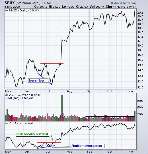
194

195 The chart for Medtronic (MDT) shows a bearish divergence with volume leading price lower. The blue dotted lines identify the divergence period. MDT moved higher (43 to 45) as OBV moved lower. Also, notice that OBV broke support during this divergence period. The uptrend in OBV reversed with the break below the February low. MDT, on the other hand, was still moving higher. Volume ultimately won the day as MDT followed volume lower with a decline into the low 30s. The second chart shows Valero Energy (VLO) with OBV forming a bearish divergence in April and a confirming support break in May.
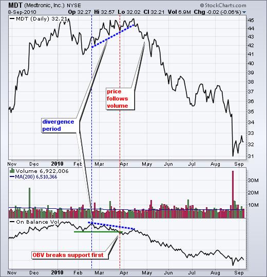
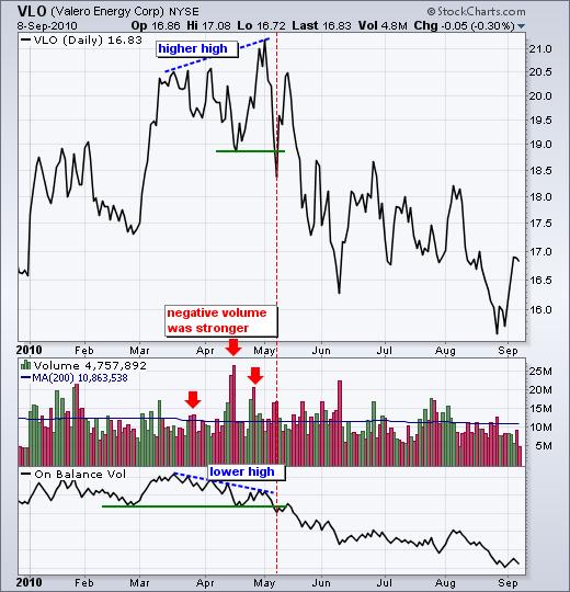
196
 shows three confirming signals as well as confirmation of the price trend.")
197 7.9.5 Trend Confirmation OBV can be used to confirm a price trend, upside breakout or downside break. The chart for Best Buy (BBY) shows three confirming signals as well as confirmation of the price trend. OBV and BBY moved lower in December-January, higher from March to April, lower from May to August and higher from September to October. The trends in OBV matched the trend in BBY. OBV also confirmed trend reversals in BBY. Notice how BBY broke its downtrend line in late February and OBV confirmed with a resistance breakout in March. BBY broke its uptrend line in late April and OBV confirmed with a support break in early May. BBY broke its downtrend line in early September and OBV confirmed with a trend line break a week later. These coincident signals indicated that positive and negative volume were in harmony with price. Sometimes OBV moves step-for-step with the underlying security. In this case, OBV is confirming the strength of the underlying trend, be it down or up. The chart for Autozone (AZO) shows prices as a black line and OBV as a pink line. Both moved steadily higher from November 2009 until October Positive volume remained strong throughout the advance.

198 7.9.6 Conclusions On Balance Volume (OBV) is a simple indicator that uses volume and price to measure buying pressure and selling pressure. Buying pressure is evident when positive volume exceeds negative volume and the OBV line rises. Selling pressure is present when negative volume exceeds positive volume and the OBV line falls. Chartists can use OBV to confirm the underlying trend or look for divergences that may foreshadow a price change. As with all indicators, it is important to use OBV in conjunction with other aspects of technical analysis. It is not a standalone indicator. OBV can be combined with basic pattern analysis or to confirm signals from momentum oscillators Using with SharpCharts On Balance Volume (OBV) is available in SharpCharts as an indicator. After selecting, OBV can be positioned above, below or behind the price plot of the underlying security. Positioning it behind the plot makes it easy to compare OBV with the underlying security. Chartists can also add a moving average or another indicator to OBV by selecting Advanced options, which is to the right of the indicator position. Click here for a live chart with On Balance Volume.


199 7.9.8 Suggested Scans Bullish Divergence in OBV and ADL This scan starts with a base of stocks that are averaging at least $10 in price and 100,000 daily volume over the last 60 days. Potential bullish divergences are found by looking for stocks where price is BELOW the 65-day SMA and 20-day SMA, but OBV and the Accumulation Distribution Line are ABOVE the 65-day SMA and 20-day SMA. [type = stock] AND [country = US] AND [Daily SMA(60,Daily Volume) > ] AND [Daily SMA(60,Daily Close) > 10] AND [Daily Close < Daily SMA(65,Daily Close)]
200 AND [Daily AccDist > Daily AccDist Signal (65)] AND [Daily OBV > Daily OBV Signal(65)] AND [Daily Close < Daily SMA(20,Daily Close)] AND [Daily AccDist > Daily AccDist Signal (20)] AND [Daily OBV > Daily OBV Signal(20)] Bearish divergence in OBV and ADL This scan starts with a base of stocks that are averaging at least $10 in price and 100,000 daily volume over the last 60 days. Potential bearish divergences are found by looking for stocks where price is ABOVE the 65-day SMA and 20-day SMA, but OBV and the Accumulation Distribution Line are BELOW the 65-day SMA and 20-day SMA. [type = stock] AND [country = US] AND [Daily SMA(60,Daily Volume) > ] AND [Daily SMA(60,Daily Close) > 10] AND [Daily Close > Daily SMA(65,Daily Close)] AND [Daily AccDist < Daily AccDist Signal (65)] AND [Daily OBV < Daily OBV Signal(65)] AND [Daily Close > Daily SMA(20,Daily Close)] AND [Daily AccDist < Daily AccDist Signal (20)] AND [Daily OBV < Daily OBV Signal(20)] For more details on the syntax to use for OBV scans, please see our Scanning Indicator Reference in the Support Center. Note: For the purposes of scanning, daily volume data is incomplete during the trading day. When running scans with volume-based indicators like OBV, be sure to base the scan on the Last Market Close. Examples of other volume-based indicators include Accumulation/Distribution, Chaikin Money Flow, and the PVO. Link: ON BALANCE VOLUME

201 7.10 PARABOLIC STOP AND REVERSAL (PSAR) Introduction Developed by Welles Wilder, the Parabolic SAR refers to a price-and-time-based trading system. Wilder called this the Parabolic Time/Price System. SAR stands for stop and reverse, which is the actual indicator used in the system. SAR trails price as the trend extends over time. The indicator is below prices when prices are rising and above prices when prices are falling. In this regard, the indicator stops and reverses when the price trend reverses and breaks above or below the indicator. Wilder introduced the Parabolic Time/Price System in his 1978 book, New Concepts in Technical Trading Systems. This book also includes RSI, Average True Range (ATR), and the Directional Movement Concept (ADX). Despite being developed before the computer age, Wilder's indicators have stood the test of time and remain extremely popular Calculation Calculation of SAR is complex with if/then variables that make it difficult to put in a spreadsheet. These examples will provide a general idea of how SAR is calculated. Because the formulas for rising
202 and falling SAR are different, it is easier to divide the calculation into two parts. The first calculation covers rising SAR and the second covers falling SAR Rising SAR Prior SAR: The SAR value for the previous period. Extreme Point (EP): The highest high of the current uptrend. Acceleration Factor (AF): Starting at.02, AF increases by.02 each time the extreme point makes a new high. AF can reach a maximu m of.20, no matter how long the uptrend extends. Current SAR = Prior SAR + Prior AF(Prior EP - Prior SAR) 13-Apr-10 SAR = = ( ) The Acceleration Factor is multiplied by the difference between the Extreme Point and the prior period's SAR. This is then added to t he prior period's SAR. Note however that SAR can never be above the prior two periods' lows. Should SAR be above one of those low s, use the lowest of the two for SAR.
 9-Feb-10 SAR = 43.")
203 Falling SAR Prior SAR: The SAR value for the previous period. Extreme Point (EP): The lowest low of the current downtrend. Acceleration Factor (AF): Starting at.02, AF increases by.02 each time the extreme point makes a new low. AF can reach a maximum of.20, no matter how long the downtrend extends. Current SAR = Prior SAR - Prior AF(Prior SAR - Prior EP) 9-Feb-10 SAR = = ( ) The Acceleration Factor is multiplied by the difference between the Prior period's SAR and the Extreme Point. This is then subtracted from the prior period's SAR. Note however that SAR can never be below the prior two periods' highs. Should SAR be below one of th ose highs, use the highest of the two for SAR.
204
205 Interpretation SAR follows price and can be considered a trend following indicator. Once a downtrend reverses and starts up, SAR follows prices like a trailing stop. The stop continuously rises as long as the uptrend remains in place. In other words, SAR never decreases in an uptrend and continuously protects profits as prices advance. The indicator acts as a guard against the propensity to lower a stop-loss. Once price stops rising and reverses below SAR, a downtrend starts and SAR is above the price. SAR follows prices lower like a trailing stop. The stop continuously falls as long as the downtrend extends. Because SAR never rises in a downtrend, it continuously protects profits on short positions Step Increments The Acceleration Factor (AF), which is also referred to as the Step, dictates SAR sensitivity. SharpCharts users can set the Step and the Maximum Step. As shown in the spreadsheet example, the Step is a multiplier that influences the rate-of-change in SAR. That is why it is referred to as the Acceleration Factor. Step gradually increases as the trend extends until it hits a maximum. SAR sensitivity can be decreased by decreasing the Step. A lower step moves SAR further from price, which makes a reversal less likely. SAR sensitivity can be increased by increasing the step. A higher step moves SAR closer to the price action, which makes a reversal more likely. The indicator will reverse too often if the step is set too high. This will produce whipsaws and fail to capture the trend. Chart 6 shows IBM with SAR (.01,.20). The step is.01 and the Maximum Step is.20. Chart 7 shows IBM with a higher Step (.03). SAR is more sensitive in chart 7 because there are more reversals. This is because the Step is higher in chart 7 (.03) than chart 6 (.01).


206 Maximum Step The sensitivity of the indicator can also be adjusted using the Maximum Step. While the Maximum Step can influence sensitivity, the Step carries more weight because it sets the incremental rate-ofincrease as the trend develops. Also, note that increasing the Step ensures that the Maximum Step will be hit quicker when a trend develops. Chart 8 shows Best Buy (BBY) with a Maximum Step (.10),
.")
207 which is lower than the default setting (.20). This lower Maximum Step decreases the sensitivity of the indicator and produces fewer reversals. Notice how this setting caught a two-month downtrend and a subsequent two-month uptrend. Chart 9 shows BBY with a higher Maximum Step (.20). This higher reading produced extra reversals in early February and early April Conclusions The Parabolic SAR works best with trending securities, which occur roughly 30% of the time according to Wilder's estimates. This means the indicator will be prone to whipsaws over 50% of the time or when a security is not trending. After all, SAR is designed to catch the trend and follow it like a trailing stop. As with most indicators, the signal quality depends on the settings and the characteristics of the underlying security. The right settings combined with decent trends can produce a great trading system. The wrong settings will result in whipsaws, losses, and frustration. There is no golden rule or


208 one-size-fits-all setting. Each security should be evaluated based on its own characteristics. Parabolic SAR should also be used in conjunction with other indicators and technical analysis techniques. For example, Wilder's Average directional index can be used to estimate the strength of the trend before considering signals Using with SharpCharts The Parabolic SAR can be found as an Overlay in SharpCharts. The default parameters are.02 for the Step and.20 for the Maximum Step. As shown above, these can be changed to suit the characteristics of an individual security. The example below shows the indicator in pink with prices in black/white and the chart grid removed. This contrast makes it easier to compare the indicator with the price action of the underlying security. Click here for a live example of Parabolic SAR.
209 Suggested Scans Break above falling SAR This scan starts with stocks that have an average price of $10 or greater over the last three months and average volume greater than 40,000. The scan then filters for stocks that have a bullish SAR reversal (Parabolic SAR (.01,.20)). This scan is just meant as a starter for further refinement. [type = stock] AND [country = US] AND [Daily SMA(20,Daily Volume) > 40000] AND [Daily SMA(60,Daily Close) > 10] AND [Yesterday's Daily High < Yesterday's Daily Parabolic SAR(0.01,0.2)] AND [Daily High > Daily Parabolic SAR(0.01,0.2)] Break below rising SAR This scan starts with stocks that have an average price of $10 or greater over the last three months and average volume greater than 40,000. The scan then filters for stocks that have a bearish SAR reversal (Parabolic SAR (.01,.20)). This scan is just meant as a starter for further refinement. [type = stock] AND [country = US] AND [Daily SMA(20,Daily Volume) > 40000] AND [Daily SMA(60,Daily Close) > 10] AND [Yesterday's Daily Low > Yesterday's Daily Parabolic SAR(0.01,0.2)] AND [Daily Low < Daily Parabolic SAR(0.01,0.2)] For more details on the syntax to use for Parabolic SAR scans, please see our Scanning Indicator Reference in the Support Center. Link : PARABOLIC STOP AND REVERSAL (PSAR)

210 7.11 RATE OF CHANGE (ROC) Introduction The Rate-of-Change (ROC) indicator, which is also referred to as simply Momentum, is a pure momentum oscillator that measures the percent change in price from one period to the next. The ROC calculation compares the current price with the price n periods ago. The plot forms an oscillator that fluctuates above and below the zero line as the Rate-of-Change moves from positive to negative. As a momentum oscillator, ROC signals include centerline crossovers, divergences and overboughtoversold readings. Divergences fail to foreshadow reversals more often than not so this article will forgo a discussion on divergences. Even though centerline crossovers are prone to whipsaw, especially short-term, these crossovers can be used to identify the overall trend. Identifying overbought or oversold extremes comes naturally to the Rate-of-Change oscillator Calculation ROC = [(Close - Close n periods ago) / (Close n periods ago)] * 100 Click here to download this spreadsheet example.

211 The table above shows the 12-day Rate-of-Change calculations for the Dow Industrials in May The yellow cells show the Rate-of-Change from April 28th to May 14th. It is actually 13 trading days, but the close on the 28th acts as the starting point on the 29th. The blue cells show the 12-day Rate-of- Change from May 7th until May 25th Interpretation As noted above, the Rate-of-Change indicator is momentum in its purest form. It measures the percentage increase or decrease in price over a given period of time. Think of its as the rise (price change) over the run (time). In general, prices are rising as long as the Rate-of-Change remains positive. Conversely, prices are falling when the Rate-of-Change is negative. ROC expands into positive territory as an advance accelerates. ROC dives deeper into negative territory as a decline accelerates. There is no upward boundary on the Rate-of-Change. The sky is the limit for an advance. There is, however, a downside limit. Securities can only decline 100%, which would be to zero. Even with these lopsided boundaries, Rate-of-Change produces identifiable extremes that signal overbought and oversold conditions Trend Identification Even though momentum oscillators are best suited for trading ranges or zigzag trends, they can also be used to define the overall direction of the underlying trend. There are approximately 250 trading days in a year. This can be broken down into 125 days per half year, 63 days per quarter and 21 days per month. A trend reversal starts with the shortest timeframe and gradually spreads to the other timeframes. In general, the long-term trend is up when both the 250-day and 125-day Rate-of-Change

212 are positive. This means that prices are higher now than they were 12 and 6 months ago. Long positions taken 6 or 12 months ago would be profitable and buyers would be happy. Chart 2 shows IBM with the 250-day, 125-day, 63-day and 21-day Rate-of-Change. There have been three big trends in the last three years. The first was up as the 250-day Rate-of-Change was largely positive until September 2008 (1). The second was down as the indicator turned negative from October 2008 until September 2009 (2). The third is up as the indicator turned positive in late September 2009 (3). Even though the big uptrend remains in force, IBM flattened out on the price chart and this affected the 125-day and 63-day Rate-of-Change. The 63-day Rate-of-Change (quarterly) has been flirting with negative territory since February (4). The 125-day Rate-of-Change (six-month) dipped into negative territory for the first time since April 2009 (5). This shows some deterioration in IBM that serves as an alert to watch the stock carefully. A break below the six-month trading range would be a bearish development (6)

213 Overbought/Oversold Extremes There are basically three price movements: up, down and sideways. Momentum oscillators are ideally suited for sideways price action with regular fluctuations. This makes it easier to identify extremes and forecast turning points. Security prices can also fluctuate when trending. For example, an uptrend consists of a series of higher highs and higher lows as prices zigzag higher. Pullbacks often occur at regular intervals based on the percentage move, time elapsed or both. A downtrend consists of lower lows and lower highs as prices zigzag lower. Counter trend advances retrace a portion of the prior decline and usually peak below the prior high. Peaks can occur at regular intervals based on the percentage move, time elapsed or both. The Rate-of-Change can be used to identify periods when the percentage change nears a level that foreshadowed a turning point in the past. Chart 3 shows Aetna (AET) with an uptrend from April 2009 until April Notice how the stock zigzagged up with a series of higher highs and higher lows. Because the overall trend was up, the Rateof-Change indicator was used to identify short-term oversold levels as a chance to partake in the bigger uptrend. Short-term overbought signals were ignored because the bigger trend was up. Based on the May-June bounces, -10% was set as the oversold boundary. Movements below this level indicated that prices were at a short-term extreme. Overbought and oversold settings depend on the volatility of the underlying security. A more volatile stock may use -15% for oversold, while a less volatile stock may use -5%. Oversold readings serve as an alert to be ready for a turning point. Prices are oversold, but
.")
214 have yet to actually turn. Remember, a security can become oversold and remain oversold as the decline continues. A 20-day moving average was overlaid to identify an actual upturn. After ROC became oversold in early October, AET moved above its 20-day SMA in late October to confirm an upturn (1). The second oversold reading occurred in early February and AET moved above its 20-day SMA in late February (2). Chart 4 shows Microsoft (MSFT) in a downtrend from November 2007 until March This example uses a 20-day Rate-of-Change to identify oversold levels within a bigger downtrend. The number of time periods depends on the individual security and the desired trading timeframe. The late December high occurred with an overbought reading above +10%. This means Microsoft was up over 10% in a 20- day period, which is about a month. That's a pretty good bounce within a bigger downtrend. The next overbought reading did not occur until April when the Rate-of-Change again exceeded +10%. MSFT broke trend line support in May to signal a continuation of the downtrend. The next overbought reading occurred in early August It took a while, but the stock eventually broke support at 24 in mid-september and again in early October.


215 Chart 5 shows Abercrombie & Fitch (ANF) within a trading range from October 2006 to February The 20-day Rate-of-Change indicator sets overbought at +10% and oversold at -10%. The overbought and oversold levels identify extremes quite well, but timing the actual turn is more difficult because of the volatility. The next chart reduces this volatility by using an exponential moving average in place of the price plot.

216 Chart 6 shows ANF as a 10-day EMA (black) and the actual price plot is invisible. A 30-day EMA has been overlaid as a signal line. Furthermore, the 20-day Rate-of-Change is shown with a 5-day SMA to smooth out the fluctuations. There are fewer overbought and oversold readings using the 5-day SMA. Focusing only on the buy signals, the green dotted line shows when ROC exceeds -10% and the green arrow shows when the 10-day EMA crosses above the 30-day SMA. The oversold readings are usually early, but the moving average crossovers are usually late. Such is life with technical analysis. The point here is to reduce whipsaws by smoothing the data. A 10-day EMA was used because it is faster than a 10-day SMA. A 30-day SMA was used because it is slower than a 30-day EMA. Speeding up the shorter moving average and slowing down the longer moving average makes for slightly quicker signals Conclusions The Rate-of-Change oscillator measures the speed at which prices are changing. An upward surge in the Rate-of-Change reflects a sharp price advance. A downward plunge indicates a steep price decline. Even though chartists can look for bullish and bearish divergences, these formations can be misleading because of sharp moves. Sustained advances often start with a big surge out of the gate. Subsequent advances are usually less sharp and this causes a bearish divergence to form in the Rate-of-Change oscillator. It is important to remember that prices are constantly increasing as long as the Rate-of- Change remains positive. Positive readings may be less than before, but a positive Rate-of-Change still reflects a price increase, not a price decline. Like all technical indicator, the Rate-of-Change oscillator should be used in conjunction with other aspects of technical analysis Using with SharpCharts Rate-of-Change can be set as an indicator above, below or behind a security's price plot. Once the indicator is chosen from the dropdown list, the default parameter setting appears (12). This parameter can be adjusted to increase or decrease sensitivity. Users can add a moving average by clicking advanced options and choosing an overlay. A moving average can be used as a signal line or to simply smooth the data. Horizontal lines can also be added to mark overbought or oversold levels. Click here for a live example of Rate-of-Change.

217 Suggested Scans Oversold Rate-of-Change This scan reveals stocks with a positive 125-day Rate-of-Change and an oversold 21-day Rate-of- Change (below -8%). Once these criteria are met, a bullish signal is triggered when the stock closes above the 20-day SMA. [type = stock] AND [country = US] AND [Daily SMA(20,Daily Volume) > 40000] AND [Daily SMA(60,Daily Close) > 20] AND [Daily ROC(125,Daily Close) > 0] AND [Daily ROC(21,Daily Close) < -8] AND [Yesterday's Daily Close < Yesterday's Daily SMA(20,Daily Close)] AND [Daily Close > Daily SMA(20,Daily Close)] Overbought Rate-of-Change This scan reveals stocks with a negative 125-day Rate-of-Change and an overbought 21-day Rate-of- Change (above 8%). Once these criteria are met, a bearish signal is triggered when the stock closes below the 20-day SMA. [type = stock] AND [country = US] AND [Daily SMA(20,Daily Volume) > 40000] AND [Daily SMA(60,Daily Close) > 20] AND [Daily ROC(125,Daily Close) < 0]
218 AND [Daily ROC(21,Daily Close) > 8] AND [Yesterday's Daily Close > Yesterday's Daily SMA(20,Daily Close)] AND [Daily Close < Daily SMA(20,Daily Close)] For more details on the syntax to use for ROC scans, please see our Scanning Indicator Reference in the Support Center. Link : RATE OF CHANGE (ROC)
219 7.12 RELATIVE STRENGTH INDEX (RSI) Introduction Developed by J. Welles Wilder, the Relative Strength Index (RSI) is a momentum oscillator that measures the speed and change of price movements. RSI oscillates between zero and 100. Traditionally, and according to Wilder, RSI is considered overbought when above 70 and oversold when below 30. Signals can also be generated by looking for divergences, failure swings, and centerline crossovers. RSI can also be used to identify the general trend. RSI is an extremely popular momentum indicator that has been featured in a number of articles, interviews, and books over the years. In particular, Constance Brown's book, Technical Analysis for the Trading Professional, features the concept of bull market and bear market ranges for RSI. Andrew Cardwell, Brown's RSI mentor, introduced positive and negative reversals for RSI. In addition, Cardwell turned the notion of divergence, literally and figuratively, on its head. Wilder features RSI in his 1978 book, New Concepts in Technical Trading Systems. This book also includes the Parabolic SAR, Average True Range and the Directional Movement Concept (ADX). Despite being developed before the computer age, Wilder's indicators have stood the test of time and remain extremely popular Calculation 100 RSI = RS RS = Average Gain / Average Loss
220 To simplify the calculation explanation, RSI has been broken down into its basic components: RS, Average Gain and Average Loss. This RSI calculation is based on 14 periods, which is the default suggested by Wilder in his book. Losses are expressed as positive values, not negative values. The very first calculations for average gain and average loss are simple 14-period averages. First Average Gain = Sum of Gains over the past 14 periods / 14. First Average Loss = Sum of Losses over the past 14 periods / 14 The second, and subsequent, calculations are based on the prior averages and the current gain loss: Average Gain = [(previous Average Gain) x 13 + current Gain] / 14. Average Loss = [(previous Average Loss) x 13 + current Loss] / 14. Taking the prior value plus the current value is a smoothing technique similar to that used in calculating an exponential moving average. This also means that RSI values become more accurate as the calculation period extends. SharpCharts uses at least 250 data points prior to the starting date of any chart (assuming that much data exists) when calculating its RSI values. To exactly replicate our RSI numbers, a formula will need at least 250 data points. Wilder's formula normalizes RS and turns it into an oscillator that fluctuates between zero and 100. In fact, a plot of RS looks exactly the same as a plot of RSI. The normalization step makes it easier to identify extremes because RSI is range bound. RSI is 0 when the Average Gain equals zero. Assuming a 14-period RSI, a zero RSI value means prices moved lower all 14 periods. There were no gains to measure. RSI is 100 when the Average Loss equals zero. This means prices moved higher all 14 periods. There were no losses to measure.
221
222 Here's an Excel Spreadsheet that shows the start of an RSI calculation in action. Note: The smoothing process affects RSI values. RS values are smoothed after the first calculation. Average Loss equals the sum of the losses divided by 14 for the first calculation. Subsequent calculations multiply the prior value by 13, add the most recent value and then divide the total by 14. This creates a smoothing affect. The same applies to Average Gain. Because of this smoothing, RSI values may differ based on the total calculation period. 250 periods will allow for more smoothing than 30 periods and this will slightly affect RSI values. Stockcharts.com goes back 250 days when
223 possible. If Average Loss equals zero, a divide by zero situation occurs for RS and RSI is set to 100 by definition. Similarly, RSI equals 0 when Average Gain equals zero Parameters The default look-back period for RSI is 14, but this can be lowered to increase sensitivity or raised to decrease sensitivity. 10-day RSI is more likely to reach overbought or oversold levels than 20-day RSI. The look-back parameters also depend on a security's volatility. 14-day RSI for internet retailer Amazon (AMZN) is more likely to become overbought or oversold than 14-day RSI for Duke Energy (DUK), a utility. RSI is considered overbought when above 70 and oversold when below 30. These traditional levels can also be adjusted to better fit the security or analytical requirements. Raising overbought to 80 or lowering oversold to 20 will reduce the number of overbought/oversold readings. Short-term traders sometimes use 2-period RSI to look for overbought readings above 80 and oversold readings below Overbought-Oversold Wilder considered RSI overbought above 70 and oversold below 30. Chart 3 shows McDonalds with 14-day RSI. This chart features daily bars in gray with a 1-day SMA in pink to highlight closing prices because RSI is based on closing prices. Working from left to right, the stock became oversold in late July and found support around 44 (1). Notice that the bottom evolved after the oversold reading. The stock did not bottom as soon as the oversold reading appeared. Bottoming can be a process. From oversold levels, RSI moved above 70 in mid September to become overbought. Despite this overbought reading, the stock did not decline. Instead, the stock stalled for a couple weeks and then continued higher. Three more overbought readings occurred before the stock finally peaked in December (2). Momentum oscillators can become overbought (oversold) and remain so in a strong up (down) trend. The first three overbought readings foreshadowed consolidations. The fourth coincided with a significant peak. RSI then moved from overbought to oversold in January. The final bottom did not coincide with the initial oversold reading as the stock ultimately bottomed a few weeks later around 46 (3).
 trading between 13.5 and 21 from April to September 2009.")
224 Like many momentum oscillators, overbought and oversold readings for RSI work best when prices move sideways within a range. Chart 4 shows MEMC Electronics (WFR) trading between 13.5 and 21 from April to September The stock peaked soon after RSI reached 70 and bottomed soon after the stock reached 30.

225 Divergences According to Wilder, divergences signal a potential reversal point because directional momentum does not confirm price. A bullish divergence occurs when the underlying security makes a lower low and RSI forms a higher low. RSI does not confirm the lower low and this shows strengthening momentum. A bearish divergence forms when the security records a higher high and RSI forms a lower high. RSI does not confirm the new high and this shows weakening momentum. Chart 5 shows Ebay (EBAY) with a bearish divergence in August-October. The stock moved to new highs in September-October, but RSI formed lower highs for the bearish divergence. The subsequent breakdown in mid October confirmed weakening momentum.

226 A bullish divergence formed in January-March. The bullish divergence formed with ebay moving to new lows in March and RSI holding above its prior low. RSI reflected less downside momentum during the February-March decline. The mid-march breakout confirmed improving momentum. Divergences tend to be more robust when they form after an overbought or oversold reading. Before getting too excited about divergences as great trading signals, it must be noted that divergences are misleading in a strong trend. A strong uptrend can show numerous bearish divergences before a top actually materializes. Conversely, bullish divergences can appear in a strong downtrend - and yet the downtrend continues. Chart 6 shows the S&P 500 ETF (SPY) with three bearish divergences and a continuing uptrend. These bearish divergences may have warned of a short-term pullback, but there was clearly no major trend reversal.

227 Failure Swings Wilder also considered failure swings as strong indications of an impending reversal. Failure swings are independent of price action. In other words, failure swings focus solely on RSI for signals and ignore the concept of divergences. A bullish failure swing forms when RSI moves below 30 (oversold), bounces above 30, pulls back, holds above 30 and then breaks its prior high. It is basically a move to oversold levels and then a higher low above oversold levels. Chart 7 shows Research in Motion (RIMM) with 10-day RSI forming a bullish failure swing.


228 A bearish failure swing forms when RSI moves above 70, pulls back, bounces, fails to exceed 70 and then breaks its prior low. It is basically a move to overbought levels and then a lower high below overbought levels. Chart 8 shows Texas Instruments (TXN) with a bearish failure swing in May-June 2008.
 with the 40-50 zones acting as support.")
229 Trend ID In Technical Analysis for the Trading Professional, Constance Brown suggests that oscillators do not travel between 0 and 100. This also happens to be the name of the first chapter. Brown identifies a bull market range and a bear market for RSI. RSI tends to fluctuate between 40 and 90 in a bull market (uptrend) with the zones acting as support. These ranges may vary depending on RSI parameters, strength of trend and volatility of the underlying security. Chart 9 shows 14-week RSI for SPY during the bull market from 2003 until RSI surged above 70 in late 2003 and then moved into its bull market range (40-90). There was one overshoot below 40 in July 2004, but RSI held the zone at least five times from January 2005 until October 2007 (green arrows). In fact, notice that pullbacks to this zone provided low risk entry points to participate in the uptrend. On the flip side, RSI tends to fluctuate between 10 and 60 in a bear market (downtrend) with the zone acting as resistance. Chart 10 shows 14-day RSI for the US Dollar Index ($USD) during its 2009 downtrend. RSI moved to 30 in March to signal the start of a bear range. The zone subsequently marked resistance until a breakout in December.

230 Positive-Negative Reversals Andrew Cardwell developed positive and negative reversals for RSI, which are the opposite of bearish and bullish divergences. Cardwell's books are out of print, but he does offer seminars detailing these methods. Constance Brown credits Andrew Cardwell for her RSI enlightenment. Before discussing the reversal technique, it should be noted that Cardwell's interpretation of divergences differs from Wilder. Cardwell considered bearish divergences as bull market phenomenon. In other words, bearish divergences are more likely to form in uptrends. Similarly, bullish divergences are considered bear market phenomenon indicative of a downtrend. A positive reversal forms when RSI forges a lower low and the security forms a higher low. This lower low is not at oversold levels, but usually somewhere between 30 and 50. Chart 11 shows MMM with a positive reversal forming in June MMM broke resistance a few weeks later and RSI moved

231 above 70. Despite weaker momentum with a lower low in RSI, MMM held above its prior low and showed underlying strength. In essence, price action overruled momentum. A negative reversal is the opposite of a positive reversal. RSI forms a higher high, but the security forms a lower high. Again, the higher high is usually just below overbought levels in the area. Chart 12 shows Starbucks (SBUX) forming a lower high as RSI forms a higher high. Even though RSI forged a new high and momentum was strong, the price action failed to confirm as lower high formed. This negative reversal foreshadowed the big support break in late June and sharp decline

232 Conclusions RSI is a versatile momentum oscillator that has stood the test of time. Despite changes in volatility and the markets over the years, RSI remains as relevant now as it was in Wilder's days. While Wilder's original interpretations are useful to understanding the indicator, the work of Brown and Cardwell takes RSI interpretation to a new level. Adjusting to this level takes some rethinking on the part of the traditionally schooled chartists. Wilder considers overbought conditions ripe for a reversal, but overbought can also be a sign of strength. Bearish divergences still produce some good sell signals, but chartists must be careful in strong trends when bearish divergences are actually normal. Even though the concept of positive and negative reversals may seem to undermine Wilder's interpretation, the logic makes sense and Wilder would hardly dismiss the value of putting more emphasis on price action. Positive and negative reversals put price action of the underlying security first and the indicator second, which is the way it should be. Bearish and bullish divergences place the indicator first and price action second. By putting more emphasis on price action, the concept of positive and negative reversals challenges our thinking towards momentum oscillators.


233 Using with SharpCharts RSI is available as an indicator for SharpCharts. Once selected, users can place the indicator above, below or behind the underlying price plot. Placing RSI directly on top of the price plot accentuates the movements relative to price action of the underlying security. Users can apply advanced options to smooth the indicator with a moving average or add a horizontal line to mark overbought or oversold levels.
234 Suggested Scans RSI Oversold in Uptrend This scan reveals stocks that are in an uptrend with oversold RSI. First, stocks must be above their 200-day moving average to be in an overall uptrend. Second, RSI must cross below 30 to become oversold. [type = stock] AND [country = US] AND [Daily SMA(20,Daily Volume) > 40000] AND [Daily SMA(60,Daily Close) > 20] AND [Daily Close > Daily SMA(200,Daily Close)] AND [Daily RSI(5,Daily Close) <= 30] RSI Overbought in Downtrend This scan reveals stocks that are in a downtrend with overbought RSI turning down. First, stocks must be below their 200-day moving average to be in an overall downtrend. Second, RSI must cross above 70 to become overbought [type = stock] AND [country = US] AND [Daily SMA(20,Daily Volume) > 40000] AND [Daily SMA(60,Daily Close) > 20] AND [Daily Close < Daily SMA(200,Daily Close)] AND [Daily RSI(5,Daily Close) >= 70] For more details on the syntax to use for RSI scans, please see our Scanning Indicator Reference in the Support Center. Link: RSI

235 7.13 SIMPLE MOVING AVERAGES (SMA) Introduction Moving averages smooth the price data to form a trend following indicator. They do not predict price direction, but rather define the current direction with a lag. Moving averages lag because they are based on past prices. Despite this lag, moving averages help smooth price action and filter out the noise. They also form the building blocks for many other technical indicators and overlays, such as Bollinger Bands, MACD and the McClellan Oscillator. The two most popular types of moving averages are the Simple Moving Average (SMA) and the Exponential Moving Average (EMA). These moving averages can be used to identify the direction of the trend or define potential support and resistance levels. Here's a chart with both an SMA and an EMA on it: Click the chart for a live version Simple Moving Average Calculation A simple moving average is formed by computing the average price of a security over a specific number of periods. Most moving averages are based on closing prices. A 5-day simple moving
236 average is the five-day sum of closing prices divided by five. As its name implies, a moving average is an average that moves. Old data is dropped as new data comes available. This causes the average to move along the time scale. Below is an example of a 5-day moving average evolving over three days. Daily Closing Prices: 11,12,13,14,15,16,17 First day of 5-day SMA: ( ) / 5 = 13 Second day of 5-day SMA: ( ) / 5 = 14 Third day of 5-day SMA: ( ) / 5 = 15 The first day of the moving average simply covers the last five days. The second day of the moving average drops the first data point (11) and adds the new data point (16). The third day of the moving average continues by dropping the first data point (12) and adding the new data point (17). In the example above, prices gradually increase from 11 to 17 over a total of seven days. Notice that the moving average also rises from 13 to 15 over a three-day calculation period. Also, notice that each moving average value is just below the last price. For example, the moving average for day one equals 13 and the last price is 15. Prices the prior four days were lower and this causes the moving average to lag Exponential Moving Average Calculation Exponential moving averages (EMAs) reduce the lag by applying more weight to recent prices. The weighting applied to the most recent price depends on the number of periods in the moving average. EMAs differ from simple moving averages in that a given day's EMA calculation depends on the EMA calculations for all the days prior to that day. You need far more than 10 days of data to calculate a reasonably accurate 10-day EMA.
237 There are three steps to calculating an exponential moving average (EMA). First, calculate the simple moving average for the initial EMA value. An exponential moving average (EMA) has to start somewhere, so a simple moving average is used as the previous period's EMA in the first calculation. Second, calculate the weighting multiplier. Third, calculate the exponential moving average for each day between the initial EMA value and today, using the price, the multiplier, and the previous period's EMA value. The formula below is for a 10-day EMA Initial SMA: 10-period sum / 10 Multiplier: (2 / (Time periods + 1) ) = (2 / (10 + 1) ) = (18.18%) EMA: {Close - EMA(previous day)} x multiplier + EMA(previous day) The Weighting Multiplier A 10-period exponential moving average applies an 18.18% weighting to the most recent price. A 10- period EMA can also be called an 18.18% EMA. A 20-period EMA applies a 9.52% weighting to the most recent price (2/(20+1) =.0952). Notice that the weighting for the shorter time period is more than the weighting for the longer time period. In fact, the weighting drops by half every time the moving average period doubles. If you want to use a specific percentage for an EMA, you can use this formula to convert it to time periods and then enter that value as the EMA's parameter: Time Period = (2 / Percentage) - 1 3% Example: Time Period = (2 / 0.03) - 1 = time periods EMA Accuracy Below is a spreadsheet example of a 10-day simple moving average and a 10-day exponential moving average for Intel. The SMA calculation is straightforward and requires little explanation: the 10-day
238 SMA simply moves as new prices become available and old prices drop off. The exponential moving average in the spreadsheet starts with the SMA value (22.22) for its first EMA value. After the first calculation, the normal EMA formula is used. The formula for an EMA incorporates the previous period's EMA value, which in turn incorporates the value for the EMA value before that, and so on. Each previous EMA value accounts for a small portion of the current value. Therefore, the current EMA value will change depending on how much past data you use in your EMA calculation. Ideally, for a 100% accurate EMA, you should use every data point the stock has ever had in calculating the EMA, starting your calculations from the first day the stock existed. This is not always practical, but the more data points you use, the more accurate your EMA will be. The goal is to maximize accuracy while minimizing calculation time. The spreadsheet example below goes back 30 periods. With only 30 data points incorporated in the EMA calculations, the 10-day EMA values in the spreadsheet are not very accurate. On our charts, we calculate back at least 250 periods (typically much further), resulting in EMA values that are accurate to within a fraction of a penny.

239 Click here to download this spreadsheet example The Lag Factor The longer the moving average, the more the lag. A 10-day exponential moving average will hug prices quite closely and turn shortly after prices turn. Short moving averages are like speedboats - nimble and quick to change. In contrast, a 100-day moving average contains lots of past data that slows it down. Longer moving averages are like ocean tankers - lethargic and slow to change. It takes a larger and longer price movement for a 100-day moving average to change course.

240 Click on the chart for a live version. The chart above shows the S&P 500 ETF with a 10-day EMA closely following prices and a 100-day SMA grinding higher. Even with the January-February decline, the 100-day SMA held the course and did not turn down. The 50-day SMA fits somewhere between the 10- and 100-day moving averages when it comes to the lag factor Simple vs Exponential Moving Averages Even though there are clear differences between simple moving averages and exponential moving averages, one is not necessarily better than the other. Exponential moving averages have less lag and are therefore more sensitive to recent prices - and recent price changes. Exponential moving averages will turn before simple moving averages. Simple moving averages, on the other hand, represent a true average of prices for the entire time period. As such, simple moving averages may be better suited to identify support or resistance levels. Moving average preference depends on objectives, analytical style, and time horizon. Chartists should experiment with both types of moving averages as well as different timeframes to find the best fit. The chart below shows IBM with the 50-day SMA in red and the 50-day EMA in green. Both

241 peaked in late January, but the decline in the EMA was sharper than the decline in the SMA. The EMA turned up in mid-february, but the SMA continued lower until the end of March. Notice that the SMA turned up over a month after the EMA Lengths and Timeframes The length of the moving average depends on the analytical objectives. Short moving averages (5-20 periods) are best suited for short-term trends and trading. Chartists interested in medium-term trends would opt for longer moving averages that might extend periods. Long-term investors will prefer moving averages with 100 or more periods. Some moving average lengths are more popular than others. The 200-day moving average is perhaps the most popular. Because of its length, this is clearly a long-term moving average. Next, the 50-day moving average is quite popular for the medium-term trend. Many chartists use the 50-day and 200- day moving averages together. Short-term, a 10-day moving average was quite popular in the past because it was easy to calculate. One simply added the numbers and moved the decimal point Trend Identification The same signals can be generated using simple or exponential moving averages. As noted above, the preference depends on each individual. These examples below will use both simple and exponential moving averages. The term moving average applies to both simple and exponential moving averages.

242 The direction of the moving average conveys important information about prices. A rising moving average shows that prices are generally increasing. A falling moving average indicates that prices, on average, are falling. A rising long-term moving average reflects a long-term uptrend. A falling longterm moving average reflects a long-term downtrend. The chart above shows 3M (MMM) with a 150-day exponential moving average. This example shows just how well moving averages work when the trend is strong. The 150-day EMA turned down in November 2007 and again in January Notice that it took a 15% decline to reverse the direction of this moving average. These lagging indicators identify trend reversals as they occur (at best) or after they occur (at worst). MMM continued lower into March 2009 and then surged 40-50%. Notice that the 150-day EMA did not turn up until after this surge. Once it did, however, MMM continued higher the next 12 months. Moving averages work brilliantly in strong trends Double Crossovers Two moving averages can be used together to generate crossover signals. In Technical Analysis of the Financial Markets, John Murphy calls this the double crossover method. Double crossovers involve one relatively short moving average and one relatively long moving average. As with all moving averages, the general length of the moving average defines the timeframe for the system. A system

243 using a 5-day EMA and 35-day EMA would be deemed short-term. A system using a 50-day SMA and 200-day SMA would be deemed medium-term, perhaps even long-term. A bullish crossover occurs when the shorter moving average crosses above the longer moving average. This is also known as a golden cross. A bearish crossover occurs when the shorter moving average crosses below the longer moving average. This is known as a dead cross. Moving average crossovers produce relatively late signals. After all, the system employs two lagging indicators. The longer the moving average periods, the greater the lag in the signals. These signals work great when a good trend takes hold. However, a moving average crossover system will produce lots of whipsaws in the absence of a strong trend. There is also a triple crossover method that involves three moving averages. Again, a signal is generated when the shortest moving average crosses the two longer moving averages. A simple triple crossover system might involve 5-day, 10-day, and 20-day moving averages. The chart above shows Home Depot (HD) with a 10-day EMA (green dotted line) and 50-day EMA (red line). The black line is the daily close. Using a moving average crossover would have resulted in three whipsaws before catching a good trade. The 10-day EMA broke below the 50-day EMA in late
 occurred near late November price levels, resulting in another whipsaw.")
244 October (1), but this did not last long as the 10-day moved back above in mid-november (2). This cross lasted longer, but the next bearish crossover in January (3) occurred near late November price levels, resulting in another whipsaw. This bearish cross did not last long as the 10-day EMA moved back above the 50-day a few days later (4). After three bad signals, the fourth signal foreshadowed a strong move as the stock advanced over 20%. There are two takeaways here. First, crossovers are prone to whipsaw. A price or time filter can be applied to help prevent whipsaws. Traders might require the crossover to last 3 days before acting or require the 10-day EMA to move above/below the 50-day EMA by a certain amount before acting. Second, MACD can be used to identify and quantify these crossovers. MACD (10,50,1) will show a line representing the difference between the two exponential moving averages. MACD turns positive during a golden cross and negative during a dead cross. The Percentage Price Oscillator (PPO) can be used the same way to show percentage differences. Note that MACD and the PPO are based on exponential moving averages and will not match up with simple moving averages.
245 This chart shows Oracle (ORCL) with the 50-day EMA, 200-day EMA and MACD(50,200,1). There were four moving average crossovers over a 2 1/2 year period. The first three resulted in whipsaws or bad trades. A sustained trend began with the fourth crossover as ORCL advanced to the mid-20s. Once again, moving average crossovers work great when the trend is strong, but produce losses in the absence of a trend Price Crossovers Moving averages can also be used to generate signals with simple price crossovers. A bullish signal is generated when prices move above the moving average. A bearish signal is generated when prices move below the moving average. Price crossovers can be combined to trade within the bigger trend. The longer moving average sets the tone for the bigger trend and the shorter moving average is used to generate the signals. One would look for bullish price crosses only when prices are already above the longer moving average. This would be trading in harmony with the bigger trend. For example, if price is above the 200-day moving average, chartists would only focus on signals when price moves above the 50-day moving average. Obviously, a move below the 50-day moving average would precede such a signal, but such bearish crosses would be ignored because the bigger trend is up. A bearish cross would simply suggest a pullback within a bigger uptrend. A cross back above the 50-day moving average would signal an upturn in prices and continuation of the bigger uptrend. The next chart shows Emerson Electric (EMR) with the 50-day EMA and 200-day EMA. The stock moved above and held above the 200-day moving average in August. There were dips below the 50- day EMA in early November and again in early February. Prices quickly moved back above the 50-day EMA to provide bullish signals (green arrows) in harmony with the bigger uptrend. MACD(1,50,1) is shown in the indicator window to confirm price crosses above or below the 50-day EMA. The 1-day EMA equals the closing price. MACD(1,50,1) is positive when the close is above the 50-day EMA and negative when the close is below the 50-day EMA


246 Support and Resistance Moving averages can also act as support in an uptrend and resistance in a downtrend. A short-term uptrend might find support near the 20-day simple moving average, which is also used in Bollinger Bands. A long-term uptrend might find support near the 200-day simple moving average, which is the most popular long-term moving average. In fact, the 200-day moving average may offer support or resistance simply because it is so widely used. It is almost like a self-fulfilling prophecy
247 The chart above shows the NY Composite with the 200-day simple moving average from mid-2004 until the end of The 200-day provided support numerous times during the advance. Once the trend reversed with a double top support break, the 200-day moving average acted as resistance around Do not expect exact support and resistance levels from moving averages, especially longer moving averages. Markets are driven by emotion, which makes them prone to overshoots. Instead of exact levels, moving averages can be used to identify support or resistance zones Conclusions The advantages of using moving averages need to be weighed against the disadvantages. Moving averages are trend following, or lagging, indicators that will always be a step behind. This is not necessarily a bad thing though. After all, the trend is your friend and it is best to trade in the direction of the trend. Moving averages ensure that a trader is in line with the current trend. Even though the trend is your friend, securities spend a great deal of time in trading ranges, which render moving averages ineffective. Once in a trend, moving averages will keep you in, but also give late signals. Don't expect to sell at the top and buy at the bottom using moving averages. As with most technical analysis tools, moving averages should not be used on their own, but in conjunction with other complementary tools. Chartists can use moving averages to define the overall trend and then use RSI to define overbought or oversold levels Using with SharpCharts Moving averages are available in SharpCharts as a price overlay. Using the Overlays drop-down menu, users can choose either a simple moving average or an exponential moving average. The first parameter is used to set the number of time periods. An optional parameter can be added to specify which price field should be used in the calculations - O for the Open, H for the High, L for the Low, and C for the Close. A comma is used to separate parameters. Another optional parameter can be added to shift the moving averages to the left (past) or right (future). A negative number (-10) would shift the moving average to the left 10 periods. A positive number (10) would shift the moving average to the right 10 periods.


248 Multiple moving averages can be overlaid the price plot by simply adding another overlay line to the workbench. StockCharts members can change the colors and style to differentiate between multiple moving averages. After selecting an indicator, open Advanced Options by clicking the little green triangle. Advanced Options can also be used to add a moving average overlay to other technical indicators like RSI, CCI, and Volume. Click here for a live chart with several different moving averages Suggested Scans Bullish Moving Average Cross This scan looks for stocks with a rising 150-day simple moving average and a bullish cross of the 5-day EMA and 35-day EMA. The 150-day moving average is rising as long as it is trading above its level five days ago. A bullish cross occurs when the 5-day EMA moves above the 35-day EMA on above-average volume. [type = stock] AND [country = US] AND [Daily SMA(20,Daily Volume) > 40000] AND [Daily SMA(60,Daily Close) > 20]
249 AND [Daily SMA(150,Daily Close) > 5 days ago Daily SMA(150,Daily Close)] AND [Daily EMA(5,Daily Close) > Daily EMA(35,Daily Close)] AND [Yesterday's Daily EMA(5,Daily Close) < Yesterday's Daily EMA(35,Daily Close)] AND [Daily Volume > Daily SMA(200,Daily Volume)] Bearish Moving Average Cross This scan looks for stocks with a falling 150-day simple moving average and a bearish cross of the 5- day EMA and 35-day EMA. The 150-day moving average is falling as long as it is trading below its level five days ago. A bearish cross occurs when the 5-day EMA moves below the 35-day EMA on aboveaverage volume. [type = stock] AND [country = US] AND [Daily SMA(20,Daily Volume) > 40000] AND [Daily SMA(60,Daily Close) > 20] AND [Daily SMA(150,Daily Close) < 5 days ago Daily SMA(150,Daily Close)] AND [Daily EMA(5,Daily Close) < Daily EMA(35,Daily Close)] AND [Yesterday's Daily EMA(5,Daily Close) > Yesterday's Daily EMA(35,Daily Close)] AND [Daily Volume > Daily SMA(200,Daily Volume)] For more details on the syntax to use for Moving Average scans, please see our Scanning Indicator Reference in the Support Center. Link : Simple moving average
250 7.14 STOCHASTIC OSCILLATOR (KD) Introduction Developed by George C. Lane in the late 1950s, the Stochastic Oscillator is a momentum indicator that shows the location of the close relative to the high-low range over a set number of periods. According to an interview with Lane, the Stochastic Oscillator doesn't follow price, it doesn't follow volume or anything like that. It follows the speed or the momentum of price. As a rule, the momentum changes direction before price. As such, bullish and bearish divergences in the Stochastic Oscillator can be used to foreshadow reversals. This was the first, and most important, signal that Lane identified. Lane also used this oscillator to identify bull and bear set-ups to anticipate a future reversal. Because the Stochastic Oscillator is range bound, is also useful for identifying overbought and oversold levels Calculation %K = (Current Close - Lowest Low)/(Highest High - Lowest Low) * 100 %D = 3-day SMA of %K Lowest Low = lowest low for the look-back period Highest High = highest high for the look-back period %K is multiplied by 100 to move the decimal point two places The default setting for the Stochastic Oscillator is 14 periods, which can be days, weeks, months or an intraday timeframe. A 14-period %K would use the most recent close, the highest high over the last 14 periods and the lowest low over the last 14 periods. %D is a 3-day simple moving average of %K. This line is plotted alongside %K to act as a signal or trigger line.
251 Click here to download this spreadsheet example.

252 Interpretation The Stochastic Oscillator measures the level of the close relative to the high-low range over a given period of time. Assume that the highest high equals 110, the lowest low equals 100 and the close equals 108. The high-low range is 10, which is the denominator in the %K formula. The close less the lowest low equals 8, which is the numerator. 8 divided by 10 equals.80 or 80%. Multiply this number by 100 to find %K %K would equal 30 if the close was at 103 (.30 x 100). The Stochastic Oscillator is above 50 when the close is in the upper half of the range and below 50 when the close is in the lower half. Low readings (below 20) indicate that price is near its low for the given time period. High readings (above 80) indicate that price is near its high for the given time period. The IBM example above shows three 14-day ranges (yellow areas) with the closing price at the end of the period (red dotted) line. The Stochastic Oscillator equals 91 when the close was at the top of the range. The
253 Stochastic Oscillator equals 15 when the close was near the bottom of the range. The close equals 57 when the close was in the middle of the range Fast, Slow or Full There are three versions of the Stochastic Oscillator available on SharpCharts. The Fast Stochastic Oscillator is based on George Lane's original formulas for %K and %D. %K in the fast version that appears rather choppy. %D is the 3-day SMA of %K. In fact, Lane used %D to generate buy or sell signals based on bullish and bearish divergences. Lane asserts that a %D divergence is the only signal which will cause you to buy or sell. Because %D in the Fast Stochastic Oscillator is used for signals, the Slow Stochastic Oscillator was introduced to reflect this emphasis. The Slow Stochastic Oscillator smooths %K with a 3-day SMA, which is exactly what %D is in the Fast Stochastic Oscillator. Notice that %K in the Slow Stochastic Oscillator equals %D in the Fast Stochastic Oscillator (chart 2).

254 Fast Stochastic Oscillator: Fast %K = %K basic calculation Fast %D = 3-period SMA of Fast %K
255 Slow Stochastic Oscillator: Slow %K = Fast %K smoothed with 3-period SMA Slow %D = 3-period SMA of Slow %K The Full Stochastic Oscillator is a fully customizable version of the Slow Stochastic Oscillator. Users can set the look-back period, the number of periods to slow %K and the number of periods for the %D moving average. The default parameters were used in these examples: Fast Stochastic Oscillator (14,3), Slow Stochastic Oscillator (14,3) and Full Stochastic Oscillator (14,3,3). Full Stochastic Oscillator: Full %K = Fast %K smoothed with X-period SMA Full %D = X-period SMA of Full %K Overbought Oversold As a bound oscillator, the Stochastic Oscillator makes it easy to identify overbought and oversold levels. The oscillator ranges from zero to one hundred. No matter how fast a security advances or declines, the Stochastic Oscillator will always fluctuate within this range. Traditional settings use 80 as the overbought threshold and 20 as the oversold threshold. These levels can be adjusted to suit analytical needs and security characteristics. Readings above 80 for the 20-day Stochastic Oscillator would indicate that the underlying security was trading near the top of its 20-day high-low range. Readings below 20 occur when a security is trading at the low end of its high-low range. Before looking at some chart examples, it is important to note that overbought readings are not necessarily bearish. Securities can become overbought and remain overbought during a strong uptrend. Closing levels that are consistently near the top of the range indicate sustained buying pressure. In a similar vein, oversold readings are not necessarily bullish. Securities can also become oversold and remain oversold during a strong downtrend. Closing levels consistently near the bottom of the range indicate sustained selling pressure. It is, therefore, important to identify the bigger trend and trade in the direction of this trend. Look for occasional oversold readings in an uptrend and ignore frequent overbought readings. Similarly, look for occasional overbought readings in a strong downtrend and ignore frequent oversold readings.
 and longer moving averages for smoothing (5 versus 3) produce a less sensitive oscillator with fewer signals.")
256 Chart 3 shows Yahoo! (YHOO) with the Full Stochastic Oscillator (20,5,5). A longer look-back period (20 days versus 14) and longer moving averages for smoothing (5 versus 3) produce a less sensitive oscillator with fewer signals. Yahoo was trading between 14 and 18 from July 2009 until April Such trading ranges are well suited for the Stochastic Oscillator. Dips below 20 warn of oversold conditions that could foreshadow a bounce. Moves above 80 warn of overbought conditions that could foreshadow a decline. Notice how the oscillator can move above 80 and remain above 80 (orange highlights). Similarly, the oscillator moved below 20 and sometimes remained below 20. The indicator is both overbought AND strong when above 80. A subsequent move below 80 is needed to signal some sort of reversal or failure at resistance (red dotted lines). Conversely, the oscillator is both oversold and weak when below 20. A move above 20 is needed to show an actual upturn and successful support test (green dotted lines).

257 Chart 4 shows Crown Castle (CCI) with a breakout in July to start an uptrend. The Full Stochastic Oscillator (20,5,5) was used to identify oversold readings. Overbought readings were ignored because the bigger trend was up. Trading in the direction of the bigger trend improves the odds. The Full Stochastic Oscillator moved below 20 in early September and early November. Subsequent moves back above 20 signaled an upturn in prices (green dotted line) and continuation of the bigger uptrend. Chart 5 shows Autozone (AZO) with a support break in May 2009 that started a downtrend. With a downtrend in force, the Full Stochastic Oscillator (10,3,3) was used to identify overbought readings to foreshadow a potential reversal. Oversold readings were ignored because of the bigger downtrend. The shorter look-back period (10 versus 14) increases the sensitivity of the oscillator for more overbought readings. For reference, the Full Stochastic Oscillator (20,5,5) is also shown. Notice that this less sensitive version did not become overbought in August, September, and October. It is sometimes necessary to increase sensitivity to generate signals.

258 Bull Bear Divergences Divergences form when a new high or low in price is not confirmed by the Stochastic Oscillator. A bullish divergence forms when price records a lower low, but the Stochastic Oscillator forms a higher low. This shows less downside momentum that could foreshadow a bullish reversal. A bearish divergence forms when price records a higher high, but the Stochastic Oscillator forms a lower high. This shows less upside momentum that could foreshadow a bearish reversal. Once a divergence takes hold, chartists should look for a confirmation to signal an actual reversal. A bearish divergence can be confirmed with a support break on the price chart or a Stochastic Oscillator break below 50, which is
259 the centerline. A bullish divergence can be confirmed with a resistance break on the price chart or a Stochastic Oscillator break above is an important level to watch. The Stochastic Oscillator moves between zero and one hundred, which makes 50 the centerline. Think of it as the 50-yard line in football. The offense has a higher chance of scoring when it crosses the 50-yard line. The defense has an edge as long as it prevents the offense from crossing the 50-yard line. A Stochastic Oscillator cross above 50 signals that prices are trading in the upper half of their high-low range for the given look-back period. This suggests that the cup is half full. Conversely, a cross below 50 means that prices are trading in the bottom half of the given look-back period. This suggests that the cup is half empty. Chart 6 shows International Gaming Tech (IGT) with a bullish divergence in February-March Notice how the stock moved to a new low, but the Stochastic Oscillator formed a higher low. There are three steps to confirming this higher low. The first is a signal line cross and/or move back above 20. A signal line cross occurs when %K (black) crosses %D (red). This provides the earliest entry possible. The second is a move above 50, which puts prices in the upper half of the Stochastic range. The third is a resistance breakout on the price chart. Notice how the Stochastic Oscillator moved above 50 in late March and remained above 50 until late May.

260 Chart 7 shows Kohls (KSS) with a bearish divergence in April The stock moved to higher highs in early and late April, but the Stochastic Oscillator peaked in late March and formed lower highs. The signal line crosses and moves below 80 did not provide good early signals in this case because KSS kept moving higher. The Stochastic Oscillator moved below 50 for the second signal and the stock broke support for the third signal. As KSS shows, early signals are not always clean and simple. Signal line crosses, moves below 80, and moves above 20 are frequent and prone to whipsaw. Even after KSS broke support and the Stochastic Oscillator moved below 50, the stock bounced back above 57 and the Stochastic Oscillator bounced back above 50 before the stock continued sharply lower.

261 Bull Bear Set-ups George Lane identified another form of divergence to predict bottoms or tops. A bull set-up is basically the inverse of a bullish divergence. The underlying security forms a lower high, but the Stochastic Oscillator forms a higher high. Even though the stock could not exceed its prior high, the higher high in the Stochastic Oscillator shows strengthening upside momentum. The next decline is then expected to result in a tradable bottom. Chart 8 shows Network Appliance (NTAP) with a bull set-up in June The stock formed a lower high as the Stochastic Oscillator forged a higher high. This higher high shows strength in upside momentum. Remember that this is a set-up, not a signal. The set-up foreshadows a tradable low in the near future. NTAP declined below its June low and the Stochastic Oscillator moved below 20 to become oversold. Traders could have acted when the Stochastic Oscillator moved above its signal line, above 20 or above 50. Alternatively, NTAP subsequently broke resistance with a strong move.

262 A bear set-up occurs when the security forms a higher low, but the Stochastic Oscillator forms a lower low. Even though the stock held above its prior low, the lower low in the Stochastic Oscillator shows increasing downside momentum. The next advance is expected to result in an important peak. Chart 9 shows Motorola (MOT) with a bear set-up in November The stock formed a higher low in late- November and early December, but the Stochastic Oscillator formed a lower low with a move below 20. This showed strong downside momentum. The subsequent bounce did not last long as the stock quickly peaked. Notice that the Stochastic Oscillator did not make it back above 80 and turned down below its signal line in mid-december.

263 Conclusions While momentum oscillators are best suited for trading ranges, they can also be used with securities that trend, provided the trend takes on a zigzag format. Pullbacks are part of uptrends that zigzag higher. Bounces are part of downtrends that zigzag lower. In this regard, the Stochastic Oscillator can be used to identify opportunities in harmony with the bigger trend. The indicator can also be used to identify turns near support or resistance. Should a security trade near support with an oversold Stochastic Oscillator, look for a break above 20 to signal an upturn and successful support test. Conversely, should a security trade near resistance with an overbought Stochastic Oscillator, look for a break below 80 to signal a downturn and resistance failure. The settings on the Stochastic Oscillator depend on personal preferences, trading style, and timeframe. A shorter look-back period will produce a choppy oscillator with many overbought and oversold readings. A longer look-back period will provide a smoother oscillator with fewer overbought and oversold readings.

264 Like all technical indicators, it is important to use the Stochastic Oscillator in conjunction with other technical analysis tools. Volume, support/resistance, and breakouts can be used to confirm or refute signals produced by the Stochastic Oscillator Using with SharpCharts As noted above, there are three versions of the Stochastic Oscillator available as an indicator on SharpCharts. The default settings are as follows: Fast Stochastic Oscillator (14,3), Slow Stochastic Oscillator (14,3) and Full Stochastic Oscillator (14,3,3). The look-back period (14) is used for the basic %K calculation. Remember, %K in the Fast Stochastic Oscillator is unsmoothed and %K in the Slow Stochastic Oscillator is smoothed with a 3-day SMA. The 3 in the Fast and Slow Stochastic Oscillator settings (14,3) sets the moving average period for %D. Chartists looking for maximum flexibility can simply choose the Full Stochastic Oscillator to set the look-back period, the smoothing factor for %K and the moving average for %D. The indicator can be placed above, below or behind the actual price plot. Placing the Stochastic Oscillator behind the price allows users to easily match indicator swings with price swings. Click here for a live example. ]
265 Suggested Scans Stochastic Oscillator Oversold Upturn This scan starts with stocks that are trading above their 200-day moving average to focus on those in a bigger uptrend. Of these, the scan then looks for stocks with a Stochastic Oscillator that turned up from an oversold level (below 20). [type = stock] AND [country = US] AND [Daily SMA(20,Daily Volume) > 40000] AND [Daily SMA(60,Daily Close) > 20] AND [Daily Close > Daily SMA(200,Daily Close)] AND [Yesterday's Daily Slow Stoch %K(14,3) < 20] AND [Daily Slow Stoch %K(14,3) > 20] Stochastic Oscillator Overbought Downturn This scan starts with stocks that are trading below their 200-day moving average to focus on those in a bigger downtrend. Of these, the scan then looks for stocks with a Stochastic Oscillator that turned down after an overbought reading (above 80). [type = stock] AND [country = US] AND [Daily SMA(20,Daily Volume) > 40000] AND [Daily SMA(60,Daily Close) > 20] AND [Daily Close < Daily SMA(200,Daily Close)] AND [Yesterday's Daily Slow Stoch %K(14,3) > 80] AND [Daily Slow Stoch %K(14,3) < 80] For more details on the syntax to use for Stochastic Oscillator scans, please see our Scanning Indicator Reference in the Support Center. Link: Stochastic Oscillator
266 7.15 TRIPLE EXPONENTIALLY SMOOTHED AVERAGE (TRIX) Introduction TRIX is a momentum oscillator that displays the percent rate of change of a triple exponentially smoothed moving average. It was developed in the early 1980's by Jack Hutson, an editor for Technical Analysis of Stocks and Commodities magazine. With its triple smoothing, TRIX is designed to filter insignificant price movements. Chartists can use TRIX to generate signals similar to MACD. A signal line can be applied to look for signal line crossovers. A directional bias can be determined with the absolute level. Bullish and bearish divergences can be used to anticipate reversals Calculation TRIX is the 1-period percentage rate-of-change for a triple smoothed exponential moving average (EMA), which is an EMA of an EMA of an EMA. Here is a breakdown of the steps involved for a 15 period TRIX. 1. Single-Smoothed EMA = 15-period EMA of the closing price 2. Double-Smoothed EMA = 15-period EMA of Single-Smoothed EMA 3. Triple-Smoothed EMA = 15-period EMA of Double-Smoothed EMA 4. TRIX = 1-period percent change in Triple-Smoothed EMA The table and chart below provide examples for the 15-day EMA, double-smoothed EMA and triplesmoothed EMA. Notice how each EMA lags price a little more. Even though exponential moving averages put more weight on recent data, they still contain past data that produces a lag. This lag increases with each smoothing.
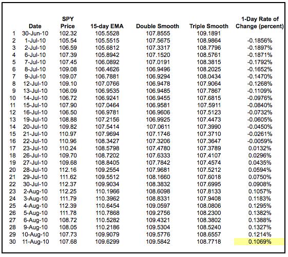
267
268 The blue line is the price plot for SPY. It is clearly the most jagged (volatile) of the four lines. The red line is the 15-day EMA, which follows the price plot the closest. The green line is the doublesmoothed EMA and the purple line is the triple-smoothed EMA. Notice how these two lines turn flatter as the lag increases. TRIX is negative as long as the triple-smoothed 15-day EMA is moving lower. TRIX turns positive when the triple-smoothed 15-day EMA turns up. The extra smoothing ensures that upturns and downturns are kept to a minimum. In other words, it takes more than a one-day advance to reverse a downtrend.

269 Interpretation TRIX (15,9) is quite similar to MACD (12,26,9). Both are momentum oscillators that fluctuate above and below the zero line. Both have signal lines based on a 9-day EMA. Most notably, both lines have similar shapes, signal line crossovers, and centerline crosses. The biggest difference between TRIX and MACD is that TRIX is smoother than MACD. The TRIX lines are less jagged and tend to turn a bit later.

270 With the similarities outweighing the differences, signals applicable to MACD are also applicable to TRIX. There are three main signals to watch for. First, signal line crossovers are the most common signals. These indicate a change in direction for TRIX and price momentum. A cross above the signal line is the first bullish indication, while a cross below is the first negative implication. Second, centerline crossovers provide chartists with a general momentum bias. The triple-smoothed moving average is rising when TRIX is positive and falling when negative. Similarly, momentum favors the bulls when TRIX is positive and the bears when negative. Third, bullish and bearish divergences can alert chartists of a possible trend reversal.

271 Signal Line Crossovers Signal line crossovers are the most common TRIX signals. The signal line is a 9-day EMA of the TRIX. As a moving average of the indicator, it trails TRIX and makes it easier to spot turns. A bullish crossover occurs when TRIX turns up and crosses above the signal line. A bearish crossover occurs when TRIX turns down and crosses below the signal line. Crossovers can last a few days or a few weeks, it all depends on the strength of the move. Due diligence is required before relying on these frequent signals. Volatility in the underlying security can also increase the number of crossovers. The chart above shows Intel (INTC) and TRIX with six signal line crosses in a seven-month period. That is almost one per month. There were three good signals and three bad signals resulting in whipsaws (yellow area). The bullish crossover in June occurred near the top, the bearish crossover in late June occurred near the low and the bullish crossover in July occurred near the top. In the absence of a strong move, the lag from the triple-smoothed EMA results in late signals that produce losses. The
 or half empty (bearish). Think of the centerline as the 50-yard line in a football game.")
272 bearish signal line cross in August foreshadowed a sharp decline and the bullish signal line cross in mid-september foreshadowed a strong advance Centerline Crossovers The centerline crossover indicates when the cup is half full (bullish) or half empty (bearish). Think of the centerline as the 50-yard line in a football game. The offense has the edge after crossing the 50 (midpoint), while the defense has the edge as long as the ball remains beyond the 50. As with signal line crossovers, these centerline crossovers produce both good signals and bad signals. The key, as always, is to minimize losses on the bad signals and maximize gains with the good signals. The chart above shows Raytheon (RTN) with five signals over a 16 month period. The first three were bad because the stock changed direction soon after the signals. In other words, a trend failed to take hold. The fourth signal (November 2009) coincided with a resistance breakout and foreshadowed a 20% advance. Great signal! This is also a classic example of combining indicator signals with chart signals for reinforcement. The resistance breakout on the price chart and the centerline cross for the

273 TRIX reinforced each other. TRIX produced a nice bearish signal in May 2010 as RTN subsequently declined around 20% Divergences Bullish and bearish divergences form when the security and the indicator do not confirm one another. A bullish divergence forms when the security forges a lower low, but the indicator forms a higher low. This higher low shows less downside momentum that may foreshadow a bullish reversal. A bearish divergence forms when the security forges a higher low, but the indicator forms a lower high. This lower high shows waning upside momentum that can sometimes foreshadow a bearish reversal. Before looking at a successful divergence, note the BHP Billiton (BHP) chart with several unsuccessful divergences.
274 Bearish divergences do not work well in strong uptrends. Even though momentum seems to be waning because the indicator is producing lower highs, momentum still has a bullish bias as long as the indicator is above its centerline. Upward momentum may be less positive, but it is still positive as long as the cup is half full. The rise is just not as fast as before. The opposite is true for bullish divergences. These do not work well in strong downtrends. Even though the indicator shows less downside momentum with higher lows, downward momentum is still stronger than upward momentum as long as the indicator remains below its centerline. When bullish and bearish divergences work, they do work great. The trick is separating the bad signals from the good signals. The chart below shows ebay (EBAY) with a successful bullish divergence. The stock moved to a lower low in early July, but TRIX held well above its prior low and formed a bullish divergence. The first potential confirmation came when TRIX moved above its signal line. However, there were no confirmations on the chart at the time. These came a little later. The green arrows show EBAY breaking chart resistance with good volume and TRIX moving into positive territory. Even though confirmation occurred well off the low, there were enough signs of strength to validate the breakout.
275 Conclusions TRIX is an indicator that combines trend with momentum. The triple smoothed moving average covers the trend, while the 1-period percentage change measures momentum. In this regard, TRIX is similar to MACD and PPO. The standard setting for TRIX is 15 for the triple smoothed EMA and 9 for the signal line. Chartists looking for more sensitivity should try a shorter timeframe (5 versus 15). This will make the indicator more volatile and better suited for centerline crossovers. Chartists looking for less sensitivity should try a longer timeframe (45 versus 15). This will smooth the indicator and make it better suited for signal line crossovers. As with all indicators, TRIX should be used in conjunction with other aspects of technical analysis, such as chart patterns.
.")
276 Using with SharpCharts TRIX can be set as an indicator above, below or behind a security's price plot. It is easy to compare indicator/price movements when the indicator is placed behind the price plot. Once the indicator is chosen from the dropdown list, the default parameter setting appears (15,9). These parameters can be adjusted to increase or decrease sensitivity. The signal line default is 9, which can also be adjusted. Click here for a live example of TRIX.

277 Suggested Scans TRIX Bullish Signal Line Cross This scan reveals stocks that meet four criteria. First, they must be above their 200-day moving average to be in an overall uptrend. Second, the TRIX must be negative to signal a pullback. Third, the TRIX crossed its signal line and turned up. Fourth, volume moved above the 250-day average to show an increase in buying pressure. [type = stock] AND [country = US] AND [Daily SMA(20,Daily Volume) > 40000] AND [Daily SMA(60,Daily Close) > 20]
278 AND [Daily Close > Daily SMA(200,Daily Close)] AND [Yesterday's Daily TRIX(15,9,Daily Close) crosses Daily TRIX Signal(15,9,Daily Close)] AND [Daily Volume > Daily SMA(250,Daily Volume)] AND [Daily TRIX(15,9,Daily Close) < 0] TRIX Bearish Signal Line Cross This scan reveals stocks that meet four criteria. First, they must be below their 200-day moving average to be in an overall downtrend. Second, the TRIX must be positive to signal a bounce. Third, the TRIX crossed its signal line and turned down. Fourth, volume moved above the 250-day average to show an increase in selling pressure. [type = stock] AND [country = US] AND [Daily SMA(20,Daily Volume) > 40000] AND [Daily SMA(60,Daily Close) > 20] AND [Daily Close < Daily SMA(200,Daily Close)] AND [Yesterday's Daily TRIX Signal(15,9,Daily Close) crosses Daily TRIX(15,9,Daily Close)] AND [Daily Volume > Daily SMA(250,Daily Volume)] AND [Daily TRIX(15,9,Daily Close) > 0] Link: TRIX For more details on the syntax to use for TRIX scans, please see our Scanning Indicator Reference in the Support Center.

279 7.16 VOLUME WEIGHTED AVERAGE PRICE (VMAP) Introduction Volume-Weighted Average Price (VWAP) is exactly what it sounds like: the average price weighted by volume. VWAP equals the dollar value of all trading periods divided by the total trading volume for the current day. The calculation starts when trading opens and ends when trading closes. Because it is good for the current trading day only, intraday periods and data are used in the calculation Tick versus Minute Traditional VWAP is based on tick data. As one can imagine, there are many ticks (trades) during each minute of the day. Active securities during active time periods can have ticks in one minute alone. With 390 minutes in a typical stock exchange trading day, many stocks end up with well over 5000 ticks per day. There are over 5000 stocks traded every day and these ticks start adding up exponentially. Needless to say, tick-data is very resource intensive. Instead of VWAP based on tick data, StockCharts.com offers intraday VWAP based on intraday periods (1, 5, 10, 15, 30 or 60 minute). Note that VWAP is not defined for daily, weekly or monthly periods due to the nature of the calculation (see below) Calculation There are five steps involved in the VWAP calculation. First, compute the typical price for the intraday period. This is the average of the high, low, and close: {(H+L+C)/3)}. Second, multiply the typical price by the period's volume. Third, create a running total of these values. This is also known as a cumulative
/Cumulative(Volume) The example above shows 1-minute VWAP for the first 30 minutes of trading in IBM.")
280 total. Fourth, create a running total of volume (cumulative volume). Fifth, divide the running total of price-volume by the running total of volume. Cumulative(Volume x Typical Price)/Cumulative(Volume) The example above shows 1-minute VWAP for the first 30 minutes of trading in IBM. Dividing cumulative price-volume by cumulative volume produces a price level that is adjusted (weighted) by volume. The first VWAP value is always the typical price because volume is equal in the numerator and the denominator. They cancel each other out in the first calculation. The chart below shows 1-minute bars with VWAP for IBM. Prices ranged from on the high to on the low for the first 30 minutes of trading. It was actually a pretty volatile first 30 minutes. VWAP ranged from to and spent its time in the middle of this range.

281 Characteristics Like moving averages, VWAP lags price because it is an average based on past data. The more data there is, the greater the lag. A stock has been trading for some 331 minutes by 3:00 PM. As a cumulative average, this indicator is akin to a 330 period moving average. That is a lot of past data. The 1-minute VWAP value at the end of the day is often quite close to the ending value for a 390- minute moving average. Both moving averages are based on the 1-minute bars for that day. At the close, both are based on 390 minutes of data (one full day). One cannot compare the 390-minute moving average to VWAP during the day though. A 390-minute moving average at 12:00 PM will include data from the previous day. VWAP will not. Remember, VWAP calculations start fresh at the open and end at the close. 150 minutes of trading have elapsed by 12:00 PM. Therefore, VWAP at 12:00 PM would need to be compared with a 150-minute moving average.

282 Despite this lag, chartists can compare VWAP with the current price to determine the general direction of intraday prices. It works similar to a moving average. In general, intraday prices are falling when below VWAP and intraday prices are rising when above VWAP. VWAP will fall somewhere between the day's high-low range when prices are range bound for the day. The next three charts show examples of rising, falling and flat VWAP.
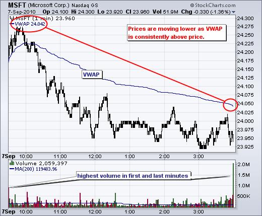
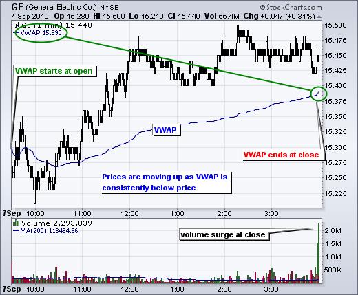
283

284 Uses for VWAP VWAP is used to identify liquidity points. As a volume-weighted price measure, VWAP reflects price levels weighted by volume. This can help institutions with large orders. The idea is not to disrupt the market when entering large buy or sell orders. VWAP helps these institutions determine the liquid and illiquid price points for a specific security over a very short time period. VWAP can also be used to measure trading efficiency. After buying or selling a security, institutions or individuals can compare their price to VWAP values. A buy order executed below the VWAP value would be considered a good fill because the security was bought at a below average price. Conversely, a sell order executed above the VWAP would be deemed a good fill because it was sold at an above average price.
285 Conclusions VWAP serves as a reference point for prices for one day. As such, it is best suited for intraday analysis.chartists can compare current prices with the VWAP values to determine the intraday trend. VWAP can also be used to determine relative value. Prices below VWAP values are relatively low for that day or that specific time. Prices above VWAP values are relatively high for that day or that specific time. Keep in mind that VWAP is a cumulative indicator, which means the number of data points progressively increases throughout the day. On a 1-minute chart, IBM will have 90 data points (minutes) by 11:00 AM, 210 data points by 1:00 PM and 390 data points by the close. The number dramatically increases as the day extends. This is why VWAP lags price and this lag increases as the day extends Using with SharpCharts Volume-Weighted Average Price (VWAP) can be plotted as an overlay indicator on Sharpcharts. After entering the security symbol, choose an intraday period and a range. This can be for 1 day or fill the chart. Chartists looking for more detail can choose fill the chart. Chartist looking for general levels can choose 1 day. VWAP can be plotted over more than one day, but the indicator will jump from its prior closing value to the typical price for the next open as a new calculation period begins. Also, note that VWAP values can sometimes fall off the price chart. VWAP at 45.5 will show up on a chart with a price range from 45.8 to 47. Chartists sometimes need to extend the range to a full day to see VWAP on the chart. The VWAP value is always displayed at the top left of the chart. Click the chart below to see a live example.


286 Link: VOLUME WEIGHTED AVERAGE PRICE (VMAP)
287 7.17 EXPONENTIAL MOVING AVERAGE (EMA) What is an 'Exponential Moving Average - EMA' An exponential moving average (EMA) is a type of moving average that is similar to a simple moving average, except that more weight is given to the latest data. It's also known as the exponentially weighted moving average. This type of moving average reacts faster to recent price changes than a simple moving average BREAKING DOWN 'Exponential Moving Average - EMA' The 12- and 26-day EMAs are the most popular short-term averages, and they are used to create indicators like the moving average convergence divergence (MACD) and the percentage price oscillator (PPO). In general, the 50- and 200-day EMAs are used as signals of long-term trends. Traders who employ technical analysis find moving averages very useful and insightful when applied correctly but create havoc when used improperly or are misinterpreted. All the moving averages commonly used in technical analysis are, by their very nature, lagging indicators. Consequently, the conclusions drawn from applying a moving average to a particular market chart should be to confirm a market move or to indicate its strength. Very often, by the time a moving average indicator line has made a change to reflect a significant move in the market, the optimal point of market entry has already passed. An EMA does serve to alleviate this dilemma to some extent. Because the EMA calculation places more weight on the latest data, it hugs the price action a bit tighter and therefore reacts quicker. This is desirable when an EMA is used to derive a trading entry signal Interpreting the EMA Like all moving average indicators, they are much better suited for trending markets. When the market is in a strong and sustained uptrend, the EMA indicator line will also show an uptrend and vice-versa for a down trend. A vigilant trader will not only pay attention to the direction of the EMA line but also the relation of the rate of change from one bar to the next. For example, as the price action of a strong uptrend begins to flatten and reverse, the EMA s rate of change from one bar to the next will begin to diminish until such time that the indicator line flattens and the rate of change is zero. Because of the lagging effect, by this point, or even a few bars before, the price action should have already reversed. It therefore follows that observing a consistent diminishing in the rate of change of the EMA could itself be used as an indicator that could further counter the dilemma caused by the lagging effect of moving averages.
288 Common Uses of the EMA Link: EMA EMAs are commonly used in conjunction with other indicators to confirm significant market moves and to gauge their validity. For traders who trade intraday and fast-moving markets, the EMA is more applicable. Quite often traders use EMAs to determine a trading bias. For example, if an EMA on a daily chart shows a strong upward trend, an intraday trader s strategy may be to trade only from the long side on an intraday chart.
 * n-1 +.")
289 7.18 WEIGHTED MOVING AVERAGES (WMA) DESCRIPTION The Weighted Moving Average (WMA) places more emphasis on recent prices than on older prices. Each period s data is multiplied by a weight, with the weighting determined by the number of periods selected FORMULA WMA = ( Price * n + Price(1) * n Price( n-1 ) * 1) / ( n * ( n + 1 ) / 2 ) Where: n = time period EXAMPLE
290 7.19 WILDER SMOOTHING (SMOOTHED MOVING AVERAGE,WEMA) introduction Wilder s Smoothing AKA Smoothed Moving Average is to duke it out in the Technical Indicator Fight for Supremacy so here is some info about how it is calculated along with an Excel Spreadsheet for your interest: Wilder s Smoothing (WS-MA) was developed buy J. Welles Wilder, Jr. and first presented in his landmark book New Concepts in Technical Trading Systems (June 1978). He used it as a component in several of his other indicators including the RSI which is one of the most popular technical indicators of all time. Despite being very different in how they are calculated, Wilder s Smoothing and the EMA are actually the same indicator. To reveal the equivalent EMA simply multiply the period by two and subtract one, test it for yourself; a 50 period WS-MA is equivalent to a 99 period EMA. You can also reveal the EMA smoothing period from any two data sets using the following formula: N = (2-( (MA-MA[1]) / (Close-MA[1]) ) ) / ( (MA-MA[1]) / (Close-MA[1]) ) Below you can see how the weighting is applied to a 50 period WS-MA, EMA and SMA:
: WSMA1 = Simple MA = SUM (CLOSE, N)/N After that it is")
291 How To Calculate Wilder s Smoothing: It starts as a Simple Moving Average (SMA): WSMA1 = Simple MA = SUM (CLOSE, N)/N After that it is calculated according to the following formula: WSMA(i) = (SUM1-WSMA1+CLOSE(i))/N Where: WSMA1 = Wilder s Smoothing for the first period.
292 WSMA(i) = Wilder s Smoothing of the current period (except for the first one). CLOSE(i) = The current closing price. N = The smoothing period. Here is an example of a 3 period Wilder s Smoothing AKA Smoothed Moving Average: Wilder s Smoothing Excel File. I have put together an Excel Spreadsheet containing Wilder s Smoothing and made it available for FREE download. It contains a basic version displaying the example above and a fancy one that will automatically adjust to the length you specify. Find it at the following link near the bottom of the page under Downloads Technical Indicators: Wilder s Smoothing (WS-MA). Smoothed Moving Average and a Simple Moving Average

293 Test Results. We tested Wilder s Smoothing through 300 years of data across 16 global markets to reveal if it is an effective trading tool see the results. Link: Wilder s Smoothing
294 7.20) WILLIAM sr (W%R) Introduction Developed by Larry Williams, Williams %R is a momentum indicator that is the inverse of the Fast Stochastic Oscillator. Also referred to as %R, Williams %R reflects the level of the close relative to the highest high for the look-back period. In contrast, the Stochastic Oscillator reflects the level of the close relative to the lowest low. %R corrects for the inversion by multiplying the raw value by As a result, the Fast Stochastic Oscillator and Williams %R produce the exact same lines, only the scaling is different. Williams %R oscillates from 0 to Readings from 0 to -20 are considered overbought. Readings from -80 to -100 are considered oversold. Unsurprisingly, signals derived from the Stochastic Oscillator are also applicable to Williams %R Calculation %R = (Highest High - Close)/(Highest High - Lowest Low) * -100 Lowest Low = lowest low for the look-back period Highest High = highest high for the look-back period %R is multiplied by -100 correct the inversion and move the decimal The default setting for Williams %R is 14 periods, which can be days, weeks, months or an intraday timeframe. A 14-period %R would use the most recent close, the highest high over the last 14 periods and the lowest low over the last 14 periods.

295 Click here to download this spreadsheet example.
, which is the denominator in the %R formula.")
296 Interpretation As with the Stochastic Oscillator, Williams %R reflects the level of the close relative to the high-low range over a given period of time. Assume that the highest high equals 110, the lowest low equals 100 and the close equals 108. The high-low range is 10 ( ), which is the denominator in the %R formula. The highest high less the close equals 2 ( ), which is the numerator 0.2 divided by 10 equals Multiply this number by -100 to get -20 for %R. If the close was 103, Williams %R would be -70 ((( )/10) x -100).
297 The centerline, -50, is an important level to watch. Williams %R moves between 0 and -100, which makes -50 the midpoint. Think of it as the 50 yard line in football. The offense has a higher chance of scoring when it crosses the 50 yard line. The defense has an edge as long as it prevents the offense from crossing the 50 yard line. A Williams %R cross above -50 signals that prices are trading in the upper half of their high-low range for the given look-back period. This suggests that the cup is half full. Conversely, a cross below -50 means prices are trading in the bottom half of the given look-back period. This suggests that the cup is half empty. Low readings (below -80) indicate that price is near its low for the given time period. High readings (above -20) indicate that price is near its high for the given time period. The IBM example above shows three 14-day ranges (yellow areas) with the closing price at the end of the period (red dotted) line. Williams %R equals -9 when the close was at the top of the range. The Williams %R equals -87 when the close was near the bottom of the range. The close equals -43 when the close was in the middle of the range Overbought/Oversold As a bound oscillator, Williams %R makes it easy to identify overbought and oversold levels. The oscillator ranges from 0 to No matter how fast a security advances or declines, Williams %R will always fluctuate within this range. Traditional settings use -20 as the overbought threshold and -80 as the oversold threshold. These levels can be adjusted to suit analytical needs and security characteristics. Readings above -20 for the 14-day Williams %R would indicate that the underlying security was trading near the top of its 14-day high-low range. Readings below -80 occur when a security is trading at the low end of its high-low range. Before looking at some chart examples, it is important to note that overbought readings are not necessarily bearish. Securities can become overbought and remain overbought during a strong uptrend. Closing levels that are consistently near the top of the range indicate sustained buying pressure. In a similar vein, oversold readings are not necessarily bullish. Securities can also become oversold and remain oversold during a strong downtrend. Closing levels consistently near the bottom of the range indicate sustained selling pressure. Chart 3 shows Arch Coal (ACI) with 14-day Williams %R hitting overbought and oversold levels on a regular basis. The red dotted lines mark a move below -50 that occurs after an overbought reading.

298 The green dotted lines mark a move above -50 that occurs after an oversold reading. As noted above, overbought is not necessarily bearish and oversold is not necessarily bullish. Top and bottom pickers can act when overbought or oversold, but it is often prudent to wait for a confirmation move. A move below -50 confirms a downturn after an overbought reading. A move above -50 confirms an upturn after an oversold reading.

299 Momentum Failure The failure to move back into overbought or oversold territory signals a change in momentum that can foreshadow a significant price move. The ability to consistently move above -20 is a show of strength. After all, it takes buying pressure to push %R into overbought territory. Once a security shows strength by pushing into overbought territory more than once, a subsequent failure to exceed this level shows weakening momentum that can foreshadow a decline. The chart above shows Cisco with 14-day %R. The stock was strong with numerous overbought readings from February to April. Even after the plunge below -80 in early April, %R surged back above - 20 to show continuing strength. After a few more weeks of overbought readings, %R plunged to oversold levels in early May. This deep plunge showed strong selling pressure. The subsequent recovery fell short of -20 and did not reach overbought territory. This provided the second sign of weakness. After failing below -20, the decline below -50 signaled a downturn in momentum and the stock declined rather sharply. Another failure just below -20 in mid-june also resulted in a sharp decline.

300 The chart above shows TJX Companies (TJX) with 28-day Williams %R. Chartists can adjust the lookback period to suit their analysis objectives. A longer timeframe makes the indicator less sensitive. After becoming overbought in October, the indicator moved lower and became oversold twice in December. The January surge carried %R into overbought territory and the stock broke channel resistance. These were promising signs. On the subsequent pullback, %R held above -80 and did not become oversold. This showed underlying strength. The subsequent move above -50 foreshadowed a sharp advance over the next few months.

301 Conclusions Williams %R is a momentum oscillator that measures the level of the close relative to the high-low range over a given period of time. In addition to the signals mentioned above, chartists can use %R to gauge the six-month trend for a security. 125-day %R covers around 6 months. Prices are above their 6- month average when %R is above -50, which is consistent with an uptrend. Readings below -50 are consistent with a downtrend. In this regard, %R can be used to help define the bigger trend (six months). Like all technical indicators, it is important to use the Williams %R in conjunction with other technical analysis tools. Volume, chart patternsand breakouts can be used to confirm or refute signals produced by Williams %R Using with SharpCharts Williams %R is available as an indicator for SharpCharts. The default setting is 14, but users can opt for a shorter timeframe to produce a more sensitive oscillator or a longer timeframe to produce a less sensitive oscillator. Once selected, the indicator can be placed above, below or behind the underlying


302 price plot. Click on advanced options to add a moving average, horizontal line or another indicator. A 3-day SMA can be added as a signal line. Click here for a live example Suggested Scans Williams %R Turns Up from Oversold Levels This scan searches for stocks that are trading above their 200-day moving average to define a long-term uptrend. A pullback is identified when %R moves below -80 and a subsequent upturn occurs when %R moves above -50.
Compiled by Timon Rossolimos
 Compiled by Timon Rossolimos - 2 - The Seven Best Forex Indicators -All yours! Dear new Forex trader, Everything we do in life, we do for a reason. Why have you taken time out of your day to read this
INTERMEDIATE EDUCATION GUIDE
 INTERMEDIATE EDUCATION GUIDE CONTENTS Key Chart Patterns That Every Trader Needs To Know Continution Patterns Reversal Patterns Statistical Indicators Support And Resistance Fibonacci Retracement Moving
OSCILLATORS. TradeSmart Education Center
 OSCILLATORS TradeSmart Education Center TABLE OF CONTENTS Oscillators Bollinger Bands... Commodity Channel Index.. Fast Stochastic... KST (Short term, Intermediate term, Long term) MACD... Momentum Relative
presented by Thomas Wood MicroQuant SM Divergence Trading Workshop Day One Naked Trading Part 2
 presented by Thomas Wood MicroQuant SM Divergence Trading Workshop Day One Naked Trading Part 2 Risk Disclaimer Trading or investing carries a high level of risk, and is not suitable for all persons. Before
Introduction. Technicians (also known as quantitative analysts or chartists) usually look at price, volume and psychological indicators over time.
 usually look at price, volume and psychological indicators over time.") Technical Analysis Introduction Technical Analysis is the study of market action, primarily through the use of charts, for the purpose of forecasting future price trends. Technicians (also known as quantitative
Technical Analysis Introduction Technical Analysis is the study of market action, primarily through the use of charts, for the purpose of forecasting future price trends. Technicians (also known as quantitative
3 Price Action Signals to Compliment ANY Approach to ANY Market
 3 Price Action Signals to Compliment ANY Approach to ANY Market Introduction: It is important to start this report by being clear that these signals and tactics for using Price Action are meant to compliment
Figure 3.6 Swing High
 Swing Highs and Lows A swing high is simply any turning point where rising price changes to falling price. I define a swing high (SH) as a price bar high, preceded by two lower highs (LH) and followed
CONNECING THE DOTS Candlesticks & Convergence of Clues. The Art & Science of Active Trend Trading
 CONNECING THE DOTS Candlesticks & Convergence of Clues The Art & Science of Active Trend Trading Disclaimer U.S. Government Required Disclaimer Commodity Futures Trading Commission Futures and Options
Introduction. Technical analysis is the attempt to forecast stock prices on the basis of market-derived data.
 Technical Analysis Introduction Technical analysis is the attempt to forecast stock prices on the basis of market-derived data. Technicians (also known as quantitative analysts or chartists) usually look
The Art & Science of Active Trend Trading
 CONNECTING THE DOTS Candlesticks & Convergence of Clues The Art & Science of Active Trend Trading Copyright ATTS 2007-2015 1 Dennis W. Wilborn, P.E. Founder, President Active Trend Trading dww@activetrendtrading.com
Test Your Chapter 1 Knowledge
 Self-Test Answers Test Your Chapter 1 Knowledge 1. Which is the preferred chart type in LOCKIT? The preferred chart type in LOCKIT is the candle chart because candle patterns are part of the decision-making
Technical Analysis and Charting Part II Having an education is one thing, being educated is another.
 Chapter 7 Technical Analysis and Charting Part II Having an education is one thing, being educated is another. Technical analysis is a very broad topic in trading. There are many methods, indicators, and
FOREX TRADING STRATEGIES.
 FOREX TRADING STRATEGIES www.ifcmarkets.com www.ifcmarkets.com 2 One of the most powerful means of winning a trade is the portfolio of Forex trading strategies applied by traders in different situations.
The Art & Science of Active Trend Trading
 CONNECTING THE DOTS Candlesticks & Convergence of Clues The Art & Science of Active Trend Trading Copywrite ATTS 2007-2015 1 Dennis W. Wilborn, P.E. Founder, President Active Trend Trading dww@activetrendtrading.com
2.0. Learning to Profit from Futures Trading with an Unfair Advantage! Income Generating Strategies Essential Trading Tips & Market Insights
 2.0 Learning to Profit from Futures Trading with an Unfair Advantage! Income Generating Strategies Essential Trading Tips & Market Insights Income Generating Strategies Essential Trading Tips & Market
The goal for Part One is to develop a common language that you and I
 PART ONE Basic Training The goal for Part One is to develop a common language that you and I can use. The rest of the book will discuss how the technical indicators highlighted in the first two chapters
Williams Percent Range
 Williams Percent Range (Williams %R or %R) By Marcille Grapa www.surefiretradingchallenge.com RISK DISCLOSURE STATEMENT / DISCLAIMER AGREEMENT Trading any financial market involves risk. This report and
PART 3 - CHART PATTERNS & TECHNICAL INDICATORS
 Tyler Chianelli s EASYOPTIONTRADING by OPTION TRADING COACH PART 3 - CHART PATTERNS & TECHNICAL INDICATORS A SIMPLE SYSTEM FOR TRADING OPTIONS WORKS IN UP, DOWN, AND SIDEWAYS MARKETS PART 3.1 - PRIMARY
TECHNICAL INDICATORS
 TECHNICAL INDICATORS WHY USE INDICATORS? Technical analysis is concerned only with price Technical analysis is grounded in the use and analysis of graphs/charts Based on several key assumptions: Price
The Art & Science of Active Trend Trading
 Candlesticks Looking for U-Turns The Art & Science of Active Trend Trading Copywrite ATTS 2007-2015 1 Disclaimer U.S. Government Required Disclaimer Commodity Futures Trading Commission Futures and Options
 1 www.candlecharts.com 2 BONUS www. candlecharts.com/special/swing-trading-2/ 3 www. candlecharts.com/special/swing-trading-2/ 4 www. candlecharts.com/special/swing-trading-2/ 5 www. candlecharts.com/special/swing-trading-2/
Binary Options Trading Strategies How to Become a Successful Trader?
 Binary Options Trading Strategies or How to Become a Successful Trader? Brought to You by: 1. Successful Binary Options Trading Strategy Successful binary options traders approach the market with three
1. Introduction 2. Chart Basics 3. Trend Lines 4. Indicators 5. Putting It All Together
 Technical Analysis: A Beginners Guide 1. Introduction 2. Chart Basics 3. Trend Lines 4. Indicators 5. Putting It All Together Disclaimer: Neither these presentations, nor anything on Twitter, Cryptoscores.org,
BONUS. www. candlecharts.com/special/swing-trading-2/
 BONUS www. candlecharts.com/special/swing-trading-2/ 1 www. candlecharts.com/special/swing-trading-2/ www. candlecharts.com/special/swing-trading-2/ www. candlecharts.com/special/swing-trading-2/ 2 www.
Trading the Hidden Divergence. Presented by Sunil Mangwani
 Trading the Hidden Divergence Indicators in technical analysis. Indicators along with chart patterns, trend lines, resistance / support levels etc., are an essential part of technical analysis. But there
How I Trade Profitably Every Single Month without Fail
 How I Trade Profitably Every Single Month without Fail First of all, let me take some time to introduce myself to you. I am Koon Hwee (KH Lee) and I am a full time currency trader. I have a passion for
THE CYCLE TRADING PATTERN MANUAL
 TIMING IS EVERYTHING And the use of time cycles can greatly improve the accuracy and success of your trading and/or system. THE CYCLE TRADING PATTERN MANUAL By Walter Bressert There is no magic oscillator
Trend Channels: How to Identify Easy Profit-Making Opportunities Using Simple Chart Analysis
 Trend Channels: How to Identify Easy Profit-Making Opportunities Using Simple Chart Analysis Trend channels produce a very powerful trading technique. They are very visible, which makes them easy to utilize
Class 7: Moving Averages & Indicators. Quick Review
 Today s Class Moving Averages Class 7: Moving Averages & Indicators 3 Key Ways to use Moving Averages Intro To Indicators 2 Indicators Strength of Lines Quick Review Great for establishing point of Support
Chapter 2.3. Technical Indicators
 1 Chapter 2.3 Technical Indicators 0 TECHNICAL ANALYSIS: TECHNICAL INDICATORS Charts always have a story to tell. However, sometimes those charts may be speaking a language you do not understand and you
 Disclaimer The candlestick patterns explained in this book are intended to provide information only.. Use these patterns is at your discretion. The use and application of the included patterns can involve
Lighting the Way: Using Candlestick Patterns. The Art & Science of Active Trend Trading
 Lighting the Way: Using Candlestick Patterns The Art & Science of Active Trend Trading Disclaimer U.S. Government Required Disclaimer Commodity Futures Trading Commission Futures and Options trading has
CMT LEVEL I CURRICULUM Self-Evaluation
 CMT LEVEL I CURRICULUM Self-Evaluation DEAR CFA CHARTERHOLDER, As a CFA charterholder, the requirement that you sit for the CMT Level I exam is waived. However, the content in the CMT Level I Curriculum
Three Techniques for Spotting Market Twists and Turns. Riding the Roller
 Three Techniques for Spotting Market Twists and Turns Riding the Roller Coaster Learn to Spot the Twists and Turns Whether you re new to forex or you ve been trading a while, you know how the unexpected
Forex Range Trading With Price Action Forex Trading System By Laurentiu Damir
 Forex Range Trading With Price Action Forex Trading System By Laurentiu Damir Copyright 2012 by Laurentiu Damir All rights reserved. No part of this book may be reproduced or transmitted in any form or
BUY SELL PRO. Improve Profitability & Reduce Risk with BUY SELL Pro. Ultimate BUY SELL Indicator for All Time Frames
 BUY SELL PRO Improve Profitability & Reduce Risk with BUY SELL Pro Ultimate BUY SELL Indicator for All Time Frames Risk Disclosure DISCLAIMER: Crypto, futures, stocks and options trading involves substantial
Profiting. with Indicators. By Jeff Drake with Ed Downs
 Profiting with Indicators By Jeff Drake with Ed Downs Profiting with Indicators By Jeff Drake with Ed Downs Copyright 2018 Nirvana Systems Inc. All Rights Reserved The charts and indicators used in this
Technicals & Time Frame
 Advanced Charting Neither Better Trades or any of its personnel are registered broker-dealers or investment advisers. I will mention that I consider certain securities or positions to be good candidates
How To Read Charts Like A Pro Your guide to reading stock charts!
 How To Read Charts Like A Pro Your guide to reading stock charts! Courtesy of Swing-Trade-Stocks.com You may distribute this book FREELY or use it as part of a commercial package as long as this page and
DAILY DAY TRADING PLAN
 DAILY DAY TRADING PLAN Gatherplace will be used to place all of your trades. You will be using the 5 minute chart for the trade setup and the 1 minute chart for your entry, stop and trailing stop.you will
Now You Can Have These Trading Gems- Free!
 Presents Killer Patterns Now You Can Have These Trading Gems- Free! The Trading Info Revealed Here is not the Same as the Proven WizardTrader.com Methods But Works Well With Them 1 Copyright Information
I Always Come Back To This One Method
 I Always Come Back To This One Method I can attribute my largest and most consistent gains to this very method of trading, It always work and never fails although I ve been known to still screw it up once
10-Year Treasury Notes ($UST Price)
") 1 Weekly Inter-market Technical Report 10-Year Treasury Notes ($UST Price) Monthly Continuing from last week's report, bonds (notes) appear to be on a strong buy signal on the monthly chart, as price is
1 Weekly Inter-market Technical Report 10-Year Treasury Notes ($UST Price) Monthly Continuing from last week's report, bonds (notes) appear to be on a strong buy signal on the monthly chart, as price is
The Schaff Trend Cycle
 The Schaff Trend Cycle by Brian Twomey This indicator can be used with great reliability to catch moves in the currency markets. Doug Schaff, president and founder of FX Strategy, created the Schaff trend
THE TREND RIDING STRATEGY
 THE TREND RIDING STRATEGY IMPORTANT : As an added bonus for downloading this report, you also received additional free training videos. To access your bonuses, go to: http://www.sublimeforexchampions.com/
The Technical Edge Page 1. The Technical Edge. Part 1. Indicator types: price, volume, and moving averages and momentum
 The Technical Edge Page 1 The Technical Edge INDICATORS Technical analysis relies on the study of a range of indicators. These come in many specific types, based on calculations or price patterns. For
Naked Trading and Price Action
 presented by Thomas Wood MicroQuant SM Divergence Trading Workshop Day One Naked Trading and Price Action Risk Disclaimer Trading or investing carries a high level of risk, and is not suitable for all
Technical Analysis Workshop Series. Session Six 1, 2, 3 Price-Bars Patterns
 Technical Analysis Workshop Series Session Six 1, 2, 3 Price-Bars Patterns DISCLOSURES & DISCLAIMERS This research material has been prepared by NUS Invest. NUS Invest specifically prohibits the redistribution
What is Technical Analysis
 Reg. office: International School of Financial Market, Plot no. 152 - P (LGF), Sec - 38, Medicity Road, Gurgaon - 122002 Contact no. : 0124-2200689,+919540008689, 9654446629 Web : www.isfm.co.in, Email
With that, let s dive into the steps. Step 1 Identify range bound markets on Daily or 4 Hour Charts
 If you have been trading for any length of time, you have probably noticed that the markets are moving sideways A LOT. Consolidation is a huge part of the market s balance and so it makes sense to learn
Icoachtrader Consulting Service WELCOME TO. Trading Boot Camp. Day 5
 Icoachtrader Consulting Service www.icoachtrader.weebly.com WELCOME TO Trading Boot Camp Day 5 David Ha Ngo Trading Coach Phone: 1.650.899.1088 Email: icoachtrader@gmail.com The information presented is
Divergence and Momentum Trading
 presented by Thomas Wood MicroQuant SM Divergence Trading Workshop Day One Divergence and Momentum Trading Risk Disclaimer Trading or investing carries a high level of risk, and is not suitable for all
Bollinger Trading Methods. Play 1 - The Squeeze
 Overview: Play 1 - The Squeeze Play 2 - The Trend Trade Play 3 - Reversals Wrap up Bollinger Trading Methods Play 1 - The Squeeze The Squeeze The most popular strategy Looks to enter a trend early on Anticipates
THE CANDLESTICK TRADING BIBLE
 1 Content Introduction 4 Overview 6 History of Candlesticks 8 What is a Candlestick 11 Candlestick Patterns 14 The Engulfing Bar Candlestick 16 The Doji Candlestick Pattern 20 The Dragon Fly Doji Pattern
The very first calculations for average gain and average loss are simple 14- period averages.
 Introduction Developed by J. Welles Wilder, the Relative Strength Index (RSI) is a momentum oscillator that measures the speed and change of price movements. RSI oscillates between zero and 100. Traditionally,
Our aim at S.T.I. is to make Technical Analysis as simple and uncomplicated as possible.
 By MPFX Our aim at S.T.I. is to make Technical Analysis as simple and uncomplicated as possible. We will try to explain the concepts of each indicator in Plain English and include examples where possible.
Resistance to support
 1 2 2.3.3.1 Resistance to support In this example price is clearly consolidated and we can expect a breakout at some time in the future. This breakout could be short or it could be long. 3 2.3.3.1 Resistance
Chapter 2.3. Technical Analysis: Technical Indicators
 Chapter 2.3 Technical Analysis: Technical Indicators 0 TECHNICAL ANALYSIS: TECHNICAL INDICATORS Charts always have a story to tell. However, from time to time those charts may be speaking a language you
The truth behind commonly used indicators
 Presents The truth behind commonly used indicators Pipkey Report Published by Alaziac Trading CC Suite 509, Private Bag X503 Northway, 4065, KZN, ZA www.tradeology.com Copyright 2014 by Alaziac Trading
Stock Market Basics Series
 Stock Market Basics Series HOW DO I TRADE STOCKS.COM Copyright 2012 Stock Market Basics Series THE STOCHASTIC OSCILLATOR A Little Background The Stochastic Oscillator was developed by the late George Lane
Wedge Pattern Breakouts: Explosive Winning Trades
 Wedge Pattern Breakouts: Explosive Winning Trades Prices move in patterns! This is due to one basic investment truism. Human nature exhibits the same habits when it comes to managing investment funds which
Schwab Investing Insights Trading Edition Text Close Window Size: November 15, 2007
 Schwab Investing Insights Trading Edition Text Close Window Size: from TheStreet.com November 15, 2007 ON TECHNIQUES Two Indicators Are Better Than One The Relative Strength Index works well but it s better
Forex Sentiment Report Q2 FORECAST WEAK AS LONG AS BELOW April
 Forex Sentiment Report 08 April 2015 www.ads-securities.com Q2 FORECAST WEAK AS LONG AS BELOW 1.1200 Targets on a break of 1.1534/35: 1.1740/50 1.1870/75 1.2230/35 Targets on a break of 1.0580/70: 1.0160
Swing Trading Strategies that Work
 Swing Trading Strategies that Work Jesse Livermore, one of the greatest traders who ever lived once said that the big money is made in the big swings of the market. In this regard, Livermore successfully
Fast Track Stochastic:
 Fast Track Stochastic: For discussion, the nuts and bolts of trading the Stochastic Indicator in any market and any timeframe are presented herein at the request of Beth Shapiro, organizer of the Day Traders
The Master Trader Counter-Trend Trade Set-Ups
 The Master Trader Counter-Trend Trade Set-Ups Trading Concepts, Inc. The Master Trader Counter-Trend Trade Set-Ups By Todd Mitchell Copyright 2014 by Trading Concepts, Inc. All Rights Reserved This training
Reversal Candles. Candlestick Bearish Reversal Patterns. Bearish Confirmation. Existing Downtrend
 Candlestick Bearish Reversal Patterns There are dozens of bearish reversal patterns. We have elected to narrow the field by selecting a few of the most popular patterns for detailed explanations. Below
EZ Trade FOREX Day Trading System. by Beau Diamond
 EZ Trade FOREX Day Trading System by Beau Diamond The EZ Trade FOREX Day Trading System is mainly used with four different currency pairs; the EUR/USD, USD/CHF, GBP/USD and AUD/USD, but some trades are
Convergence and Divergence
 Convergence and Divergence Momentum: The Verge of Success Momentum plays a key role in trend analysis. Trends are composed of a series of price swings. It is a trader s edge to know when a trend is slowing
FOREX. analysing made easy. UNDERSTANDING TECHNICAL ANALYSIS An educational tool by Blackwell Global
 FOREX analysing made easy UNDERSTANDING TECHNICAL ANALYSIS An educational tool by Blackwell Global Risk Warning: Forex and CFDs are leveraged products and you may lose your initial deposit as well as substantial
Candlestick Forum Boot Camp. High Profit Patterns. Why is it important to know the patterns? Eliminates emotions
 Candlestick Forum Boot Camp High Profit Patterns Why is it important to know the patterns? Eliminates emotions 1 Advanced Candlestick Patterns Fry Pan Bottom Dumpling Top Cradle Pattern Jay-Hook Scoop
Agenda. Who is Recognia. Event Driven Technical Analysis. Types of Technical Events. Finding and Validating Ideas using Recognia Q & A
 Disclaimer The information presented here is for educational and informational purposes only. The inclusion of any specific securities detailed is for illustrative purposes only. No information contained
When traders make trading decisions based on repeated price patterns that once formed,
 Trading Strategy / Gert.Nurme@iBrokers.ee Price Action Trading Strategy Introduction WHAT IS PRICE ACTION TRADING? When traders make trading decisions based on repeated price patterns that once formed,
GUIDE TO STOCK trading tools
 P age 1 GUIDE TO STOCK trading tools VI. TECHNICAL INDICATORS AND OSCILLATORS I. Introduction to Indicators and Oscillators Technical indicators, to start, are data points derived from a specific formula.
Understanding Oscillators & Indicators March 4, Clarify, Simplify & Multiply
 Understanding Oscillators & Indicators March 4, 2015 Clarify, Simplify & Multiply Disclaimer U.S. Government Required Disclaimer Commodity Futures Trading Commission Futures and Options trading has large
Multi Indicator Usage Concepts 4/1/2012 Brooky-Indicators.com Brooky
 Multi Indicator Usage Concepts www.brooky-indicator.com 4/1/2012 Brooky-Indicators.com Brooky U.S. Government Required Disclaimer Commodity Futures Trading Commission Futures, Currency and Options trading
Introduction 3. Charts: line, bar and candle 4. Critical price levels 6
 Contents page Introduction 3 Charts: line, bar and candle 4 Critical price levels 6 Resistance, support and pivot points 6 Definitions 6 Reasoning 7 Pivot points 8 Fibonacci retracements 9 Relative Strength
TRADING ACADEMY MODULE-3 TECHNICAL ANALYSIS SECTION-6 PRICE ACTION. LEVEL-1: THE COMPLETE GUIDE TO TRADING FOREX & CFDs
 TRADING ACADEMY LEVEL-1: THE COMPLETE GUIDE TO TRADING FOREX & CFDs MODULE-3 TECHNICAL ANALYSIS SECTION-6 PRICE ACTION TRADING ACADEMY LIMITED MODULE-3: TECHNICAL ANALYSIS SECTION-6: PRICE ACTION TRADING
Chapter Eight. Japanese Candle Chart
 Chapter Eight Japanese Candle Chart Candle chart (also called candlestick) analysis has been used since the 18 th century by Japanese rice traders to predict the rice price s movement. According to sources,
presented by Thomas Wood MicroQuant SM Divergence Trading Workshop Day One Black Gold
 presented by Thomas Wood MicroQuant SM Divergence Trading Workshop Day One Black Gold Risk Disclaimer Trading or investing carries a high level of risk, and is not suitable for all persons. Before deciding
Technical Stock Market and Stock Analysis UCLA Extension
 Technical Stock Market and Stock Analysis UCLA Extension Date: February 4, 2012 Duration: Instructor: 9:00 AM - 4:00 PM Andrew Lais Investment Executive and General Principal Course Topics and Aim: This
Free signal generator for traders
 Free signal generator for traders Trader s Bulletin Pivot Point Trading Strategy 1. Just download the FREE tool 2. Key in a few numbers 3. And follow the simple techniques by Mark Rose To make money from
Syl Desaulniers Nison Certified Trainer Nison Candle Software Tech Support
 Syl Desaulniers Nison Certified Trainer Nison Candle Software Tech Support Legal Notice: This webcast and recording is Candlecharts.com and may not be copied, retransmitted, nor distributed in any manner
Tradeciety s Price Action Guide
 Tradeciety s Price Action Guide Welcome... 3 Who am I?... 3 Some impressions from my trading & traveling lifestyle... 4 What Is Price Action?... 6 Candlesticks vs. Chart patterns... 7 Top 3 Candlestick
IVolatility.com E G A R O N E S e r v i c e
 IVolatility.com E G A R O N E S e r v i c e Stock Sentiment Service User Guide The Stock Sentiment service is a tool equally useful for both stock and options traders as it provides you stock trend analysis
Presents. SPY the MARKET. With. Bill Corcoran
 Presents SPY the MARKET With Bill Corcoran I am not a registered broker-dealer or investment adviser. I will mention that I consider certain securities or positions to be good candidates for the types
The Stackable Carry Trade
 The Stackable Carry Trade Introduction: The Carry Trade is a relatively popular strategy among Forex traders. The concept is to pair high yielding interest currencies against low interest currencies in
Options Mastery Day 1 System Training
 Options Mastery Day 1 System Training Day 1 Agenda 10:00-10:15 - Intro & Course Outline 10:15-11:00 Indicator Overview and Setup 11:00-11:15 - Break 11:15-12:15 - Active Swing Trader Training 12:15-12:30
Tommy s Revenge 2.0 Module 2 Part 2
 1 Mark Deaton here with your follow-up to Module 2. Going to cover a few things in this video and try to keep it short and sweet. We re going to look at Stock Fetcher and how we can use Stock Fetcher to
Trade the Price Action By Laurentiu Damir. Copyright 2012 Laurentiu Damir
 Trade the Price Action By Laurentiu Damir Copyright 2012 Laurentiu Damir All rights reserved. No part of this book may be reproduced or transmitted in any form or by any means, electronic or mechanical,
Naked Trading - Double Top Chart Pattern Strategy
 Naked Trading - Double Top Chart Pattern Strategy If you really want to learn a profitable way to trade then look no further, the Double Top chart pattern strategy uses simple and sound trading principles
Introduction to Technical Analysis
 Introduction to Technical Analysis All About Chart Patterns, Candlesticks and Technical Studies rjofutures.rjobrien.com 800-441-1616 A division of R.J. O Brien Important Information About Trading Futures
MULTI-TIMEFRAME TREND TRADING
 1. SYNOPSIS The system described is a trend-following system on a slow timeframe that uses optimized (that is, contrarian) entries and exits on a fast timeframe at the tops and bottoms of retraces against
 Jack Schwager s Planned Trading Approach 1.Define your trading philosophy or system 2. Choose your markets to be traded 3. Specify your risk parameters A. Minimum risk per trade B. Stop loss strategy C.
THE FOREX TRADING GUIDE TECHNICAL ANALYSIS CHART PATTERNS
 1 Copyright 2016 TradingSpine All rights reserved by TradingSpine. No parts of this work may be reproduced in any form or by any means - graphic, electronic, or mechanical, including photocopying, recording,
Using Oscillators & Indicators Properly May 7, Clarify, Simplify & Multiply
 Using Oscillators & Indicators Properly May 7, 2016 Clarify, Simplify & Multiply Disclaimer U.S. Government Required Disclaimer Commodity Futures Trading Commission Futures and Options trading has large