What is Technical Analysis
|
|
|
- Bartholomew Heath
- 5 years ago
- Views:
Transcription

1 Reg. office: International School of Financial Market, Plot no P (LGF), Sec - 38, Medicity Road, Gurgaon Contact no. : , , Web : info@isfm.co.in What is Technical Analysis The word technical comes from the Greek technikos, relating to art or skillful. Webster s goes on to define technical as having special and practical knowledge. Technical Analysis is the forecasting of future financial price movements based on an examination of past price movements. Technical analysis does not result in absolute predictions about the future. Instead, technical analysis can help investors anticipate what is "likely" to happen to prices over time. It is an Art more than a Science. 1
2 Technical analysis can be applied to:- Stock market Commodities Futures Derivatives Currencies etc. What are Charts? A price chart is a sequence of prices plotted over a specific time frame. In statistical terms, charts are referred to as time series plots. The word Securities refers to any tradable financial instrument or quantifiable index such as stocks, bonds, commodities, futures or market indices. A graphical historical record makes it easy to spot the effect of key events on a securities s price, its performance over a period of time and whether it s trading near its highs, near its lows, or in between. 2
3 Types of Charts Bar Chart Line Chart Candle Stick Line Chart * The most basic of the four charts is the line chart because it represents only the closing prices over a set period of time. * The line is formed by connecting the closing prices over the time frame. * Line charts do not provide visual information of the trading range for the individual points such as the high, low and opening prices. * However, the closing price is often considered to be the most important price in stock data compared to the high and low for the day and this is why it is the only value used in line charts. 3
4 Bar Chart * The bar chart expands on the line chart by adding several more key peices of information to each data point. * The chart is made up of a series of vertical lines that represent each data point. * This vertical line represents the high and low for the trading period, along with the closing price. The close and open are represented on the vertical line by a horizontal dash. * The opening price on a bar chart is illustrated by the dash that is located on the left side of the vertical bar. Conversely, the close is represented by the dash on the right. Generally, if the left dash (open) is lower than the right dash (close) then the bar will be shaded black, representing an up period for the stock, which means it has gained value. 4

5 high closing low 5
6 Candlestick Chart Originated in Japan over 300 years ago. Candlesticks charts have become quiet popular in recent years. The candlestick chart is similar to a bar chart but it differs in the way that it is visually constructed. Similar to the bar chart, the candlestick also has a thin vertical line showing the period's trading range. 6
7 7
8 Properties of Charts There are several things that you should be aware of when looking at a chart, as these factors can affect the information that is provided. They include :- Time Scale Price Scale Volume Range 8
9 Time Scale The time scale refers to the range of dates at the bottom of the chart, which can vary from decades to seconds. The most frequently used time scales are intraday daily weekly monthly quarterly annually The Price Scale and Price Point Properties The price scale is on the right-hand side of the chart. It shows a stock's current price and compares it to past data points. This may seem like a simple concept in that the price scale goes from lower prices to higher prices as you move along the scale from the bottom to the top. 9

10 Price scale Price Scale Time scale Trends A Trend represents a consistent change in prices i.e. a change in investors expectations. One of the most important concept is Technical Analysis is that of trend. A trend is nothing more than the general direction in which a securities or market is headed. In other words A Trend represents a consistent change in prices i.e. a change in investors expectations. Unfortunately, trends are not always easy to see. In other words defining a trend goes well beyond the obvious. In any particular given chart, you will probably notice that price does not tend to move in a straight line in any direction, but rather in a series of high and lows. In Technical analysis it is the movement of high and lows that constitutes a TREND. Trend is your friend. 10
11 Bull (or uptrend)-price rises A bull market is indicated by progressively higher highs and higher lows, also called an uptrend. When the securities price increases more than 20% within two weeks then it is a confirm bullish trend. Volume of the securities increase continues and everyday closes on a higher price. Up trend 11
12 Bear (or downtrend)-price falls A bearish market is indicated by progressively lower highs and lower lows. When the securities price moves down more than 20% within two weeks, then it is a confirm bearish trend in the market. Volume of the securities increases but with selling pressure and make a new low everyday. 12
13 Flat (Sideways) When the securities price neither move up side more and neither move downside then its because some range bound market. In this trend securities price doesn t make new high and low there is less volume as compared to up & down trend. Flat Trend 13
14 What is Trend Line The trendline is perhaps the simplest and most valuable tool available to the chartist. An up trendline is a straight line drawn up and to the right, connecting successive rising market bottoms. The line is drawn in such a way that all of the price action. Types of Trend lines: 1. Down Trend line 2. Up Trend line How to draw a Trendline A down trendline is drawn down and to the right, connecting the successive declining market highs. The line is drawn in such a way that all of the price action is below the trendline. An up trendline, for example, is drawn when at least two rising reaction lows (or troughs) are visible. However, while it takes two points to draw a trendline,a third point is necessary to identify the line as a valid trend line. If prices in an uptrend dip back down to the trendline a third time and bounce off it, a valid up trendline is confirmed 14
15 Uses of Trend lines Trendlines have two major uses. They allow identification of support and resistance levels that can be used, while a market is trending, to initiate new positions. As a rule, the longer a trendline has been ain effect and the more times it has been tested, the more significant it becomes. The violation of a trendline is often the best warning of a change in trend. What is Price Channels Price Channels are lines set above and below the price of a securities. The upper channel is set at the x-period high and the lower channel is set at the x-period low. For a 20-day Price Channel, the upper channel would equal the 20-day high and the lower channel would equal the 20-day low. The dotted centerline is the midpoint between the two channel lines. Price Channels can be used to identify upward thrusts that signal the start of an uptrend or downward plunges that signal the start of a downtrend. Price Channels can also be used to identify overbought or oversold levels within a bigger downtrend or uptrend. Calculation Upper Channel Line: 20-day high Lower Channel Line: 20-day low International Centerline: School (20-day of Financial high + 20-day Market low)/2 (ISFM) 15

16 Interpretation Price Channels can be used to identify trend reversals or overbought/oversold levels that denote pullbacks within a bigger trend. A surge above the upper channel line shows extraordinary strength that can signal the start of an uptrend. Conversely, a plunge below the lower channel line shows serious weakness that can signal the start of a downtrend. Once an uptrend has started, chartists can move to a shorter timeframe to identify pullbacks with oversold readings. A move below the lower channel line indicates oversold conditions that can foreshadow an end to the pullback. Similarly, short-term bounces within a bigger uptrend can be identified with Price Channels. A move above the upper channel line signals overbought conditions that can foreshadow an end to the bounce. 16
17 Conclusions Price Channels tells us when a securities reaches an xxperiod high or an xx-period low. 20-day Price Channels mark the 20-day high-low range, 10-week Price Channels mark the 10-week high-low range. The centerline marks the midpoint. Securities that continuously exceed the upper channel line show strength. After all, it takes strong buying pressure to forge higher highs. Conversely, securities that continuously break the lower channel line show weakness. Strong selling pressure is evident with lower lows. Using Price Channels, chartists can determine the dominant force, buying pressure or selling pressure. As with all indicators, it is important to use other analysis techniques to confirm or refute the Price Channels. Chartists can use chart patterns, indicators or basic chart analysis to complement Price Channels. Trend Identification Price Channels can be used to identify strong moves that may result in lasting trend reversals. Basically, a move above the 20-day Price Channel signals a new 20-day high. A move above the 20-week Price Channel signals a new 20-week high. Obviously, a 20-week high is more consequential than a 20-day high. The choice of timeframe depends on your trading timeframe and rationale for using Price Channels. For example, chartists can use weekly charts with 20-week Price Channels to determine the big trend and overall trading bias. Price Channels are similar to the Stochastic Oscillator when one considers what the Stochastic Oscillator measures. This momentum oscillator measures the level of the close relative to the high-low range over a given period of time, say 20 days. The Stochastic Oscillator is relatively high when the close is near the high end of its 20-day range and low when the Stochastic Oscillator is near the low end of this range. Put in numbers, the Stochastic Oscillator is relatively high above 80 and relatively low below
18 Support Support is a level below the market where buying pressure exceeds selling pressure and a decline is halted. Resistance is marked by a previous market peak. Resistance is a level above the market where selling pressure exceeds buying pressure and a rally is halted Areas of congestion or previous lows below the current price mark support levels. A break below support would be considered bearish. When the price of the securities go below the support level then support become the resistance and when the price go above the resistance level then resistance become the support level, when the stock move down from high level. 18
19 Support and Resistance represent key junctures where the forces of demand and supply meet. In the financial market, prices are driven by excessive supply (down) and demand (up). Supply is synonymous with bearish, bears and selling. Demand is synonymous with bullish, bull and buying. There are two important cases of demand and supply in support and resistance levels:- (1). As demand increases, prices advance and as supply increases, prices decline. (2). When supply and demand are equal, prices moves sideways as bulls and bears slug it out of control. Where is Support established? Support price are usually below the current price, but it is not uncommon for a securities to trade at or near support. Technical analysis is not an exact science and it is sometimes difficult to set exact support levels. For this reason, some traders and investors establish support zones. 19
20 20
21 Pivots Points Pivots Points are significant levels chartists can use to determine directional movement and potential support/resistance levels. Pivot Points use the prior period's high, low, and close to estimate future support and resistance levels. In this regard, Pivot Points are predictive or leading indicators. There are at least five different versions of Pivot Points. This article will focus on 1. Standard Pivot Points 2. Demark Pivot Points 3. Fibonacci Pivot Points Time Frame Pivot Points for 1-, 5-, 10- and 15-minute charts use the prior day's high, low and close. In other words, Pivot Points for today's intraday charts would be based solely on yesterday's high, low and close. Once Pivot Points are set, they do not change and remain in play throughout the day. Pivot Points for and 120-minute charts use the prior week's high, low, and close. These calculations are based on calendar weeks. Once the week starts, the Pivot Points for and 120-minute charts remain fixed for the entire week. They do not change until the week ends and new Pivots can be calculated. 21
22 Standard Pivot Points Standard Pivot Points begin with a base Pivot Point. This is a simple average of the high, low and close. The middle Pivot Point is shown as a solid line between the support and resistance pivots. Keep in mind that the high, low and close are all from the prior period. Pivot Point (P) = (High + Low + Close)/3 Support 1 (S1) = (P x 2) - High Support 2 (S2) = P - (High - Low) Resistance 1 (R1) = (P x 2) - Low Resistance 2 (R2) = P + (High - Low) Fibonacci Pivot Points Fibonacci Pivot Points start just the same as Standard Pivot Points. From the base Pivot Point, Fibonacci multiples of the high-low differential are added to form resistance levels and subtracted to form support levels. Pivot Point (P) = (High + Low + Close)/3 Support 1 (S1) = P - {.382 * (High - Low)} Support 2 (S2) = P - {.618 * (High - Low)} Support 3 (S3) = P - {1 * (High - Low)} Resistance 1 (R1) = P + {.382 * (High - Low)} Resistance 2 (R2) = P + {.618 * (High - Low)} Resistance 3 (R3) = P + {1 * (High - Low)} 22
23 Demark Pivot Points Demark Pivot Points start with a different base and use different formulas for support and resistance. These Pivot Points are conditional on the relationship between the close and the open. If Close < Open, then X = High + (2 x Low) + Close If Close > Open, then X = (2 x High) + Low + Close If Close = Open, then X = High + Low + (2 x Close) Pivot Point (P) = X/4 Support 1 (S1) = X/2 - High Resistance 1 (R1) = X/2 - Low Moving Average In statistics, a moving average is also called rolling average, rolling mean or running average. Moving average tells you short-term fluctuations and highlight longer-term trends. Moving average can be used in variety of ways. It depends on your requirement like if you are a short term investor then you can use days and if you are a long term investor then you can use 100 days or 200 days moving average. 23
24 Types of Moving Average Simple Moving Average Exponential Moving Average Weighted Moving Average Simple Moving Average * A simple moving average (SMA) is the unweighted mean of the previous n data points. For example, a 10-day simple moving average of closing price is the mean of the previous 10 days' closing prices. * In technical analysis there are various popular values for n, like 10 days, 40 days, or 200 days. The period selected depends on the kind of movement one is concentrating on, such as short, intermediate, or long term. In any case moving average levels are interpreted as support in a rising market, or resistance in a falling market. * Simple moving average focus on overall price history and tell us about whole past price movement of the securities. 24
25 25
26 Exponential Moving Average (EMA) EMA s reduce the lag by applying more weight to recent prices relative to older prices. The weighting applied to the most recent price depends on the specified period of the moving average. The shorter the EMA s period, the more weight that will be applied to the most recent price. For example: a 10 days period exponential moving average weighs the most recent price. The important thing to remember is that the exponential moving average puts more weight on recent prices. As such, it will react quicker to recent price changes than a simple moving average. 26
27 Which is better? It depends on your trading and investing styles and performances. The simple moving average obviously has a lag, but the exponential moving average may be prone to quicker breaks. Some traders prefer to use exponential moving averages for shorter time periods to capture changes quicker. Some investors prefer simple moving averages over long time periods to identify long-terms changes. For moving averages, the one dilemma applies. Shorter moving averages will be more sensitive and generate more signals. The EMA, which is generally more sensitive than the SMA, will also be likely to generate more signals. These signals will likely prove more reliable, but they also may come late. Each investor or trader should experiment with different moving average lengths and types to examine the trade-off between sensitivity and signal reliability. Uses of Moving Averages There are many uses for moving averages, but three basic uses stand out: Generate buy and sell signal. Trend identification/confirmation. Support and Resistance level identification/confirmation. 27
28 Trading Systems The first trend identification technique uses the direction of the moving average to determine the trend. If the moving average is rising, the trend is considered up. If the moving average is declining, the trend is considered down. The direction of a moving average can be determined simply by looking at a plot of the moving average or by applying an indicator to the moving average. This is not a scientific study, but a number of significant turning points can be spotted just based on visual observation. The second technique for trend identification is based on the location of the shorter moving average relative to the longer moving average. If the shorter moving average is above the longer moving average, the trend is considered up. If the shorter moving average is below the longer moving average, the trend is considered down. 28
29 Support and Resistance Levels Another use of moving average is to identify support and resistance levels. This is usually accomplished with one moving average and is based on historical precedent. As with trend identification, support and resistance level identification through moving averages work best in trend markets. Moving averages are available as a price overlay feature on Charts. From the price overlay option, you can choose either a simple moving average or an exponential moving average. The first parameter is used to set the number of time periods. Buy and Sell signal When the lower (13 days)moving average cut the upper ( 21 days) average then you can buy the securities on that level. When the 13 days moving average cut the 21 days average from upper to down then you can sell the securities. Another way you can use 5,13,26 as a anticipatory buy and sell signal for any securities. 29
30 30

31 Mor Strategy Mor Strategy is developed by Mr. Anil Mor on EMA with the combination of shorter and longer moving average to know the breakout or breakdown in the market. This strategy is mostly help to the options investor to pick the right time call and put on a reasonable premium so that we can get the benefits from the movement of the securities. Shorter EMA combination should be 2,5,8,12,15,18 Longer EMA combination should be 25,30,35,40,45,50 It all about intersection of the moving average where we can generate the buy and sell signal from the market. Mor Strategy 31

32 Mor Strategy Mor Strategy 32

33 Mor Strategy OSCILLATORS Oscillators sold the bottom of the price chart and fluctuates within a market conditions. The oscillator is plotted on are used to identify overbought and over horizontal band. When the oscillator line reaches the upper limit of the band, a market is said to be overbought and vulnerable to a short-term setback. When the line is at the bottom of the range, the market is oversold and probably due for a rally. The oscillator helps to measure market extremes and tells the chartist when a market advance or decline has become overextended. 33

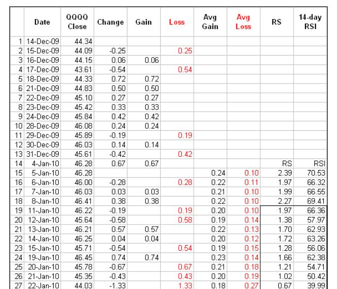
34 Relative Strength Index (RSI) * The Relative Strength Index was developed by J. Welles Wilder and published in a 1978 book, New Concepts in Technical Trading Systems. * RSI is a trading indicator in the technical analysis of financial markets. It is intended to indicate the current and historical strength or weakness of a market based on the closing prices of completed trading periods. It assumes that prices close higher in strong market periods, and lower in weaker periods and computes this as a ratio of the number of incrementally higher closes to the incrementally lower closes. * It compares the magnitude of a stock s recent gains to the magnitude of its recent losses and turns that information into a number that ranges from 0 to 100 and average period of using the RSI is 14 days. Calculation To simplify the calculation explanation, RSI has been broken down into its basic components: RS, Average Gain and Average Loss. This RSI calculation is based on 14 periods, which is the default suggested by Wilder in his book. Losses are expressed as positive values, not negative values. The very first calculations for average gain and average loss are simple 14- period averages. First Average Gain = Sum of Gains over the past 14 periods / 14. First Average Loss = Sum of Losses over the past 14 periods / 14 The second, and subsequent, calculations are based on the prior averages and the current gain loss: Average Gain = [(previous Average Gain) x 13 + current Gain] / 14. Average Loss = [(previous Average Loss) x 13 + current Loss] /
35 35
36 36
37 Uses of RSI Overbought/Oversold If the RSI goes below 30 level it is considered oversold for the underlying stock. Conversely, if the RSI rises above 70 it is consider overbought zone. Generally if the RSI rises above 50 it is considered bullish for the underlying stock. Conversely, if the RSI falls below 50, it is a bearish signal. 37
38 Buy and Sell signal RSI generates a signal of buy and sell for you. When the RSI cross the centerline(40), it is a bullish signal and price may go up. And when the price goes down from the centerline(40), it means prices are going to decline in near future. But here overbought means not a sell signal and oversold means not a buy signal because a stock may move in overbought zone as well as oversold zone respectively but in the case of index this formula may be weak because Index can t stay in overbought and oversold zone for long time as compare to securities. So you should wait for good signal that occurs from the RSI and other supportive tools like Trend, MACD and Divergences etc. Divergence Positive divergence --- above 50 scale Negative divergence--- below 30 scale You should buy and sell mostly on the second signal generated by the RSI. 38
39 Divergence Divergence occurs when an indicator and the price of an asset are heading in opposite directions. Negative divergence happens when the price of a securities is in an uptrend and a major indicator such as the moving average convergence divergence (MACD), price rate of change (ROC) or relative strength index (RSI) heads downward. Conversely, positive divergence occurs when the price is in a downtrend but an indicator starts to rise. These are usually reliable signs that the price of an asset may be reversing. When using divergence to help make trading decisions, be aware that indicator divergence can occur over extended periods of time, so tools such as trend lines and support and resistance levels should also be used to help confirm the reversal. 39
40 40

41 Trend identification In Technical Analysis for the Trading Professional, Constance Brown suggests that oscillators do not travel between 0 and 100. This also happens to be the name of the first chapter. Brown identifies a bull market range and a bear market for RSI. RSI tends to fluctuate between 40 and 90 in a bull market (uptrend) with the zones acting as support. These ranges may vary depending on RSI parameters, strength of trend and volatility of the underlying securities. On the flip side, RSI tends to fluctuate between 10 and 60 in a bear market (downtrend) with the zone acting as resistance. The zone subsequently marked resistance until a breakout. 41
42 Conclusions RSI is a versatile momentum oscillator that has stood the test of time. Despite changes in volatility and the markets over the years, RSI remains as relevant now as it was in Wilder's days. While Wilder's original interpretations are useful to understanding the indicator, the work of Brown and Cardwell takes RSI interpretation to a new level. Adjusting to this level takes some rethinking on the part of the traditionally schooled chartists. Wilder considers overbought conditions ripe for a reversal, but overbought can also be a sign of strength. Bearish divergences still produce some good sell signals, but chartists must be careful in strong trends when bearish divergences are actually normal. Even though the concept of positive and negative reversals may seem to undermine Wilder's interpretation, the logic makes sense and Wilder would hardly dismiss the value of putting more emphasis on price action. Positive and negative reversals put price action of the underlying securities first and the indicator second, which is the way it should be. Bearish and bullish divergences place the indicator first and price action second. By putting more emphasis on price action, the concept of positive and negative reversals challenges our thinking towards momentum oscillators. Stoch RSI Developed by Tushar Chande and Stanley Kroll, StochRSI is an oscillator that measures the level of RSI relative to its high-low range over a set time period. StochRSI applies the Stochastics formula to RSI values, instead of price values. This makes it an indicator of an indicator. The result is an oscillator that fluctuates between 0 and 1. In their 1994 book, The New Technical Trader, Chande and Kroll explain that RSI can oscillate between 80 and 20 for extended periods without reaching extreme levels. Notice that 80 and 20 are used for overbought and oversold instead of the more traditional 70 and 30. Traders looking to enter a stock based on an overbought or oversold reading in RSI might find themselves continuously on the sidelines. Chande and Kroll developed StochRSI to increase sensitivity and generate more overbought/oversold signals. 42
43 Calculation StochRSI = (RSI - Lowest Low RSI) / (Highest High RSI - Lowest Low RSI) StochRSI measures the value of RSI relative to its high/low range over a set number of periods. The number of periods used to calculate StochRSI is transferred to RSI in the formula. For example, 14-day StochRSI would use the current value of 14-day RSI and the 14-day high-low range for 14-day RSI. 14-day StochRSI equals 0 when RSI is at its lowest point for 14 days. 14-day StochRSI equals 1 when RSI is at its highest point for 14 days. 14-day StochRSI equals.5 when RSI is in the middle of its 14-day high-low range. 14-day StochRSI equals.2 when RSI is near the low of its 14-day high-low range. 14-day StochRSI equals.80 when RSI is near the high of its 14-day high-low range. 43
 removed from the price of the underlying securities. Price has undergone two changes to become StochRSI. Converting prices to RSI is one change.")
44 Interpretation It is important to remember that StochRSI is an indicator of an indicator, which makes it the second derivative of price. This means it is two steps (formulas) removed from the price of the underlying securities. Price has undergone two changes to become StochRSI. Converting prices to RSI is one change. Converting RSI to the Stochastic Oscillator is the second change. This is why the end product (StochRSI) looks much different than the original (price). StochRSI has characteristics similar to most bound momentum oscillators. First, it can be used to identify overbought or oversold conditions. A move above.80 is considered overbought, while a move below.20 is considered oversold. Second, it can be used to identify the short-term trend. As a bound oscillator, the centerline is at.50. StochRSI reflects an uptrend when consistently above.50 and a downtrend when consistently below.50. Because this indicator is quite volatile, some smoothing with a moving average can help for short-term trend identification. 44

45 Overbought/Oversold Trend identification is the key to successfully choosing between overbought and oversold levels. It is important to look for oversold conditions when the bigger trend is up and overbought conditions when the bigger trend is down. In other words, look for trades in the direction of the bigger trend. 14-day StochRSI would be considered a short-term indicator. Therefore, it is important to identify the medium-term trend when looking for overbought and oversold conditions. 14-day RSI did not become oversold during this timeframe because it is less sensitive. Oversold is not the same as bullish though. It serves as a warning to watch for a bounce. A catalyst is still needed to solidify the low and signal an actual upturn. In this example, chartists could look for prices to break above the 10-day SMA or for StochRSI to break above.50, its centerline. 45
46 46
47 Conclusion StochRSI is like RSI on steroids. RSI produces relatively fewer signals and StochRSI dramatically increases the signal count. There will be more overbought/oversold readings, more centerline crosses, more good signals and more bad signals. Speed comes at a price. This means it is important to use StochRSI with other aspects of technical analysis for confirmation. The examples above use gaps, support/resistance breaks, and price patterns to confirm StochRSI signals. Chartists can also employ other complementary indicators, such as On Balance Volume (OBV) or the Accumulation Distribution Line. These volume-based indicators do not overlap with momentum oscillators. Chartists should also experiment with various settings and learn the nuances of StochRSI before using it in the real world. Stochastic Oscillator Developed by George C. Lane in the late 1950s, the Stochastic Oscillator is a momentum indicator that shows the location of the close relative to the high-low range over a set number of periods. According to an interview with Lane, the Stochastic Oscillator doesn't follow price, it doesn't follow volume or anything like that. It follows the speed or the momentum of price. As a rule, the momentum changes direction before price. As such, bullish and bearish divergences in the Stochastic Oscillator can be used to foreshadow reversals. This was the first, and most important, signal that Lane identified. Lane also used this oscillator to identify bull and bear set-ups to anticipate a future reversal. Because the Stochastic Oscillator is range bound, is also useful for identifying overbought and oversold levels. 47
48 Calculation %K = (Current Close - Lowest Low)/(Highest High - Lowest Low) * 100 %D = 3-day SMA of %K Lowest Low = lowest low for the look-back period Highest High = highest high for the look-back period %K is multiplied by 100 to move the decimal point two places The default setting for the Stochastic Oscillator is 14 periods, which can be days, weeks, months or an intraday timeframe. A 14-period %K would use the most recent close, the highest high over the last 14 periods and the lowest low over the last 14 periods. %D is a 3- day simple moving average of %K. This line is plotted alongside %K to act as a signal or trigger line. 48

49 Interpretation The Stochastic Oscillator measures the level of the close relative to the high-low range over a given period of time. Assume that the highest high equals 110, the lowest low equals 100 and the close equals 108. The high-low range is 10, which is the denominator in the %K formula. The close less the lowest low equals 8, which is the numerator. 8 divided by 10 equals.80 or 80%. Multiply this number by 100 to find %K %K would equal 30 if the close was at 103 (.30 x 100). The Stochastic Oscillator is above 50 when the close is in the upper half of the range and below 50 when the close is in the lower half. Low readings (below 20) indicate that price is near its low for the given time period. High readings (above 80) indicate that price is near its high for the given time period. 49

50 Fast and Slow There are two versions of the Stochastic Oscillator available on KeyStock The Fast Stochastic Oscillator is based on George Lane's original formulas for %K and %D. %K in the fast version that appears rather choppy. %D is the 3-day SMA of %K. In fact, Lane used %D to generate buy or sell signals based on bullish and bearish divergences. Lane asserts that a %D divergence is the only signal which will cause you to buy or sell. Because %D in the Fast Stochastic Oscillator is used for signals, the Slow Stochastic Oscillator was introduced to reflect this emphasis. The Slow Stochastic Oscillator smooths %K with a 3-day SMA, which is exactly what %D is in the Fast Stochastic Oscillator. Notice that %K in the Slow Stochastic Oscillator equals %D in the Fast Stochastic Oscillator 50

51 Overbought Oversold Traditional settings use 80 as the overbought threshold and 20 as the oversold threshold. These levels can be adjusted to suit analytical needs and securities characteristics. Readings above 80 for the 20-day Stochastic Oscillator would indicate that the underlying securities was trading near the top of its 20-day high-low range. Readings below 20 occur when a securities is trading at the low end of its high-low range. overbought readings are not necessarily bearish. Securities can become overbought and remain overbought during a strong uptrend. Closing levels that are consistently near the top of the range indicate sustained buying pressure. In a similar vein, oversold readings are not necessarily bullish. Securities can also become oversold and remain oversold during a strong downtrend. Closing levels consistently near the bottom of the range indicate sustained selling pressure. It is, therefore, important to identify the bigger trend and trade in the direction of this trend. Look for occasional oversold readings in an uptrend and ignore frequent overbought readings. Similarly, look for occasional overbought readings in a strong downtrend and ignore frequent oversold readings. 51
52 52
53 Bull Bear Divergences Divergences form when a new high or low in price is not confirmed by the Stochastic Oscillator. A bullish divergence forms when price records a lower low, but the Stochastic Oscillator forms a higher low. This shows less downside momentum that could foreshadow a bullish reversal. A bearish divergence forms when price records a higher high, but the Stochastic Oscillator forms a lower high. This shows less upside momentum that could foreshadow a bearish reversal. Once a divergence takes hold, chartists should look for a confirmation to signal an actual reversal. A bearish divergence can be confirmed with a support break on the price chart or a Stochastic Oscillator break below 50, which is the centerline. A bullish divergence can be confirmed with a resistance break on the price chart or a Stochastic Oscillator break above is an important level to watch. The Stochastic Oscillator moves between zero and one hundred, which makes 50 the centerline. Think of it as the 50- yard line in football. The offense has a higher chance of scoring when it crosses the 50-yard line. The defense has an edge as long as it prevents the offense from crossing the 50-yard line. A Stochastic Oscillator cross above 50 signals that prices are trading in the upper half of their high-low range for the given look-back period. This suggests that the cup is half full. Conversely, a cross below 50 means that prices are trading in the bottom half of the given look-back period. This suggests that the cup is half empty. Conclusions The settings on the Stochastic Oscillator depend on personal preferences, trading style, and timeframe. A shorter look-back period will produce a choppy oscillator with many overbought and oversold readings. A longer look-back period will provide a smoother oscillator with fewer overbought and oversold readings. Like all technical indicators, it is important to use the Stochastic Oscillator in conjunction with other technical analysis tools. Volume, support/resistance, and breakouts can be used to confirm or refute signals produced by the Stochastic Oscillator. The indicator can also be used to identify turns near support or resistance. Should a securities trade near support with an oversold Stochastic Oscillator, look for a break above 20 to signal an upturn and successful support test. Conversely, should a securities trade near resistance with an overbought Stochastic Oscillator, look for a break below 80 to signal a downturn and resistance failure. 53
54 The Money Flow Index (MFI) The Money Flow Index (MFI) is an oscillator that uses both price and volume to measure buying and selling pressure. Created by Gene Quong and Avrum Soudack, MFI is also known as volume-weighted RSI. MFI starts with the typical price for each period. Money flow is positive when the typical price rises (buying pressure) and negative when the typical price declines (selling pressure). A ratio of positive and negative money flow is then plugged into an RSI formula to create an oscillator that moves between zero and one hundred. As a momentum oscillator tied to volume, the Money Flow Index (MFI) is best suited to identify reversals and price extremes with a variety of signals. Calculation There are several steps involved in the Money Flow Index calculation. The example below is based on a 14-period Money Flow Index, which is the default setting in Key Stock and the setting recommended by the creators. Typical Price = (High + Low + Close)/3 Raw Money Flow = Typical Price x Volume Money Flow Ratio = (14-period Positive Money Flow)/(14- period Negative Money Flow) Money Flow Index = /(1 + Money Flow Ratio) 54

55 Interpretation As a volume-weighted version of RSI, the Money Flow Index (MFI) can be interpreted similarly to RSI. The big difference is, of course, volume. Because volume is added to the mix, the Money Flow Index will act a little differently than RSI. Theories suggest that volume leads prices. RSI is a momentum oscillator that already leads prices. Incorporating volume can increase this lead time. Quong and Soudack identified three basic signals using the Money Flow Index. First, chartists can look for overbought or oversold levels to warn of unsustainable price extremes. Second, bullish and bearish divergence can be used to anticipate trend reversals. Third, failure swings at 80 or 20 can also be used to identify potential price reversals. For this article, the divergences and failure swings are be combined to create one signal group and increase robustness. 55
 and prices can simply continue higher when the uptrend is strong.")
56 Overbought/Oversold Overbought and oversold levels can be used to identify unsustainable price extremes. Typically, MFI above 80 is considered overbought and MFI below 20 is considered oversold. Strong trends can present a problem for these classic overbought and oversold levels. MFI can become overbought (>80) and prices can simply continue higher when the uptrend is strong. Conversely, MFI can become oversold (<20) and prices can simply continue lower when the downtrend is strong. Quong and Soudack recommended expanding these extremes to further qualify signals. A move above 90 is truly overbought and a move below 10 is truly oversold. Moves above 90 and below 10 are rare occurrences that suggest a price move is unsustainable. Admittedly, many stocks will trade for a long time without reaching the 90/10 extremes. However, chartists can use the keystock scan engine to find those that do. 56
57 Divergences and Failures Failure swings and divergences can be combined to create more robust signals. A bullish failure swing occurs when MFI becomes oversold below 20, surges above 20, holds above 20 on a pullback and then breaks above its prior reaction high. A bullish divergence forms when prices move to a lower low, but the indicator forms a higher low to show improving money flow or momentum. A bearish failure swing occurs when MFI becomes overbought above 80, plunges below 80, fails to exceed 80 on a bounce and then breaks below the prior reaction low. A bearish divergence forms when the stock forges a higher high and the indicator forms a lower high, which indicates deteriorating money flow or momentum Conclusions The Money Flow Index is a rather unique indicator that combines momentum and volume with an RSI formula. RSI momentum generally favors the bulls when the indicator is above 50 and the bears when below 50. Even though MFI is considered a volume-weighted RSI, using the centerline to determine a bullish or bearish bias does not work as well. Instead, MFI is better suited to identify potential reversals with overbought/oversold levels, bullish/bearish divergences, and bullish/bearish failure swings. As with all indicators, MFI should not be used by itself. A pure momentum oscillator, such as RSI, or pattern analysis can be combined with MFI to increase signal robustness. 57
58 Bollinger Bands Bollinger Bands is technical analysis tool invented by John Bollinger in the 1980s. Having evolved from the concept of trading bands, Bollinger Bands can be used to measure the highness or lowness of the price relative to previous trades and to find out the support and resistance level of any financial securities. Bollinger Bands consist of a center line and two price channels (bands) above and below it. The center line is an exponential moving average; the price channels are the standard deviations of the stock being studied. The bands will expand and contract as the price action of an issue becomes volatile (expansion) or becomes bound into a tight trading pattern (contraction) Bollinger Bands When stock prices continually touch the upper Bollinger Band, the prices are thought to be overbought; conversely, when they continually touch the lower band, prices are thought to be oversold, triggering a buy signal. When using Bollinger Bands, designate the upper and lower bands as price targets. If the price deflects off the lower band and crosses above the 20-day average (the middle line), the upper band comes to represent the upper price target. In a strong uptrend, prices usually fluctuate between the upper band and the 20-day moving average. When that happens, a crossing below the 20-day moving average warns of a trend reversal to the downside. (For more about gauging an asset's direction and profiting from it International School of Financial Market (ISFM) 58
59 59

60 Uses * Bollinger Bands can be combined with price action and other indicators to generate signals and foreshadow significant moves. * Double Bottom Buy: A Double Bottom Buy signal is given when prices penetrate the lower band and remain above the lower band after subsequent low forms. Either low can be higher or lower than other. * Double Top Sell: A Double Top Sell signal is given when prices peak above the upper band and a subsequent peak fails to break above the upper band. The bearish setup is confirmed when prices decline below the middle band. 60
61 Moving Average Convergence/Divergence (MACD) Developed by Gerald Appel in the late seventies, the Moving Average Convergence/Divergence oscillator (MACD) is one of the simplest and most effective momentum indicators available. Which are lagging indicators, to include some trend-following characteristics. These lagging indicators are turned into a momentum oscillator by subtracting the longer moving average from the shorter moving average. Calculation MACD Line: (12-day EMA - 26-day EMA) Signal Line: 9-day EMA of MACD Line MACD Histogram: MACD Line - Signal Line The MACD Line is the 12-day Exponential Moving Average (EMA) less the 26-day EMA. Closing prices are used for these moving averages. A 9-day EMA of the MACDLine is plotted with the indicator to act as a signal line and identify turns. The MACDHistogram represents the difference between MACD and its 9-day EMA, the Signal line. The histogram is positive when the MACD Line is above its Signal line and negative when the MACD Line is below its Signal line. The values of 12, 26 and 9 are the typical setting used with the MACD, however other values can be substituted depending on your trading style and goals. 61
 is faster and responsible for most MACD movements.")
62 Interpretation As its name implies, the MACD is all about the convergence and divergence of the two moving averages. Convergence occurs when the moving averages move towards each other. Divergence occurs when the moving averages move away from each other. The shorter moving average (12-day) is faster and responsible for most MACD movements. The longer moving average (26-day) is slower and less reactive to price changes in the underlying securities. The MACD Line oscillates above and below the zero line, which is also known as the centerline. These crossovers signal that the 12-day EMA has crossed the 26-day EMA. The direction, of course, depends on the direction of the moving average cross. Positive MACD indicates that the 12-day EMA is above the 26-day EMA. Positive values increase as the shorter EMA diverges further from the longer EMA. This means upside momentum is increasing. Negative MACD values indicate that the 12-day EMA is below the 26-day EMA. Negative values increase as the shorter EMA diverges further below the longer EMA. 62

63 Signal Line Crossovers Signal line crossovers are the most common MACD signals. The signal line is a 9-day EMA of the MACD Line. As a moving average of the indicator, it trails the MACD and makes it easier to spot MACD turns. A bullish crossover occurs when the MACD turns up and crosses above the signal line. A bearish crossover occurs when the MACD turns down and crosses below the signal line. Crossovers can last a few days or a few weeks, it all depends on the strength of the move. Due diligence is required before relying on these common signals. Signal line crossovers at positive or negative extremes should be viewed with caution. Even though the MACDdoes not have upper and lower limits, chartists can estimate historical extremes with a simple visual assessment. It takes a strong move in the underlying securities to push momentum to an extreme. Even though the move may continue, momentum is likely to slow and this will usually produce a signal line crossover at the extremities. Volatility in the underlying securities can also increase the number of crossovers. 63
64 Centerline Crossovers Centerline crossovers are the next most common MACD signals. A bullish centerline crossover occurs when the MACD Line moves above the zero line to turn positive. This happens when the 12-day EMA of the underlying securities moves above the 26-day EMA. A bearish centerline crossover occurs when the MACD moves below the zero line to turn negative. This happens when the 12-day EMA moves below the 26-day EMA. Centerline crossovers can last a few days or a few months. It all depends on the strength of the trend. The MACD will remain positive as long as there is a sustained uptrend. The MACD will remain negative when there is a sustained downtrend. The next chart shows Pulte Homes (PHM) with at least four centerline crosses in nine months. The resulting signals worked well because strong trends emerged with these centerline crossovers. Divergences Divergences form when the MACD diverges from the price action of the underlying securities. A bullish divergence forms when a securities records a lower low and the MACD forms a higher low. The lower low in the securities affirms the current downtrend, but the higher low in the MACD shows less downside momentum. Despite less downside momentum, downside momentum is still outpacing upside momentum as long as the MACD remains in negative territory. Slowing downside momentum can sometimes foreshadow a trend reversal or a sizable rally. A bearish divergence forms when a securities records a higher high and the MACD Line forms a lower high. The higher high in the securities is normal for an uptrend, but the lower high in the MACD shows less upside momentum. Even though upside momentum may be less, upside momentum is still outpacing downside momentum as long as the MACD is positive. Waning upward momentum can sometimes foreshadow a trend reversal or sizable decline. 64
65 Divergences Divergences should be taken with caution. Bearish divergences are commonplace in a strong uptrend, while bullish divergences occur often in a strong downtrend. Yes, you read that right. Uptrends often start with a strong advance that produces a surge in upside momentum (MACD). Even though the uptrend continues, it continues at a slower pace that causes the MACD to decline from its highs. Upside momentum may not be as strong, but upside momentum is still outpacing downside momentum as long as the MACD Line is above zero. The opposite occurs at the beginning of a strong downtrend. The standard setting for MACD is the difference between the 12 and 26- period EMAs. Chartists looking for more sensitivity may try a shorter short-term moving average and a longer long-term moving average. MACD(5,35,5) is more sensitive than MACD(12,26,9) and might be better suited for weekly charts. Chartists looking for less sensitivity may consider lengthening the moving averages. A less sensitive MACD will still oscillate above/below zero, but the centerline crossovers and signal line crossovers will be less frequent. Conclusions The MACD indicator is special because it brings together momentum and trend in one indicator. This unique blend of trend and momentum can be applied to daily, weekly or monthly charts. The standard setting for MACD is the difference between the 12 and 26-period EMAs. Chartists looking for more sensitivity may try a shorter short-term moving average and a longer long-term moving average. MACD(5,35,5) is more sensitive than MACD(12,26,9) and might be better suited for weekly charts. Chartists looking for less sensitivity may consider lengthening the moving averages. A less sensitive MACD will still oscillate above/below zero, but the centerline crossovers and signal line crossovers will be less frequent. Finally, remember that the MACD Line is calculated using the actual difference between two moving averages. This means MACD values are dependent on the price of the underlying securities. The MACD values for a $20 stocks may range from -1.5 to 1.5, while the MACD values for a $100 may range from -10 to +10. It is not possible to compare MACD values for a group of securities with varying prices. If you want to compare momentum readings, you should use the Percentage Price Oscillator (PPO), instead of the MACD. 65
66 66
67 MACD Bullish Signals MACD generates bullish signals from three main sources: Positive Divergence Bullish Moving Average Crossover Bullish Centerline Crossover 67
68 Bearish Signals MACD generates bearish signals from three main sources. These signals are mirror reflections of the bullish signals: Negative Divergence Bearish Moving Average Crossover Bearish centreline Crossover 68

69 MACD-Histogram Developed by Thomas Aspray in 1986, the MACD-Histogram measures the distance between MACD and its signal line (the 9-day EMA of MACD). Like MACD, the MACD-Histogram is also an oscillator that fluctuates above and below the zero line. Aspray developed the MACD-Histogram to anticipate signal line crossovers in MACD. Because MACD uses moving averages and moving averages lag price, signal line crossovers can come late and affect the reward-torisk ratio of a trade. Bullish or bearish divergences in the MACD- Histogram can alert chartists to an imminent signal line crossover in MACD. Calculation: MACD: (12-day EMA - 26-day EMA) Signal Line: 9-day EMA of MACD MACD Histogram: MACD - Signal Line 69

70 Four Steps Process The MACD-Histogram is an indicator of an indicator. In fact, MACD is also an indicator of an indicator. This means that the MACD- Histogram is four steps removed from the price of the underlying securities. In other words, it is the fourth derivative of price. First derivative: 12-day EMA and 26-day EMA Second derivative: MACD (12-day EMA less the 26-day EMA) Third derivative: MACD signal line (9-day EMA of MACD) Fourth derivative: MACD-Histogram (MACD less MACD signal line) The base for this indicator is the securities's price. It takes four steps to get from the actual price to the MACD-Histogram. Talk about massaging the data. While not necessarily a bad thing, chartists should keep this in mind when analyzing the MACD- Histogram. It is an indicator of an indicator. Therefore, it is designed to anticipate signals in MACD, which in turn is designed to identify changes in the price momentum of the underlying securities. 70
71 Interpretation As with MACD, the MACD-Histogram is also designed to identify convergence, divergence and crossovers. The MACD- Histogram, however, is measuring the distance between MACD and its signal line. The histogram is positive when MACD is above its signal line. Positive values increase as MACD diverges further from its signal line (to the upside). Positive values decrease as MACD and its signal line converge. The MACD-Histogram crosses the zero line as MACD crosses below its signal line. The indicator is negative when MACD is below its signal line. Negative values increase as MACD diverges further from its signal line (to the downside). Conversely, negative values decrease as MACD converges on its signal line. Conclusions The MACD-Histogram is an indicator designed to predict signal line crossovers in MACD. By extension, it is designed as an early warning system for these signal line crossovers, which are the most frequent of MACD signals. Divergences in the MACD-Histogram can be used to filter signal line crossovers, which will reduce the number of signals. Even with a filter, the robustness of MACD-Histogram divergences is still an issue. Short and shallow divergences are much more frequent than long and large divergences. In other words, divergences that develop over a few days with shallow movements are generally less robust than divergences that develop over a few weeks with more pronounced movements. The signal line crossover provides the ultimate confirmation, but aggressive traders may try to improve the reward-to-risk ratio by making their move just before the crossover. This is when the MACD-Histogram is as close to the zero line as it can be without actually making a cross, usually between -.20 and

72 On Balance Volume (OBV) On Balance Volume (OBV) measures buying and selling pressure as a cumulative indicator that adds volume on up days and subtracts volume on down days. OBV was developed by Joe Granville and introduced in his 1963 book, Granville's New Key to Stock Market Profits. It was one of the first indicators to measure positive and negative volume flow. Chartists can look for divergences between OBV and price to predict price movements or use OBV to confirm price trends. Calculation : If the closing price is above the prior close price then: Current OBV = Previous OBV + Current Volume If the closing price is below the prior close price then: Current OBV = Previous OBV - Current Volume If the closing prices equals the prior close price then: Current OBV = Previous OBV (no change) 72

73 Interpretation Granville theorized that volume precedes price. OBV rises when volume on up days outpaces volume on down days. OBV falls when volume on down days is stronger. A rising OBV reflects positive volume pressure that can lead to higher prices. Conversely, falling OBV reflects negative volume pressure that can foreshadow lower prices. Granville noted in his research that OBV would often move before price. Expect prices to move higher if OBV is rising while prices are either flat or moving down. Expect prices to move lower if OBV is falling while prices are either flat or moving up. The absolute value of OBV is not important. Chartists should instead focus on the characteristics of the OBV line. First, define the trend for OBV. Second, determine if the current trend matches the trend for the underlying securities. Third, look for potential support or resistance levels. Once broken, the trend for OBV will change and these breaks can be used to generate signals. Also, notice that OBV is based on closing prices. Therefore, closing prices should be considered when looking for divergences or support/resistance breaks. And finally, volume spikes can sometimes throw off the indicator by causing a sharp move that will require a settling period. 73

74 Divergences Bullish and bearish divergence signals can be used to anticipate a trend reversal. These signals are truly based on the theory that volume precedes prices. A bullish divergence forms when OBV moves higher or forms a higher low even as prices move lower or forge a lower low. A bearish divergence forms when OBV moves lower or forms a lower low even as prices move higher or forge a higher high. The divergence between OBV and price should alert chartists that a price reversal could be in the making. 74

75 Conclusions On Balance Volume (OBV) is a simple indicator that uses volume and price to measure buying pressure and selling pressure. Buying pressure is evident when positive volume exceeds negative volume and the OBV line rises. Selling pressure is present when negative volume exceeds positive volume and the OBV line falls. Chartists can use OBV to confirm the underlying trend or look for divergences that may foreshadow a price change. As with all indicators, it is important to use OBV in conjunction with other aspects of technical analysis. It is not a standalone indicator. OBV can be combined with basic pattern analysis or to confirm signals from momentum oscillators. 75
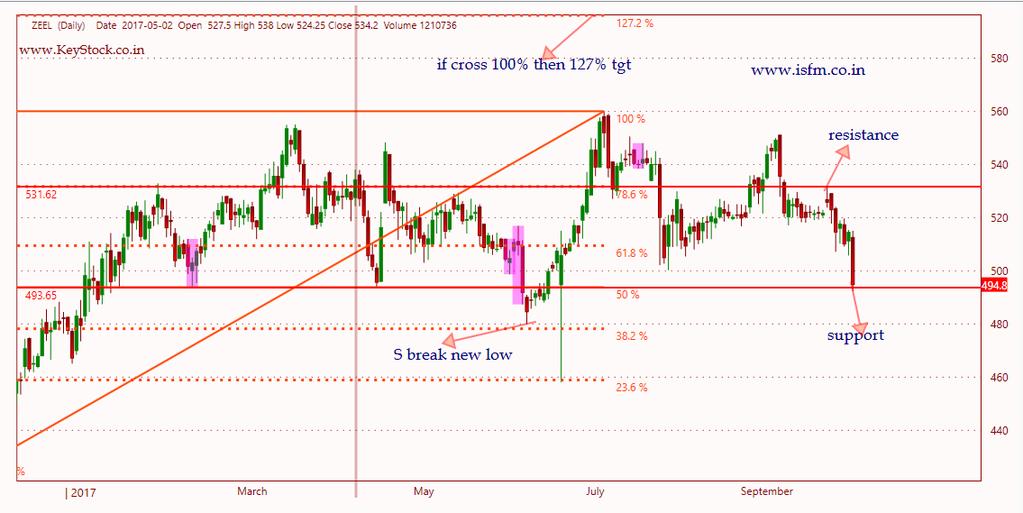
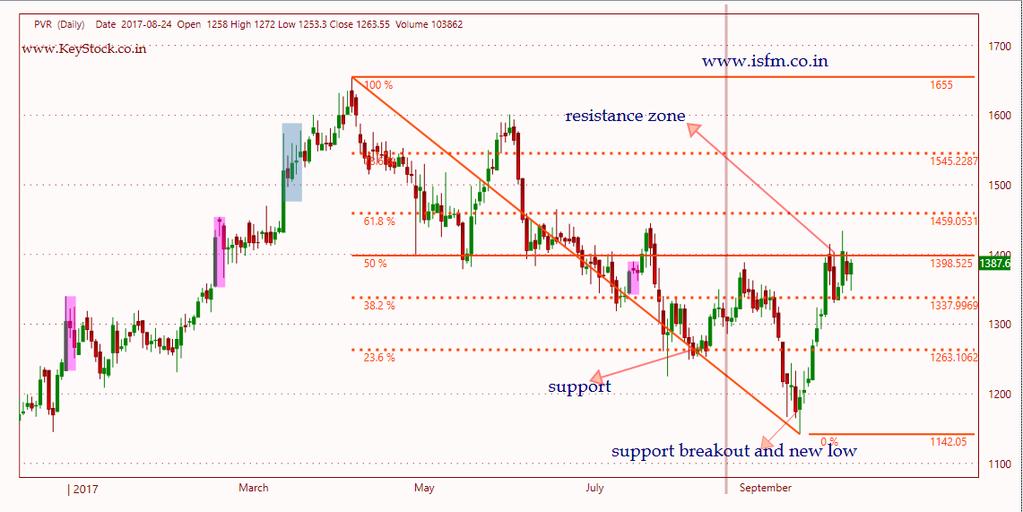
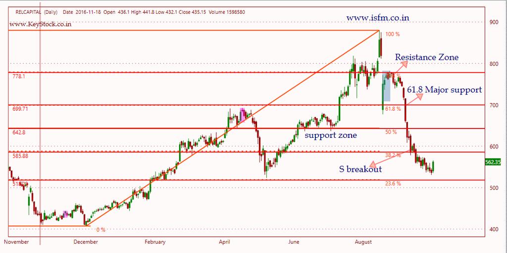
76 Fibonacci Retracement Fibonacci Retracements are ratios used to identify potential reversal levels. These ratios are found in the Fibonacci sequence. The most popular Fibonacci Retracements are 61.8% and 38.2%. Fibonacci Retracements can also be applied after a decline to forecast the length of a counter-trend bounce. These retracements can be combined with other indicators and price patterns to create an overall strategy. We will not deeply discuss the mathematical properties behind the Fibonacci sequence and Golden Ratio. There are plenty of other sources for this detail. A few basics, however, will provide the necessary background for the most popular numbers. Leonardo Pisano Bogollo ( ), an Italian mathematician from Pisa, is credited with introducing the Fibonacci sequence to the West. It is as follows: 0, 1, 1, 2, 3, 5, 8, 13, 21, 34, 55, 89, 144, 233, 377, 610 Sequence of Fibonacci Retracement After 0 and 1, each number is the sum of the two prior numbers (1+2=3, 2+3=5, 5+8= =21 etc ). A number divided by the previous number approximates (21/13=1.6153, 34/21=1.6190, 55/34=1.6176, 89/55=1.6181). The approximation nears as the numbers increase. A number divided by the next highest number approximates.6180 (13/21=.6190, 21/34=.6176, 34/55=.6181, 55/89=.6179 etc.). The approximation nears.6180 as the numbers increase. This is the basis for the 61.8% retracement. A number divided by another two places higher approximates.3820 (13/34=.382, 21/55=.3818, 34/89=.3820, 55/=144=3819 etc.). The approximation nears.3820 as the numbers increase. This is the basis for the 38.2% retracement. Also, note that =.382 A number divided by another three places higher approximates.2360 (13/55=.2363, 21/89=.2359, 34/144=.2361, 55/233=.2361 etc.). The approximation nears.2360 as the numbers increase. This is the basis for the 23.6% retracement. 76
77 How to take Clue Retracement levels alert traders or investors of a potential trend reversal, resistance area or support area. Retracements are based on the prior move. A bounce is expected to retrace a portion of the prior decline, while a correction is expected to retrace a portion of the prior advance. Once a pullback starts, chartists can identify specific Fibonacci retracement levels for monitoring. As the correction approaches these retracements, chartists should become more alert for a potential bullish reversal. Keep in mind that these retracement levels are not hard reversal points. Instead, they serve as alert zones for a potential reversal. It is at this point that traders should employ other aspects of technical analysis to identify or confirm a reversal. These may include candlesticks, price patterns, momentum oscillators or moving averages. Retracements Level we can consider a 23.6% retracement to be relatively shallow. Such retracements would be appropriate for flags or short pullbacks. Retracements in the 38.2%- 50% range would be considered moderate. Even though deeper, the 61.8% retracement can be referred to as the golden retracement. It is, after all, based on the Golden Ratio. Shallow retracements occur, but catching these requires a closer watch and quicker trigger finger. The examples below use daily charts covering 3-9 months. Focus will be on moderate retracements ( %) and golden retracements (61.8%). In addition, these examples will show how to combine retracements with other indicators to confirm a reversal. 77
78 78
79 79
80 Average Directional Index (ADX) ADX is plotted as a single line with values ranging from a low of zero to a high of 100. ADX is non-directional; it registers trend strength whether price is trending up or down. The Average Directional Index (ADX), Minus Directional Indicator (-DI) and Plus Directional Indicator (+DI) represent a group of directional movement indicators that form a trading system developed by Welles Wilder. The Average Directional Index (ADX) measures trend strength without regard to trend direction. The other two indicators, Plus Directional Indicator (+DI) and Minus Directional Indicator (-DI), complement ADX by defining tren direction. Used together, chartists can determine both the direction and strength of the trend. How it works 1. ADX system has three components ADX, +DI, and -DI 2. ADX is used to measure the strength/weakness of the trend and not the actual direction 3. ADX above 25 indicates that the present trend is strong, ADX below 20 suggest that the trend lacks strength. ADX between 20 and 25 is a grey area 4. A buy signal is generated when ADX is 25 and the +DI crosses over DI 5. A sell signal is generated when ADX is 25 and the DI crosses over +DI 6. Once the buy or sell signal is generated, take the trade by defining the stop loss 7. The stop loss is usually the low of the signal candle (for buy signals) and the high of the signal candles ( for short signals) 8. The trade stays valid till the stop loss is breached (even if the +DI and DI reverses the crossover) 9. The default look back period for ADX is 14 days 80
81 How to Measure ADX ADX values help traders to identify the strongest and most profitable trends to trade. The values are also important for distinguishing between trending and nontrending conditions. Many traders will use ADX readings above 25 to suggest that the trend's strength is strong enough for trend trading strategies. Conversely, when ADX is below 25, many will avoid trend trading strategies. Low ADX is a usually a sign of accumulation or distribution. When ADX is below 25 for more than 30 bars, price enters range conditions and price patterns are often easier to identify. Price then moves up and down between resistance and support to find selling and buying interest, respectively. From low ADX conditions, price will eventually break out into a trend. In Figure 2, price moves from a low ADX price channel to an uptrend with strong ADX. ADX Value Trend Strength 0-25 Absent or Weak Trend Strong Trend Very Strong Trend Extremely Strong Trend 81
82 Super trend A 'Supertrend' indicator is one, which can give you precise buy or sell signal in a trending market. As the name suggests, 'Supertrend' is a trend-following indicator just like moving averages and MACD (moving average convergence divergence). It is plotted on prices and their placement indicates the current trend. The indicator is easy to use and gives an accurate reading about an ongoing trend. It is constructed with two parameters, namely period and multiplier. "The average true range (ATR) plays an important role in 'Supertrend' as the indicator uses ATR to calculate its value. The ATR indicator signals the degree of price volatility," 82
83 Average True Range Developed by J. Welles Wilder, the Average True Range (ATR) is an indicator that measures volatility. As with most of his indicators, Wilder designed ATR with commodities and daily prices in mind. Commodities are frequently more volatile than stocks. They were are often subject to gaps and limit moves, which occur when a commodity opens up or down its maximum allowed move for the session. A volatility formula based only on the high-low range would fail to capture volatility from gap or limit moves. Wilder created Average True Range to capture this missing volatility. It is important to remember that ATR does not provide an indication of price direction, just volatility. How it works: 1. Average True Range (ATR) is an extension of True Range concept 2. ATR is not upper or lower bound, hence can take any value 3. ATR is stock price specific, hence for Stock 1 ATR can be in the range of 1.2 and Stock 2 ATR could be in the range of
84 4. ATR attempts to measure the volatility situation and not really the direction of the prices 5. ATR is used to identify stop loss as well 6. If the ATR of a stock is 48, then it means that on average the stock is likely to move 48 points either ways up or down. You can add this to the current day s range to estimate the day s range. For example the stock price is 1320, then the stock is likely to trade between = 1272 and = If the ATR for the next day decreases to say 40, then it means that the volatility is decreasing, and so is the expected range for the day 8. It is best to use ATR to identify the volatility based SL while trading. Assume you have initiated a long trade on the stock at 1325, then your SL should be at least 1272 or below since the ATR is Likewise if you have initiated a short at 1320, then your stoploss should be at least 1368 or above 10. If these SL levels are outside your risk to reward appetite, the its best to avoid such trade. 84
85 Chart Patterns Double Top (Reversal) Double Bottom (Reversal) Head and Shoulders Top (Reversal) Head and Shoulders Bottom (Reversal) Three Highs Three Lows Support Turns Resistance Resistance Become Support 85
86 Double Top (Reversal) The double top is a major reversal pattern that forms after an extended uptrend. The pattern is made up of two consecutive peaks that are roughly equal, with a moderate trough in-between. Many potential double tops can form along the way up, but until key support is broken, a reversal cannot be confirmed. To help clarify, we will look at the key points in the formation and then walk through an example. Prior Trend:- With any reversal pattern, there must be an existing trend to reverse. In the case of the double top, a significant uptrend of several months should be in place. First Peak:- The first peak should mark the highest point of the current trend. As such, the first peak is fairly normal and the uptrend is not in jeopardy (or in question) at this time. Trough:- After the first peak, a decline takes place that typically ranges from 10 to 20%. Volume on the decline from the first peak is usually inconsequential. The lows are sometimes rounded or drawn out a bit, which can be a sign of tepid demand. Second Peak: The advance off the lows usually occurs with low volume and meets resistance from the previous high. Resistance from the previous high should be expected. Decline from Peak:- The subsequent decline from the second peak should witness an expansion in volume and/or an accelerated International descent, perhaps School marked of Financial with a gap. Market (ISFM) 86
87 1 st top 2 nd top First top Second top Support breakout 87
88 Double Bottom (Reversal) The double bottom is a major reversal pattern that forms after an extended downtrend. As its name implies, the pattern is made up of two consecutive troughs that are roughly equal, with a moderate peak in-between. The classic double bottom usually marks an intermediate or long-term change in trend. Many potential double bottoms can form along the way down, but until key resistance is broken, a reversal cannot be confirmed. 1 st low 2 nd low (buying) 88
89 Key points should be considered First Trough: The first trough should mark the lowest point of the current trend. As such, the first trough is fairly normal in appearance and the downtrend remains firmly in place. Peak: After the first trough, an advance takes place that typically ranges from 10 to 20%. Volume on the advance from the first trough is usually inconsequential, but an increase could signal early accumulation. Second Trough: The decline off the reaction high usually occurs with low volume and meets support from the previous low. Support from the previous low should be expected. Even after establishing support, only the possibility of a double bottom exists, it still needs to be confirmed. 89
90 * Advance from Trough: Volume is more important for the double bottom than the double top. There should be clear evidence that volume and buying pressure are accelerating during the advance off of the second trough. An accelerated ascent, perhaps marked with a gap or two. * Resistance Break: Even after trading up to resistance, the double top and trend reversal are still not complete. Breaking resistance from the highest point between the troughs completes the double bottom. This too should occur with an increase in volume and/or an accelerated ascent. * Resistance Turned Support: Broken resistance becomes potential support and there is sometimes a test of this newfound support level with the first correction. Such a test can offer a second chance to close a short position or initiate a long. Price Target: The distance from the resistance breakout to trough lows can be added on top of the resistance break to estimate a target. This would imply that the bigger the formation is, the larger the potential advance. It is important to remember that the double bottom is an intermediate to long-term reversal pattern that will not form in a few days. Even though formation in a few weeks is possible, it is preferable to have at least 4 weeks between lows. Bottoms usually take longer than tops to form and patience can often be a virtue. Give the pattern time to develop and look for the proper clues. The advance off of the first trough should be 10-20%. The second trough should form a low within 3% of the previous low and volume on the ensuing advance should increase. 90
 being the highest and the two outside peaks (shoulders) being low and roughly equal.")
91 Head and Shoulders Top (Reversal) A Head and Shoulders reversal pattern forms after an uptrend, and its completion marks a trend reversal. The pattern contains three successive peaks with the middle peak (head) being the highest and the two outside peaks (shoulders) being low and roughly equal. The reaction lows of each peak can be connected to form support or a neckline. As its name implies, the Head and Shoulders reversal pattern is made up of a left shoulder, a head, a right shoulder and a neckline. Other parts playing a role in the pattern are volume, the breakout, price target and support turned resistance. Left shoulders head Right Neckline breakout neckline 91
.")
92 Left shoulders head Right shoulders Neckline Neckline breakout Key points should be considered Prior Trend: It is important to establish the existence of a prior uptrend for this to be a reversal pattern. Without a prior uptrend to reverse, there cannot be a Head and Shoulders reversal pattern (or any reversal pattern for that matter). Left Shoulder: While in an uptrend, the left shoulder forms a peak that marks the high point of the current trend. After making this peak, a decline ensues to complete the formation of the shoulder (1). The low of the decline usually remains above the trend line, keeping the uptrend intact. Head: From the low of the left shoulder, an advance begins that exceeds the previous high and marks the top of the head. After peaking, the low of the subsequent decline marks the second point of the neckline (2). The low of the decline usually breaks the uptrend line, putting the uptrend in jeopardy. 92
93 Right Shoulder: The advance from the low of the head forms the right shoulder. This peak is lower than the head (a lower high) and usually in line with the high of the left shoulder. While symmetry is preferred, sometimes the shoulders can be out of whack. The decline from the peak of the right shoulder should break the neckline. Neckline: The neckline forms by connecting low points 1 and 2. Low point 1 marks the end of the left shoulder and the beginning of the head. Low point 2 marks the end of the head and the beginning of the right shoulder. Depending on the relationship between the two low points, the neckline can slope up, slope down or be horizontal. The slope of the neckline will affect the pattern's degree of bearishness: a downward slope is more bearish than an upward slope. Sometimes more than one low point can be used to form the neckline. Volume: As the Head and Shoulders pattern unfolds, volume plays an important role in confirmation. Volume can be measured as an indicator or simply by analyzing volume levels. Ideally, but not always, volume during the advance of the left shoulder should be higher than during the advance of the head. This decrease in volume and the new high of the head, together, serve as a warning sign. The next warning sign comes when volume increases on the decline from the peak of the head. Final confirmation comes when volume further increases during the decline of the right shoulder. Neckline Break: The head and shoulders pattern is not complete and the uptrend is not reversed until neckline support is broken. Ideally, this should also occur in a convincing manner, with an expansion in volume. 93
94 * Support Turned Resistance: Once support is broken, it is common for this same support level to turn into resistance. Sometimes, but certainly not always, the price will return to the support break and offer a second chance to sell. * Price Target: After breaking neckline support, the projected price decline is found by measuring the distance from the neckline to the top of the head. This distance is then subtracted from the neckline to reach a price target. Any price target should serve as a rough guide and other factors should be considered as well. These factors might include previous support levels, Fibonacci retracements or long-term moving averages. Head and Shoulders Bottom (Reversal) The Head and Shoulders bottom is referred to sometimes as an Inverse Head and Shoulders. The pattern shares many common characteristics with its comparable partner, but relies more heavily on volume patterns for confirmation. As a major reversal pattern, the Head and Shoulders Bottom forms after a downtrend, and its completion marks a change in trend. The pattern contains three successive troughs with the middle trough (head) being the deepest and the two outside troughs (shoulders) being shallower. Ideally, the two shoulders would be equal in height and width. The reaction highs in the middle of the pattern can be connected to form resistance, or a neckline. volume plays a larger role in bottom formations than top formations. While an increase in volume on the neckline breakout for a Head and Shoulders Top is welcomed, it is absolutely required for a bottom. 94


95 neckline breakout left Head Right Neckline breakout Neckline Left Right shoulder Head 95
96 Key points should be considered Prior Trend: It is important to establish the existence of a prior downtrend for this to be a reversal pattern. Without a prior downtrend to reverse, there cannot be a Head and Shoulders Bottom formation. Left Shoulder: While in a downtrend, the left shoulder forms a trough that marks a new reaction low in the current trend. After forming this trough, an advance ensues to complete the formation of the left shoulder (1). The high of the decline usually remains below any longer trend line, thus keeping the downtrend intact. Head: From the high of the left shoulder, a decline begins that exceeds the previous low and forms the low point of the head. After making a bottom, the high of the subsequent advance forms the second point of the neckline (2). The high of the advance sometimes breaks a downtrend line, which calls into question the robustness of the downtrend. Right Shoulder: The decline from the high of the head (neckline) begins to form the right shoulder. This low is always higher than the head and it is usually in line with the low of the left shoulder. While symmetry is preferred, sometimes the shoulders can be out of whack and the right shoulder will be higher, lower, wider or narrower. When the advance from the low of the right shoulder breaks the neckline, the Head and Shoulders Bottom reversal is complete. 96
97 Neckline: The neckline forms by connecting reaction highs 1 and 2. Reaction High 1 marks the end of the left shoulder and the beginning of the head. Reaction High 2 marks the end of the head and the beginning of the right shoulder. Depending on the relationship between the two reaction highs, the neckline can go up, slope down or be horizontal. The slope of the neckline will affect the pattern's degree of bullishness: an upward slope is more bullish than downward slope. Volume: While volume plays an important role in the Head and Shoulders Top, it plays a crucial role in the Head and Shoulders Bottom. Without the proper expansion of volume, the validity of any breakout becomes suspect. Volume can be measured as an indicator or simply by analyzing the absolute levels associated with each peak and trough. Volume levels during the first half of the pattern are less important than in the second half. Volume on the decline of the left shoulder is usually pretty heavy and selling pressure quite intense. The intensity of selling can even continue during the decline that forms the low of the head. After this low, subsequent volume patterns should be watched carefully to look for expansion during the advances. * Neckline Break: The Head and Shoulders Bottom pattern is not complete, and the downtrend is not reversed until neckline resistance is broken. For a Head and Shoulders Bottom, this must occur in a convincing manner, with an expansion of volume. 97
98 Resistance Turned Support: Once resistance is broken, it is common for this same resistance level to turn into support. Often, the price will return to the resistance break and offer a second chance to buy. Price Target: After breaking neckline resistance, the projected advance is found by measuring the distance from the neckline to the bottom of the head. This distance is then added to the neckline to reach a price target. Triple Top (Reversal) The triple top is a reversal pattern made up of three equal highs followed by a break below support. In contrast to the triple bottom, triple tops usually form over a shorter time frame and typically range from 3 to 6 months. Key factors:- Prior Trend: With any reversal pattern, there should be an existing trend to reverse. In the case of the triple top, an uptrend or long trading range should be in place. Three Highs: All three highs should be reasonable equal, well spaced and mark significant turning points. The highs do not have to be exactly equal, but should be reasonably equivalent to each other. Volume: As the triple top develops, overall volume levels usually decline. Volume sometimes increases near the highs. After the third high, an expansion of volume on the subsequent decline and at the support break greatly reinforces the soundness of the pattern. 98


99 1 st 2st 3st Support break out New low Down fall First second Third 99
100 Support Break: As with many other reversal patterns, the triple top is not complete until a support break. The lowest point of the formation, which would be the lowest of the intermittent lows, marks this key support level. Support Turns Resistance: Broken support becomes potential resistance and there is sometimes a test of this newfound resistance level with a subsequent reaction rally. Price Target: The distance from the support break to highs can be measured and subtracted from the support break for a price target. The longer the pattern develops, the more significant is the ultimate break. Triple tops that are 6 or more months old represent major tops and a price target is less likely to be effective. Note:- Three equal highs can also be found in an ascending triangle or rectangle. Of these patterns mentioned, only the ascending triangle has bullish overtones, the others are neutral until a break occurs. In this same vein, the triple top should also be treated as a neutral pattern until a breakout occurs. The inability to break above resistance is bearish, but the bears have not won the battle until support is broken. Volume on the last decline off resistance can sometimes yield a clue. If there is a sharp increase in volume and momentum, then the chances of a support break increase. When looking for patterns, it is important to keep in mind that technical analysis is more art and less science. 100
101 Triple Bottom(Reversal) The triple bottom is a reversal pattern made up of three equal lows followed by a breakout above resistance. While this pattern can form over just a few months, it is usually a longterm pattern that covers many months. Because of its longterm nature, weekly charts can be best suited for analysis. [[[ Key factors Should be considered:- Prior Trend: With any reversal pattern, there should be an existing trend to reverse. In the case of the triple bottom, a downtrend or long trading range should be in place. Sometimes there will be a definitive downtrend to reverse. Other times the downtrend will fade away after many months [[[of sideways trading. * Three Lows: All three lows should be reasonable equal, well spaced and mark significant turning points. The lows do not have to be exactly equal, but should be reasonably equivalent. * Volume: As the triple bottom develops, overall volume levels usually decline. Volume sometimes increases near the lows. After thethird low, an expansion of volume on the advance and at the resistance breakout greatly reinforces the soundness of the pattern. 101

102 Resistance breakout first second Third Resistance Break: As with many other reversal patterns, the triple bottom is not complete until a resistance breakout. The highest point of the formation, which would be the highest of the intermittent highs, marks resistance. Resistance Turns Support: Broken resistance becomes potential support, and there is sometimes a test of this newfound support level with the first correction. Because the triple bottom is a longterm pattern, the test of newfound support may occur many months later. Price Target: The distance from the resistance breakout to lows can be measured and added to the resistance break for a price target. The longer the pattern develops, the more significant is the ultimate breakout. Triple bottoms that are 6 or more months in duration represent major bottoms and a price target is less likely to be effective. 102
103 Dow Theory Dow Theory has been around for almost 100 years, yet even in today's volatile and technology-driven markets, the basic components of Dow Theory still remain valid. Developed by Charles Dow, refined by William Hamilton and articulated by Robert Rhea, Dow Theory addresses not only technical analysis and price action, but also market philosophy. Many of the ideas and comments put forth by Dow and Hamilton became axioms of Wall Street. While there are those who may think that the market is different now, a read through Rhea's book, The Dow Theory, will attest that the stock market behaves the same today as it did almost 100 years ago. Dow Theory at a high level describes market trends and how they typically behave. At a more granular level, it provides signals that can be used to identify the primary market trend and/or indicate a change in that trend. Investors can use these signals to identify the primary market trend, and then trade with that trend. Background Charles Dow developed Dow Theory from his analysis of market price action in the late 19th century. Until his death in 1902, Dow was partowner as well as editor of The Wall Street Journal. Although he never wrote a book on these theories, he did write several editorials that reflected his views on speculation and the role of the rail and industrial averages. Even though Charles Dow is credited with developing Dow Theory, it was S.A. Nelson and William Hamilton who later refined the theory into what it is today. Nelson wrote The ABC of Stock Speculation and was the first to actually use the term Dow Theory. Hamilton further refined the theory through a series of articles in The Wall Street Journal from 1902 to Hamilton also wrote The Stock Market Barometer in 1922, which sought to explain the theory in detail. In 1932, Robert Rhea further refined the analysis of Dow and Hamilton in his book, The Dow Theory. Rhea read, studied and deciphered some 252 editorials through which Dow ( ) and Hamilton ( ) conveyed their thoughts on the market. Rhea also referred to Hamilton's The Stock Market Barometer. 103
104 Assumptions 1. Manipulation : The first assumption is: The manipulation of the primary trend is not possible. When large amounts of money are at stake, the temptation to manipulate is bound to be present. Hamilton did not argue against the possibility that speculators, specialists or anyone else involved in the markets could manipulate the prices. He qualified his assumption by asserting that it was not possible to manipulate the primary trend. Intraday, day-to-day and possibly even secondary movements could be prone to manipulation. These short movements, from a few hours to a few weeks, could be subject to manipulation by large institutions, speculators, breaking news or rumors. Today, Hamilton would likely add message boards and day-traders to this list. Hamilton went on to say that individual shares could be manipulated. Examples of manipulation usually end the same way: the securities runs up and then falls back and continues the primary trend. Assumptions 2. Averages Discount Everything: The second assumption is: the market reflects all available information. Everything there is to know is already reflected in the markets through the price. Prices represent the sum total of all the hopes, fears and expectations of all participants. Interest rate movements, earnings expectations, revenue projections, presidential elections, product initiatives and all else are already priced into the market. The unexpected will occur, but usually this will only affect the short-term trend. The primary trend will remain unaffected. Dow Theory Is Not Infallible : The third assumption is: the theory is not infallible. Hamilton and Dow readily admit that Dow Theory is not a sure-fire means of beating the market. It is looked upon as a set of guidelines and principles to assist investors and traders with their own study of the market. Dow Theory provides a mechanism for investors to use that will help remove some of the emotion. Hamilton warns that investors should not be influenced by their own wishes. 104
105 Market Movements Dow and Hamilton identified three types of price movements for the Dow Jones Industrial and Rail averages: primary movements, secondary movements, and daily fluctuations. Primary moves last from a few months to many years and represent the broad underlying trend of the market. Secondary (or reaction) movements last from a few weeks to a few months and move counter to the primary trend. Daily fluctuations can move with or against the primary trend and last from a few hours to a few days, but usually not more than a week. Primary Movement Primary movements represent the broad underlying trend of the market and can last from a few months to many years. These movements are typically referred to as bull and bear markets. Once the primary trend has been identified, it will remain in effect until proved otherwise. Hamilton believed that the length and the duration of the trend were largely indeterminable. Hamilton did study the averages and came up with some general guidelines for length and duration, but warned against attempting to apply these as rules for forecasting. Many traders and investors get hung up on price and time targets. The reality of the situation is that nobody knows where and when the primary trend will end. The objective of Dow Theory is to utilize what we do know, not to haphazardly guess about what we don't know. Through a set of guidelines, Dow Theory enables investors to identify the primary trend and invest accordingly. Trying to predict the length and the duration of the trend is an exercise in futility. Hamilton and Dow were mainly interested in catching the big moves of the primary trend. Success, according to Hamilton and Dow, is measured by the ability to identify the primary trend and stay with it. 105
106 Secondary Movements Secondary movements run counter to the primary trend and are reactionary in nature. In a bull market, a secondary move is considered a correction. In a bear market, secondary moves are sometimes called reaction rallies. Earlier in this article, a chart of Coca-Cola was used to illustrate reaction rallies (or secondary movements) within the confines of a primary bear trend. Below is a chart illustrating a correction within the confines of a primary bull trend. Daily Fluctuations Daily fluctuations, while important when viewed as a group, can be dangerous and unreliable individually. Due to the randomness of the movements from day to day, the forecasting value of daily fluctuations is limited at best. At worst, too much emphasis on daily fluctuation will lead to forecasting errors and possibly losses. Getting too caught up in the movement of one or two days can lead to hasty decisions that are based on emotion. It is vitally important to keep the whole picture in mind when analyzing daily price movements. The study of daily price action can add valuable insight, but only when taken in the context of the larger picture. There is little structure in one, two or even three days' worth of price action. However, when a series of days are combined, a structure will start to emerge and analysis becomes better grounded. 106
107 The Three Stages of Primary Bull Markets Hamilton identified three stages to both primary bull markets and primary bear markets. These stages relate as much to the psychological state of the market as to the movement of prices. A primary bull market is defined as a long sustained advance marked by improving business conditions that elicit increased speculation and demand for stocks. In a primary bull market, there will be secondary movements that run counter to the major trend. Stage 1 - Accumulation Hamilton noted that the first stage of a bull market was largely indistinguishable from the last reaction rally of a bear market. Pessimism, which was excessive at the end of the bear market, still reigns at the beginning of a bull market. It is a period when the public is out of stocks, the news from corporate America is bad and valuations are usually at historical lows. However, it is at this stage that the so-called smart money begins to accumulate stocks. This is the stage of the market when those with patience see value in owning stocks for the long haul. Stocks are cheap, but nobody seems to want them. Stage 1 - Accumulation In the first stage of a bull market, stocks begin to find a bottom and quietly firm up. When the market starts to rise, there is widespread disbelief that a bull market has begun. After the first leg peaks and starts to head back down, the bears come out proclaiming that the bear market is not over. Stage 2 - Big Move The second stage of a primary bull market is usually the longest, and sees the largest advance in prices. It is a period marked by improving business conditions and increased valuations in stocks. Earnings begin to rise again and confidence starts to mend. This is considered the easiest stage to make money as participation is broad and the trend followers begin to participate. Stage 3 - Excess :- The third stage of a primary bull market is marked by excessive speculation and the appearance of inflationary pressures. (Dow formed these theorems about 100 years ago, but this scenario is certainly familiar.) During the third and final stage, the public is fully involved in the market, valuations are excessive and confidence is extraordinarily high. This is the mirror image to the first stage of the bull market. A Wall Street axiom: When the taxi cab drivers begin to offer tips, the top cannot be far off. 107
108 The Three Stages of Primary Bear Markets A primary bear market is defined as a long sustained decline marked by deteriorating business conditions and subsequent decrease in demand for stocks. Just like with primary bull markets. a primary bear market will have secondary movements that run counter to the major trend. Stage 1 Distribution : Just as accumulation is the hallmark of the first stage of a primary bull market, distribution marks the beginning of a bear market. As the smart money begins to realize that business conditions are not quite as good as once thought, they start to sell stocks. The public is still involved in the market at this stage and become willing buyers. There is little in the headlines to indicate a bear market is at hand and general business conditions remain good. However, stocks begin to lose a bit of their luster and the decline begins to take hold. While the market declines, there is little belief that a bear market has started and most forecasters remain bullish. After a moderate decline, there is a reaction rally (secondary move) that retraces a portion of the decline. Hamilton noted that reaction rallies during bear markets were quite swift and sharp. As with his analysis of secondary moves in general, Hamilton noted that a large percentage of the losses would be recouped in a matter of days or perhaps weeks. This quick and sudden movement would invigorate the bulls to proclaim the bull market alive and well. However, the reaction high of the secondary move would form and be lower than the previous high. After making a lower high, a break below the previous low would confirm that this was the second stage of a bear market. The Three Stages of Primary Bear Markets Stage 2 - Big Move As with the primary bull market, stage two of a primary bear market provides the largest move. This is when the trend has been identified as down and business conditions begin to deteriorate. Earnings estimates are reduced, shortfalls occur, profit margins shrink and revenues fall. As business conditions worsen, the sell-off continues. Stage 3 - Despair At the top of a primary bull market, hope springs eternal and excess is the order of the day. By the final stage of a bear market, all hope is lost and stocks are frowned upon. Valuations are low, but the selling continues as participants seek to sell no matter what. The news from corporate America is bad, the economic outlook bleak and not a buyer is to be found. The market will continue to decline until all the bad news is fully priced into stocks. Once stocks fully reflect the worst possible outcome, the cycle begins again. 108
109 The Role of Volume The importance of volume was alluded to above with the chart of the Apr- 97 bottom in the DJIA. Rhea notes that while Hamilton did analyze volume statistics, price action was the ultimate determinant. Volume is more important when confirming the strength of advances and can also help to identify potential reversals. Volume Confirmation Hamilton thought that volume should increase in the direction of the primary trend. In a primary bull market, volume should be heavier on advances than during corrections. Not only should volume decline on corrections, but participation should also decrease. As Hamilton put it, the market should become dull and narrow on corrections, narrow meaning that the number of declining issues should not be expanding dramatically. The opposite is true in a primary bear market. Volume should increase on the declines and decrease during the reaction rallies. The reaction rallies should also be narrow and reflect poor participation of the broader market. By analyzing the reaction rallies and corrections, it is possible to judge the underlying strength of the primary trend. Volume and Reversals Hamilton noted that high volume levels could be indicative of an impending reversal. A high volume day after a long advance may signal that the trend is about to change or that a reaction high may form soon. In his StockCharts.com commentary on 25-Jun-99, Rex Takasugi discusses the correlation between volume and peaks in the market. Even though his analysis reveals a lag time between volume peaks and market reversals, the relationship still exists. Takasugi's analysis reveals that since 1900 there have been 14 cycles and volume peaked on average 5.6 months ahead of the market. He also notes that the most recent volume peak occurred in Apr-99. Lines (a.k.a. Trading Ranges) 109
110 Criticisms of Dow Theory The first criticism of Dow Theory is that it is really not a theory. Neither Dow nor Hamilton wrote proper academic papers outlining the theory and testing the theorems. The ideas of Dow and Hamilton were put forth through their editorials in the Wall Street Journal. Robert Rhea stitched the theory together by poring over these writings. Secondly, Dow Theory is criticized for being too late. The trend does not change from bearish to bullish until the previous reaction high has been surpassed. Many traders feel that this is simply too late and misses much of the move. Thirdly, because it uses the DJIA and DJTA, Dow Theory is criticized as being outdated and no longer an accurate reflection of the economy. This may be a valid point, but as outlined earlier, the DJTA is one of the most economically sensitive indices. Conclusions The goal of Dow and Hamilton was to identify the primary trend and catch the big moves. They understood that the market was influenced by emotion and prone to overreaction both up and down. With this in mind, they concentrated on identification and following: identify the trend and then follow the trend. The trend is in place until proven otherwise. That is when the trend will end, when it is proved otherwise. Dow Theory helps investors identify facts, not make assumptions or forecast. It can be dangerous when investors and traders begin to assume. Predicting the market is a difficult, if not impossible, game. Hamilton readily admitted that Dow Theory was not infallible. While Dow Theory may be able to form the foundation for analysis, it is meant as a starting point for investors and traders to develop analysis guidelines that they are comfortable with and understand. Reading the markets is an empirical science. As such there will be exceptions to the theorems put forth by Hamilton and Dow. They believed that success in the markets required serious study and analysis that would be fraught with successes and failures. Success is a great thing, but don't get too smug about it. Failures, while painful, should be looked upon as learning experiences. Technical analysis is an art form and the eye grows keener with practice. Study both successes and failures with an eye to the future. 110
111 Points to Remember: Dow Theory helps investors identify facts, not make assumptions or forecast. Dow Theory may be able to form the foundation for analysis, it is meant as a starting point for investors and traders to develop analysis guidelines that they are comfortable with and understand. Technical analysis is an art form and the eye grows keener with practice. Study both successes and failures with an eye to the future. Stop loss Meaning :- Stop loss is a risk management tool. How much loss you can bear, it decided by yourself in advance and you place order in advance. It will save your portfolio from major loss occur in the trading. Stop loss is mandatory for intraday trading more as compare to delivery base trading. 111
112 Some Important Trading Rules Trade with a strict stop loss & never worry about trail them. Never average your loss, average your profit. Select the best 5-10 stocks based on your analysis. Do not influenced by external news & rumours. Always use the ratio of 60% to 40% for saving and trading & never buy huge quantity at once time. Never let a profit turn in to loss. Take a big profit and small loss. Don t buy something because it is low priced. Basic Candle Pattern 112
113 Know the formation of Candle Long Versus Short Bodies Generally speaking, the longer the body is, the more intense the buying or selling pressure. Conversely, short candlesticks indicate little price movement and represent consolidation. 113
114 Long Versus Short Bodies Long white candlesticks show strong buying pressure. The longer the white candlestick is, the further the close is above the open. This indicates that prices advanced significantly from open to close and buyers were aggressive. While long white candlesticks are generally bullish, much depends on their position within the broader technical picture. After extended declines, long white candlesticks can mark a potential turning point or support level. If buying gets too aggressive after a long advance, it can lead to excessive bullishness. Long black candlesticks show strong selling pressure. The longer the black candlestick is, the further the close is below the open. This indicates that prices declined significantly from the open and sellers were aggressive. After a long advance, a long black candlestick can foreshadow a turning point or mark a future resistance level. After a long decline, a long black candlestick can indicate panic or capitulation. Long Versus Short Shadows The upper and lower shadows on candlesticks can provide valuable information about the trading session. Upper shadows represent the session high and lower shadows the session low. Candlesticks with short shadows indicate that most of the trading action was confined near the open and close. Candlesticks with long shadows show that prices extended well past the open and close. 114
115 Long Versus Short Shadows Candlesticks with a long upper shadow and short lower shadow indicate that buyers dominated during the session, and bid prices higher. However, sellers later forced prices down from their highs, and the weak close created a long upper shadow. Conversely, candlesticks with long lower shadows and short upper shadows indicate that sellers dominated during the session and drove prices lower. However, buyers later resurfaced to bid prices higher by the end of the session and the strong close created a long lower shadow. Spinning tops Candlesticks with a long upper shadow, long lower shadow, and small real body are called spinning tops. One long shadow represents a reversal of sorts; spinning tops represent indecision. The small real body (whether hollow or filled) shows little movement from open to close, and the shadows indicate that both bulls and bears were active during the session. Even though the session opened and closed with little change, prices moved significantly higher and lower in the meantime. Neither buyers nor sellers could gain the upper hand and the result was a standoff. After a long advance or long white candlestick, a spinning top indicates weakness among the bulls and a potential change or interruption in trend. After a long decline or long black candlestick, a spinning top indicates weakness among the bears and a potential change or interruption in trend. 115
116 Spinning tops 116
117 1. Long white candlesticks indicate that the Bulls controlled the ball (trading) for most of the game. 2. Long black candlesticks indicate that the Bears controlled the ball (trading) for most of the game. 3. Small candlesticks indicate that neither team could move the ball and prices finished about where they started. 4. A long lower shadow indicates that the Bears controlled the ball for part of the game, but lost control by the end and the Bulls made an impressive comeback. 5. A long upper shadow indicates that the Bulls controlled the ball for part of the game, but lost control by the end and the Bears made an impressive comeback. 6. A long upper and lower shadow indicates that the both the Bears and the Bulls had their moments during the game, but neither could put the other away, resulting in a standoff. Doji Criteria: Open and close are narrow or the same Psychology: Market is tired 117
118 Doji Doji --a session in which the open and close are the same (or almost the same). There are different varieties of doji lines (such as a gravestone or long-legged doji) depending on where the opening and closing are in relation to the entire range. Doji lines are among the most important individual candlestick lines. They are also components of important candlestick patterns. Doji 118
119 Marubozu Marubozu Even more potent long candlesticks are the Marubozu brothers, Black and White. Marubozu do not have upper or lower shadows and the high and low are represented by the open or close. A White Marubozu forms when the open equals the low and the close equals the high. This indicates that buyers controlled the price action from the first trade to the last trade. Black Marubozu form when the open equals the high and the close equals the low. This indicates that sellers controlled the price action from the first trade to the last trade. 119
120 Star Position Star Position A candlestick that gaps away from the previous candlestick is said to be in star position. The first candlestick usually has a large real body, but not always, and the second candlestick in star position has a small real body. Depending on the previous candlestick, the star position candlestick gaps up or down and appears isolated from previous price action. The two candlesticks can be any combination of white and black. Doji, hammers, shooting stars and spinning tops have small real bodies, and can form in the star position. Later we will examine 2- and 3-candlestick patterns that utilize the star position. 120
121 Hammer Hanging man 1. Lower Shadow 2X length of Real Body 2. RB at upper end, colour not important 3. No/very small upper shadow 4. Confirmed with a strong bullish day Hammering a base 1. Lower Shadow 2X length of Real Body 2. RB at lower end, colour not important 3. No/very small upper shadow 4. Confirmed with a strong bearish day Trouble overhead Hammer The Hammer is a bullish reversal pattern that forms after a decline. In addition to a potential trend reversal, hammers can mark bottoms or support levels. After a decline, hammers signal a bullish revival. The low of the long lower shadow implies that sellers drove prices lower during the session. However, the strong finish indicates that buyers regained their footing to end the session on a strong note. While this may seem enough to act on, hammers require further bullish confirmation. The low of the hammer shows that plenty of sellers remain. Further buying pressure, and preferably on expanding volume, is needed before acting. Such confirmation could come from a gap up or long white candlestick. Hammers are similar to selling climaxes, and heavy volume can serve to reinforce the validity of the reversal. 121
122 Hammer Inverted Hammer 1. Upper Shadow 2X length of Real Body 2. RB at lower end, colour not important 3. No/very small lower shadow 4. Confirmed with a strong bearish day after confirmation. 122
123 Inverted hammer --- following a downtrend, this is a candlestick line that has a long upper shadow and a small real body at the lower end of the session. There should be no, or very little, lower shadow. It has the same shape as the bearish shooting star, but when this line occurs in a downtrend, it is a bullish bottom reversal signal with confirmation the next session (i.e., a white candlestick with a higher close or a higher opening). HANGING MAN 1. Lower Shadow 2X length of Real Body 2. RB at high end, colour not important 3. No/very small upper shadow 4. Confirmed with a strong bearish day Trouble overhead 123
124 Hanging man An important top reversal. The hanging man and the hammer are both the same type of candlestick line (i.e., a small real body (white or black), with little or no upper shadow, at the top of the session's range and a very long lower shadow). But when this line appears during an uptrend, it becomes a bearish hanging man. It signals the market has become vulnerable, but there should be bearish confirmation the next session (i.e., a black candlestick session with a lower close or a weaker opening) to signal a top. In principle, the hanging man's lower shadow should be two or three times the Height of real body. SHOOTING STAR 1. Upper Shadow 2X length of Real Body 2. RB at lower end, colour not important 3. very small lower shadow 4. Confirmed with a strong bearish day Trouble overhead 124
125 SHOOTING STAR The Shooting Star is a bearish reversal pattern that forms after an advance and in the star position, hence its name. A Shooting Star can mark a potential trend reversal or resistance level. The candlestick forms when prices gap higher on the open, advance during the session, and close well off their highs. The resulting candlestick has a long upper shadow and small black or white body. After a large advance (the upper shadow), the ability of the bears to force prices down raises the yellow flag. To indicate a substantial reversal, the upper shadow should relatively long and at least 2 times the length of the body. Bearish confirmation is required after the Shooting Star and can take the form of a gap down or long black candlestick on heavy volume. Shooting Star Risk? Sell? Selling on close implies risking the pattern high Wheat (Weekly Chart) Preferred Sell 125
126 Belt Hold Lines Bearish Lines Bullish Line Belt Hold Lines Belt-hold line -- there are bullish and bearish belt holds. A bullish belt hold is a tall white candlestick that opens on its low. It is also called a white opening shaven bottom. At a low price area, this is a bullish signal. A bearish belt hold is a long black candlestick which opens on its high. Also referred to as a black opening shaven head. At a high price level, it is considered bearish. 126
127 Engulfing Patterns Bullish Pattern Bearish Pattern Engulfing Patterns Engulfing patterns -- there is a bullish and bearish engulfing pattern. A bullish engulfing pattern is comprised of a large whie real body which engulfs a small black real body in a downtrend. The bullish engulfing pattern is an important bottom reversal. A bearish engulfing pattern (a major top reversal pattern), occurs when selling pressure overwhelms buying pressure as refleccted by a long black real body engulfing a small white real body in an uptrend. 127
128 Blending Candlesticks Candlestick patterns are made up of one or more candlesticks and can be blended together to form one candlestick. This blended candlestick captures the essence of the pattern and can be formed using the following: The open of the first candlestick The close of the last candlestick The high and low of the pattern 128
129 Blending Candles By using the open of the first candlestick, close of the second candlestick, and high/low of the pattern, a Bullish Engulfing Pattern or Piercing Patternblends into a Hammer. The long lower shadow of the Hammer signals a potential bullish reversal. As with the Hammer, both the Bullish Engulfing Pattern and the Piercing Pattern require bullish confirmation. 129
130 Blending Candles Blending the candlesticks of a Bearish Engulfing Pattern or Dark Cloud Cover Pattern creates a Shooting Star. The long, upper shadow of the Shooting Star indicates a potential bearish reversal. As with the Shooting Star, Bearish Engulfing, and Dark Cloud Cover Patterns require bearish confirmation. 130
131 Blending Candles More than two candlesticks can be blended using the same guidelines: open from the first, close from the last and high/low of the pattern. Blending Three White Soldiers creates a long white candlestick and blending Three Black Crows creates a long black candlestick. Three Line Morning Star Evening Star 3 White Soldiers 3 Black Crows 1. Downtrend evident 2. Bearish session is followed by indecision. 3. Bulls close > 50% into prior Bear RB 1. Uptrend evident 2. Bullish session is followed by indecision. 3. Bears close > 50% into prior Bull RB 1. Three bullish RB s, all of similar size 2. Prior trend is down 3. Each session opens with recent RB & closes near high 1. Three bearish RB s, all of similar size 2. Prior trend is up 3. Each session opens with recent RB & closes near lows Upside reversal Downside reversal Uptrend Downtrend 131
132 Morning Star Morning star -- a major bottom reversal pattern formed by three candlesticks. The first is a long black real body, the second is a small real body (white or black) which gaps lower to form a star, the third is a white candlestick that closes well into the first session's black real body. Morning Doji Star Morning Doji Star 132
133 Morning Doji star Morning doji star -- the same as a morning star except the middle candlestick is a doji instead of a small real body. Because there is a doji in this pattern it is considered more bullish than the regular morning star. Evening Star 133
134 Evening star Evening star -- a major top reversal pattern formed by three candlesticks. The first is a tall white real body, the second is a small real body (white or black) which gaps higher to form a star, the third is a black candlestick which closes well into the first session's white real body. Evening Star (Bearish) 134
135 Evening Doji Star Evening doji star -- the same as an evening star except the middle candlestick (i.e., the star portion) is a doji instead of a small real body. Because there is a doji in this patter, it is considered more bearish than the regular evening star. 135
136 Harami Bearish signal Bullish signal Harami A candlestick that forms within the real body of the previous candlestick is in Harami position. Harami means pregnant in Japanese and the second candlestick is nestled inside the first. The first candlestick usually has a large real body and the second a smaller real body than the first. The shadows (high/low) of the second candlestick do not have to be contained within the first, though it's preferable if they are. Doji and spinning tops have small real bodies, and can form in the harami position as well. Later we will examine candlestick patterns that utilize the harami position. 136
137 What is Elliott Wave Theory Elliott Wave Theory is a commonly used form of technical analysis that is applied to stock market charts for the purposes of forecasting the future direction of prices. The Elliott Wave Principle is founded upon the concept that stock market price movements are not a result of the latest news headline, but are in fact a direct product of the mass psyche of the market participants. For a technical analyst it is not the news that matters, or even the numbers in those results, it is the market s reaction to them that is the only thing that matters. Applying Elliott Wave theory is the study of the stock markets price data in the search for recognisable patterns in the behavior of the markets prices. These price patterns can enable an Elliott Wave analyst to assess whether prices are likely to rise or fall - ahead of the event. Basic Principle We have all heard the phrase one step forward and two steps back to describe a situation where we feel as though we are going nowhere, or achieving nothing. R.N. Elliott s observations were that as the market progresses, prices tend to ebb and flow in wave like moves. Impulsive, flowing moves would consist of 5 waves followed by an ebbing back, in a more corrective period where prices seem to struggle to get anywhere, and consisting of 3 waves. Each wave then develops within part of a larger cycle. The complete cycle is composed by those 2 parts and each cycle is part of an ever expanding matrix of interlinking cycles of various degrees of trend. Chart Courtesy of Elliott Wave International In the 137
138 BASIC WAVES IMPULSIVE 2 CORRECTIVE Impulse Waves Impulse waves are powerful moves composed of 5 sub waves that drive the market in the direction of the larger trend. Within the larger impulse wave, the 5 waves subdivide into 5,3,5,3,5 formations and are labeled 1,2,3,4,5. Waves 1,3 and 5 are the impulse waves and are powerful, driving moves which are interrupted by the waves 2 and 4 which are corrective and consolidating phases, creating the wave like structure. An impulse wave itself, always subdivides into 5 waves to a lesser degree, so the important factor for an Elliott Wave analyst in recognizing that the trend has reversed, is to be able to count 5 waves in the internal sub divisions of the move. 138
139 WAVE 1 LIGHT VOLUME AND LOW VOLATILITY FIRST SIGN OF STRENGTH OR WEAKNESS BEGINNING OF A NEW TREND WAVE 2 USUALLY A SIMPLE CORRECTION LIGHT VOLUME FIRST RETRACEMENT 139
140 WAVE 3 MOST VIOLENT HEAVIEST VOLUME LONGEST WAVE TREND FOLLOWING WAVE WAVE 4 MOST COMPLEX WAVE TRIANGLE RECTANGLE FORMATION SHOULD NEVER GO BELOW TOP WAVE 1 VOLUME USUALLY DRIES UP 140
141 WAVE 5 LIGHTEST VOLUME OF THE IMPULSIVE WAVES CAN END AT THE BOTTOM OF WAVE 3 (in a downmove) EXTENDED SELLING/BUYING CLIMAX AND HIGH VOLUME Experience & Quotes of Top Trader 141
142 Being a Successful trader & winning in the stock market is a matter of skill & discipline, not luck alone Jack D. Schwager You cannot control the environment & external factors that control the share price movements but you can control yourself Mark Douglas If a trader didn t make any mistake he would own the world in a short time.. But if he didn t learn from his mistake he wouldn t own anything Dr. Edwin Lefevre If you can t take a small loss, sooner or latter, you will take the mother of all losses. Jack D. Schwager A good trader watches his capital as carefully as a professional scuba diver watches is air supply Dr. Alexander Elder The desire for constant action is responsible for most of the losses in the share market Dr.Edwin Lefevre 142

143 Thanks & Regards By:- Plot no. 152 P, Sec 38 Medicity Road, Gurgaon Tel : Mob info@isfm.co.in 143
The very first calculations for average gain and average loss are simple 14- period averages.
 Introduction Developed by J. Welles Wilder, the Relative Strength Index (RSI) is a momentum oscillator that measures the speed and change of price movements. RSI oscillates between zero and 100. Traditionally,
OSCILLATORS. TradeSmart Education Center
 OSCILLATORS TradeSmart Education Center TABLE OF CONTENTS Oscillators Bollinger Bands... Commodity Channel Index.. Fast Stochastic... KST (Short term, Intermediate term, Long term) MACD... Momentum Relative
Introduction. Technicians (also known as quantitative analysts or chartists) usually look at price, volume and psychological indicators over time.
 usually look at price, volume and psychological indicators over time.") Technical Analysis Introduction Technical Analysis is the study of market action, primarily through the use of charts, for the purpose of forecasting future price trends. Technicians (also known as quantitative
Technical Analysis Introduction Technical Analysis is the study of market action, primarily through the use of charts, for the purpose of forecasting future price trends. Technicians (also known as quantitative
Introduction. Technical analysis is the attempt to forecast stock prices on the basis of market-derived data.
 Technical Analysis Introduction Technical analysis is the attempt to forecast stock prices on the basis of market-derived data. Technicians (also known as quantitative analysts or chartists) usually look
INTERMEDIATE EDUCATION GUIDE
 INTERMEDIATE EDUCATION GUIDE CONTENTS Key Chart Patterns That Every Trader Needs To Know Continution Patterns Reversal Patterns Statistical Indicators Support And Resistance Fibonacci Retracement Moving
Chapter 2.3. Technical Indicators
 1 Chapter 2.3 Technical Indicators 0 TECHNICAL ANALYSIS: TECHNICAL INDICATORS Charts always have a story to tell. However, sometimes those charts may be speaking a language you do not understand and you
Chapter 2.3. Technical Analysis: Technical Indicators
 Chapter 2.3 Technical Analysis: Technical Indicators 0 TECHNICAL ANALYSIS: TECHNICAL INDICATORS Charts always have a story to tell. However, from time to time those charts may be speaking a language you
PART 3 - CHART PATTERNS & TECHNICAL INDICATORS
 Tyler Chianelli s EASYOPTIONTRADING by OPTION TRADING COACH PART 3 - CHART PATTERNS & TECHNICAL INDICATORS A SIMPLE SYSTEM FOR TRADING OPTIONS WORKS IN UP, DOWN, AND SIDEWAYS MARKETS PART 3.1 - PRIMARY
THE CYCLE TRADING PATTERN MANUAL
 TIMING IS EVERYTHING And the use of time cycles can greatly improve the accuracy and success of your trading and/or system. THE CYCLE TRADING PATTERN MANUAL By Walter Bressert There is no magic oscillator
Table of Contents. Risk Disclosure. Things we will be going over. 2 Most Common Chart Layouts Anatomy of a candlestick.
 Table of Contents Risk Disclosure Things we will be going over 2 Most Common Chart Layouts Anatomy of a candlestick Candlestick chart Anatomy of a BAR PLOT Indicators Trend-Lines Volume MACD RSI The Stochastic
The Schaff Trend Cycle
 The Schaff Trend Cycle by Brian Twomey This indicator can be used with great reliability to catch moves in the currency markets. Doug Schaff, president and founder of FX Strategy, created the Schaff trend
Stock Market Basics Series
 Stock Market Basics Series HOW DO I TRADE STOCKS.COM Copyright 2012 Stock Market Basics Series THE STOCHASTIC OSCILLATOR A Little Background The Stochastic Oscillator was developed by the late George Lane
Schwab Investing Insights Trading Edition Text Close Window Size: November 15, 2007
 Schwab Investing Insights Trading Edition Text Close Window Size: from TheStreet.com November 15, 2007 ON TECHNIQUES Two Indicators Are Better Than One The Relative Strength Index works well but it s better
TD AMERITRADE Technical Analysis Night School Week 2
 TD AMERITRADE Technical Analysis Night School Week 2 Hosted By Derek Moore Director, National Education For the audio portion of today s webcast, please enable your computer speakers. Past performance
Additional Reading Material on Technical Analysis
 Additional Reading Material on Relevant for 1. Module 7 (Financial Statement Analysis and Asset Valuation) 2. Module 18 (Securities and Derivatives Trading [Products and Analysis]) Copyright 2017 Securities
Technical Analysis and Charting Part II Having an education is one thing, being educated is another.
 Chapter 7 Technical Analysis and Charting Part II Having an education is one thing, being educated is another. Technical analysis is a very broad topic in trading. There are many methods, indicators, and
Class 7: Moving Averages & Indicators. Quick Review
 Today s Class Moving Averages Class 7: Moving Averages & Indicators 3 Key Ways to use Moving Averages Intro To Indicators 2 Indicators Strength of Lines Quick Review Great for establishing point of Support
Real-time Analytics Methodology
 New High/Low New High/Low alerts are generated once daily when a stock hits a new 13 Week, 26 Week or 52 Week High/Low. Each second of the trading day, the stock price is compared to its previous 13 Week,
IVolatility.com E G A R O N E S e r v i c e
 IVolatility.com E G A R O N E S e r v i c e Stock Sentiment Service User Guide The Stock Sentiment service is a tool equally useful for both stock and options traders as it provides you stock trend analysis
The goal for Part One is to develop a common language that you and I
 PART ONE Basic Training The goal for Part One is to develop a common language that you and I can use. The rest of the book will discuss how the technical indicators highlighted in the first two chapters
Technical Analysis Workshop Series. Session Eight Commodity Channel Index
 Technical Analysis Workshop Series Session Eight DISCLOSURES & DISCLAIMERS This research material has been prepared by NUS Invest. NUS Invest specifically prohibits the redistribution of this material
 1 www.candlecharts.com 2 BONUS www. candlecharts.com/special/swing-trading-2/ 3 www. candlecharts.com/special/swing-trading-2/ 4 www. candlecharts.com/special/swing-trading-2/ 5 www. candlecharts.com/special/swing-trading-2/
Profiting. with Indicators. By Jeff Drake with Ed Downs
 Profiting with Indicators By Jeff Drake with Ed Downs Profiting with Indicators By Jeff Drake with Ed Downs Copyright 2018 Nirvana Systems Inc. All Rights Reserved The charts and indicators used in this
Williams Percent Range
 Williams Percent Range (Williams %R or %R) By Marcille Grapa www.surefiretradingchallenge.com RISK DISCLOSURE STATEMENT / DISCLAIMER AGREEMENT Trading any financial market involves risk. This report and
Moving Average Convergence Divergence (MACD) by
 by") Moving Average Convergence Divergence (MACD) by www.surefire-trading.com Ty Young Hi, this is Ty Young with Surefiretrading.com and today we will be discussing the Moving Average Convergence/Divergence
Moving Average Convergence Divergence (MACD) by www.surefire-trading.com Ty Young Hi, this is Ty Young with Surefiretrading.com and today we will be discussing the Moving Average Convergence/Divergence
FOREX TRADING STRATEGIES.
 FOREX TRADING STRATEGIES www.ifcmarkets.com www.ifcmarkets.com 2 One of the most powerful means of winning a trade is the portfolio of Forex trading strategies applied by traders in different situations.
Technicals & Time Frame
 Advanced Charting Neither Better Trades or any of its personnel are registered broker-dealers or investment advisers. I will mention that I consider certain securities or positions to be good candidates
Technical analysis & Charting The Foundation of technical analysis is the Chart.
 Technical analysis & Charting The Foundation of technical analysis is the Chart. Charts Mainly there are 2 types of charts 1. Line Chart 2. Candlestick Chart Line charts A chart shown below is the Line
Test Your Chapter 1 Knowledge
 Self-Test Answers Test Your Chapter 1 Knowledge 1. Which is the preferred chart type in LOCKIT? The preferred chart type in LOCKIT is the candle chart because candle patterns are part of the decision-making
Technical Analysis Indicators
 Technical Analysis Indicators William s Percent R Rules, Scans, Adding Filters, Breakout, Retest, and Application across MTFs Course Instructor: Price Headley, CFA, CMT BigTrends Coaching Access to BigTrends
TECHNICAL INDICATORS
 TECHNICAL INDICATORS WHY USE INDICATORS? Technical analysis is concerned only with price Technical analysis is grounded in the use and analysis of graphs/charts Based on several key assumptions: Price
1. Introduction 2. Chart Basics 3. Trend Lines 4. Indicators 5. Putting It All Together
 Technical Analysis: A Beginners Guide 1. Introduction 2. Chart Basics 3. Trend Lines 4. Indicators 5. Putting It All Together Disclaimer: Neither these presentations, nor anything on Twitter, Cryptoscores.org,
20.2 Charting the Market
 NPTEL Course Course Title: Security Analysis and Portfolio Management Course Coordinator: Dr. Jitendra Mahakud Module-10 Session-20 Technical Analysis-II 20.1. Other Instruments of Technical Analysis Several
The Technical Edge Page 1. The Technical Edge. Part 1. Indicator types: price, volume, and moving averages and momentum
 The Technical Edge Page 1 The Technical Edge INDICATORS Technical analysis relies on the study of a range of indicators. These come in many specific types, based on calculations or price patterns. For
Compiled by Timon Rossolimos
 Compiled by Timon Rossolimos - 2 - The Seven Best Forex Indicators -All yours! Dear new Forex trader, Everything we do in life, we do for a reason. Why have you taken time out of your day to read this
Figure 3.6 Swing High
 Swing Highs and Lows A swing high is simply any turning point where rising price changes to falling price. I define a swing high (SH) as a price bar high, preceded by two lower highs (LH) and followed
Notices and Disclaimer
 Part 2 March 14, 2013 Saul Seinberg Notices and Disclaimer } This is a copyrighted presentation. It may not be copied or used in whole or in part for any purpose without prior written consent from the
Technical Analysis Workshop Series. Session Ten Semester 2 Week 4 Oscillators Part 1
 Technical Analysis Workshop Series Session Ten Semester 2 Week 4 Oscillators Part 1 DISCLOSURES & DISCLAIMERS This research material has been prepared by NUS Invest. NUS Invest specifically prohibits the
Technical Analysis Workshop Series. Session 11 Semester 2 Week 5 Oscillators Part 2
 Technical Analysis Workshop Series Session 11 Semester 2 Week 5 Oscillators Part 2 DISCLOSURES & DISCLAIMERS This research material has been prepared by NUS Invest. NUS Invest specifically prohibits the
Icoachtrader Consulting Service WELCOME TO. Trading Boot Camp. Day 5
 Icoachtrader Consulting Service www.icoachtrader.weebly.com WELCOME TO Trading Boot Camp Day 5 David Ha Ngo Trading Coach Phone: 1.650.899.1088 Email: icoachtrader@gmail.com The information presented is
BONUS. www. candlecharts.com/special/swing-trading-2/
 BONUS www. candlecharts.com/special/swing-trading-2/ 1 www. candlecharts.com/special/swing-trading-2/ www. candlecharts.com/special/swing-trading-2/ www. candlecharts.com/special/swing-trading-2/ 2 www.
Technical Indicators versiunea
 Technical Indicators versiunea 2.0 03.10.2008 Contents 1 Price... 1 2 Charts... 1 2.1 Line, Step, Scatter, Histogram/Mountain charts 1 2.2 Open/High/Low/Close charts (Bar Charts)... 2 2.3 Candle charts...
Wedge Pattern Breakouts: Explosive Winning Trades
 Wedge Pattern Breakouts: Explosive Winning Trades Prices move in patterns! This is due to one basic investment truism. Human nature exhibits the same habits when it comes to managing investment funds which
Fast Track Stochastic:
 Fast Track Stochastic: For discussion, the nuts and bolts of trading the Stochastic Indicator in any market and any timeframe are presented herein at the request of Beth Shapiro, organizer of the Day Traders
Trend Channels: How to Identify Easy Profit-Making Opportunities Using Simple Chart Analysis
 Trend Channels: How to Identify Easy Profit-Making Opportunities Using Simple Chart Analysis Trend channels produce a very powerful trading technique. They are very visible, which makes them easy to utilize
Maybank IB. Understanding technical analysis. by Lee Cheng Hooi. 24 September Slide 1 of Maybank-IB
 Maybank IB Understanding technical analysis 24 September 2011 by Lee Cheng Hooi Slide 1 of 40 Why technical analysis? 1) Market action discounts everything 2) Prices move in trends 3) History repeats itself
Technical Indicators that Really Work
 Technical Indicators that Really Work TECHNICAL INDICATORS Technical indicators have become more important than Fundamentals. With the proper use of technical indicators investors are able to determine
Forex Sentiment Report Q2 FORECAST WEAK AS LONG AS BELOW April
 Forex Sentiment Report 08 April 2015 www.ads-securities.com Q2 FORECAST WEAK AS LONG AS BELOW 1.1200 Targets on a break of 1.1534/35: 1.1740/50 1.1870/75 1.2230/35 Targets on a break of 1.0580/70: 1.0160
Understanding Oscillators & Indicators March 4, Clarify, Simplify & Multiply
 Understanding Oscillators & Indicators March 4, 2015 Clarify, Simplify & Multiply Disclaimer U.S. Government Required Disclaimer Commodity Futures Trading Commission Futures and Options trading has large
How I Trade Profitably Every Single Month without Fail
 How I Trade Profitably Every Single Month without Fail First of all, let me take some time to introduce myself to you. I am Koon Hwee (KH Lee) and I am a full time currency trader. I have a passion for
Charting Glossary. September 2008 Version 1
 Charting Glossary September 2008 Version 1 i Contents 1 Price... 1 2 Charts... 1 2.1 Line, Step, Scatter, Histogram/Mountain charts...1 2.2 Open/High/Low/Close charts (Bar Charts)...1 2.3 Candle charts...2
What Would It Take to Trigger a Secular Reversal in Bond Yields?
 What Would It Take to Trigger a Secular Reversal in Bond Yields? January 18, 2018 by Martin Pring of Pring Turner Capital Group In the fall of 1981, the twenty-year US bond yield peaked slightly above
Walter Bressert, Inc.
 Walter Bressert, Inc. http://www.walterbressert.com mailto:info@walterbressert.com Copyright Walter Bressert, Inc. All rights reserved. 1 PROFITTRADER for METASTOCK END-OF-DAY AND INTRA VERSIONS The EOD
JOURNAL INTRODUCING THE HPO ROBERT KRAUSZ'S. Volume 2, Issue 2. ear Trader,
 ROBERT KRAUSZ'S JOURNAL INTRODUCING THE HPO TM ear Trader, D First, I would like to introduce myself. My name is Thom Hartle (www.thomhartle.com) and I have put together this latest issue of the FT Journal.
IronFX. technical indicators
 IronFX technical indicators Average Directional Index (ADX) The Average Directional Index (ADX) helps traders see if a trend is developing in the charts and whether the trend is strengthening or weakening.
2.0. Learning to Profit from Futures Trading with an Unfair Advantage! Income Generating Strategies Essential Trading Tips & Market Insights
 2.0 Learning to Profit from Futures Trading with an Unfair Advantage! Income Generating Strategies Essential Trading Tips & Market Insights Income Generating Strategies Essential Trading Tips & Market
GUIDE TO STOCK trading tools
 P age 1 GUIDE TO STOCK trading tools VI. TECHNICAL INDICATORS AND OSCILLATORS I. Introduction to Indicators and Oscillators Technical indicators, to start, are data points derived from a specific formula.
Trends. Define the term Trend Explain why Trend is important Identify Primary, Secondary, and Short-Term trends
 Trends Define the term Trend Explain why Trend is important Identify Primary, Secondary, and Short-Term trends 1 What is a Trend? Uptrend Prices rise and fall in Trends Trend is defined as: Up (Rising)
1. Accumulation Swing Index
 1. Accumulation Swing Index The Accumulation Swing Index (Wilder) is a cumulative total of the Swing Index. The Accumulation Swing Index may be analyzed using technical indicators, line studies, and chart
BUY SELL PRO. Improve Profitability & Reduce Risk with BUY SELL Pro. Ultimate BUY SELL Indicator for All Time Frames
 BUY SELL PRO Improve Profitability & Reduce Risk with BUY SELL Pro Ultimate BUY SELL Indicator for All Time Frames Risk Disclosure DISCLAIMER: Crypto, futures, stocks and options trading involves substantial
Module 12. Momentum Indicators & Oscillators
 Module 12 Momentum Indicators & Oscillators Oscillators or Indicators Now we will talk about momentum indicators The term momentum refers to the velocity of a price trend. This indicator measures whether
TDP-Academy Trading SetupGuide
 TDP-Academy Trading SetupGuide Version 1.1. March 2017 Author: Boris Nikolajew & Wiktor Majorkiewicz INDEX 1. Foreword 2. Charts 3. Timeframes 4. Indicators 5. Drawings 6. Chartpatterns 7. Analyzing the
Bollinger Trading Methods. Play 1 - The Squeeze
 Overview: Play 1 - The Squeeze Play 2 - The Trend Trade Play 3 - Reversals Wrap up Bollinger Trading Methods Play 1 - The Squeeze The Squeeze The most popular strategy Looks to enter a trend early on Anticipates
The Trifecta Guide to Technical Analysis 1
 The Trifecta Guide to Technical Analysis 1 No trading system is bullet-proof. The list of factors that can impact a stock s share price is long and growing from investor sentiment to economic growth to
Technical Analysis Workshop Series. Session Two
 Technical Analysis Workshop eries ession Two DICLOURE & DICLAIMER This research material has been prepared by NU Invest. NU Invest specifically prohibits the redistribution of this material in whole or
Interpreting Technical Indicators
 Interpreting Technical Indicators Copyright 1998, Optima Investment Research, Inc. All rights reserved. Reproduction of this material in any manner, including photocopying or electronic transmission via
FIND THE SLAM DUNKS: COMBINE VSA WITH TECHNICAL ANALYSIS
 FIND THE SLAM DUNKS: COMBINE VSA WITH TECHNICAL ANALYSIS November 2006 By Todd Krueger In any competitive sports game there must be a specific set of boundaries for the game to make any sense. This actually
INDICATORS. The Insync Index
 INDICATORS The Insync Index Here's a method to graphically display the signal status for a group of indicators as well as an algorithm for generating a consensus indicator that shows when these indicators
Our aim at S.T.I. is to make Technical Analysis as simple and uncomplicated as possible.
 By MPFX Our aim at S.T.I. is to make Technical Analysis as simple and uncomplicated as possible. We will try to explain the concepts of each indicator in Plain English and include examples where possible.
Convergence and Divergence
 Convergence and Divergence Momentum: The Verge of Success Momentum plays a key role in trend analysis. Trends are composed of a series of price swings. It is a trader s edge to know when a trend is slowing
DAILY DAY TRADING PLAN
 DAILY DAY TRADING PLAN Gatherplace will be used to place all of your trades. You will be using the 5 minute chart for the trade setup and the 1 minute chart for your entry, stop and trailing stop.you will
Forexsignal30 Extreme ver. 2 Tutorials
 Forexsignal30 Extreme ver. 2 Tutorials Forexsignal30.com is a manual trading system that is composed of several indicators that mutually cooperate with each other. Very difficult to find indicators that
FinQuiz Notes
 Reading 13 Technical analysis is a security analysis technique that involves forecasting the future direction of prices by studying past market data, primarily price and volume. Technical Analysis 2. TECHNICAL
Stay on the Right Side & Finishing the Year Strong! From the Active Trend Trader
 Stay on the Right Side & Finishing the Year Strong! From the Active Trend Trader Disclaimer U.S. GOVERNMENT REQUIRED DISCLAIMER COMMODITY FUTURES TRADING COMMISSION FUTURES AND OPTIONS TRADING HAS LARGE
Technical Indicators
 Taken From: Technical Analysis of the Financial Markets A Comprehensive Guide to Trading Methods & Applications John Murphy, New York Institute of Finance, Published 1999 Technical Indicators Technical
Subject: Daily report explanatory notes, page 2 Version: 0.9 Date: Dec 29, 2013 Author: Ken Long
 Subject: Daily report explanatory notes, page 2 Version: 0.9 Date: Dec 29, 2013 Author: Ken Long Description Example from Dec 23, 2013 1. Market Classification: o Shows market condition in one of 9 conditions,
Intelligent Stock Monitor
 Intelligent Stock Monitor (by SHK Financial Data Ltd.) - 1 - Content 1. Technical Analysis 4 1.1 Chart 1.1.1 Line Chart 1.1.2 Bar Chart 1.1.3 Candlestick Chart 1.2 Technical Drawing Skills 1.2.1 Golden
MULTI-TIMEFRAME TREND TRADING
 1. SYNOPSIS The system described is a trend-following system on a slow timeframe that uses optimized (that is, contrarian) entries and exits on a fast timeframe at the tops and bottoms of retraces against
.. /-!"::- '..- ( \.- - '-/../ '
 ....'-/ -!"::- ' ( \.-../ ' /- Triple Shot Forex Trading System The term "Day Trading" usually refers to the act of buying and selling a financial instrument within the same day. In the Forex market, a
Intermediate - Trading Analysis
 Intermediate - Trading Analysis Technical Analysis Technical analysis is the attempt to forecast currencies prices on the basis of market-derived data. Technicians (also known as quantitative analysts
FOREX. analysing made easy. UNDERSTANDING TECHNICAL ANALYSIS An educational tool by Blackwell Global
 FOREX analysing made easy UNDERSTANDING TECHNICAL ANALYSIS An educational tool by Blackwell Global Risk Warning: Forex and CFDs are leveraged products and you may lose your initial deposit as well as substantial
1 P a g e. Executive Summary
 Executive Summary Price finally reached our expect SPX2112-2120 and the negative divergences that started to creep in on the daily TIs finally also took their toll over the past 2 days. The weekly charts
THE RELATIVE STRENGTH CONCEPT APPLIED TO SECTOR INDICES
 THE RELATIVE STRENGTH CONCEPT APPLIED TO SECTOR INDICES An Illustration with the DJ Stoxx 600 Index Yann CORDIER, CFTe, MFTA AXA Investment Managers London, 10/03/2015 OUTLINE The concept and power of
Chapter 3. Price Action
 Chapter 3 Price Action The movement of price in any market is called Price Action. This movement is caused by the beliefs and trading systems of hundreds of thousands of worldwide traders that the market
Technical Analysis. Dealing Room Peter Leonidou. Peter Leonidou
 Technical Analysis Dealing Room Questions Traders Should Ask What is the trend? What is the pivot point? What is the support levels? What is the resistance levels? Strong or weaker USD? What 1. Trade
Relative Strength Index (RSI) by Ty Young
 by Ty Young") Relative Strength Index (RSI) by www.surefire-trading.com Ty Young Hi, this is Ty Young with Surefire-trading.com and today I will be discussing the Relative Strength Index (RSI). History J. Welles Wilder,
Relative Strength Index (RSI) by www.surefire-trading.com Ty Young Hi, this is Ty Young with Surefire-trading.com and today I will be discussing the Relative Strength Index (RSI). History J. Welles Wilder,
Chapter 24 DIVERGENCE DECISIONS
 Chapter 24 DIVERGENCE DECISIONS The subject of divergence is one that we will approach with the utmost caution. We hope we have made ourselves clear in the other volumes of this course that we have little
Swing Trading Strategies that Work
 Swing Trading Strategies that Work Jesse Livermore, one of the greatest traders who ever lived once said that the big money is made in the big swings of the market. In this regard, Livermore successfully
Stocks & Commodities V. 11:9 ( ): Trading Options With Bollinger Bands And The Dual Cci by D.W. Davies
: Trading Options With Bollinger Bands And The Dual Cci by D.W. Davies") Trading Options With Bollinger Bands And The Dual CCI by D.W. Davies Combining two classic indicators, the commodity channel index (CCI) and Bollinger bands, can be a potent timing tool for options trading.
Trading Options With Bollinger Bands And The Dual CCI by D.W. Davies Combining two classic indicators, the commodity channel index (CCI) and Bollinger bands, can be a potent timing tool for options trading.
Using Oscillators & Indicators Properly May 7, Clarify, Simplify & Multiply
 Using Oscillators & Indicators Properly May 7, 2016 Clarify, Simplify & Multiply Disclaimer U.S. Government Required Disclaimer Commodity Futures Trading Commission Futures and Options trading has large
The Strategies Working Best in Today s E-Mini Market
 The Strategies Working Best in Today s E-Mini Market Todd Mitchell Craig Hill Legal Disclaimer No claim is made by Trading Concepts, Inc. that the trading strategies shown here will result in profits and
Inter-market Technical Analysis for April 22, Summary Chart TheoTrade LLC. All rights reserved.
 1 Weekly Inter-market Technical Report Summary Chart 1 2018 TheoTrade LLC. All rights reserved. 2 Intraday Intermarket Volatility is returning to the markets, particularly with the collapse/sell-swing
Word for the day: Basic concepts of trends
 Word for the day: Basic concepts of trends The concept of trend is the cornerstone of the technical approach of analyzing financial markets. The purpose of the tools used by a chartist (trend lines, support
Trade Ideas A.I. Strategy Descriptions Revised : 10/04/2017
 Trade Ideas A.I. Strategy Descriptions Revised : 10/04/2017 The 5 Day Bounce The trigger for this alert has to cross above resistance while also making a 60 minute high on stocks that are trying to bounce
CHAPTER V TIME SERIES IN DATA MINING
 CHAPTER V TIME SERIES IN DATA MINING 5.1 INTRODUCTION The Time series data mining (TSDM) framework is fundamental contribution to the fields of time series analysis and data mining in the recent past.
Weekly outlook for April 30 May
 Weekly outlook for April 30 May 4 2018 Summary The S&P500 index is having trouble deciding if it will rally or decline. This indecision makes trading less profitable. Wait for a break-out direction to
CMT LEVEL I CURRICULUM Self-Evaluation
 CMT LEVEL I CURRICULUM Self-Evaluation DEAR CFA CHARTERHOLDER, As a CFA charterholder, the requirement that you sit for the CMT Level I exam is waived. However, the content in the CMT Level I Curriculum
Multi Indicator Usage Concepts 4/1/2012 Brooky-Indicators.com Brooky
 Multi Indicator Usage Concepts www.brooky-indicator.com 4/1/2012 Brooky-Indicators.com Brooky U.S. Government Required Disclaimer Commodity Futures Trading Commission Futures, Currency and Options trading
Resistance to support
 1 2 2.3.3.1 Resistance to support In this example price is clearly consolidated and we can expect a breakout at some time in the future. This breakout could be short or it could be long. 3 2.3.3.1 Resistance
FOREX PROFITABILITY CODE
 FOREX PROFITABILITY CODE Forex Secret Protocol Published by Old Tree Publishing CC Suite 509, Private Bag X503 Northway, 4065, KZN, ZA www.oldtreepublishing.com Copyright 2013 by Old Tree Publishing CC,