Supplemental Information and Analysis for Blount County Plans Table of Contents
|
|
|
- Sarah Caldwell
- 5 years ago
- Views:
Transcription
1 Supplemental Information and Analysis for Blount County Plans Table of Contents Introduction page 1 Time Horizon page 3 Population Growth Historical Trends page 3 Population Projections to 2030 page 5 Net Migration Assumptions page 7 Birth Assumptions page 9 Death or Survival Assumptions page 9 Projections of Total Population page 9 Population Characteristics Age, Gender and Race page 10 Age of Population page 10 Children (w/ projections) page 16 Labor Pool (w/ projections) page 18 Senior Citizens (w/ projections) page 19 Percent of Population by Age Group page 21 Gender of Population Male and Female page 22 Race of Population White, Black and Other page 23 Households and Housing Units page 24 Households Trends and Projections page 24 Housing Historical Trends page 29 Labor Force, Employment, Businesses and Income page 31 Labor Force and Participation Rate page 31 Employment 34 Primary Sector Employment of the Population page 36 Secondary Sector Employment of the Population page 37 Tertiary Sector Employment of the Population page 38 Comparison of Employment Sectors page 38 Commuting Employment in a Regional Context page 41 Employment Generated by Businesses in the County page 43 Income page 47 Income per Household page 47 Income per Capita page 50 i
2 Land, Water and Air The Geographic Base page 52 Terrain and Relief - page 52 Slope - page 53 Geology page 53 Soils and Prime Agricultural Land page 55 Water, Water Quality, and Flood Plains page 57 Air Quality page 61 Infrastructure - The Support Base page 62 Roads page 62 Water page 64 Sewer page 66 Electric page 67 Fire Protection page 68 Law Enforcement and Justice page 68 Schools page 69 Parks and Recreation page 70 Solid Waste and Landfill page 71 Industrial Development page 71 Health and Hospital page 71 Public Library page 71 General Government page 71 Development and Land Use Patterns on the Land page 73 Population Patterns, Urban and Rural Development page 73 Development Pattern in Impervious Surfaces page 77 Residential Development, Historical Patterns page 78 Land Use Maps - Integrating Residential, Economic and Other Patterns page Land Use Patterns Tax Record Base page Land Use Patterns Local Planning Assistance Office Analysis page Land Use Patterns IPSI Aerial Photo Interpretation page 92 Indicative Land Use Projections page 94 Maintaining and Extending Information and Analysis for Planning page 96 Acknowledgements page 97 ii


3 Supplemental Information and Analysis for Blount County Plans Introduction Blount County is located at the eastern boundary of Tennessee, just south of Knoxville and Knox County, and is part of the 16 county East Tennessee Development District region. The county is also part of the urbanized, metropolitan area associated with the City of Knoxville and Knox County to the north. The county contains six cities Alcoa, Friendsville, Louisville, Maryville, Rockford, and Townsend. Using 2008 US Census Bureau estimates of population, Alcoa at 8,606 and Maryville at 27,156 were the two largest cities. The 2008 estimated populations of the other cities were: Friendsville 921; Louisville 2,192; Rockford 814; and Townsend 272. The 2009 estimated population for the whole county was 122,784. Blount County has many plans and planning studies, produced over the years to inform and guide decisions about the future of our community. The Planning Commission adopted a 1
4 general Policies Plan in 1999 that covered a wide range of issues related to growth and development in the County. The Planning Commission also consulted, at various times, plans produced prior to 1999, including a School Facilities Plan (1997 with horizon year to 2010), a Mountain Area Plan (1997 with horizon year to 2010), and the Land Use and Policies Plan (1976 with horizon year to 1990). From 1999 to 2008, many other plans and studies were completed, including 1101 Growth Plan (1999 with final State approval 2001), Conceptual Land Use Plan (2000), Roadway Needs Study (2000 updated 2004), Water Quality Plan (2003), Parks and Recreation Master Plan (2005), and County Growth Strategy (2005). The Planning Commission adopted an updated Policies Plan in 2008 that considered previous plans and studies. After updating the Policies Plan, the Planning Commission undertook and adopted the Blount County Green Infrastructure Plan in 2009 and an updated Major Road Plan in In addition, the Planning Department produced an updated population analysis with projections in Planning in Blount County did not proceed along the traditional path of master plan or comprehensive plan production, but addressed issues identified as most important from several planning processes conducted over more than twelve years. Not finding a unitary document that encompasses traditional and easily identifiable planning information and analysis may cause some to conclude that our plans are incomplete. The State of Tennessee Three Star Program has as a benchmark for a minimum traditional plan in the following: Land Use and Transportation Plan. An adopted Land Use and Transportation Plan, whether stand-alone or as part of a larger Comprehensive Plan, covering the current time period (ex ; ), and approved by the local planning commission. Land Use plans may be prepared in various formats and using differing approaches, but the study at a minimum should include the following information: a description of the existing land uses in the jurisdiction and an analysis of past and present land use patterns; a description and analysis of the local physical environment; a description and analysis of current municipal and/or county public facilities and services; an analysis of past, present and future demographics, including population projections and ranges; a listing of community employment information including at a minimum a breakdown of employment by sector; an analysis of current and proposed transportation facilities and patterns; development goals, policies, and implementation action steps. (from Three Star program manual) This document is intended to meet the above benchmark for supplemental planning information and analysis. The content of present plans will remain unchanged and stand on their own. For the most part, this document constitutes background information and analysis for plans, highlighting population growth and characteristics, households and housing, economy, physical characteristics of the land, infrastructure supporting growth, and land use. The following provides as much as practical a dynamic view of trends from past to future. 2
5 Time Horizon. Being oriented to the future, a plan has some future time horizon. For plans and studies from 1995 to 2008, projections of population were to the year 2010 or 2020, thus establishing plan time horizons. The plans produced from 2009 to 2010 used projections to the year This document uses projections to the year 2030, the time horizon for present planning. Population Growth Historical Trends. Our population is composed of people residing in Blount County. Counting people over time provides us with a trend of population growth. The US Census Bureau counts population every ten years. To the right is a graph of population trend, showing that county population grew continuously from 1950 to However, growth over the decades was uneven. To the right is a graph of population change by decade. Population growth was relatively low in the 1950 s, increased through the 1960 s, and showed a peak in the 1970 s. This was followed by a slow-down in the 1980 s, and then a substantial increase to highest historical growth in the 1990 s. The US Census Bureau also publishes yearly estimates of population. Population estimates from 2000 to 2009 (graphs on next page) showed a continuation of population growth. Average yearly growth from 1990 to 2000 was 1,985 persons per year, and continued at a slightly lower estimated average of 1,841 persons per year to

6 Population Estimates 2000 to 2009 Population Estimates Change 2000 to , , , ,037 1,717 1,583 1,579 1,960 2,123 2,863 1,791 1, , ,051 1, , ,512111, , Source: US Census Bureau July 1 of each year Source Base: US Census Bureau Estimates July 1 to July 1 of each year The components of population growth were the natural processes of births and deaths, and the movement of people into or out of the county. Births and deaths may be combined into a summary number called natural increase, calculated as births minus deaths. The movement of people into or out of the county can be summarized as net migration, and can be calculated as population change minus natural increase. The graph below presents in summary form the components of population growth from 1950 to
7 Natural increase showed a downward trend from peak in the 1950 s. The peak was due to the baby boom of higher birth rates, and consequent greater number of births that started shortly after World War II and lasted from 1946 to After that, the birth rate dropped and leveled out. In recent decades, births again began to climb, but this was due to an increasing population of parents and not to any substantial increase in birth rate. For all the decades, deaths increased in a growing population, and this was fueled recently by aging of the baby boom into older years with higher death rates. The continual decline of natural increase was the result of deaths increasing faster than births in an increasing and aging population. Net migration showed a more variable pattern. In the 1950 s, many people left the county, due probably to limited job opportunities at the time. This out-migration began to shift in the 1960 s and transitioned to high in-migration in the 1970 s. The 1980 s saw a slow-down of net migration, which was followed by a jump again to historical high in-migration in the 1990 s. From 1970 to 2000, net in-migration dominated the population growth trend, and accounted for 89 percent of population growth in the 1990 s. The trend of net inmigration dominance continued to The graph to the right, based on Census population estimates, illustrates this. Net migration continued at an average rate similar to the 1990 s and still dominated the growth trend, accounting for about 90 percent of estimated growth over the nine years. 3,500 3,000 2,500 2,000 1,500 1, Population Components (estimates) 2000 to 2009 Population Change Natural Increase Net Migration (calc.) Source: US Census Bureau 1,471 1,474 1,498 1,834 1,935 2,707 1,546 1, Population Projections to To make projections, we need to make assumptions about the components of population growth. The projection years will be 2010, 2020 and For the 2010 projections, we have at least partial information from population estimates provided by the Census Bureau to 2009 as shown above. In addition we also know that the last part of the 2000 to 2010 decade was characterized by a severe recession. We can use this information and clues from the past to get a more precise range for end of decade 2010 projections. Note that the 2010 census count of population was conducted as this report was being written, and data that can confirm the

8 projections will be available by the end of 2010, after completion of this report. Projections to 2020 and 2030 may need to be adjusted based on 2010 Census results. Major changes occurred at the end of the decade that could affect the trend in net migration to the end of decade and beyond. The national and local economy slowed into the worst recession since the great depression of the 1930 s. The recession began in December of 2007, and indicators showed that it may have been technically over by early However, some predict that associated high unemployment may be slow to recover (see An Economic Report to the Governor of the State of Tennessee The State s Economic Outlook, January 2010, by the University of Tennessee, Center for Business and Economic Research). The level of net migration may be related to the economy, with restricted jobs leading to slowed in-migration or even out-migration. The most recent indicative decade would be which saw a decrease of net-migration. A relatively prolonged recession with high unemployment occurred at the beginning of the 1980s. While the cause and effect relationship may not be rigorously proven, we can assume that restricted job prospects in the local economy related to deep and prolonged recession may lead to a reduction of net migration. In addition to other indicators showing a recession, trends in housing and residential building permits showed considerable decrease in the last years of the decade. The graph below shows yearly increase in estimated housing units in the County from 2000 to Note the dip in 2001 to 2002, associated with a mild recession at the beginning of the decade. Note also the decrease from 2007 to 2008 that could indicate a slowing in the first year of the most recent severe recession. The graph on the next page shows trend in residential building permits for Blount County from 2004 to Note the substantial decrease in residential building permits beginning in 2007, 6
9 and intensifying in 2008 and 2009 as the recession deepened. The data were from a quarterly report compiled by The Market Edge ( From the indications of decrease in housing growth, we may surmise that the demand for new housing units was decreaseing toward the end of the decade. This in turn may be associated with a decrease of net migration as we approach the end of the decade. If we assume this, we would need to adjust average yearly net migration downward from the 1,675 level of the first nine years of the decade. For the purposes of more realistic projections, we can assume a range of net migration figures to capture possible futures. To generate projections for future population, we will need to make assumptions about births, deaths and net migration the main components of population growth. Net Migration Assumptions. Net migration probably will continue to be the most important component defining population growth into the future. The table below presents the assumptions for net migration used in generating a range of population projections. Net Migration Assumptions Projection Decade Very High Assumption 16,500 19,000 22,500 High Assumption 16,500 17,500 20,000 Moderate Assumption 16,000 16,000 17,500 Low Assumption 15,500 10,500 15,500 Very Low Assumption 15,500 5,500 12,500 7
10 For very high projections, the assumption is for quick recovery from effects of the end of decade recession, and boost of net migration during the succeeding two decades to numbers greater than the 1990 s historic high net in-migration of 17,413. The underlying assumption is that the end of decade recession will not affect net migration to a great degree, and that the local economy will rebound quickly to a higher level than prerecession. This also assumes the strength of being part of a larger metropolitan regional economy, and the favorable place that Blount County holds in that regional economy. For high projections, the assumption is for modest effect of the recent recession early in the decade, with recovery of net migration early in the decade. The recovery of net migration is assumed to be to 1990 s level. For , the assumption is for a boost in net migration level to greater than the historic high of the 1990 s. The underlying assumptions concerning local and regional economy are the same as above for very high projections. For moderate projections, the assumption is for a greater and more prolonged effect of the recent recession into the decade, with recovery of net migration during the second quarter of the decade. The future trend is assumed to be roughly a mirror image of the decade, thus leading to essentially the same net migration for both decades. For the assumption is for net migration to return to the same level as the historic high of the 1990 s. The underlying assumption is that the most recent recession will have a substantial effect, but that the local economy will be basically strong on its own and as part of a larger regional economy. For low projections, the assumption is for a greater and more prolonged effect of the most recent recession, with possible addition of other factors, into the decade of This is based on observation of the possible deeper effect of recession historically in the 1980 s, though of lesser expression in net migration. For the assumption is for a low level of net migration recovery, and assumes that the decade of the 1990 s will not be a model for level of net migration during the term of the projections. The underlying assumption is that the local economy may be subject to other factors that could prolong a weaker job market. The other factors could be a succession of recessions, or closing of a large business. To capture the most recent historic low of net migration in the 1980 s we may assume an even more severe effect of economic conditions lasting nearly the whole decade from 2010 to We will call this scenario the very low assumption, and assume a level of net migration similar to the 1980 s. The trend is assumed to improve only slightly in The underlying assumption is the same as for low projections above, but with more severe effect of other factors. Note that the moderate, high and very high assumptions indicate a level of optimism in this very important component of population growth. Even the low assumption does not approach 8
11 the low level of net migration during the 1980 s, and the very low assumption does not approach the negative net migration of the 1950 s. This optimism is based on observation that the economy of Blount County is basically strong, and more importantly is stronger by integration with a larger regional economy centered on the metropolitan hub of Knoxville and Knox County. Birth Assumptions. The next most variable component of population growth historically has been births, and particularly birth rates. The baby boom of the 1950 s and early 1960 s defined much more than just the two decade growth trend of their birth, and we need to consider this in long term projections. The evidence showed a long term trend of decrease and levelling out of birth rates after the initial interruption of the baby boom. For the the five standard projection scenarios, we assume that crude birth rate (ratio of births to population age 15 to 44) has levelled-out and will remain the same for the three projection decades. Death or Survival Assumptions. Survival rates are the inverse of death rates, and indicate the proportion of a population or sub-population who are expected to survive from one decade to the next. The basic assumption is that survival rates will continue to improve in all projection scenarios, but at different marginal rates. The very high and high projections assume greatest improvement in survival rates, perpetuating the same rate of improvement shown in the 1990 s. The moderate, low and very low projections assume least improvement, with decreasing marginal improvement from the 1990 s base level. The decreasing marginal improvement scenario would perpetuate a trend noted in the last few decades. Projections of Total Population. We can plug our assumptions into a simple cohort model to generate a set of population projections to the year Projections are shown in table below, and the graph on the following page. Population Projections to 2030 Census Very High Projection 105, , , ,479 High Projection 105, , , ,306 Moderate Projection 105, , , ,670 Low Projection 105, , , ,799 Very Low Projection 105, , , ,991 9
12 Population Trend and Projection 1950 to , , , ,000 Historical Very High Projection High Projection Moderate Projection Low Projection Very Low Projection 144, , , , , , , , , , ,823 80,000 77,770 85,969 60,000 40,000 63,744 54,691 57, Population Characteristics Age, Gender and Race. Age of the Population. Analysis of population distribution by different age groups within the population can provide insight into important changes and trends over time. The graphs below and on the following pages present population age distributions from 1950 to 2000, and projected to The 1950 Cohort Age Distribution cohorts represent arbitrary 12,000 five year age categories 10,000 containing people that grew older as a group over 8,000 time. This concept will be 6,000 important in understanding cohort net migration later. 4,000 The 1950 age distribution 2,000 looked like a pyramid laid on its side, with a large up base of young people and a Age Cohorts 10
13 12,000 10,000 8,000 6,000 4,000 2, ,000 10,000 8,000 6,000 4,000 2, ,000 10,000 8,000 6,000 4,000 2, Cohort Age Distribution up Age Cohorts 1970 Cohort Age Distribution up Age Cohorts 1980 Cohort Age Distribution up Age Cohorts small tip of old people. The large base included the first four years of the baby boom born from 1946 through The 1960 age distribution showed the bulge of the baby boom, born from 1946 through 1959, and also showed a depression in ages 20 to 34. This depression was related to high out-migration shown previously in the 1950 s. The 1970 age distribution showed slight shifts of age cohort population when compared to The shifts occurred during the decade from 1960 to 1970, a decade with little overall net migration. However, there was shift in age specific migration which will be presented later. The now completed baby boom bulge was prominent within ages 5 to 24. The distribution was beginning to show a decreasing base of young people. This was due to the decreased birth rate after the baby boom. The decade from 1970 to 1980 showed a spike of in- 11
14 migration, and this was expressed as increases for most cohorts as they aged ten years from 1970 to The baby boom bulge was prominent within ages 15 to 34. The baby boom aged ten years into the 1990 age distribution, showing increased prominence within ages 25 to 44. The decade from 1980 to 1990 showed a slowing of net migration, but much of the in-migration 1990 Cohort Age Distribution was concentrated in the 12,000 baby boom cohorts. 10,000 8,000 6,000 4,000 2, ,000 10,000 8,000 6, up Age Cohorts 2000 Cohort Age Distribution The 1990 to 2000 decade showed highest historical growth and net migration. The 2000 age distribution reflected this with increases in most age cohorts. The baby boom was again prominent within ages 35 to 54. Associated with increases in the baby boom cohorts were increases in cohorts of children that inmigrated with baby boom parents, resulting in a smaller second bulge within ages 5 to 19. Compared to the 1950 age 4,000 distribution, the 2000 age 2,000 distribution no longer looked like a pyramid laid up on its side. It showed the Age Cohorts effects of changes in births, deaths and net migration over five decades. The baby boom became evident in the 1950 s and early 1960 s, followed by reduction and leveling out of the birth rate. Thus the baby boom bulge aged over 40 to 50 years to 2000, leaving a smaller base in the younger years to the left of the graph. Survival rates improved over the decades, especially for the older population. This resulted in more people surviving each decade as they aged into the older age groups, reflected in larger numbers in the older age cohorts. The most variable component of population growth was net migration, and it would be informative to study this in more detail. 12
15 The graphs below show age cohort net migration by decade from 1950 to The graphs should be read as the number within an age cohort that net in-migrated (positive number) or net out-migrated (negative number) as they aged ten years from beginning of decade to end to 1960 Cohort Net Migration 1960 to 1970 Cohort Net Migration 2,000 2,000 1,000 1, ,000-1,000-2,000-2, Cohort Age (1950 Cohort Age + 10) 1970 Cohort Age (1960 Cohort Age + 10) 1970 to 1980 Cohort Net Migration 1980 to 1990 Cohort Net Migration 2,000 2,000 1,000 1, ,000-1,000-2,000-2, Cohort Age (1970 Cohort Age + 10) 1990 Cohort Age (1980 Cohort Age + 10) 1990 to 2000 Cohort Net Migration 2,000 1, ,000-2, Cohort Age (1990 Cohort Age + 10) 13
16 The graph for 1950 to 1960 (previous page) was for the same decade that had high outmigration. The out-migration cut across a wide range of age cohorts from 0 to 49 years old. There were distinct troughs (negative peaks) around the ages of 0 to 9 and 20 to 29 years old. The double troughs indicated movement of families out of the county, young parents with their children. This was associated with reductions in employment in both agriculture and manufacturing, and was probably related to limited job prospects during the decade. The limited job prospects most affected young adults entering the job market. The graph for 1960 to 1970 was for the same decade that had almost no overall net migration. This did not mean there was no movement of people, just that the net flow was close to zero. There was continued out migration in the young adult age cohorts 20 to 29 years old, indicating a continued limitation in the job market. However, there was no second trough in the youngest cohorts. This lack of a second trough may have been due to the reversal to net in-migration for the age cohorts 30 to 39 years old, who may have been moving into the county with children as younger parents were moving out with children. The in-migration for the age cohorts 30 years old and older could indicate a transition to a more accommodating job market for experienced workers, and also could indicate retirement destination moves for ages 60 and older. The graph for 1970 to 1980 was for the same decade that had a peak of high net in-migration. This high in-migration was expressed across all age cohorts, except the oldest. This would indicate a transition to an expansive job market, and possibly a quickening of retirement destination moves for ages 60 and older. There were two distinct peaks of in-migration, one around parent ages 30 to 34, and the other around children ages 10 to 14 years old. This would indicate a reversal and complete transition from 1950 s out-migration of parents with their children, to 1970 s in-migration of parents with their children. The graph for 1980 to 1990 was for the same decade that had a decrease of net in-migration. This decreased was associated with reduced net in-migration for almost all age cohorts, with reversal to net out-migration shown for the young adult age cohort 20 to 24 years old. This may indicate a weaker job market for new entrants to the labor force, but could also indicate a newer phenomenon of greater numbers of young people leaving for higher education. The small peak at age 65 to 69 years old may indicate that retirement moves were independent of overall economic conditions. The graph for 1990 to 2000 was for the same decade that had highest net in-migration in the historical series. This peak of in-migration was again expressed across all age cohorts, except the oldest. There were again two peaks, indicating in-migration of parents with children. The breadth of in-migration across the age groups would indicate a very favorable job market in the county for the decade, and also an intensification of retirement destination moves for older age cohorts. 14
17 12,000 10,000 8,000 6,000 4,000 2, ,000 10,000 8,000 6,000 4,000 2, ,000 10,000 8,000 6,000 4,000 2, Cohort Age Distribution - Moderate Projection up Age Cohorts 2020 Cohort Age Distribution - Moderate Projection up Age Cohorts 2030 Cohort Age Distribution - Moderate Projection up Age Cohorts If we assume continuation of the 1990 to 2000 decade age cohort in-migration pattern, we can project the age distribution of the population to the years 2010, 2020 and 2030 as shown to the left. For this presentation, moderate projection assumptions were used. For the 2010 projection, the baby boom bulge will probably still be prominent within the ages 45 to 64 years old. The baby boom and preceding generations will be aging in greater numbers into the ages where greater deaths are expected. This will continue into the succeeding projection years and further reduce natural increase as a driver of population growth. By 2020, the baby boom peak will begin to lose its prominence due to greater deaths, and increases in younger cohorts through continued net in-migration. By 2030, the age distribution of the population could look radically different than the 15
18 distributions in past decades, with greater evenness in the proportions of the population across most of the cohorts. We can now show projections for specific age groupings of interest. Children. Below are projections for children ages 0 to 17 years old, and a subset of school age children ages 5 to 17. Projection of school age children may be of particular importance in planning for schools. Children 0 through 17 years old - Projections 35,000 30,000 27,097 30,082 34,046 33,143 32,150 30,268 29,119 Very High Projection High Projection Moderate Projection Low Projection Very Low Projection 25,000 26,863 26,900 24,145 20,000 15, ,000 School Age Children 5 through 17 years old - Projections 25,000 20,000 20,378 20,156 22,677 19,519 25,622 24,862 24,036 22,909 21,516 Very High Projection High Projection Moderate Projection Low Projection Very Low Projection 18,040 15,
19 The projections on the preceding page for children and school age children show similar trend, and the following will focus on school age children. Note that for moderate to very high projections, the upward trend of projections is very similar. These projections have common assumption of continued strength in the local and regional economy that will continue to support in-migration of parents with children, similar to the pattern for the decade The implication for schools of this kind of growth over the next 20 years is the need to accommodate 4,000 to 5,000 new students (city and county combined) between 2010 and The low and very low projections paint a different picture, with possibility of short term leveling-out or even decrease in school age population. This slowing of school age population growth would be related to the assumption of disruption in the local and regional economy that would lead to depressed in-migration of parents with children, or even out-migration. Keep in mind that both economic scenarios have been part of the past history of the county. The graph below puts the moderate projection into historical perspective. Note that in the past, school age population showed an erratic up and down trend, but in a relatively tight range of numbers. Note the increase from 1950 to 1960 as the baby boom aged into school years, followed by reduction from 1960 to 1970 with the waning of the baby boom. Note also the increase from 1970 to 1980 as net in-migration peaked, followed by reduction from 1980 to 1990 as in-migration waned for a decade. From 1990 to 2000, the historical high in-migration decade, and projected also to 2010, the trend shows dramatic and consistent increase of almost 6,000, followed by a projected increase of about 4,000 from 2010 to This could indicate that the pace of need to accommodate students in schools may be reduced over the next 20 years compared to the last 20 years, but the need will probably remain substantial. Child and School Age Populations - Moderate Projection Child (0 thorough 17) School Age (5 through 17) 35,000 30,000 25,000 20,000 15,000 10,000 21,537 21,655 20,374 20,905 14,747 15,858 15,309 15,980 19,786 14,507 24,145 18,040 26,980 20,267 29,278 21,945 32,150 24,036 5, Projections 17
20 Labor Pool. In age progression, the next age grouping of interest can be termed the labor pool. The labor pool is the population bounded by traditional employable ages, and does not constitute actual employment or number of employable people. Analysis of labor force and economic sectors follows in a separate section and focuses on actual employment in the population. Below are projections for the population age 16 to 64. The employable age break for the young end of the range was 14 years old in 1950 and 1960, but was changed in 1970 to 16 years old and remained so since. The 16 year old age was used for consistency in this analysis. The 64 year old age was based on traditional qualification for Social Security benefits at age 65. Note that the age span of this population overlaps slightly with both the children age group (0 to 17) presented above, and the senior citizen age group (60 and older) to be presented later. Projection of the potential labor pool age population may be of particular importance in analysis of economic strategies that can accommodate a growing population. 105, ,000 95,000 Potential Labor Pool 16 through 64 years old - Projections 92, , ,571 97,380 Very High Projection High Projection Moderate Projection 90,000 89,567 Low Projection 85,000 81,597 83,021 Very Low Projection 80,000 80,903 81,123 75,000 70,000 65,000 69, The graph above shows similar trend for the moderate to high projections. This is based on similar assumptions of continued strength in the local and regional economy that will continue to support in-migration across all ages in this population group, similar to the pattern of for the decade 1990 to The implication for the economy from this type of growth over the next 20 years is that jobs will need to continue to grow at an average of about 2.1 to 2.7 percent per year to accommodate entry into the job market of new workers through aging of younger cohorts and in-migration. The low and very low projections assume a more limited expansion of jobs in the economy that may be reflected in reduced in-migration into this age group, particularly for younger or less experienced new entrants into the job market, and thus a 18
21 reduction or flattening-out in the pace of growth. Keep in mind that both economic scenarios have been part of the past history of the county. The graph below puts the moderate projection into historical perspective. Note the low level of increase from 1950 to 1960 as a wide range of age cohorts within the potential labor pool outmigrated. This was followed by a quickening of increase from 1960 to 1970 and from 1970 to 1980 as the growth pattern was shaped by transition to increasing net in-migration into this age group. At the same time, the large baby boom aged into this group. This was followed by a slowing of increase from 1980 to 1990 as in-migration waned for a decade and smaller post- baby boom cohorts aged into this group. From 1990 to 2000, the historical high in-migration decade, and projected also to 2010, the trend shows quickened increase based mainly on increased in-migration into this group. This is projected to be followed by a slight slowing of the pace of increase as the large baby boom ages out of this group and into senior citizen and retirement years. 120, ,000 80,000 Potential Labor Pool Population 16 to 64 years old Moderate Projection 69,513 81,250 89,534 97,380 60,000 40,000 32,117 33,910 39,794 50,435 55,999 20, Projections Senior Citizens. In age progression, the next age grouping of interest is senior citizens. The category of senior citizens can be defined by beginning age ranging from 60 to 65. The 65 year old beginning would coincide with traditional qualification for full Social Security coverage. However, retirement often begins at ages less that 65, and many qualify for early retirement or less traditional senior citizen benefits at age 60. For the purpose of this analysis, age 60 is the beginning point for the senior citizen age group. Note that this age group span of 60 and older overlaps with the previously discussed potential labor pool population. Projection of the senior citizen population may be of particular importance in addressing issues of an aging population, 19
22 and the wave of demand and special needs specific to senior citizens that may be forthcoming from aging of the large baby boom in the coming decades. 50,000 45,000 40,000 35,000 30,000 25,000 20,000 15,000 19,909 Senior Citizens 60 years old and older - Projections 26,509 26,345 35,434 33, ,240 42,724 41,872 41,050 40,602 Very High Projection High Projection Moderate Projection Low Projection Very Low Projection The graph above shows similar trend for all assumption scenarios, and shows much less spread in the projections when compared to the other age groups discussed earlier. For the most part, younger cohorts respond to economic conditions with migration much more than the older cohorts included in the senior citizen age group. Thus, the assumptions about migration show little effect in this older age group. In addition, some of the spread in projections for senior citizens is related to assumptions about marginal improvement in survival rates, with high projections assuming greater marginal improvement than low projections. The assumptions about survival rates have greater expression in the older age groups where expected survival shows greater change (reduction) between five-year cohorts over the decade. The graph on the following page puts the moderate projection into historical perspective. Note that the trend line and projection line form a smoother curve when compared to the other age groups, and the curve shows generally increasing slope over the decades. This is due to three factors. First, the curve is smoother due to the lesser effect of shifts in net migration between decades for the senior citizen population. Second is the natural progression of larger precedent cohorts over the decades, aging with greater survival rates from younger cohorts into the senior citizen age group. Third, the upward trend will be particularly noticeable as the baby boom ages into senior citizen status from 2000 to 2030, showing on the graph as a noticeable increase in the slope of the projection line from past trend line. 20
23 Percent of Total Population ,000 40,000 30,000 Senior Citizen Population - 60 years old & older Moderate Projection 26,431 34,664 41,872 20,000 13,109 16,560 19,909 10,000 4,289 5,997 8, Projections Percent of Population by Age Group. Comparing the moderate trends and projections for all three age groups as proportion of total population illustrates the concept of an aging population over time. For consistency in comparison to total population, the labor pool population was truncated at 18 instead of 16 years old for beginning of age span, and was truncated at 59 instead of 64 years old for end of age span. The children and senior citizen age spans remained the same. See graphic comparisons below Percent of Population in Age Groups - Moderate Projection Children 0 to 17 years old Labor Pool 18 to 59 years old (truncated) Senior Citizens 60 years old and older Projections 21
24 Age Group Age Group The graph on the preceding page shows that the percent of total population accounted to the senior citizen age group increased substantially from 1950 to 2000, and is projected to continue increase to Comparing 2010 and 2030 projections shows that the senior citizen age group is expected to increase from about 1 in 5 of total population in 2010, to 1 in 4 in This aging of the population was due to several factors over the span of trend and projection years. From 1950 to 1960, the population of children was expanded by the baby boom, the labor pool was reduced by out-migration, and senior citizens increased by aging of larger precedent cohorts in a period of improved survival rates. From 1960 to 2000, the population of children decreased in percent of total population after the baby boom aged out and birth rates fell and remained at lower rates. At the same time, the labor pool showed increased representation as the baby boom aged in and as in-migration swelled this group. Senior citizens continued proportional increase by aging of larger precedent cohorts and improved survival rates. Note also that previous in-migration into labor pool cohorts in earlier decades was expressed several decades later with increase in the percent of population accounted to senior citizens as the larger precedent cohorts aged into senior citizen status. The projection years show a relatively stable percent of population in the children group, and a decrease in the percent representation in the labor pool group. The decrease in the percent of population in the labor pool group will be due to aging out of the baby boom. Consequently, much of the projected increase in the percent of population in the senior citizens group will be due to aging in of the previuosly in-migration augmented baby boom in the projection years. Gender of the Population Male and Female. Turning now to the latest Census count, we can look at one aspect of gender that has an effect on how a population grows. Below is a standard population pyramid of percent of total population by age and gender for Blount County 2000 Age/Population Pyramid Proportion of Female to Male Female Male Percent of Total Population Proportion 22

25 The Population Pyramid graph on the preceding page shows two lines that would indicate how a true pyramid might look if the cohort populations were distributed more like the 1950 distribution, with a wide base of young people and a smaller top of older people. The divergence from the lines was the result of past changes in the basic components of population growth births, deaths and net migration as they shifted and changed over the previous decades. The baby boom bulge was evident in the 35 to 54 year old age groups. The secondary bulge in the 5 to 19 year old age groups was due to net in-migration with parents. The smaller base was due to continued relatively low birth rate after the baby boom peak in the 1950s and early 1960s. The small tip in the older age groups was due to progressively lower survival rates from age category to age category for older age cohorts. Of interest is the proportion of female to male in comparing the age cohorts. The younger cohorts showed roughly equal distribution of male and female, with 1.00 being equal. However, at around age 65, females began to substantially outnumber males, reaching a ratio of 2.55 females for each male surviving to age 85 and older. This was due to a long term trend of females having higher survival rates than males. Thus, not only was the whole population aging, the aging was proportionately more concentrated in the female population. Race of the Population White, Black and 0ther. Population growth dynamics, and the major components of births, deaths and migration, may be different for different races in the population. The percent of total population by race for 2000 is shown graphically below. 23
26 The population was predominantly white. Only 2.9 percent of the population was black, and all other races accounted for much less of the total population. Given the small representation of black and other races in the population, a separate analysis of population growth based on race was not undertaken for this report. Households and Housing Units. Population may be accounted into households which live in housing units. The US Census Bureau provides the following definitions of household and housing unit (or separate living quarters): A household includes all the persons who occupy a housing unit. A housing unit is a house, an apartment, a mobile home, a group of rooms, or a single room that is occupied (or if vacant, is intended for occupancy) as separate living quarters. Separate living quarters are those in which the occupants live and eat separately from any other persons in the building and which have direct access from the outside of the building or through a common hall. The occupants may be a single family, one person living alone, two or more families living together, or any other group of related or unrelated persons who share living arrangements. (People not living in households are classified as living in group quarters.) ( Households Trends and Projections. The US Decennial Census provides a count of households each decade, and from this we can see trends over time. The graph below presents the trend in household count for Blount County from 1950 to Number of Households 50,000 42,667 40,000 30,000 20,000 13,737 15,778 20,341 28,177 33,624 10,000 0 Source: US Census
27 The trend was similar to the trend in population, and was reflected also in change in number of households decade to decade as shown on the graph below. However, there were differences, and these differences were related to change in household size. Change in Number of Households 10,000 8,000 7,836 9,043 6,000 4,000 4,563 5,447 2,000 2, Source: US Census The graph below presents the trend in household size, or average number of persons living in households divided by number of households (excluding persons living in group quarters). The trend was for smaller and smaller household size from census year to census year, resulting in a 38 percent reduction in average household size from 1950 to Persons per Household Source: US Census
28 The graph below shows that the rate of reduction in average household size was greatest from 1960 to 1980, and began to level out with smaller reduction from 1990 to Percent Reduction in Household Size * *Average Persons per Household There were at least two underlying trends that could account for the change in average household size over the decades. First, the baby boom tended to increase household size in the 1950 s and 1960 s. After that, household size tended to decrease as the baby boom aged into household formation ages, and decreased birth rate resulted in smaller household size. Second, the structure of the family and household changed over the decades as a reflection of changes found in society as a whole. Extended families became less common, divorce rates increased resulting in splits of households, marriages were delayed to older ages, never married single parent households increased, younger households with single individuals increased as a lifestyle choice, and elderly single person households increased with deaths of partners in an ever increasing elderly population. The effects of many of these trends were evident in household characteristics reported in the 2000 Census. Married couple family households predominated with 58 percent of total households. Non-family households accounted for 28 percent of total households. Single head of family households with no spouse accounted for 13 percent of total households, with female head (no husband) outnumbering male head (no wife) by three to one. The percent of households with only one person accounted for 21 percent of all households, with solitary elderly person householder age 65 years old and older accounting for 9 percent of all households. The proportion of female to male age 65 years old and older who lived alone 26
29 was 2.8 to 1, reflecting the findings earlier in this report on the survival differential between elderly females and males, with females having substantially greater survival rates than males in senior cohorts. The small decrease in household size from 1990 to 2000 may indicate that some of the shifts in underlying trends were beginning to level out. As with any shift in overall social trends, the trends themselves can change. An increase in household size in the future should not be discounted, and this could have dramatic effect on household formation and consequent demand for housing units. The reduction in household size had an effect on the pace of household creation over the years. The graph below compares percent change in number of households and percent change in total population. Note that the rate of change in number of households far outpaced the rate of change in population for all decades except If we assume that the change in average household size has leveled out at about 2.4 persons per household and will continue at that level to our projection horizon year of 2030, we can convert our projected population to projected households. To do this, we first will need to adjust projected total population by subtracting projected group quarters population. Assuming that the 2000 Census count of about 2,100 persons in group quarters will hold steady to 2030, we can calculate the projected number of households from 2010 to 2030 shown in the table on the following page. 27
30 Number of Households Projected (2.4 persons/hh) Census Very High Projection 42,667 50,851 59,325 68,908 High Projection 42,667 50,851 58,589 66,752 Moderate Projection 42,667 50,642 57,743 64,821 Low Projection 42,667 50,431 55,189 60,708 Very Low Projection 42,667 50,431 53,106 57,455 The projection of number of households can be sensitive to the assumption about average household size, or number of persons per household. If the household size trend were to reverse and show increase over the projection period, the number of households projected could be considerably less. This is illustrated in the table below with assumption of 2.5, 2.6 and 2.7 persons per household for 2010, 2020 and 2030 respectively, as a possible trend of increase in average household size. Note that these numbers are within the realm of recent historical levels, and the difference could be even more dramatic if average household size were to increase to other, higher historical levels. Number of Households Projected (increase in persons/hh) Census (2.5) 2020 (2.6) 2030 (2.7) Very High Projection 42,667 48,817 54,761 61,252 High Projection 42,667 48,817 54,082 59,336 Moderate Projection 42,667 48,617 53,301 57,618 Low Projection 42,667 48,414 50,944 53,963 Very Low Projection 42,667 48,414 49,021 51,071 The graph on the next page continues the illustration of how assumptions about household size can affect projection of number of households, or future household formation. The moderate projection assumption is used to compare projected number of households for the two scenarios of steady average 2.4 persons per household (in blue), and increasing average of 2.5, 2.6 and 2.7 persons per household (in red) over the projection period. By 2030, the projected number of households could be less by about 7,200 households if average persons per household were to increase by only 0.1 persons per decade. 28
31 Housing Historical Trends. Households provide demand for housing units. Housing is the physical structure that shelters a household. A housing unit can be a single family house (including detached site built houses and manufactured homes), a unit in a duplex or multi-unit attached housing, or an apartment. The housing unit may be owned by the household, or rented, and also may be vacant or not occupied for a period of time. The housing unit, for the most part, is fixed geographically during the time of occupancy or vacancy. See below for Census counts. Housing Units Census Year Total Housing Units 14,706 17,543 21,835 30,836 36,532 47,059 Non-occupied Housing Units 933 1,765 1,494 2,659 2,908 4,392 Occupied Housing Units 13,773 15,778 20,341 28,177 33,624 42,667 Owner Occupied 8,907 11,415 15,300 21,112 25,072 32,381 Renter Occupied 4,866 4,363 5,041 7,065 8,552 10,286 The graph on the next page shows that total housing units and occupied housing units grew in similar fashion to population. The trend in occupied housing units is the same as households presented previously, and shows rate of increase greater than for total population. 29
32 Housing Units Total Housing Units Occupied Housing Units 50,000 47,059 40,000 30,000 20,000 10,000 14,706 13,773 17,543 15,778 21,835 20,341 30,836 28,177 36,532 33,624 42, Source: US Census Occupied Housing Units Owner Occupied Renter Occupied 40,000 32,381 30,000 25,072 21,112 20,000 15,300 11,415 8,907 10,000 10,286 8,552 7,065 4,866 4,363 5, Source: US Census Percent Owner and Renter Occupied Housing Units % Owner Occupied % Renter Occupied The two graphs immediately above show that owner occupied housing units increased in proportion from 1950 to 1970, and then leveled out at roughly 75 percent of total occupied housing units from 1970 to Conversely, renter occupied housing units decreased in proportion from 1950 to 1970, and then leveled out at about 25 percent of total occupied housing units from 1970 to The graph on the next page shows the percent of housing units by type and tenure. Single unit houses (commonly called single family houses) accounted for 73 percent of all housing units, with 63 percent of all housing units being owner occupied single family houses. Of the single family rental units, other information from the 2000 Census indicated that a majority were 30
33 older units built prior to Mobile homes accounted for 14 percent of all housing units, with 11 percent of all housing units being owner occupied mobile homes. Mobile homes showed increased popularity in the 1990 s, with 55 percent being placed from 1990 to Apartments (housing units in multi-unit buildings) accounted for 10.7 percent of all housing units, with almost all such units being rental. The majority of rental apartments were constructed between 1960 and 2000, with peak construction between 1970 and Occupied Housing Units by Type and Tenure Boat, RV, van, other Mobile home In buildings w/ 10 to 50 units In buildings w/ 2 to 9 units Single-unit attached Single-unit detached Percent Renter Occupied Percent Owner Occupied Source: 2000 Census Percent of Total Housing Units Labor Force, Employment, Businesses and Income. Individuals are employed, are paid for their employment or otherwise gain monetarily, and provide income for households. Individuals participate in employment at different rates, and find employment in different sectors or industries in the economy. Businesses in the different sectors provide employment, wages or salaries to employees, and income or profit for owners. Income turned into consumption can drive the demand for businesses within a community. Labor Force and Participation Rate. The labor force, specifically the civilian labor force, is composed of those individuals who are employed or are unemployed and seeking employment, excluding those in the armed services. Labor force participation is the relation between labor force and the number of individuals that are considered to be of employable age. The age 31
34 range considered employable changed over the years for Census purposes, with 14 years old and older used in 1950 and 1960, and 16 years old and older used from 1970 to date. The graphs below show trends in labor force and labor force participation by gender. 60,000 Labor Force by Gender In civilian labor force Male Female 52,442 50,000 41,715 40,000 33,879 30,000 24,119 28,029 23,030 19,353 20,538 20,000 17,406 24,413 16,103 18,685 13,893 14,344 10,000 13,341 3,513 5,009 8, Source: US Census Labor Force Participation - Percent by Gender In Civilian Labor Force Male Female
35 0.29 Note from the graphs on the preceding page that the total civilian labor force increased slowly from 1950 to 1970, and then increased at a greater rate from 1970 to The trend by gender showed that male labor force increased at a rate less than female labor force. This was reflected in labor force participation rates (bottom graph on preceding page). Total civilian labor force participation rate increased each decade. The difference between genders was striking, and showed that most of the increase in total civilian labor force participation rate was due to increase in female participation rate, while male participation rate decreased for most of the decades. This can be seen in summary form comparing the percentage point increase or decrease in participation rate for each decade shown in graph below, and this can be related to other population trends noted in previous sections. Labor Force Participation Percentage Point Difference by Decade In Civilian Labor Force Male Female From 1950 to 1960, there was little change in civilian labor force participation rate, decrease in male participation rate, and a substantial increase in female participation rate. This was during the decade that showed large outmigration from the county common to most labor force ages, due probably to limited employment prospects at the time. From 1960 to 1970, total civilian labor force participation rate increased substantially, with both male and female participation rates increasing, and with female participation rate showing dramatic increase and leading the trend. Note that some of this change may have been due to the change in beginning age for labor force from 14 to 16 years old between 1960 and This was during the decade that saw the beginning of a migration turnaround, with in-migration evident in the middle and mature labor force ages. The economy thus expanded enough to 33
36 accommodate greater female participation and the beginnings of a turnaround to in-migration in employable ages. For the two decades and , the increase in total civilian labor force participation rate was less than in the 1960 s, with male participation rate decreasing, and female participation rate still increasing substantially but at a slightly lower rate both decades. This was during the first peak of in-migration for the county in the 1970 s, followed by continued inmigration at a lower level in the 1980 s. In addition, the baby boom aged fully into labor force ages during the two decades from 1970 to The economy thus expanded employment sufficient to accommodate increases in labor force participation for females, increases in labor force from in-migration for both genders, and increases in labor force from entry of a large baby boom cohort. From 1990 to 2000, the rate of increase in total civilian labor force participation lessened, along with lessening of the rate of increase for female participation. Male participation continued decrease. This was in the decade that saw the largest increase in population for the county, and the decade that saw the largest net in-migration, concentrated in labor force ages. Thus, the economy expanded employment sufficient to accommodate a more moderate increase in labor force participation and a substantial increase in labor force from in-migration. Employment. Of those who participated in the labor force, some were temporarily unemployed but seeking employment (usually a small proportion much less than 10 percent), and the remaining participants were employed in various industries. The term industry included all forms of employment generation in the economy. Industries were divided into primary, secondary and tertiary sectors. The primary or first level sector included those employment generators that were associated with extraction or direct production of raw materials. This included agriculture, forestry, fishing, and mining, and the incidental processing and packaging of raw materials. The secondary sector included those employment generators that were associated mainly with processing raw materials into finished products, or further processing products from others in the sector to final consumable product. This included manufacturing and construction. The tertiary or third level sector included those employment generators that transported products, sold products produced by the primary and secondary sectors, or provided services. This included retail businesses and service businesses. Employment of the population residing in the county was not necessarily the same as employment generated by businesses within the county. The following analysis looks first at employment of the resident population in historical context, then looks at employment accounted within and outside the county through commuting patterns, and then looks at a 34
37 snapshot of employment generation by businesses. The following tables present employment and percent of total employment for the resident population in Blount County by Census year. Employed Population by Industry Agriculture, Forestry, Fisheries, Mining 2,335 1, , Construction 903 1,303 1,766 1,976 2,974 4,062 Manufacturing 6,980 6,641 8,291 8,293 7,683 9,225 Transportation, Communication, Utilities ,290 2,456 3,011 2,705 Wholesale Trade ,292 1,686 2,063 Retail Trade 2,334 2,868 3,428 5,154 7,561 6,095 Services 2,628 4,041 6,174 10,024 13,622 23,450 Public Administration ,371 1,250 1,952 Other not specified TOTAL EMPLOYED POPULATION 16,596 18,124 23,120 31,358 38,840 50,065 Source: US Census Percent of Total Employed Population Agriculture, Forestry, Fisheries, Mining Construction Manufacturing Transportation, Communication, Utilities Wholesale Trade Retail Trade Services Public Administration Other not specified TOTAL EMPLOYED POPULATION
38 The tables on the previous page were used to produce the following analysis by sector and industry. Primary Sector Employment of the Population. The primary sector of the economy was composed of agriculture, forestry, fisheries and mining. For Blount County, this sector was composed mainly of employment in agriculture. The following graphs show that agriculture, reported here combined with minor employment in forestry, fisheries and hunting, showed a long term trend of decrease in numbers and as a proportion of the overall employment of the population. The analysis has been extended to 1930 to show that the decrease was part of a long term trend that began to level out after From a dominant position in the 1930 economy, agriculture became less of a factor for employment, decreasing to very minor employment generation in the overall economy of The long term trend was associated with progressively greater mechanization of agriculture that made much labor obsolete or of marginal utility. Of particular note was the decrease in employment for agriculture between 1950 to 1960, the decade that showed substantial net outmigration, and between 1960 and 1970, the decade that showed close to zero net migration overall but with continued net outmigration for younger cohorts in the beginning of the labor force age group. The outmigration may have been associated, at least in part, with decrease of Employment in Agriculture, Forestry, Fisheries, and Hunting Source: US Census Percent of Total Employment in Agriculture, Forestry, Fisheries, and Hunting Source: US Census
39 employment opportunities in agriculture during the two decades. As will be seen below, decreases in manufacturing during the 1950 s added to the limitations in the job market that may have accounted for the large outmigration in the decade. Secondary Sector Employment of the Population. The secondary sector of the economy was composed of manufacturing and construction. The graphs below show historical employment in these two components. In 1950, manufacturing was dominant with 42 percent of total employed population. From 1950 to 1960, employment in Employment in Manufacturing manufacturing fell during the 10,000 9,225 decade that also saw decrease 8,291 8,293 7,683 in agriculture employment 8,000 6,980 6,641 and substantial out-migration 6,000 from the county. Thus, decrease in manufacturing 4,000 employment, added to decrease in agricultural 2,000 employment, may have been related to a weak job market 0 and the out-migration during the decade. From 1960 to Source: US Census 2000, the trend of employment in manufacuring Employment in Construction was uneven, but generally 5,000 trended upward. However, 4,062 by 2000, manufacturing 4,000 accounted for only 18 percent 2,974 3,000 of total employed population. Employment in construction 2,000 saw a continuous increase from 1950 to 2000, with 1,000 substantial gains from 1980 to The proportionate 0 share of total employed population rose from five percent in 1950 to eight percent in Source: US Census 1,303 1,766 1,
40 Tertiary Sector Employment of the Population. The tertiary sector of the economy included transportation, communication, utilities, wholesale trade, and public administration, each accounting for less than six percent of total employed population in The sector also included the larger industries of retail trade and services. The graphs below show the historical employment in these last two industries. Retail trade employment showed increase from 1950 to 1990, and then decrease to As a proportion of total employed population, retail trade rose from 14 percent in 1950, to 19 percent in 1990, and fell to 12 percent in Service employment showed dramatic and consistent growth from 1950 to 2000, with a sharp increase from 1990 to As a proportion of total employed population, service employment rose from 16 percent in 1950, to dominance in the economy at 47 percent in Employment in Retail Trade 10,000 8,000 7,561 6,095 6,000 5,154 4,000 3,428 2,868 2,334 2, Source: US Census Comparison of Employment Sectors. The shifts between sector employment in the county reflected trends in the larger state and national economy. The primary sector, particularly agriculture, showed strength at the turn of the last century, but declined in importance as an employment generator into mid-century, and declined further to account for a very small percent of employment of the population by The secondary sector, particularly manufacturing, showed dominance at mid-century, but decreased in proportionate share by Over the last half of the last century, the tertiary sector rose dramaticaly to dominance. 38
41 This is illustrated by comparison of the trends in main sector and industry employment from 1950 to 2000 in graph below. The trend in total employed population is shown in the graph at the bottom of the page for comparison. Comparison of Selected Industry Employment 25,000 20,000 15,000 10,000 5, ,450 9,225 6,095 4, Services Manufacturing Retail Trade Construction Agriculture, Forestry, Fisheries, Mining Total Employed Population 60,000 50,000 40,000 31,358 38,840 50,065 30,000 20,000 16,596 18,124 23,120 10,000 0 Source: US Census The graphs above can be translated into proportion of employment in the various industries over time, as shown on the following page. 39
42 Services, Percent of Total Employed Population by Industry Other, 8.53 Agriculture, Forestry, Fisheries, Mining, Construction, 5.44 Services, Percent of Total Employed Population by Industry Other, Agriculture, Forestry, Fisheries, Mining, 7.16 Construction, 7.19 Retail Trade, Manufacturing, Manufacturing, Retail Trade, Percent of Total Employed Population by Industry Other, Agriculture, Forestry, Fisheries, Mining, 2.52 Construction, Percent of Total Employed Population by Industry Other, Agriculture, Forestry, Fisheries, Mining, 2.53 Construction, 6.30 Manufacturing, Services, Manufacturing, Services, Retail Trade, Retail Trade, Percent of Total Employed Population by Industry Other, Agriculture, Forestry, Fisheries, Mining, 2.71 Construction, 7.66 Manufacturing, Percent of Total Employed Population by Industry Other, Agriculture, Forestry, Fisheries, Mining, 1.02 Construction, 8.11 Manufacturing, Services, Retail Trade, Services, Retail Trade,
43 The pie charts on the preceding page show that primary sector employment (Agriculture, etc.) was on par with the tertiary industries of Retail Trade and Services in The secondary sector industries of Construction and Manufacturing accounted for almost half of employment in 1950, with Manufacturing being the dominant industry. Agriculture quickly decreased as a proportion of employment over the next two decades. Manufacturing started to decrease from 1950 on as a proportion of employment, with the tertiary sector growing to account for about half of employment of the population in 1960, and a majority from 1970 on, and with Services overtaking manufacturing as the dominant industry by Services continued increase as the dominant proportion of employment into 2000, showing dramatic jump from 1990 to Commuting Employment in a Regional Context. Not all workers who live in Blount County are employed in Blount County. Blount County is part of a larger regional economy. Excluding those who worked out of their home or home site (815 workers) and thus did not commute, 49,250 workers commuted from home to work in Of these, 31,298 workers, or 64 percent, commuted to their jobs within Blount County. Those workers who lived in Blount County but commuted out of the county to their jobs numbered 17,952 or 36 percent of total commuting workers living in the county. The following map summarizes the regional worker commuter flows for the 16 county East Tennessee Development District (ETDD) region. ETDD Counties Commuter Flows 2000 Census McCreary Co. KY Bell Co. KY Scott Campbell Claiborne Hawkins Co. TN Union Grainger Hamblen Morgan Anderson Greene Co. TN Knox Jefferson Roane 13,611 Sevier Cocke Loudon Blount McMinn Co. TN Monroe NOTE: Below 499 commuters not shown UP 41
44 Those commuting from Blount County to Knox County accounted for 13,616 workers or 28 percent of workers living in Blount County. Thus, Knox County provided employment for more than one in four workers who lived in Blount County in Note from the map on the preceding page that a substantial number of workers also commuted from Knox County to Blount County, numbering 5,328 workers living in Knox County who were employed by Blount County businesses in Accounting for all flows of commuters shows that 9,676 workers lived outside Blount County and commuted to work in Blount County. If we add this number to the 31,298 who lived in and commuted to work within Blount County and the 815 who worked in Blount County but did not commute, we find that businesses or organizations located within Blount County provided or generated 41,789 jobs in The commuting flows over time showed development of a long term regional economic relationship between Blount and Knox Counties, illustrated in the table below. Worker Commuting Flows Between Blount and Knox Counties Year from Blount to Knox from Knox to Blount , ,858 1, ,034 1, ,938 2, ,611 5,328 (Source: US Census) Note in particular that the flows of commuters to and from both counties increased substantially over the decades. Knox County was a large regional generator of employment, with Blount County linked strongly by economic ties and commuting patterns to the larger regional neighbor. The growth of population within Blount County, particularly the growth related to in-migration, was at least in part the result of regional economic relationships, and not just factors contained within the boundaries of the county. 42
45 Employment Generated by Businesses in the County. As shown above, the employment generated within Blount County did not account for all the employment of the population living in the county, and did not provide employment exclusively to county residents. However, businesses located in the county provided part of the framework for growth and development. It is instructive then to study the employment generated by businesses in the county, and also to study income generation potential of businesses. Since the analysis in the previous subsection on employment of the population gave a historical view, this sub-section will focus only on information produced with the 2000 Census and later to give a snapshot of businesses in the county. The US Census Bureau conducted a special tabulation of commuter data by industry of persons employed in Blount County from the 2000 Census, thus providing a snapshot of employment generated by businesses in the county. See summary table below and graph on following page. Note that the total employment estimate was different from the total reported above in discussion on commuting, due in part to estimation methodology and rounding within the base of 88 industries used in the special tabulation. The NAICS codes referred to the North American Industry Classification System, and the table below was a summary of 88 categories. Equal Employment Opportunity (EEO) Special Tabulation - Estimates of Blount County Worksite Specific Employment by Industry from 2000 Census Employment Estimates Percent Agriculture, Forestry, Fisheries, Hunting (NAICS ) Mining and Oil and Gas Extraction (NAICS ) Utilities (NAICS 22) Construction (NAICS 23) 3, Manufacturing (NAICS ) 8, Wholesale Trade (NAICS ) 1, Retail Trade (NAICS ) 5, Transportation and Warehousing (NAICS ) 2, Services (NAICS ) 17, Government and Public Administration (NAICS ) 1, TOTAL 40, Source: US Census Bureau at 43
46 Employment Generated in County By Industry Services (NAICS ) 17,447 Manufacturing (NAICS ) 8,437 Retail Trade (NAICS ) 5,461 Transportation and Warehousing (NAICS ) Government and Public Administration (NAICS ) Agriculture, Forrestry, Fisheries, Hunting (NAICS ) Mining and Oil and Gas Extraction (NAICS ) Source: US Census Bureau EEO Special Tabulation of 2000 Census data. Construction (NAICS 23) Wholesale Trade (NAICS ) Utilities (NAICS 22) 3,250 2,067 1,641 1, ,000 10,000 15,000 20, Percent of Employment Generated in County by Industry Other, Agriculture, Forestry, Fisheries, Mining, 1.21 Construction, 8.05 Manufacturing, The graph above shows that Services was the largest employment generator in 2000, followed by Manufacturing at less than one-half the number of Services employment, Retail Trade at less than one-third the number, and Construction at less than one-fifth the number. Services, Retail Trade, The pie chart to the left is comparable to the pie chart in previous analysis of employment of the resident population, and shows similar proportions, with Services being the dominant industry for employment generation in the county. The tertiary sector of Retail Trade, Services and Other industries generated almost 70 percent of employment in Blount County in
47 For more recent data, County Business Patterns can provide a relatively complete view of business sectors and industries in the county, along with payroll. See the table below for 2007 County Business Patterns for Blount County (most recent data as of this writing) County Business Patterns - Selected Information by Industry Number of Establishments Annual Payroll ($1,000) Number of Employees * Average Payroll per Employee ($) (calculated) TOTAL ALL INDUSTRIES 2,463 1,519,692 43,346 35,060 Manufacturing ,084 7,728 48,148 Construction ,448 4,980 41,054 Wholesale Trade ,026 1,336 53,163 Retail Trade ,324 5,926 24,523 Transportation & Warehousing 86 54,998 1,687 32,601 Services (Total) ** 1, ,994 18,310 28,126 Information 25 14,486 in range NC Finance, Insurance ,835 2,178 38,951 Real Estate, Rental, Leasing , ,292 Professional, Scientific, Technical ,285 1,281 47,061 Management *** 31 withheld in range NC Administrative Support, et al *** ,224 1,481 21,758 Educational 24 25,248 in range NC Health Care, Social Assistance ,529 5,905 34,637 Arts, Entertainment, Recreation 34 5, ,671 Accommodation & Food Services ,948 4,683 13,442 Other Services *** ,559 1,827 21,105 Other Sectors and not classified 10 withheld withheld NC Source: US Bureau of the Census, 2007 County Business Patterns * Paid employees for pay period including March 12 ** Except Information, Management and Educational with ranged or withheld information *** Management of companies and enterprises; Administrative & support & waste management & remediation services; Other services except public administration **** Excluding professional, scientific and technical services due to withholding of data in source NC - Not Calculated due to limitation of data in source 45
48 The information on average payroll per employee is shown in graph below, ranked from highest to lowest. The tertiary sector industry of Wholesale Trade led the list in average payroll per employee. The secondary sector industries of Manufacturing and Construction ranked third and fifth respectively. The tertiary sector industries of Services (Total) and Retail Trade ranked below the total average for all sectors and industries. However, some of the components of the Service industry such as real estate, rental and leasing, professional, scientific and technical services, and finance and insurance ranked in the top of the list. Wholesale Trade Real Estate, Rental, Leasing Manufacturing Professional, Scientific, Technical Construction Finance, Insurance TOTAL ALL SECTORS Health Care, Social Assistance Transportation & Warehousing Services (Total) ** Retail Trade Administrative Support, et al Other Services Arts, Entertainment, Recreation Accommodation & Food Services Average Payroll per Employee ,671 13,442 21,758 21,105 38,951 35,060 34,637 32,601 28,126 24,523 49,292 48,148 47,061 41,054 53, ,000 20,000 30,000 40,000 50,000 60,000 Source: US Bureau of the Census, Dollars per Employee (calculated) 2007 County Business Patterns ** Excluding: Information services; Management of companies and enterprises; and Educational Services Note that County Business Patterns accounted for only selected businesses that generated payroll employment, and did not account for self employed persons, employees of private households, railroad employees, agricultural production employment, and government employment. To account for some of these exclusions, we need to turn to non-employer statistics. Non-employer statistics for Blount County for 2006 (most recent data as of writing) were found at and showed that there was a total of 8,436 firms which were not accounted in County Business Patterns. This was much 46
49 greater than the total of 2,385 firms with employees accounted in the County Business Patterns for 2006 for Blount County, and probably accounted in total employment on the order of magnitude of some of the large major industries that generated payroll employment. The nonemployer firms were concentrated in Services (5,052 firms), including professional, scientific and technical services (832 firms), real estate, rental and leasing (757 firms), and administrative and support and waste management and remediation services (723 firms). In addition to Services, other industries accounting for a substantial share of non-employer firms were Construction (1,892 firms), and Retail Trade (801 firms). Total receipts for non-employer firms were over $401 million in Income. For most of the population and households, employment provided the majority of income. Added to this were incomes from such sources as interest payments, investment returns, transfer payments, pensions or retirement benefits, social security payments, and disability payments. For senior citizen households with retirees, the majority of income probably did not include income from employment. In relation to previous analysis, Income can be viewed per household, or per capita (total divided by population). Differences in gathering and reporting of income information between sources, and even between dates, can result in data that are not comparable. To present an overview of income, the following focused on two perspectives and sources, the 1950 to 2000 decennial Censuses for household income, and personal income from the Regional Economic Information System (REIS), Bureau of Economic Analysis, U.S. Department of Commerce. The time span for analysis of Census information was 1950 to 2000, to allow link back to previous analysis. The time span for the REIS data was limited by start in 1969, but extended analysis to The two sources were not necessarily comparable. Income per Household. Each decade, the Census asks information about income for the previous year. Thus, for the 2000 Census, the year for reported income would be Household income distribution in 1999 (from the 2000 Census) is presented in table below and graph on the following page. Household Income Distribution Household Income (2000 Census in 1999 dollars) $0-24,999 $25,000-49,999 $50,000-74,999 $75,000-99,999 $100,000 or more Households 13,526 14,249 8,542 3,395 3,122 Percent of Households Source: US Census Median = $37,862 47
50 Percent of Households Percent Distribution of 1999 Household Income $0-24,999 $25,000-49,999 $50,000-74,999 $75,000-99,999 $100,000 or more Source: US Census - Median = $37,862 Household Income in 1999 Note that the distribution was skewed toward the lower end of the scale for household income. The median household income of $37,862 defined the income point at which 50 percent of households reported less than that figure, and 50 percent of households reported more. The following table presents comparable median income figures using Censuses from 1950 to 2000, based on reported income from 1949 to Census Year For Households Median Income to 1999 in Constant 1999 Dollars Year of Reported Income Median Income $37, $34, $34,555 For Families and Unrelated Individuals * $31, $23, $14,539 Source: US Census - Dollar figures inflated by CPI indexed to * 1950, 1960 and 1970 Census reported previous year median income for families and unrelated individuals which was not necessarily comparable to median household income. 48
51 The median income figures in the table on the preceding page were inflated using the Consumer Price Index, indexed to 1999 dollars to create constant, and thus comparable 1999 dollar figures for each Census year. Note that the scheme of reporting changed between the 1970 and 1980 Censuses, from median income for families and unrelated individuals for 1950 to 1970, to median income for households from 1980 to The numbers were thus not completely comparable, but the differences were probably slight since households encompassed family and individual person households. The differences seemed to be for households that contained more than one unrelated individual. The graph below shows the trend in median income. $40,000 $35,000 Median Income (Constant 1999 Dollars) $31,745 $34,555 $34,361 $37,862 $30,000 $25,000 $23,839 Of Households for 1979 to 1999 $20,000 $15,000 $10,000 $5,000 $14,539 Of Families and Unrelated Individuals for 1949 to 1969 $ Year of Reported Income (year previous to Census year) Source: US Census Real median income increased substantially from 1949 to 1969 (from 1950 to 1970 Censuses respectively). These were the same two decades that saw a reversal from high out-migration across a wide range of ages in the 1950 s, to moderate in-migration in the experienced labor force ages in the 1960 s. During the two decades, female particpation rate in the labor force increased substantially, resulting in more two income families. Also during the two decades, lower wage agricultural employment decreased, and relatively higher wage tertiary sector employment such as retail trade and services increased. Since the change in median income reporting occurred between 1969 and 1979 (1970 and 1980 Censuses respectively), the trend was not completely comparable during that decade. However, the graph indicates that increase in median income began to slow during the decade 49
52 of the 1970 s. This was the decade that saw a completion of migration transition with reversal to high in-migration across most age groups, a continuation of increase in female participation rate, and aging into the labor force of a large baby boom cohort. If looked at in terms of supply and demand for labor, businesses expanded employment generation to accommodate the larger supply of labor force entrants, but with more moderate increases for income generation. At the same time, average household size was continuing a long term decrease, thus spreading household income over relatively fewer people per household on average. From 1979 to 1989 (reported from 1980 and 1990 Censuses respectively), real median household income fell slightly. This was a period that saw a decrease of in-migration associated with a relatively prolonged recession at the beginning of the decade, a decrease in high wage manufacturing employment, and increases in the proportion of employment in relatively lower wage retail trade and service industries. From 1989 to 1999 (reported from 1990 and 2000 Censuses respectively), real median household income increased moderately, on the order of magnitude seen in the 1970 s. As with the 1970 s, the decade of the 1990 s saw a historically high peak of net in-migration expressed across all age groups. Decrease in average household size and increases in female participation rate began to level out. Service industries increased substantially and expanded dominance of employment, including some component industries that rivaled relatively high wage manufacturing and construction. Relatively high wage manufacturing bounced back with substantial employment increase. Income per Capita. Turning now to per capita income, or average income across all persons in the population, we can extend our analysis to The first graph on the following page presents trend in real percapita income from 1969 to Reported percapita income from the source was inflated by use of the Consumer Price Index, indexed to 2008 dollars to create constant, and thus comparable 2008 dollar figures for each year. Highlighted are the ammounts of per capita income for years corresponding to the last four Census years, and 2007 and 2008 to highlight the last two years of the series. Note that real per capita income showed general increase from 1969 to However, the rate of increase slowed across the span of analysis. The second graph on the following page illustrates this slowing of increase over time. Note that 2007 was the final year for analysis of trend, excluding the first year of the recent severe recession that began in (If 2008 per capita income were used, the average yearly increase would have been only $88 from 2000 to 2008.) The rate of average yearly increase slowed by half from to This trend was generally consistent with findings about slowing of increases for median household income to the year 2000, and may indicate that median household income may have continued its trend of slowed increase beyond the year
53 $35,000 Per Capita Personal Income (Constant 2008 Dollars) $32,027 $30,399 $31,109 $26,607 $25,000 $22,377 $17,374 $15,000 Source: Regional Economic Information System, Bureau of Economic Analysis, U.S. Department of Commerce Average Yearly Change in Real Per Capita Personal Income (Constant 2008 Dollars) $600 $537 $500 $400 $423 $379 $300 $233 $200 $100 $ As a final note on income, total real personal income in 2008 constant dollars increased more than three-fold from $1.1 Billion in 1970 to $3.78 Billion in Even with slowing of increases for median household income and average yearly increases for per capita income, the overall economy of the county showed substantial expansion consistent with overall population trend. 51
54 Land, Water and Air The Geographic Base. The growth of population, the increase in households and housing, and the development of a framework of businesses that generate employment and income play out across a physical landscape. The basic characteristics of county geography are important to understanding patterns on the physical landscape, and future possibilities. Terrain and Relief. The following map shows a representation of the terrain or relief of the land in Blount County. Blount County has ridge/mountain and valley terrain characteristic of East Tennessee. The ridge and valley pattern runs in a southwest to northeast direction. Proceding perpendicular to the ridge and valley pattern, the county boundary starts along the Tennessee River (Fort Loundon Lake) to the north, northwest and west of Alcoa and Maryville. The terrain from the 52
55 river inland toward Friendsville, Louisville and Alcoa shows a defined low ridge and narrow valley pattern. Closer to Alcoa, Rockford and Maryville, the pattern shifts to a more rolling low ridge and valley pattern. Southeast of Maryville the pattern again changes, first to prominent knob (broken ridge) and narrow valley pattern, then transitions into prominent foothills, and then the more prominent and elevated Chilhowee Mountain range. On the other side of the Chilhowee Mountains the pattern changes to coves and narrow valleys before transitioning to the prominent and steep mountains of the Great Smoky Mountains National Park. The elevation of the land around the Tennessee River ranges from 800 to 840 feet (above sea level). The hills between the Tennessee River and the knobs range up to 1000 to 1300 feet. In front of Chilhowee Mountain, the knobs and foothills range up to 1300 to 1400 feet. The Chilhowee Mountain range is very prominent when viewed from the lowlands with elevations up to 2000 to 2600 feet. The mountains in the Great Smoky Mountains National Park gain elevation to greater than 5000 feet toward the state boundary to the south of the county. Slope. Slope is the relation between relief, or vertical elevation, and horizontal distance. The map on the following page portrays slope by categories. As example of the measurment scale, a 15% slope defines a situation on the land where average rise in elevation is 15 feet for every 100 feet of horizontal distance. A 0-15% slope is generally conducive to development. A 15-30% slope begins to pose constraints to development, but can be overcome with appropriate design and engineering. A slope greater than 30% begins to pose severe constraints to development that may be overcome by design and engineering, but generally at greater cost and with more risk of long term failure. Slopes greater than 50% are generally not conducive to development. Lowland slopes from the Tennessee River to the knobs and foothills generally are within the range of 0 to 15%. The slopes are generally greater than 30% for the knobs and foothills, the Chilhowee Mountains, and the mountains surrounding the coves and into the Great Smoky Mountains Park. Geology. The geology of Blount County is varied, and technical discussion is left to other sources. See in particular for a generalized map of Tennessee geology where Blount County can be viewed if enlarged. See also a discussion under Tennessee Geology Summarized at Lowland geology is relatively unremarkable, with exception of karst formations that can result in sink-holes. The Blount County Land Use Plan: A Plan for Mountain Areas adopted by the Planning Commission in 1998 presents the following analysis taken from a previous Blount County: 1990 Land Use Plan and Policy adopted in 1976, to highlight some important geological considerations in the mountains of the county including the Chilhowee Mountains (see 53

56 The Unaka Mountains are the high, rugged peaks and ranges in southern Blount County. The rocks are meta-morphosed sediments, and consist of slates, quartzites, and conglomerates, with minor limestones. These rocks are greatly folded and faulted, relatively tough and resistant and underlie the high ridges and mountains. They are generally lacking in available lime and so weather to produce acid soils. The steep slopes, high rainfall, and slow decay of the rocks result in generally thin soil cover, commonly with stone fragments in a humic clay. The slaty rocks have cleavages (partings) as a result of metamorphism and break up into slabs or thin sheets. All the rocks are thoroughly fractured. Water and roots penetrate these fractures, loosen the broken fragments, and start them moving down-slope. These conditions produce masses of unstable materials that if undercut, over-saturated, or denuded of vegetation may slide suddenly and with great force and possibly disastrous consequences. Many of 54

57 the streams and wet weather drainage courses are marked by trains of bouldery material so formed. Cuts and structures through or located on such materials are extremely hazardous as are developments located down slope from these hazards. Soils and Prime Agricultural Land. Soils provide the physical base on which plants grow, particularly those that support agriculture. Soils also provide the matrix into which a substantial amount of human waste is deposited for those households that are dependent on individual septic fields (about 56 percent of total households based on Blount County Environmental Department estimate). With few exceptions, soils in the lowlands of the county are generally favorable to some form of agricultural use, and to some form of development. Mountains provide a much more limited amount of suitable soils and soil depth. Soils that are most conducive to agriculture may be called prime farmland soils. 55
58 The map on the preceding page shows the prime farmland soils in the county. Most of these soils are also conducive to development on individual septic fields. The bands of prime farmland soils run with the characteristic ridge and valley pattern of the lowlands. The mountain areas of the county are generally not conducive to agriculture or to intensive development. See for a more detailed description of soils in the county. Another characteristic of soils is the relation between water and slope. Lowlying soils with little relief (flat) can accumulate water for longer periods of time and have characteristics that limit 56

59 both agriculture and residential use. The map on the preceding page shows the distribution of hydric soils, or those soils that are sufficiently wet in the upper part to develop anaerbic conditions during the growing season, as identified by the US Department of Agriculture, Natural Resources Conservation Service ( However, such soils are not entirely without merit, since hydric soils are useful in identifying areas of existing or potential wetlands that can be important parts of the green infrastructure of the county. Water, Water Quality, and Flood Plains. All of Blount County is within one watershed or another. The map below and table on the following page portray the system of waterways and associated watersheds in Blount County. See following page for watershed codes and names. 57
60 Little Tennessee River Basin (flows into Tennessee River through Loudon County) 4001 Abrams Creek National Park and Happy Valley 4102 Fourmile Creek 4201 Minor tributaries to Little Tennessee River (part) 4301 Ninemile Creek Six Mile Creek 4401 Baker Creek Little River Basin (flows into Tennessee River in Blount County) 01L Left side of Little River from mouth to Pistol Creek 01R Right side of Little River from mouth to Nails Creek 0301 Stock Creek (most in Knox County) 0701 Pistol Creek 07L Left side of Little River from Pistol Creek to Crooked Creek 0901 Nails Creek 09R Right side of Little River from Nails Creek to Ellejoy Creek 11 Little River from Crooked Creek & Ellejoy Creek to Reed Creek 1101 Crooked Creek 1201 Ellejoy Creek 14 Little River from Reed Creek to Carr Creek & Short Creek 1401 Reed Creek 1601 Hesse Creek 1901 Carr Creek 19R Right side of Little River from Carr Creek to National Park 2001 Short Creek 20L Left side of Little River from Short Creek to National Park 24 Little River within Great Smoky Mountain National Park Tennessee River Basin 4502 Floyd Creek (into larger Cloyd Creek in Loudon County) 4601 Minor tributaries to Tennessee River west of Gallager Creek 4701 Gallager and Ish Creeks 4801 Poland Creek and surrounding minor tributaries to Tennessee River 4901 Lackey Creek 5001 George Creek and surrounding minor tributaries to Tennessee River Source: TVA through the Integrated Pollution Source Identification Project, consistent with report at 58

61 A watershed is the area of land in which all surface water drains to a particular waterway. An example might be the Little River Watershed in which all water drains to the Little River. The Little River has smaller sub-watersheds, and these could be divided even further into smaller sub-watersheds. The network that connects all these watersheds is the system of waterways streams, creeks and rivers. To the west and southwest, the Baker Creek, Nine-Mile/Six-Mile Creeks, Four-Mile Creek, Abrams Creek and other small tributairy watersheds comprising about two-fifths of the county flow to the Little Tennessee River (Tellico Lake), and thence to the Tennessee River. The remainder of the county is covered by the Galagar Creek, Lacky Creek, Little River and smaller tributaries that flow into the Tennessee River (Fort Loudon Lake). The Tennessee Department of Environment and Conservation (TDEC) evaluates streams and rivers in the state and reports in a 303(d) list those that are not in compliance with minimum 59
 that are listed as impaired by pollution sources in the 2008 303(d) list. (As of writing, TDEC released a draft 2010 303(d) list.")
62 water quality standards (see at The map on the preceding page highlights those waterways (in red) that are listed as impaired by pollution sources in the (d) list. (As of writing, TDEC released a draft (d) list.) Most of the urban streams listed in and around Maryville and Alcoa showed impairment from discharges of runoff from more densly developed urban areas, with impairment from bacteria, stream alterations, and siltation. In the more rural areas, the prime pollutant sources were from pasture grazing, cattle access and some discharge from development, with impairment from loss of streambank cover, stream alterations, siltation, bacteria, and nitrates. Another aspect of waterways is their propensity to flood. The Federal Emergency Management Agency (FEMA) produced a set of Flood Insurance Rate Maps (FIRM) for use in administering the National Flood Insurance Program (NFIP). Blount County and all the municipalities 60
63 participate in the NFIP. The areas of the county that are subject to a one percent probablity of flooding within a year, commonly called the 100 year flood, are shown in map on the preceding page. For complete and detailed coverage of flood plain delineation in the county, see at The Fort Loudon Lake reservoir on the Tennessee River and the Tellico Lake Reservoir on the Little Tennessee River control flood levels by dams. The most prominent flood plains are along the Little River. Heavy rains can cause frequent flood events less than the 100 year flood level. Flood levels may change over time due to upstream development, siltation of waterways, and errosion of waterway banks. Air Quality. State Statutes in Tennessee Code Annotated provide the following guidance for considering air quality in local plans Land use plan in certain counties that are in an early action compact or in nonattainment for air quality. (a) This section applies to any county in the state of Tennessee that either is in an early action compact or is in nonattainment for air quality according to the environmental protection agency as of April 15, (b) Any county that qualifies under subsection (a) and whose population according to the 2000 federal census was sixty thousand (60,000) or more and the county as of April 15, 2004, did not have a land use plan, shall adopt a land use plan which states that air quality issues will be considered as part of the county-wide land use plans. Blount County is in nonattainment for ozone and particulate matter (PM 2.5) air pollution, and is also part of an early action compact under provisions of the Environmental Protection Agency. Blount County has a population greater than 60,000. Although Blount County adopted a land use plan prior to April 15, 2004, and thus does not fall strictly under the provisions of the statutes, the intent of the statutes would indicate that air quality should be considered in local planning. The Blount County Environmental Health Action Team (EHAT), a part of the Blount County Community Health Initiative, analyzed the air quality situation in an Action Plan (see at Included were findings that air quality was generally less favorable in higher elevations (mountains of the county) than in lowlands. Some of the problem with air quality was related to high elevation pollution blowing in from other regions, some far away. However, much of the air quality problem was generated locally, and was exacerbated by the ridge and valley geography that trapped pollutants when climatic inversions occurred. While the air quality situation has shown 61
64 improvement over time, air quality still may cause health problems for those that are particularly sensitive. Infrastructure The Support Base. Supporting the growth of population, the functioning of household and individual activities, and the functioning of businesses is an array of systems called infrastructure. This infrastructure includes many public support systems such as roads and schools, and public services such as law enforcement and fire protection. Some infrastructure such as water, sewer and electric may be provided by a local government, but may also be provided by a chartered public utility. The following highlights the major support infrastructure in the county. Roads. Roads in the county may be classified for different functions. A road network serves dual purposes: providing access to property, and providing routes for traffic, or mobility to and from places. Places range from individual properties, to larger centers of activity, all of which generate traffic. The larger centers of activity may be cities, with large populations, dense pattern of properties, and heavy generators of traffic such as commercial and industrial uses. Places also may include recreation areas and schools which generate substantial traffic independent of urban centers. Roads are classified based on relative importance of function in providing access and mobility (accommodating traffic). At the lowest level of local roads, the function is mainly provision of access to property, which in turn becomes the lowest level of place. Traffic is generated from a desire to get from one place (property) to another often higher order place (such as a business in a town center). A local road provides first order function in providing a route from origin place (property), but usually does not provide a direct route to destination, with traffic needing to connect through higher level roads toward final destination. Higher level roads provide mobility, or routes for accumulated traffic to go efficiently from place to place, but can also provide access to property along the way. Collector roads provide access and mobility functions on a roughly balanced basis. In other words, collector roads provide access to adjoining properties, but also accumulate and carry traffic from lower level local roads and properties to higher level roads and places. Arterial roads have the main functions of accumulating traffic from lower level roads, and carrying large amounts of traffic to and through large centers of activity such as cities. Arterial roads may also provide access to adjoining properties, but the access function is secondary and may be restricted to accommodate the main function of mobility or traffic conveyance. The application of the classifications is different in rural and urban areas. Urban areas have the dual character of place destinations in a larger road network, and also provide access and mobility on a denser internal network of arterial, collector and local roads. Urban areas thus 62
 functional classification maps for Blount County can be accessed at http://www.tdot.state.tn.us/longrange/maps/co05.")
65 provide not only a network of access and mobility within the urban boundaries, but also a network connection into rural areas and connections to other major centers of activity. Tennessee Department of Transportation (TDOT) functional classification maps for Blount County can be accessed at for rural areas, and at for urbanized areas. The map below shows an adaptation of state classification of roads in the county, including the cities. Most of the roads in the county are publicly maintained. However, there are a substantial number of privately maintained roads serving mainly low density development. Each municipality is responsible for maintaining the local public roads within its corporate jurisdiction, except major roads maintained by the state. The County maintains all other public roads, except major state routes maintained directly by the State of Tennessee. The Blount County Highway Department maintains 823 miles of roads outside the jurisdictions of the six municipalities. The roads are a mix of local roads and collector roads, but no arterial roads. The arterial roads are maintained by the State of Tennessee. The official Blount County Roads List can be accessed at 63
66 Growth and development can place increased demands on the road system in the county. A 2004 Blount County Roadway Needs Update (update of a 2000 study see at presented traffic counts for the different classification of roads as of 2003, and projections to 2030, along with a wealth of other information about the road system in the county. The study estimated that immediate need for road improvements amounted to over $29 million. Water. Public water utilities serve most of the population and most of the territory in the county. There are only a few areas that are not covered by public water supplies, mainly in the more remote and sparsely settled rural and mountain areas, small areas in the vicinity of Friendsville, and to the east and northeast of Rockford. Providers with water source in Blount County Water Utility Residential Customers Commercial Customers City of Alcoa * 8,700 1,500 City of Maryville 12,877 1,552 Water Source Little River Little River Treatment Capacity (gpd) Pumping Capacity (gpd) Storage Capacity (gallons) Average Daily Water Use (gpd) 16,000,000 16,000,000 13,350,000 8,000,000 6,000,000 9,000,000 6,800,000 3,752,000 South Blount Utility Dist. ** 13, Tellico Reservoir 8,000,000 6,000,000 7,700,000 3,150,000 Tuckaleechee Utility District 3, Alcoa *** NA 1,152,000 5,600, ,000 Friendsville Waterworks 1, SBUD & TASS *** NA distribution only 871, ,000 TOTAL 40,536 3,218 30,000,000 32,152,000 34,321,000 15,814,000 (gpd) - gallons per day * includes three industrial customers and also sells water to Tuckaleechee Utility District ** also sells water to Friendsville Waterworks *** Tuckaleechee Utility District purchases water from the Alcoa city utility, Friendsville Waterworks purchases water from South Blount Utility District and Tellico Area Services System. 64

67 See map above for coverage of public utility water, and table on preceding page. There are seven public water utilities that serve Blount County residents and businesses. The two cities of Alcoa and Maryville operate separate municipal utilities with separate intakes and processing plants on the Little River. Both utilities serve some customers outside municipal boundaries. Alcoa also sells water to Tuckaleechee Utility District. South Blount Utility District covers a large, mainly rural area and has an intake and processing plant on the Little Tennessee River (Tellico Lake), and also sells water to Friendsville Water Works. Friendsville Waterworks operates a distribution system and purchases water from South Blount Utilities and Tellico Area Services System. Tuckaleechee Utility District operates a distribution system, and purchases water from the Alcoa municipal utility. Knox Chapman Utility District (not shown in table on preceding page) provides water from outside the county in the Seymour area and a small area 65
 provides water from outside the county to a very small area in the southwest of the county, and also sells water to the")
68 to the north of Rockford. Tellico Area Services System (not shown in table on preceding page) provides water from outside the county to a very small area in the southwest of the county, and also sells water to the Friendsville Water Works. Sewer. Public sewer serves only part of the households and businesses in the county. The Blount County Environmental Department estimates that about 56 percent of households are not connected to public utility sewer, but rely on on-site septic tank and leach field for disposal of waste. The map below presents the coverage of the municipal providers and small utility systems. The main providers of public utility sewer are the two cities of Alcoa and Maryville, which jointly operate a regional sewage treatment plant. The municipal systems cover most of the 66

69 area within the two large cities, and limited areas outside the cities. Alcoa covers 5,100 residential customers and 900 commercial customers. Maryville covers 11,156 residential customers and 1,333 commercial customers. In addition to the integrated city systems, South Blount Utility District and Tennessee Wastewater Systems operate small, site specific wastewater treatment facilities scattered outside the two municipal systems. Electric. Utility electric service essentially covers all households and businesses in the county. The map below shows the coverage of the four electric utility providers in the county. Alcoa Electric covers the city of Alcoa, the city of Louisville, and much of the eastern and southern portion of the county, with 23,719 residential customers and 3,667 commercial customers. Maryville Electric covers the city of Maryville, the city of Rockford and other small 67
70 portions of the county outside city limits, with 16,000 residential customers and 4,000 commercial customers. Fort Loudon Electric Cooperative covers the western portion of the county and the city of Friendsville, with 12,051 residential customers and 1,919 commercial customers. Sevier County Electric System covers the Townsend and Tuckaleechee Cove area with 1,920 residential customers and 100 commercial customers. Note that the total residential customers accounted from reports by providers exceeded the number of households projected for the county in This may be due to error in estimation for multicounty service providers Fort Loudon Electric serving parts of Monroe and Loudon County also, and to a lesser extent Sevier County Electric System with main service area in Sevier County, and may also be due to counting certain non-commercial and non-residential uses as residential customers. None of the utility providers generates electricity, and all electricity is purchased from the Tennessee Valley Authority. Not shown is TAPOCO, a dedicated industrial generator which operates a series of four dams along the Little Tennessee and Cheoah Rivers to serve the large electricity demand of the Aluminum Corporation of America (ALCOA) operations in the City of Alcoa. Fire Protection. The cities of Alcoa and Maryville operate municipal fire departments that cover incorporated areas. The remainder of the county is covered by the Blount County Fire Protection District and four volunteer fire districts. See map on the following page for area of coverage and fire stations. In addition, the McGhee Tyson Airport and the Great Smoky Mountains National Park have internal firefighting operations. All jurisdictions operate under mutual aid agreements that allow cross-jurisdiction provision of fire protection when necessary. Law Enforcement and Justice. The Blount County Sheriff s Office (BCSO) covers all of Blount County for law enforcement. However, the cities of Alcoa, Maryville and Townsend have their own police departments and effectively have separate jurisdiction. The other cities of Friendsville, Louisville and Rockford come under the general law enforcement service of the BCSO. The BCSO also administers the county jail at the Blount Count Justice Center, and a juvenile detention facility in the Blount County Courthouse. The offices of the BCSO are located in the Blount County Justice Center, along with all courts in the county (except Juvenile Court), and related offices of Circuit Court Clerk, Clerk and Master, and District Attorney General. The Juvenile Court and related administrative offices are housed in the Blount County Courthouse along with the juvenile detention facility. The McGhee Tyson Airport has its own security force, as does the National Parks Service in the Great Smoky Mountains National Park. Other law enforcements officers from the State of Tennessee and the federal government provide additional service in the county. All jurisdictions operate under mutual aid agreements that allow cross-jurisdiction enforcement activities when necessary. 68
71 Schools. Alcoa, Maryville and Blount County operate separate public school systems educating approximately 18,000 students. There are eight private schools operating in the county educating approximately 570 students, as well as families opting for private home schooling for approximately 500 students. In addition, Sevier County public schools accept several students (number unknown) from the Seymour area in the upper northeast of the county through informal agreement. See the following sources for more detailed information: State report on public schools including enrollment of the various public school systems and separate schools at list of private schools and school enrollment at and 69

72 information on home schooling in Blount County at The map below shows Blount County public school locations. See at for maps of attendance zones for the public school systems and separate schools. Parks and Recreation. Blount County along with the cities of Alcoa and Maryville jointly support a Parks and Recreation Commission with a staff of 20 that operates and maintains several parks and recreation facilities in the county. Most of the facilities are located in or near the two large cities of Alcoa and Maryville, but a park in Louisville and a trail system in Townsend provide recreation opportunities to the outlying areas. The facilities are owned by the respective governments. There are also some smaller facilities that are owned and 70
73 operated independently by the smaller towns, and some facilities related to Fort Loudon Lake access that are owned and maintained by the Tennessee Valley Authority. See at for more information on individual facilities and programs. The Parks and Recreation Master Plan provides detailed analysis of capacities and coverage and can be found at (scroll then to bottom of web page). A map of the greenway park system in Alcoa and Maryville can be found at pdf. Solid Waste and Landfill. The City of Alcoa operates a Solid Waste Landfill for the county under supervision of the Alcoa, Maryville and Blount County Solid Waste Authority, with membership appointed by the two cities and the county. Alcoa and Maryville provide municipal garbage pick-up and disposal. The remainder of the county is covered by several private garbage hauling service providers. Recycling drop-off services are provided at the Solid Waste Landfill, and at convenience centers in the cities of Maryville and Alcoa. Industrial Development. Industrial development is promoted by the Blount County Economic Development Board, with joint membership and support from Blount County and the cities of Alcoa and Maryville. The Board has been instrumental in developing several industrial parks in the county. See at for information about the Economic Development Board and its programs, and map of industrial park sites at Health and Hospital. The Blount County Health Department operates a public health center located in the City of Maryville with support from Blount County and the State of Tennessee (see more information at Also located in the City of Maryville is the Blount Memorial Hospital, a public hospital owned by Blount County, which provides a wide range of services and is administered by a Board that is appointed by Blount County, Alcoa and Maryville (see history at Public Library. Blount County, Alcoa and Maryville jointly support the Blount County Public Library located in the City of Maryville (see more information at The City of Townsend supports the Mary E. Tippet Memorial Library in Townsend. General Government. Blount County and all the cities provide general government services. In accordance with state statutes and with elected office heads, Blount County provides services of County Clerk, Register of Deeds, Property Assessor, and Trustee in addition to the services of highways and roads, schools, law enforcement, justice, and hospital and health noted earlier. Under the County Mayor s office, the county provides public services such as animal control, soil conservation and agricultural extension, veteran affairs assistance, records management, and planning and codes enforcement. 71
74 The planning function in the county is administered independently in each jurisdiction by separate planning commissions. Blount County, Alcoa and Maryville all provide planning staff support to their respective planning commissions. The cities of Friendsville, Louisville, Rockford and Townsend contract their planning staff support from the Local Planning Assistance Office of the State of Tennessee Department of Economic and Community Development. The cities of Alcoa and Maryville have planning regions that extend outside their city limits as shown on the map below. The cities have subdivision regulation authority while the county retains zoning authority in the planning regions, and the cities and the county plan for the regions. 72
75 Development and Land Use Patterns on the Land. Blount County had a history of non-native settlement that stretched back to the 1700 s. Blount County was formed by division from Knox County in 1795, and Maryville was designated as the county seat. Agriculture was the main industry in the early history of the county, and was accommodated in the rolling lowlands and along rivers and streams. Friendsville was formed by settlement of Quakers in the late 1700 s. The Rockford community developed along the main route from Maryville to Knoxville, now Old Knoxville Highway, near a ford in the Tennessee River. The community of Louisville was an important river landing for cargo until its partial inundation by the Fort Loudon reservoir in the 1940 s. Lumbering came into its prime in the early 1900 s, and the Little River Lumber Company gave rise to the community of Townsend. Alcoa was formed as an extension of the founding of the Aluminum Corporation of America in the early 1900 s, and grew also as a northern urban extension of Maryville. McGhee Tyson Airport was deeded to the City of Knoxville in 1934 adjacent to the City of Alcoa. With major transportation improvements linking the airport to Knoxville, urbanization of the Alcoa/Maryville area intensified. Many other small and unincorporated communities developed as Blount County settlement progressed, including Wildwood, Ellejoy, Chilhowee View (Nickel Point), Walland, Benfield, Happy Valley, and Lanier. Eagleton Village developed as an outgrowth of housing development for the ALCOA plant, Top of the World evolved as a transformation of a camping and recreation development, and Seymour spread as an extension of settlement pattern from Sevier and Knox counties off of Chapman Highway. This history of settlement, from residential, commercial, industrial and agricultural development, left its mark in patterns on the land. Population Patterns, Urban and Rural Development. We can get an overall view of settlement pattern by looking at where people live and concentrate. Population density is one measure of settlement pattern and intensity. The map on the following page shows the population density of the county in 2000 as persons per square mile at the census block level. There was a concentration in and around the two cities of Alcoa and Maryville, historically the main urban center of growth in the county. Population density decreased from this urban center into the more rural areas of the county, but showed scattered areas of substantial concentration. These scattered areas included some defined older communities, but also included residential subdivisions that were developed independent of older settlement patterns. This will be explored further in the section on historical residential development patterns below. Urban areas are generally characterized by higher density of population, while rural areas are generally characterized by lower density of population. The point at which density becomes urban or rural is not precise, but the Bureau of the Census defines urbanized areas as follows: For Census 2000, the Census Bureau classifies as "urban" all territory, population, and housing units located within an urbanized area (UA) or an urban 73
76 cluster (UC). It delineates UA and UC boundaries to encompass densely settled territory, which consists of: core census block groups or blocks that have a population density of at least 1,000 people per square mile; and surrounding census blocks that have an overall density of at least 500 people per square mile. In addition, under certain conditions, less densely settled territory may be part of each UA or UC. The Census Bureau's classification of "rural" consists of all territory, population, and housing units located outside of UAs and UCs. (See more at 74
77 The map below shows the urbanized area of the county, basically being the concentration of population and settlement in and around Alcoa and Maryville, and including parts of Rockford and Louisville, as well as unincorporated Eagleton Village. A small portion of unincorporated Seymour in the northeast of the county also was identified as urbanized, and was an extension of the urbanized area within Knox and Sevier counties. The pie chart on the following page shows that the majority of the population in Blount County lived in urbanized areas. The pie chart also shows that most of the rural population was not associated with farming, but was just living in low density areas not directly associated with the urban pattern in the county. 75


78 The map below shows population density in a regional context for the 16 counties of the East Tennessee Development District (county boundaries not shown), with the red areas identifying a larger pattern of urban settlement. Knox Blount 76
79 The regional pattern shows varying degrees of geographical continuity and connectivity. Continuity is evident between the Blount County cities of Alcoa and Maryville and the large urban center of Knoxville and Knox County to the north, and reinforces the relationships shown previously with map and discussion of employment commuting pattern (see at page 41). The Office of Management and Budget delineates metropolitan areas based on presence of a core urban area of population 50,000 or greater, and surrounding counties with substantial connectivity to the core (see definition and lists of metropolitan areas at Knoxville provides the urban core of a metropolitan region that includes Blount County, along with Anderson, Knox, Loudon and Union counties. Development Pattern in Impervious Surfaces. The density of population presents one overall view of development pattern related to where people live. People conduct other activities on the land, such as commerce, production, education, and worship, all of which take place at certain locations. These activities along with residential location are usually concentrated in urban areas, and form a pattern of impervious surfaces with roads, driveways parking lots, and rooftops, that do not allow penetration of water into the ground. The pattern of these impervious surfaces can give an overall view of where development is concentrated. The map on the following page shows the pattern of impervious surface from the Integrated Pollution Source Identification project interpreted from year 2000 aerial photographs. The pattern of impervious surface, and thus of overall intensity of development, follows closely the pattern of population density, with concentration in and near the cities of Alcoa and Maryville. The outlying areas show a lattice pattern related to roads and linear development along roads. The significance of the impervious surface categories relates to water quality. With greater impervious surface, and the usual greater intensity of use, rainfall runs off at a faster rate, and carries with the runoff a greater amount of accumulated pollution from such surfaces as roads and parking lots. This is related to previous analysis and map of polluted streams (see at page 59) from the State of Tennessee 303(d) list. For those watersheds covering Alcoa and Maryville, the associated streams showed substantial pollution from urban development. As a general rule, for areas or watersheds with average impervious surface of less than 10 percent, characteristic of most of the rural areas of the county, the probability of substantial pollution load from development is slight. For average impervious surface of between 10 to 25 percent, the probability of pollution load increases since there is greater area to both accumulate pollutants and to wash off in rain events. For areas or watersheds with average impervious surface greater than 25 percent, the probability of stream pollution is high, characteristic of the developed urban areas of the county. 77
80 Blount County Impervious Surface Knox Co. /(129 Impervious Sruface < 10 % % > 25 % Y Rockford # Y # Louisville Y Alcoa # YFriendsville # Y # Maryville /(4 11 /( ! " Sevier Co. Blount Co. /(1 29 Y # /(32 1 Townsend Fo ot h il ls Loudon Co. Pa rk wa y 33 "! N see Tennes a Caro lin No rth Miles Monroe Co. /(1 29 Residential Development, Historical Patterns. Population density is related to where people live as households. Households live in physical structures called housing units (see also analysis starting at page 29). We can create a historical view of residential development by mapping housing units by date of construction from records in the office of the Blount County Property Assessor (thanks to the East Tennessee Region Local Planning Assistance Office for the following maps). The series of maps on the following pages capture about 85 percent of current housing units (multiple units in a structure and mobile home parks were not included older housing units from the past could have been destroyed and thus not of current record). The maps portray first the pattern of residential structures at the end of 1949, and progress by highlighting additional residential structures by decade in red from 1950 to The dots for each residential structure are exaggerated to highlight pattern. For a more proportioned perspective, see the section on land use following. 78
81 79

82 80
83 81
84 Before 1950, the pattern of residential structures was concentrated in the cities of Alcoa and Maryville, and such pattern was characterized by grid street layout, small lots and higher density. Scattered and low density development was present in the rural areas, much of it related to agriculture, but some related to older historical communities such as Friendsville (now incorporated) and Wildwood (unincorporated). 82
85 A substantial number of residential structures were added in the 1950 s, even as population growth was characterized by substantial outmigration. Outmigration was occurring at the same time that average household size was beginning to decrease, and demand for new housing may have been fueled by resulting greater household formation. Also, additions of residential structures were predominantly located close to the existing urban core, and decreases in rural households related to decrease in agriculture employment during the decade may have resulted in abandonment of some agricultural related housing. A pattern of scattered residential development into rural areas was just emerging at the fringe of the Alcoa and Maryville urban core. From 1960 to 2005 as county population grew with substantial in-migration, new residential development took on a much more scattered pattern with large tract subdivisions in rural areas, but with much development still located near the urban center. The net effect of the five and-one-half decades of residential development is compared in the two smaller maps on the preceding page. The urban center still showed a higher density around the old 1949 urban core, but substantial residential use was scattered throughout the lowlands of the county. Land Use Maps - Integrating Residential, Economic and Other Patterns. The maps on the preceding pages showed residential structure location as a point. As a land use, residences used varying areas of land (lots or parcels), as did other uses such as commercial, industrial and agricultural land use. There are many ways of portraying land use. The following analyses used three sources and formats of presentation. First was a mapping to show overall pattern of present residential, commercial/industrial, and agricultural uses coded in the files of the Blount County Property Assessor as of June Second was a more detailed and adjusted analysis done in 2006 by the East Tennessee Region of the Local Planning Assistance Office (Tennessee Department of Economic and Community Development) using also the same parcel information from the Office of the Blount County Assessor (also stored as a file in the Tennessee Comptroller of the Treasury see at Third was result of an interpretation of year 2000 aerial photographs done for the Integrated Pollution Source Identification (IPSI) project (see final IPSI report at Land Use Patterns Tax Record Base. The Blount County Property Assessor s office keeps records of all parcels in the county, and assesses for tax purposes each parcel based on use. The maps on the following pages portray in general categories the uses of residential lands (excluding apartments and mobile home parks), commercial/industrial lands, a composite map of residential/commercial/industrial lands to show overall development pattern, agriculture/forest lands, and preserved land. 83
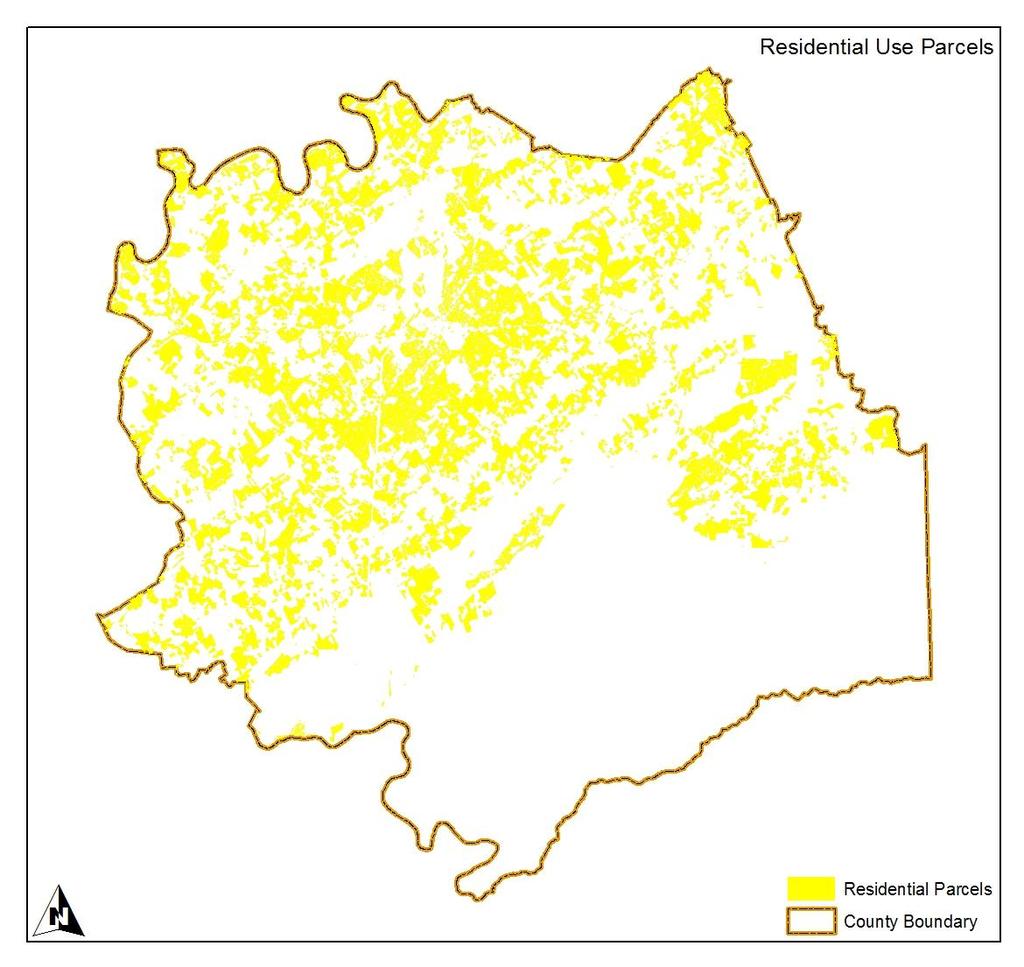
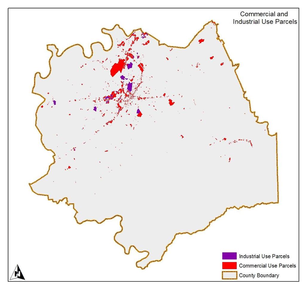
86 84
87 85
.")
88 The following will reference the above five maps in sequence. The map of residential use parcels portrays a pattern that looks denser in the rural areas than the analysis of historical residential development in the previous section (last map in that sequence). This is due to coding whole lots as residential regardless of size. Thus, the pattern of actual intensity of use is relatively overstated in rural areas. Still, the pattern mirrors the scattered nature of residential development in rural areas noted previously. The map of commercial and industrial use parcels shows a pattern of concentration in and around the cities of Alcoa and Maryville in the urbanized area of the county, but with noticeable linear pattern stretching out along major roads. This is not surprising since commercial and industrial activities are generally traffic oriented or oriented to transportation routes. This category included the McGhee Tyson Airport even though technically the airport was owned by the City of Knoxville and could be classified as a public use. The composite map of residential, commercial and industrial uses shows the overall pattern of development in the county, with concentration of development within the urbanized area of Alcoa and Maryville, and with scattered, mainly residential development in the rural areas. The map of agriculture and forest uses begins to fill in the blanks of previous maps, showing a pattern of substantial agriculture and forest use still existing in the rural areas of the county. 86
89 The blanks in this map show that the urban uses in and around Alcoa and Maryville excluded most agriculture and forest use, but there were still some small embedded agriculture use parcels even within the urbanized area. The last map fills in some of the other gaps in the previous maps, showing those lands that were purposefully preserved, particularly the large land holdings of the National Parks Service, and a relatively large wildlife management area in the south of the county. Most of these lands were in forest cover. Some of the preserved lands in conservation easements overlapped with parcels classified as agriculture or forest on the preceding map. The following table presents the land areas and percent of total associated with the general land use categories above. The pie chart on the following page presents the percent of total graphically Land Use Classifications and Acreage From Blount County Assessor Records Land Use Category Acreage Percent of Total Residential 80, Commercial/Industrial 6, Agriculture 111, Forest 29, Great Smoky Mountains National Park 93, Other Public Lands/Utilities 17, Other 8, Total 348, The table and the pie chart show that about 25 percent of the county was developed in residential and commercial and industrial uses. About 40 percent was in agriculture and forest use, and about 27 percent was preserved in the Great Smoky Mountains National Park which was generally forest with some preserved historical agricultural areas. Note that the total land area did not match the land area reported in other sources. Land area from all sources consulted (including Census measurements) ranged between 348,000 to 363,000 acres. The variation probably was due to variations in the detail of county boundary, and/or method of area measurement. 87
90 2010 Land Use - Percent of Total Other Public Lands/Utilities 5% Other 3% Residential 23% Commercial/ Industrial 2% Agriculture 32% Great Smoky Mountains National Park 27% Forest 8% 2006 Land Use Patterns Local Planning Assistance Office Analysis. The map on the following page shows the land use pattern of the county in 2006 produced by the East Tennessee Region Local Planning Assistance Office (LPAO of the Tennessee Department of Economic and Community Development). The information on land use was taken from the Tax Records of the Blount County Assessor s Office through a central database in the Tennessee Office of the Comptroller. The pattern of residential land use (in yellow) was similar to the pattern shown in the last map of historical residential development in a previous section (see at page 82). Note that the LPAO allocation of residential land area used a method that accounted to residential use only the first two acres of tracts with greater than two acres of land area that were classified as residential. The remainder greater than two acres was accounted to agriculture/open space. Using this allocation method reduced the residential pattern effect of large tracts that were accounted in 88

91 total in the previous analysis of 2010 land use, or were accounted to agriculture or forest outside a small home site. Just as population and households found pattern in residential development and land use, economic activity found pattern in commercial development and land use. Like population and households, commercial activity was concentrated in the urban centers of Alcoa and Maryville, but also showed a linear pattern along the major roads in the county. Another concentration of commercial activity was in the Townsend area associated with tourism at a major gateway to the Great Smoky Mountains National Park. Public land was a general category that included publicly owned land and land that was encumbered by some form of public or semi-public easement such as utilities (excluding roads). Of note were some large public lands, the largest being the Great Smoky Mountains National Park, a large wildlife management area in the south of the county, and the large area just to the northwest of Alcoa that contained the McGhee Tyson Airport (owned by Knoxville and accounted to public use). 89
Socio-economic Series Long-term household projections 2011 update
 research highlight October 2011 Socio-economic Series 11-008 INTRODUCTION This Research Highlight presents an update of the projections of household growth for Canada reported in the 2009 Canadian Housing
Rifle city Demographic and Economic Profile
 Rifle city Demographic and Economic Profile Community Quick Facts Population (2014) 9,289 Population Change 2010 to 2014 156 Place Median HH Income (ACS 10-14) $52,539 State Median HH Income (ACS 10-14)
Lehigh Valley Planning Commission
 Lehigh Valley Planning Commission 961 Marcon Boulevard, Suite 310 Allentown, Pennsylvania 18109 Telephone: 610-264-4544 or 1-888-627-8808 E-mail: lvpc@lvpc.org POPULATION PROJECTIONS FOR LEHIGH AND COUNTIES:
DEMOGRAPHIC DRIVERS. Household growth is picking up pace. With more. than a million young foreign-born adults arriving
 DEMOGRAPHIC DRIVERS Household growth is picking up pace. With more than a million young foreign-born adults arriving each year, household formations in the next decade will outnumber those in the last
Demographic Drivers. Joint Center for Housing Studies of Harvard University 11
 3 Demographic Drivers Household formations were already on the decline when the recession started to hit in December 27. Annual net additions fell from 1.37 million in the first half of the decade to only
Population and Labor Force Projections for New Jersey: 2008 to 2028
 Population and Labor Force Projections for New Jersey: 2008 to 2028 by Sen-Yuan Wu, Division of Labor Market and Demographic Research Similar to other northern states, New Jersey has had slower population
Community and Economic Development
 192 193 194 195 196 197 198 199 2 21 22 23 24 2-1 Lycoming County Comprehensive Plan Update 218 Community and Economic Development At a Glance Over the last ten years, has experienced a decline in population,
Population and Household Projections Northeast Avalon Region
 Northeast Avalon Region June 2008 Prepared By: Economic Research and Analysis Division Economics and Statistics Branch Department of Finance P.O. Box 8700 St. John s, NL A1B 4J6 Telephone: (709) 729-3255
Metro Houston Population Forecast
 Metro Houston Population Forecast Projections to 2050 Prepared by the Greater Houston Partnership Research Department Data from Texas Demographic Center www.houston.org April 2017 Greater Houston Partnership
TECHNICAL REPORT NO. 11 (5 TH EDITION) THE POPULATION OF SOUTHEASTERN WISCONSIN PRELIMINARY DRAFT SOUTHEASTERN WISCONSIN REGIONAL PLANNING COMMISSION
 THE POPULATION OF SOUTHEASTERN WISCONSIN PRELIMINARY DRAFT SOUTHEASTERN WISCONSIN REGIONAL PLANNING COMMISSION") TECHNICAL REPORT NO. 11 (5 TH EDITION) THE POPULATION OF SOUTHEASTERN WISCONSIN PRELIMINARY DRAFT 208903 SOUTHEASTERN WISCONSIN REGIONAL PLANNING COMMISSION KRY/WJS/lgh 12/17/12 203905 SEWRPC Technical
TECHNICAL REPORT NO. 11 (5 TH EDITION) THE POPULATION OF SOUTHEASTERN WISCONSIN PRELIMINARY DRAFT 208903 SOUTHEASTERN WISCONSIN REGIONAL PLANNING COMMISSION KRY/WJS/lgh 12/17/12 203905 SEWRPC Technical
E APPENDIX METHODOLOGY FOR LAND USE PROJECTIONS IN THE BOSTON REGION INTRODUCTION
 E APPENDIX METHODOLOGY FOR LAND USE PROJECTIONS IN THE BOSTON REGION INTRODUCTION The Metropolitan Area Planning Council (MAPC), the region s land use planning agency, is responsible for preparing detailed
The Province of Prince Edward Island Employment Trends and Data Poverty Reduction Action Plan Backgrounder
 The Province of Prince Edward Island Employment Trends and Data Poverty Reduction Action Plan Backgrounder 5/17/2018 www.princeedwardisland.ca/poverty-reduction $000's Poverty Reduction Action Plan Backgrounder:
NEW STATE AND REGIONAL POPULATION PROJECTIONS FOR NEW SOUTH WALES
 NEW STATE AND REGIONAL POPULATION PROJECTIONS FOR NEW SOUTH WALES Tom Wilson The New South Wales Department of Planning recently published state and regional population projections for 06 to 36. This paper
Business in Nebraska
 Business in Nebraska VOLUME 61 NO. 684 PRESENTED BY THE UNL BUREAU OF BUSINESS RESEARCH (BBR) OCTOBER 2006 Labor Force Implications of Population Decline in Non-Metropolitan Nebraska By Dr. Randy Cantrell,
10,100 NEW ENTRANTS 1,300 (3%) EMPLOYMENT CHANGE
 EMPLOYMENT CHANGE") CONSTRUCTION & MAINTENANCE LOOKING FORWARD SASKATCHEWAN The pace slows ahead of new opportunities HIGHLIGHTS 2018 2027 2027 The Saskatchewan construction industry has seen significant expansion over the
CONSTRUCTION & MAINTENANCE LOOKING FORWARD SASKATCHEWAN The pace slows ahead of new opportunities HIGHLIGHTS 2018 2027 2027 The Saskatchewan construction industry has seen significant expansion over the
Richmond Community Schools
 2017 Study Prepared by: Carl H. Baxmeyer, AICP, REFP Senior Planner Wightman & Associates, Inc. 2303 Pipestone Road Benton Harbor, MI 49022 cbaxmeyer@wightman-assoc.com Phone: (269) 487-9699 [direct]
Methods and Data for Developing Coordinated Population Forecasts
 Methods and Data for Developing Coordinated Population Forecasts Prepared by Population Research Center College of Urban and Public Affairs Portland State University March 2017 Table of Contents Introduction...
Florida: An Economic Overview
 Florida: An Economic Overview December 26, 2018 Presented by: The Florida Legislature Office of Economic and Demographic Research 850.487.1402 http://edr.state.fl.us Shifting in Key Economic Variables
Population & Demographic Analysis
 Population & Demographic Analysis The United States Census Bureau conducts a nationwide census every ten years. This census compiles information relating to the socio-economic characteristics of the entire
Population Changes and the Economy
 Population Changes and the Economy Predicting the effect of the retirement of the baby boom generation on the economy is not a straightforward matter. J ANICE F. MADDEN SOME ECONOMIC forecasters have suggested
THE ECONOMY AND POPULATION OF THE SOUTHEASTERN WISCONSIN REGION
 THE ECONOMY AND POPULATION OF THE SOUTHEASTERN WISCONSIN REGION NEWSLETTER JANUARY214 The reports were developed under the guidance of the SEWRPC Advisory Committee on Regional Population and Economic
Florida: An Economic Overview
 Florida: An Economic Overview January 26, 2016 Presented by: The Florida Legislature Office of Economic and Demographic Research 850.487.1402 http://edr.state.fl.us Key Economic Variables Improving Economy
A STATISTICAL PROFILE OF WOMEN IN THE SASKATCHEWAN LABOUR MARKET
 A STATISTICAL PROFILE OF WOMEN IN THE SASKATCHEWAN LABOUR MARKET A report prepared for: Status of Women Office Saskatchewan Ministry of Social Services by Sask Trends Monitor April 2017 Table of Contents
Texas: Demographically Different
 FEDERAL RESERVE BANK OF DALLAS ISSUE 3 99 : Demographically Different A s the st century nears, demographic changes are reshaping the U.S. economy. The largest impact is coming from the maturing of baby
SLUGGISH HOUSEHOLD GROWTH
 3 Demographic Drivers Household growth has yet to rebound fully as the weak economic recovery continues to prevent many young adults from living independently. As the economy strengthens, though, millions
Ravenna s most significant growth occurred before Between 1960 and 1980 the city s population declined by 8.5%.
 DRAFT Ravenna Comprehensive Plan Draft May 2008 1 A Profile of Ravenna This section examines demographic trends that will affect Ravenna. The analysis examines population and demographic dynamics, including
NEW ENTRANTS 300 (6.8%) EMPLOYMENT CHANGE
 EMPLOYMENT CHANGE") CONSTRUCTION & MAINTENANCE LOOKING FORWARD Prince Edward Island Steady non-residential growth follows the residential boom HIGHLIGHTS 2018 2027 Prince Edward Island s construction labour market has been
CONSTRUCTION & MAINTENANCE LOOKING FORWARD Prince Edward Island Steady non-residential growth follows the residential boom HIGHLIGHTS 2018 2027 Prince Edward Island s construction labour market has been
1,200 NEW ENTRANTS 400 (9.1%) EMPLOYMENT CHANGE
 EMPLOYMENT CHANGE") CONSTRUCTION & MAINTENANCE LOOKING FORWARD prince edward island An island of growth within Atlantic Canada HIGHLIGHTS 2019 2028 Prince Edward Island is bracing for the busiest construction season ever
CONSTRUCTION & MAINTENANCE LOOKING FORWARD prince edward island An island of growth within Atlantic Canada HIGHLIGHTS 2019 2028 Prince Edward Island is bracing for the busiest construction season ever
Clay County Comprehensive Plan
 2011-2021 Clay County Comprehensive Plan Chapter 1: Demographic Overview Clay County Comprehensive Plan Demographic Overview Population Trends This section examines historic and current population trends
CITY OF STRATFORD OFFICIAL PLAN REVIEW BACKGROUND REPORT DEMOGRAPHIC AND ECONOMIC PROFILE AND POPULATION AND HOUSING GROWTH FORECAST NOVEMBER 21, 2012
 CITY OF STRATFORD OFFICIAL PLAN REVIEW BACKGROUND REPORT DEMOGRAPHIC AND ECONOMIC PROFILE AND POPULATION AND HOUSING GROWTH FORECAST NOVEMBER 21, 2012 IN ASSOCIATION WITH: CONTENTS Page 1. INTRODUCTION
Michigan Socioeconomic Conditions and Trends: West Michigan Compared to East Michigan
 Reports Upjohn Research home page 2007 Michigan Socioeconomic Conditions and Trends: Michigan Compared to Michigan Brad R. Watts W.E. Upjohn Institute Citation Watts, Brad R. 2007. "Michigan Socioeconomic
CITY OF KINGSTON AND KINGSTON CMA POPULATION, HOUSING AND EMPLOYMENT PROJECTIONS
 CITY OF KINGSTON AND KINGSTON CMA POPULATION, HOUSING AND EMPLOYMENT PROJECTIONS September 2013 CITY OF KINGSTON AND KINGSTON CMA POPULATION, HOUSING AND EMPLOYMENT PROJECTIONS HIGHLIGHTS OF THE REPORT
Nova Scotia Retirements drive rising hiring requirements, despite muted growth outlook
 CONSTRUCTION & MAINTENANCE LOOKING FORWARD Nova Scotia Retirements drive rising hiring requirements, despite muted growth outlook The Nova Scotia construction industry has seen significant expansion over
Projections for Western North Dakota Bottineau County
 Projections for Western North Dakota Bottineau County Acknowledgments Analysts Dean Bangsund, NDSU Dr. Nancy Hodur, NDSU Funders North Dakota Association of Oil and Gas Producing Counties North Dakota
WHO S LEFT TO HIRE? WORKFORCE AND UNEMPLOYMENT ANALYSIS PREPARED BY BENJAMIN FRIEDMAN JANUARY 23, 2019
 JANUARY 23, 2019 WHO S LEFT TO HIRE? WORKFORCE AND UNEMPLOYMENT ANALYSIS PREPARED BY BENJAMIN FRIEDMAN 13805 58TH STREET NORTH CLEARNWATER, FL, 33760 727-464-7332 Executive Summary: Pinellas County s unemployment
Cumberland Comprehensive Plan - Demographics Element Town Council adopted August 2003, State adopted June 2004 II. DEMOGRAPHIC ANALYSIS
 II. DEMOGRAPHIC ANALYSIS A. INTRODUCTION This demographic analysis establishes past trends and projects future population characteristics for the Town of Cumberland. It then explores the relationship of
Wellesley Public Schools, MA Demographic Study. February 2013
 Wellesley Public Schools, MA Demographic Study February 2013 Table of Contents Executive Summary 1 Introduction 2 Data 3 Assumptions 3 Methodology 5 Results and Analysis of the Population Forecasts 6 Table
The Health of Jefferson County: 2010 Demographic Update
 The Health of : 2010 Demographic Update BACKGROUND How people live the sociodemographic context of their lives influences their health. People who have lower incomes may not have the resources to meet
City of Edmonton Population Change by Age,
 Population Change by Age, 1996-2001 2001 Edmonton Demographic Profile The City of Edmonton s 2001population increased by 49,800 since the 1996 census. Migration figures are not available at the municipal
MANITOBA Building to a plateau
 CONSTRUCTION & MAINTENANCE LOOKING FORWARD MANITOBA Building to a plateau HIGHLIGHTS 2017 2026 DISTRIBUTION OF CONSTRUCTION EMPLOYMENT IN 2017, MANITOBA Construction activity in Manitoba is expected to
Investment Company Institute and the Securities Industry Association. Equity Ownership
 Investment Company Institute and the Securities Industry Association Equity Ownership in America, 2005 Investment Company Institute and the Securities Industry Association Equity Ownership in America,
Williston Basin 2016: Employment, Population, and Housing Projections
 Williston Basin 2016: Employment, Population, and Housing Projections Vision West Consortium Meeting December 8, 2016 Dickinson, ND Dean A. Bangsund Department of Agribusiness and Applied Economics Nancy
NSW Long-Term Fiscal Pressures Report
 NSW Long-Term Fiscal Pressures Report NSW Intergenerational Report 2011-12 Budget Paper No. 6 Table of Contents Executive Summary... i Chapter 1: Background to the Report 1.1 Fiscal Sustainability... 1-1
Lake County. Government Finance Study. Supplemental Material by Geography. Prepared by the Indiana Business Research Center
 County Government Finance Study Supplemental Material by Geography Prepared by the Indiana Business Research www.ibrc.indiana.edu for Sustainable Regional Vitality www.iun.edu/~csrv/index.shtml west Indiana
Her Majesty the Queen in Right of Canada (2018) All rights reserved
 All rights reserved") 0 Her Majesty the Queen in Right of Canada (2018) All rights reserved All requests for permission to reproduce this document or any part thereof shall be addressed to the Department of Finance Canada.
0 Her Majesty the Queen in Right of Canada (2018) All rights reserved All requests for permission to reproduce this document or any part thereof shall be addressed to the Department of Finance Canada.
NEWFOUNDLAND & LABRADOR
 CONSTRUCTION & MAINTENANCE LOOKING FORWARD NEWFOUNDLAND & LABRADOR At the midpoint of the down-cycle; stable demands ahead HIGHLIGHTS 2018 2027 2027 The Newfoundland and Labrador construction industry
Monitoring the Performance of the South African Labour Market
 Monitoring the Performance of the South African Labour Market An overview of the South African labour market for the Year Ending 2012 8 October 2012 Contents Recent labour market trends... 2 A labour market
In contrast to its neighbors and to Washington County as a whole the population of Addison grew by 8.5% from 1990 to 2000.
 C. POPULATION The ultimate goal of a municipal comprehensive plan is to relate the town s future population with its economy, development and environment. Most phases and policy recommendations of this
MEMORANDUM. Gloria Macdonald, Jennifer Benedict Nevada Division of Health Care Financing and Policy (DHCFP)
") MEMORANDUM To: From: Re: Gloria Macdonald, Jennifer Benedict Nevada Division of Health Care Financing and Policy (DHCFP) Bob Carey, Public Consulting Group (PCG) An Overview of the in the State of Nevada
MEMORANDUM To: From: Re: Gloria Macdonald, Jennifer Benedict Nevada Division of Health Care Financing and Policy (DHCFP) Bob Carey, Public Consulting Group (PCG) An Overview of the in the State of Nevada
Monitoring the Performance of the South African Labour Market
 Monitoring the Performance of the South African Labour Market An overview of the South African labour market from 1 of 2009 to of 2010 August 2010 Contents Recent labour market trends... 2 A brief labour
Fast Facts & Figures About Social Security, 2005
 Fast Facts & Figures About Social Security, 2005 Social Security Administration Office of Policy Office of Research, Evaluation, and Statistics 500 E Street, SW, 8th Floor Washington, DC 20254 SSA Publication
SPRUCE GROVE Demographic Report 2016
 SPRUCE GROVE Demographic Report 2016 Contents Background... 4 Item Non Response... 4 20 years of Population Growth... 5 Age and Gender Distribution, City of Spruce Grove 2016... 6 City of Spruce Grove
Poverty in the United Way Service Area
 Poverty in the United Way Service Area Year 4 Update - 2014 The Institute for Urban Policy Research At The University of Texas at Dallas Poverty in the United Way Service Area Year 4 Update - 2014 Introduction
SASKATCHEWAN Re-calibration ahead as resource expansion slows
 CONSTRUCTION & MAINTENANCE LOOKING FORWARD SASKATCHEWAN Re-calibration ahead as resource expansion slows HIGHLIGHTS 2017 2026 DISTRIBUTION OF CONSTRUCTION EMPLOYMENT IN 2017, SASKATCHEWAN Construction
8,400 NEW ENTRANTS 2,600 (-6.5%) EMPLOYMENT CHANGE
 EMPLOYMENT CHANGE") CONSTRUCTION & MAINTENANCE LOOKING FORWARD Manitoba Construction investment slows from the peak HIGHLIGHTS 2018 2027 The Manitoba construction industry has seen a significant expansion over the past decade,
CONSTRUCTION & MAINTENANCE LOOKING FORWARD Manitoba Construction investment slows from the peak HIGHLIGHTS 2018 2027 The Manitoba construction industry has seen a significant expansion over the past decade,
Patterns of Unemployment
 Patterns of Unemployment By: OpenStaxCollege Let s look at how unemployment rates have changed over time and how various groups of people are affected by unemployment differently. The Historical U.S. Unemployment
RESIDENTIAL SUMMARY 94,100 NEW ENTRANTS 37,400 (-7.3%) EMPLOYMENT CHANGE
 EMPLOYMENT CHANGE") CONSTRUCTION & MAINTENANCE LOOKING FORWARD RESIDENTIAL SUMMARY Retirements dominate hiring needs; 118,000 expected to retire by 2026 New workers will be required in residential construction over the 2017
CONSTRUCTION & MAINTENANCE LOOKING FORWARD RESIDENTIAL SUMMARY Retirements dominate hiring needs; 118,000 expected to retire by 2026 New workers will be required in residential construction over the 2017
Maine's Economic Forecast: Modest Growth Ahead
 Maine Policy Review Volume 2 Issue 3 1993 Maine's Economic Forecast: Modest Growth Ahead Laurie LaChance Follow this and additional works at: https://digitalcommons.library.umaine.edu/mpr Part of the Growth
Her Majesty the Queen in Right of Canada (2017) All rights reserved
 All rights reserved") Her Majesty the Queen in Right of Canada (2017) All rights reserved All requests for permission to reproduce this document or any part thereof shall be addressed to the Department of Finance Canada. Cette
Her Majesty the Queen in Right of Canada (2017) All rights reserved All requests for permission to reproduce this document or any part thereof shall be addressed to the Department of Finance Canada. Cette
Home Mortgage Disclosure Act Report ( ) Submitted by Jonathan M. Cabral, AICP
 Submitted by Jonathan M. Cabral, AICP") Home Mortgage Disclosure Act Report (2008-2015) Submitted by Jonathan M. Cabral, AICP Introduction This report provides a review of the single family (1-to-4 units) mortgage lending activity in Connecticut
Home Mortgage Disclosure Act Report (2008-2015) Submitted by Jonathan M. Cabral, AICP Introduction This report provides a review of the single family (1-to-4 units) mortgage lending activity in Connecticut
2. Demographics. Population and Households
 2. Demographics This analysis describes the existing demographics in. It will be used to identify the major demographic trends that may have an effect on public policy in in the next decade. Demographic
The Beehive Shape: Provisional 50-Year Demographic and Economic Projections for the State of Utah,
 Policy Brief October 2016 The Beehive Shape: Provisional 50-Year Demographic and Economic Projections for the State of Utah, 2015-2065 Authored by: Mike Hollingshaus, Ph.D., Emily Harris, M.S., Catherine
Millennials Have Begun to Play Homeownership Catch-Up
 Millennials Have Begun to Play Homeownership Catch-Up Since the onset of the housing bust, bad news has inundated the homeownership market. The national homeownership rate has fallen to multi-decade lows,
Women in the Labor Force: A Databook
 Cornell University ILR School DigitalCommons@ILR Federal Publications Key Workplace Documents 12-2010 Women in the Labor Force: A Databook Bureau of Labor Statistics Follow this and additional works at:
Lake County. Government Finance Study. Supplemental Material by Geography. Prepared by the Indiana Business Research Center
 County Government Finance Study Supplemental Material by Geography Prepared by the Indiana Business Research www.ibrc.indiana.edu for Sustainable Regional Vitality www.iun.edu/~csrv/index.shtml west Indiana
SOME IMPORTANT CHANGES IN THE STRUCTURE OF IRISH SOCIETY. A REVIEW OF PAST DEVELOPMENTS AND A PERSPECTIVE ON THE FUTURE. J.J.Sexton.
 SOME IMPORTANT CHANGES IN THE STRUCTURE OF IRISH SOCIETY. A REVIEW OF PAST DEVELOPMENTS AND A PERSPECTIVE ON THE FUTURE J.J.Sexton February 2001 Working Paper No. 137 1 CONTENTS Introductory Note...3 I.
HEMSON C o n s u l t i n g L t d.
 GROWTH OUTLOOK TO 2036 City of Greater Sudbury DRAFT C o n s u l t i n g L t d. May 2013 TABLE OF CONTENTS EXECUTIVE SUMMARY... 1 I II III INTRODUCTION AND PURPOSE... 3 POSITIVE GROWTH OUTLOOK FOR GREATER
Greater Knoxville Annual Report Card 2018
 Greater Knoxville Annual Report Card 2018 This report is the work of the Power Up! Committee of ConnectKnox, and represents a partnership between researchers at the Knoxville Chamber, the Knoxville- Metropolitan
Monitoring the Performance of the South African Labour Market
 Monitoring the Performance of the South African Labour Market An overview of the South African labour market for the Year ending 2011 5 May 2012 Contents Recent labour market trends... 2 A labour market
Looking to the Future, Now. Mackenzie and Area Seniors Needs Project. Population Background and Trends Report
 Looking to the Future, Now Mackenzie and Area Seniors Needs Project Population Background and Trends Report prepared by: Rachael Clasby, Greg Halseth, and Neil Hanlon Geography Program University of Northern
The Economic Downturn and Changes in Health Insurance Coverage, John Holahan & Arunabh Ghosh The Urban Institute September 2004
 The Economic Downturn and Changes in Health Insurance Coverage, 2000-2003 John Holahan & Arunabh Ghosh The Urban Institute September 2004 Introduction On August 26, 2004 the Census released data on changes
Women in the Labor Force: A Databook
 Cornell University ILR School DigitalCommons@ILR Federal Publications Key Workplace Documents 12-2011 Women in the Labor Force: A Databook Bureau of Labor Statistics Follow this and additional works at:
Monitoring the Performance of the South African Labour Market
 Monitoring the Performance of the South African Labour Market An overview of the South African labour market for the Year Ending 2012 6 June 2012 Contents Recent labour market trends... 2 A labour market
THE BABY BOOM CHART BOOK 1997
 Deutsche Morgan Grenfell US Equity Research Portfolio Strategy Service # The Economic Consequences Of The Peace #3 Conference Call With Alan Blinder #37 New Era Recession? #3 Fed s Stock Market Model Finds
Labor Force Participation Rates by Age and Gender and the Age and Gender Composition of the U.S. Civilian Labor Force and Adult Population
 May 8, 2018 No. 449 Labor Force Participation Rates by Age and Gender and the Age and Gender Composition of the U.S. Civilian Labor Force and Adult Population By Craig Copeland, Employee Benefit Research
ECONorthwest ECONOMICS FINANCE PLANNING
 ECONorthwest ECONOMICS FINANCE PLANNING DATE: July 13th, 2015 TO: TriMet Board of Directors FROM: Andrew Dyke, Senior Economist SUBJECT: PORTLAND ECONOMIC RECOVERY ANALYSIS Introduction TriMet contracted
Household Income Trends April Issued May Gordon Green and John Coder Sentier Research, LLC
 Household Income Trends April 2018 Issued May 2018 Gordon Green and John Coder Sentier Research, LLC Household Income Trends April 2018 Source This report on median household income for April 2018 is based
GROWTH STRATEGY REPORT FOR THE OKANAGAN SIMILKAMEEN REGION, 2004 to 2031
 GROWTH STRATEGY REPORT FOR THE OKANAGAN SIMILKAMEEN REGION, 2004 to 2031 Population Age Profile, Okanagan Similkameen RD, 2004 and 2031 100 95 90 85 80 75 70 65 60 55 50 45 40 35 30 25 20 15 10 5 0 Female
EXECUTIVE OFFICE OF THE PRESIDENT COUNCIL OF ECONOMIC ADVISERS WASHINGTON, DC 20502
 EXECUTIVE OFFICE OF THE PRESIDENT COUNCIL OF ECONOMIC ADVISERS WASHINGTON, DC 20502 Prepared Remarks of Edward P. Lazear, Chairman Productivity and Wages At the National Association of Business Economics
Georgia Per Capita Income: Identifying the Factors Contributing to the Growing Income Gap with Other States
 Georgia Per Capita Income: Identifying the Factors Contributing to the Growing Income Gap with Other States Sean Turner Fiscal Research Center Andrew Young School of Policy Studies Georgia State University
Labor Force Participation in New England vs. the United States, : Why Was the Regional Decline More Moderate?
 No. 16-2 Labor Force Participation in New England vs. the United States, 2007 2015: Why Was the Regional Decline More Moderate? Mary A. Burke Abstract: This paper identifies the main forces that contributed
J. D. Kennedy, M.C.I.P., R.P.P. C. A. Tyrrell, M.C.I.P., R.P.P. Associate
 MARSHALL MACKLIN MONAGHAN LIMITED 80 COMMERCE VALLEY DR. EAST THORNHILL, ONTARIO L3T 7N4 TEL: (905) 882-1100 FAX: (905) 882-0055 EMAIL: mmm@mmm.ca WEB SITE: www.mmm.ca January 6, 2004 File No. 14.02138.01.P01
UNEMPLOYMENT RATES IMPROVING IN THE DISTRICT By Caitlin Biegler
 An Affiliate of the Center on Budget and Policy Priorities 820 First Street NE, Suite 460 Washington, DC 20002 (202) 408-1080 Fax (202) 408-8173 www.dcfpi.org UNEMPLOYMENT RATES IMPROVING IN THE DISTRICT
Maine s Labor Market Recovery: Far From Complete by Joel Johnson and Garrett Martin
 April 1, 2014 Maine s Labor Market Recovery: Far From Complete by Joel Johnson and Garrett Martin Nearly five years after the end of the worst recession since the 1930s, Maine s economic recovery is still
CRS Report for Congress Received through the CRS Web
 Order Code RL33387 CRS Report for Congress Received through the CRS Web Topics in Aging: Income of Americans Age 65 and Older, 1969 to 2004 April 21, 2006 Patrick Purcell Specialist in Social Legislation
Additional Slack in the Economy: The Poor Recovery in Labor Force Participation During This Business Cycle
 No. 5 Additional Slack in the Economy: The Poor Recovery in Labor Force Participation During This Business Cycle Katharine Bradbury This public policy brief examines labor force participation rates in
OVERVIEW OF THE SAN DIEGO REGION Current Conditions and Future Trends
 OVERVIEW OF THE SAN DIEGO REGION Current Conditions and Future Trends Why do we need a Regional Comprehensive Plan? Let s examine the facts. It helps to look at some objective statistical information that
Short- Term Employment Growth Forecast (as at February 19, 2015)
") Background According to Statistics Canada s Labour Force Survey records, employment conditions in Newfoundland and Labrador showed signs of weakening this past year. Having grown to a record level high
Background According to Statistics Canada s Labour Force Survey records, employment conditions in Newfoundland and Labrador showed signs of weakening this past year. Having grown to a record level high
POPULATION GROWTH AND THE CONTEXT FOR MANAGING CHANGE
 THE FRASER VALLEY REGIONAL DISTRICT: POPULATION GROWTH AND THE CONTEXT FOR MANAGING CHANGE 92,684 Population Growth, Fraser Valley Regional District, 1971 to 2003 Estimated, Projected to 2031 1971 1974
AUGUST 2012 An Update to the Budget and Economic Outlook: Fiscal Years 2012 to 2022 Provided as a convenience, this screen-friendly version is identic
 AUGUST 2012 An Update to the Budget and Economic Outlook: Fiscal Years 2012 to 2022 Provided as a convenience, this screen-friendly version is identical in content to the principal, printer-friendly version
POPULATION 1 I. INTRODUCTION BACKGROUND POLICY:
 POPULATION 1 POLICY: FOR PLANNING PURPOSES, JACKSON COUNTY SHALL MONITOR POPULATION TRENDS AND ASSIST IN THE DEVELOPMENT OF POPULATION FORECASTS. THESE FORECASTS SHALL BE DEVELOPED IN COOPERATION WITH
ECONOMICS AND STATISTICS BRANCH DEPARTMENT OF FINANCE
 ECONOMICS AND STATISTICS BRANCH DEPARTMENT OF FINANCE The Branch is responsible for meeting the broad macroeconomic and statistical requirements of Government and its agencies. As part of this mandate,
Debt. In the third quarter of 2016, the upward. Consumer Debt Growth Stalls Despite Strong Sectors. Executive Summary
 VOL., ISSUE 3, COVERING 6:Q3 Debt Consumer Debt Growth Stalls Despite Strong Sectors By Lowell R. Ricketts and Don E. Schlagenhauf In the third quarter of 6, the upward trend in per capita consumer debt
32,800 NEW ENTRANTS 2,300 (-1.3%) EMPLOYMENT CHANGE
 EMPLOYMENT CHANGE") CONSTRUCTION & MAINTENANCE LOOKING FORWARD British Columbia Stacked major project demands; market challenges loom HIGHLIGHTS 2018 2027 British Columbia is facing very tight construction labour markets
CONSTRUCTION & MAINTENANCE LOOKING FORWARD British Columbia Stacked major project demands; market challenges loom HIGHLIGHTS 2018 2027 British Columbia is facing very tight construction labour markets
The South West Its People and Future
 The South West Its People and Future John Henstridge Data Analysis Australia UDIA Bunker Bay 2004 Overview The Myth Population movements Population Structure How we understand it Forecast models The Grey
Regional Economic Benchmarking Report For Aiken County 2016 Update
 Regional Economic Benchmarking Report For Aiken County 2016 Update Commissioned by the Greater Aiken Chamber of Commerce and the Economic Development Partnership of Aiken, Edgefield and Saluda Counties,
CURRENT DEMOGRAPHICS & CONTEXT GROWTH FORECAST SOUTHERN CALIFORNIA ASSOCIATION OF GOVERNMENTS APPENDIX
 CURRENT DEMOGRAPHICS & CONTEXT GROWTH FORECAST SOUTHERN CALIFORNIA ASSOCIATION OF GOVERNMENTS APPENDIX PROPOSED FINAL MARCH 2016 INTRODUCTION 1 FORECASTING PROCESS 1 GROWTH TRENDS 2 REGIONAL GROWTH FORECAST
Population Forecasts for Lane County, its Cities and Unincorporated Area
 ulation Forecasts for Lane County, its Cities and Unincorporated Area 2008-2035 Prepared by: ulation Research Center College of Urban and Public Affairs Portland State University May 2009 ulation Forecasts
Household Income Trends March Issued April Gordon Green and John Coder Sentier Research, LLC
 Household Income Trends March 2017 Issued April 2017 Gordon Green and John Coder Sentier Research, LLC 1 Household Income Trends March 2017 Source This report on median household income for March 2017
Retirement Income Scenario Matrices. William F. Sharpe. 1. Demographics
 Retirement Income Scenario Matrices William F. Sharpe 1. Demographics This is a book about strategies for producing retirement income personal income during one's retirement years. The latter expression