Complete Descriptive Analytics. Dr. A.N. Sah
|
|
|
- Silvester Wheeler
- 6 years ago
- Views:
Transcription

1
2 Complete Descriptive Analytics Dr. A.N. Sah
3 To my daughter Devanshi
4 Preface This is ebook is carefully design for students and professionals who want to do descriptive analysis for decision making. This ebook not only provide conceptual clarity but also tell you how to carry out analytics using MS Excel. The various topics it includes are: Line Chart, Bar Chart, Sub-divided Bar Graph, Percentage Bar Graph, Pie Chart, Doughnut Chat, Area Chart, Stock Chart, Scatter Chart, Bubble Chart,
5 Measures of Central Tendency, Measures of Dispersion and Measures of Shape.
6 Contents Chapter 1: Introduction to Data Analytics Chapter 2: Data Visualization and Representation Chapter 3: Descriptive Analytics by Numerical Methods Chapter 4: Covariance and Correlation Chapter 5: Regression
7 Detailed Contents Introduction to Data Analytics Diagrammatic Representation Graphic Representation Line Chart Bar Chart Sub-divided Bar Graph Percentage Bar Graph Pie Chart Doughnut Chat Area Chart Stock Chart Scatter Chart
8 Bubble Chart Frequency Distribution Frequency Polygon Histogram Ogive Exploratory Data Analysis: The Stem-and-Leaf Display Cross Tabulation Summarizing Data: Numerical Methods Measures of Central Tendency Mean Median Mode
9 Quartile Percentile Measures of Dispersion Range Inter-quartile Range Variance Standard Deviation Coefficient of Variation Measures of Shape Symmetrical Distribution Asymmetrical Distribution Skewness Kurtosis
10 Tchebycheff Theorem z-scores Exploratory Data Analysis Five-Number Summary Box-Plot Working with Grouped Data Weighted Mean Arithmetic Mean in Case of Grouped Data Variance in case of Grouped Data Covariance and Correlation Regression
11 Chapter 1 Introduction to Data Analytics Introduction Numerical facts and figures are called data. Consider the following examples: Indian economy will grow by 9-10 % per annum in coming 5 years. The money supply in the US economy is increasing by 5% every year. Some Stock market analysts believe that BSE Sensesx will be at 35,000 points by 2020 A.D. The male-female ration in India is
12 980 as per 2011 census. The population of India is growing by above 2% every year. The voters turn out in India is only 50%. The literacy rate in Bihar even after 50 years of Independence is only 47%. The inflation in India in the year was below 4%. To conduct any kind of empirical analysis analysts in business and economics or for that matter in any field require data. Once the data is in hand, the first problem before the analyst is how data should be handled so that meaningful inferences can be drawn
13 from it. This chapter provides basics of data handling. Essentially, it focuses on: (1) the types of data used in business analysis; (2) use of various graphs for presenting information; (3) descriptive statistics which are used numerically to summarize main characteristics of a data set. Meaning of Data As said earlier, numerical facts and figures are called data. In fact, data is nothing but meaning of statistics in plural sense. In plural sense, it is used to denote and refer to numerical and quantitative information. For example, Bill scored 72 marks in business statistics paper. In 2015, while Chinese
14 economy grew at 6.5 per cent Indian economy grew at 7.5 per cent annum. These numerical and quantitative informations are called data. They are collected, tabulated, summarized, and analyzed for presentation and interpretation. Elements and Variables The unit on which data are collected is known as elements. Table 1.1: Marks of Students Name of Students Bob Alan Alisha Mike Marks obtained
15 For example in the above Table 1.1, each individual student is an element. Data in the table 1.1 contains four elements. A variable is a characteristic of the elements. In the Table 1.1, mark obtained is the variable. Thus, Bob (Element) Marks Obtained (Variable) Measurements on variable provide data.
16 Measurements obtained for a particular element is called an observation. Thus, Bob (Element) Marks Obtained (Variable) 75 (observation). Levels of Measurement There are generally four types of variables encountered in empirical analysis. The type of variable under consideration plays an important role in selecting appropriate statistical tool for analysis. For instance, it is not advisable to compute arithmetic mean of
17 nominal scale variable. These various types of variables and its nature are discussed as follows: Nominal Scale Variables Nominal scale variable is very common in marketing or social science research. A nominal scale divides data into categories which are mutually exclusives and collectively exhaustive. In other words, a data point is grouped under one and only one category and all other data will grouped somewhere else in the scale. The word nominal means namelike which means that the numbers
18 or codes given to objects or events are naming or classifying only. These numbers have no true meaning and thus cannot be added, multiplied or divided. They are simply labels or identification number. The following are examples of nominal scales: Gender: (1) Men (2) Women Nationality: (1) Indian (2) American (3) Other
19 What kind of analysis can be done on this type of data? We can only find the numbers and percentages of items in each group. The only appropriate statistical tool which can be applied to such data is mode. Ordinal Scale Variables Ordinal scale is one step further in levels of measurement. Ordinal scales not only classify data into categories but also order them. One point to note here is that ordinal measurement requires transitivity assumption which is
20 described as: if A is preferred to B, and B is preferred to C, then A is preferred to C. The following is an example of ordinal scale: Please rank the following cars by look from 1 to 5 with 1 being most stylish and 5 the least stylish. Enzo Ferrari ( ) Koenigsegg CCXR ( ) McLareb F1 ( ) Bugati Veyron ( ) Lamborghini Reventon ( ) Numbers in an ordinal scale only stand for rank order. They do not represent absolute quantities and the interval between two numbers need not be equal. In case of ordinal scaled data
21 mathematical operations such as addition and division cannot be permitted. Mode and median can be found but arithmetic mean must not be computed. One can also use quartile and percentile for measuring variation. Interval and Ratio Scale Variables Interval scales take measurement one step further. It has all the characteristics of ordinal scales in addition to equal interval between the points on the scale. On interval scales common mathematical operations are permitted. One can find arithmetic mean, variance and other statistics. Ratio scales have a meaningful origin or
22 absolute zero in addition to all the features of interval scale. Since the origin or location of zero point is universally acceptable, we can compare magnitudes of ratio-scaled variables. In other words, this scale includes a zero value to indicate that nothing exists for the variable at the zero point. For example, if the price of a smart phone is zero means it has no cost and it is free. Suppose the price of Apple smart phone is Rs and the price of Micromax phone is Rs It can be infer that price of Apple phone is twice of Micromax. Examples of ratio scales are income, weights, etc. All types of statistical and mathematical computations are permitted on ratio-
23 scaled variables. Types of Data There are three common types of data Time Series Data A time series data is a sequence of observations ordered in time. For example data on real gross domestic product, money supply, inflation, etc. are collected at specific points in time, say yearly. These data are ordered by time and are called time series. The observations made on GDP or money supply at time t and t+1 are separated
24 by some unit of time such as days, weeks, months or years. The following are some examples of time series data: Annual GDP at current price from1950 to 2016 Monthly figures on broad money (M 3 ) from April 2005 to March 2016 Profits of Reliance Industry over 20 years Daily closing price of BSE Sensex over 10 years Macroeconomist who studies economy as a whole often works with time series data on important macroeconomic
25 variables like real GDP and inflation, etc. Cross-Sectional Data Cross-sectional data refers to parallel data on many units such as individuals, firms, countries, etc. at the same point of time. The following are few examples of cross sectional data: Profits of 50 firms in Per capita income of 100 nations in 2016 Heights and weights of 500 people in a company in 2016.
26 Income, education and experience of 2500 workers in a locality in In economics field, micro economists often work with cross-sectional data. For example, suppose a labor economist wish to know how much the workers of the textile industry earn. To this end, he asks 100 workers how much they earn. Thus, income of 100 workers in textile industry is nothing but cross sectional data. Panel Data Panel data contains features of both time
27 series as well as cross sectional data. In panel data analysis the same cross section unit is surveyed over time. The following are examples of panel data: Growth rate of M 3 of 20 countries from 1995 to 2015 Profits of 100 firms over 10 years Rate of return of 120 mutual funds over 15 years
28 Chapter 2 Data Visualization and Representation Introduction Descriptive analytics means describing any phenomenon in terms of graph, pictures, symbols and mathematical expressions. Describing data related to economy, business and other areas is the first step in data handling. There is a famous saying, one picture is worth a thousand words. Summarizing data through graphic representation involves use of graph and charts to
29 report key features of data. Diagrammatic Representation Diagrams and graphs are useful because they provide a bird s eye view of the entire data and information presented is easily understood. However, a distinction is there between diagram and graph. A diagram is generally constructed on a plain paper. Diagrams are better suited for publicity, campaign, and promotion. Steps for Constructing Diagram Step 1: Diagram must be given a suitable title. The title should convey the
30 main idea in a few possible words that the diagram intends to portray. Step 2: Proper proportion between the width and height of the diagram should be maintained. Step 3: Scale should be in even numbers or multiple of five. Odd scale of 1, 3, 5, 7, 9 should be avoided. Step 4: Footnote should be given at the bottom of the diagram. Step 5: An index of different types of lines or shades, colors should be used which may help in understanding the meaning of diagram.
31 Graphic Representation Graph brings the figures in concrete form. In constructing a graph we generally make use of a graph paper. For representing frequency distributions and time series, graphs are more appropriate than diagrams. Graphs indicate trends and relations. Method of Construction of Graph. Graphs are drawn on a special type of paper called graph paper which has a network of horizontal and vertical lines. The thick lines for each division of a centimeter or an inch measure and the thin lines of small parts are the same.
32 . In a graph of any size, two straight lines are drawn at right angle to each other, intersecting at point O is called origin.. Two lines are called co-ordinate axis, horizontal line is called X-axis and is denoted by X OX and vertical line is called Y-axis and is denoted by Y OY.. Graph is divided in four quadrants. Generally we use first quadrant unless negative magnitudes are to be displayed.
33 . Scale along the axis should be chosen that the entire data can be accommodated in available space without crowding. If data are irregular use false line. In this chapter, we will discuss
34 techniques to present graphically time series and cross-sectional data which are frequently used in economic and business analysis. Line Chart Line graph is used to present a particular variable measured at various points over time. It is drawn by connecting lines between two data points. A line graph is very useful in highlighting trends in a variable over time. Monthly closing stock prices data of Facebook, Inc., from 18 th May 2012 through 1st February 2017 is shown in Figure 2.1 is an example of line chart. This data set contains 58 observations and it is
35 difficult for a reader to comprehend anything meaningful observing raw data. However, a reader can easily grasp the main characteristics and its trend over the years looking at the line graph. Figure 2.1
36 As evident from Fig. 1.1, the stock price of Facebook shows a rising trend after 18 th May, 2013; before this the stock price of Facebook has remained stagnant almost for a year. The stock price of Facebook was around $30 in May 2012 and it crossed $50 somewhere in mid of The trend in the stock is up and as on 1 st February 2017, the stock was quoting a price of $ Computer Application Microsoft Excel with Chart Wizard can generate line graph. To construct line graph in Excel, enter label and data into a column. Choose Insert from the menu bar, then go for Chart from the pull
37 down menu. Select Line from this and follow the instructions and in four steps line graph is completed. There are options in Excel such as including a legend, deciding data labels and finally deciding the location of the chart. Using Excel Many of the graphs such as line graph, bar graph and scatter plot discussed in this chapter can be generated by the help of Chart Wizard. Excel can also generate histogram using Data Analysis. Line Graph Step 1: Open Excel and entered the data in columns or rows in the worksheet as
38 shown below.
39
40 Step 2: Select the data
41 Step 3: On the Insert Tab, in the chart group, click the line chart icon
42
43
44 Step 4: If you click on the first option, excel generate the line chart shown below:
45 Step 5: Put cursor on the figure and click. Chart Tools will appear above the
46 toolbar. After this, click layout, you will find options line Axis Title, Chart Title, etc. Step 6: For labeling X-axis, click Axis Title and select Primary Horizontal axis title from drop menu. When you will click primary horizontal axis title another drop menu will appear. Click Title Below Axis, a box will appear below X-axis.
47 Step 7: Write the name of variable in the box as shown below
48 Step 8: For labeling Y-axis, click Axis
49 Title and select Primary vertical axis title from drop menu. When you will click primary vertical axis title another drop menu will appear. Click either vertical title or horizontal title; a box will appear on Y-axis.

50
51 Step 9: Write the name of variable in the box
52 Step 10: If you want to put chart title
53 then click chart Title; a drop menu will appear. Next, select either Centered Overtay Title or Above Chart.
54
55 Step 11: Write the chart title in the box.
56 Bar Graph Simple bar graph is used to represent the figures on a single variable. Figures of profits of different companies in a particular year, population in various years etc may be represented by bar graph. Bar graph has same width but the length is drawn in proportion to the size of the figure. Table 2.1: Sales/ Revenue of Facebook Year Revenue ($ Billions)
57 Table 2.1 gives figures on sales of the Facebook from 2012 to This information may be represented by bar graph which provides a visual display of this information. Fig. 2.1 Sales/ Revenue of Facebook
58 Fig. 2.1 shows revenue of the Facebook during 2012 and The sales of the Facebook which was merely 5 billion dollars in 2012, it has increased in excess of 25 billion dollars in 2016.
59 Computer Application Microsoft Excel with Chart Wizard can also generate bar graph. To construct bar graph in Excel, enter label into one column and data into another column. Choose Insert from the menu bar, then go for Chart from the pull down menu. Select Bar from this and follow the instructions and in four steps line graph is completed. There are options in Excel such as including a legend, deciding data labels and finally deciding the location of the chart Using Excel Step 1: Open Excel and entered data as shown below
60 Step 2: Click Insert on the toolbar the
61 screen below will appear
62
63 Step 3: Select data and click Column as shown below
64 Step 4: If you click on the first option the screen below will appear
65
66 Step 5: The procedure for labeling the bar chart is same to that of line graph discussed under step 5 to step 11. Following those steps the bar graph produced in Excel is shown below:
67
68 Multiple Bar Graph When you want to compare two or more independent variables, it is better to construct two bars side by side instead of drawing two separate bar graphs at two different places. In multiple bar graph two or more bars are drawn together on a common scale using different shades for different series. For example, if you want to compare the revenue and expenditure of a country each year, you can draw two bars together to show the revenue and expenditure each year. Illustration The following table shows the Sales of Apple Inc.($ Billions) and cost of goods
69 sold ($ billions) from 2012 to Year Sales of Apple Inc ($ billion) The information in the above table can be suitably represented by using multiple bar diagram. Fig. 2.3: Sales of Apple Inc. and cost of goods sold from 2012 to 2016
70 From the above multiple bar graph, it is
71 clear that total sales of Apple Inc. is always higher than total cost of goods sold. Both the variables move in tandem. Computer Application Step 1: Enter data in excel sheet as shown below
72 Step 2: Click Insert on the toolbar then the screen below will appear
73
74 Step 3: Select data as shown below
75
76 Step 4: Next click Column as shown below
77
78 Step 5: Click on the first option then the screen will appear as shown below
79 Step 6: The procedure for labeling the
80 multiple bar chart is same to that of line graph discussed under step 5 to step 11. Following those steps the multiple bar graph produced in Excel is shown below:
81
82 Subdivided Bar Diagrams Subdivided or component bar diagram is used to represent various parts of the total. In this diagram, the total magnitude is divided into different parts or components. The procedure for constructing a subdivided bar graph is that first we construct simple bars for each class taking total in that class. Next, we divide these simple bars into parts in the ratio of various components. Subdivided bar diagram is also known as component bar diagram. Illustration The table below shows sector-wise
83 capital formation of household sector, private corporate sector and public sector in India from to The appropriate bar diagram to represent the contribution of one sector in total capital formation in India is subdivided bar diagram. Years Household Sector Private Corporate Sector
84 Fig. 2.4: Sector-wise Capital Formation in India from to
85
86 Computer Application Step 1: Enter data in excel as shown below
87 Step 2: Click Insert on the toolbar then
88 the screen below will appear
89 Step 3: Select data as shown below
90 Step 4: Next click Column as shown

91 below
92 Step 5: Click on the second option under 2-D Column then the screen will appear as shown below

93 Step 6: The procedure for labeling the
94 subdivided bar graph is same to that of line graph discussed under step 5 to step 11. Following those steps the subdivided bar graph produced in Excel is shown below:

95 Percentage Bar Diagram When sub-divided bar is drawn on
96 percentage basis it is termed as percentage bar diagram. The main idea behind this is comparison on relative basis. To draw percentage bar diagram, the total of each bar is kept equal to 100 and each subdivision is cut in the percentage of their component in the aggregate. In this bar diagram, all the bars are of equal height and components show the percentage visually and help in comparison very easily. Illustration The table below shows major components of Central Government
97 Receipts from to Construct the percentage bar to illustrate this data. Years Tax Non-Tax Capita Revenue Revenue Receip Solution The percentage bar graph of Central
98 Government Receipts from to is shown below. Fig. 2.5: Percentage Bar Graph of Major Components of Central Government Receipts (Rs. Cr)
99 Fig 2.5 shows that in , the share of tax revenue was more than 60% in total receipts. The share of non-tax revenue in the total receipts was around 15% and share of capital receipts was roughly 25 percent. However, in , we find slight change in total receipts. The percentage share of tax revenue was less than 50% in the total receipts; non-tax revenue was more or less 12% but the capital receipts were around 38% in the total receipts. Computer Application Step 1: Enter data in excel sheet as shown below
100
101 Step 2: Click Insert on the toolbar then the screen below will appear
102 Step 3: Select data as shown below
103
104 Step 4: Next click Column as shown below
105
106 Step 5: Click on the third option under 2-D Column then the screen will appear as shown below
107 Step 6: The procedure for labeling the
108 percentage bar graph is same to that of line graph discussed under step 5 to step 11. Following those steps the percentage bar graph produced in Excel is shown below:

109 Pie Chart A pie chart is a circular chart which is
110 divided into segments to give an idea about percentages or the relative shares of parts to a whole. A pie chart provides a quick visual idea of the relative magnitudes of a part to a whole. Pie charts are frequently used when the objective is to compare a part of a group with the whole group. One can use a pie chart to show, say, market shares for various airline companies in India, or different types of toys sold by a store. However, a pie chart is not a good technique for showing increases and decreases, or direct relationships between two variables. We will explain the construction of a pie chart with an example. Consider the hypothetical annual advertising expenditure of
111 various companies given in the following Table 2.2: Table 2.2 Company Expenditure (Rs.lakhs) Tata Rs. 600 Reliance Rs Godrej Rs. 200 M&M Rs. 200 Bajaj Rs. 300 Birla Rs. 100 Others Rs. 400 Total Rs The first step in the construction of pie chart is to determine the proportion of
112 the subunit to the total. This can be accomplished by dividing each subunit by total. The next step is to multiply each proportion by 360 for obtaining number of degrees to represent each item because a circle contains For example, Tata spends Rs. 600 lakhs represent 0.20 proportion of the total advertising spending. When this value is multiplied by 360 0, it results in Hence, Tata expenses will account for 72 0 of the circle. To draw other slices of the pie chart a compass can be used. The pie chart for the above problem is shown in the following figure. Fig 2.6: Pie Chart

113 From the above figure, it is evident that Reliance constitutes 40% of the total advertising expenditure. Birla accounted for only 3% in total advertising expenditure. Computer Application
114 Microsoft Excel with Chart Wizard can also generate pie chart. To construct pie chart in Excel, enter label into one column and data into another column. Choose Insert from the menu bar, then go for Chart from the pull down menu. Select Pie from this and follow the instructions and in four steps line graph is completed. There are options in Excel such as including a legend, deciding data labels and finally deciding the location of the chart. Using Excel The following table 2.3 shows sectoral allocations of financial resources during 10 th plan. Table 2.3: Sectoral Allocation during
115 10 th Plan Sectors Rs. Crores Education Rural Development Land Resources & Panchayati Raj Health Family Welfare & Ayush Agriculture & Irrigation Social Justice Physical Infrastructure Scientific Department Energy Total Priority Sector Others
116 Total We will create pie chart using excel now. Step 1: Open Excel and entered data as shown below. Compute the percentage share of each sector by dividing each subunit by total. Next to obtain percentage multiply it by 100. Column C gives percentage share in of each sector in total.
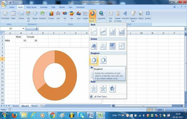
117 Step 2: Click Insert on the toolbar the screen below will appear
118 Step 3: Select data and click Pie as shown below:
119
120 Step 4: If you click on the first option the screen below will appear
121
122 Step 5: The procedure for labeling the bar chart is same to that of line graph discussed under step 5 to step 11. Following those steps the bar graph produced in Excel is shown below:

123 Doughnut Chart
124 Doughnut chart is very similar to a pie chart. Like pie chart it also shows the size of items in a data series, proportional to the sum of the items. However, it can be used for more than one data series. The doughnut charts show data in rings where each ring represents a data series. It is also kept in mind that doughnut charts are not easy to read. Example In a MBA course there are 55 male and 30 female students respectively. Construct a doughnut chart to display this information.
125 Computer Application Microsoft Excel with Chart Wizard can also generate pie chart. To construct pie chart in Excel, enter label into one column and data into another column. Choose Insert from the menu bar, then go for Chart from the pull down menu. Select Doughnut from this and follow the instructions and in four steps. There are options in Excel such as including a legend, deciding data labels and finally deciding the location of the chart. Using Excel The following table shows data relating to gender of students: Male Female MBA 55 30
126 We will create doughnut chart using excel now. Step 1: Open Excel and entered data as shown below.
127 Step 2: Click Insert on the toolbar the
128 screen below will appear
129 Step 3: Select data and click other charts as shown below:
130
131 Step 4: If you click on the first option of the doughnut chart the following screen will appear
132 Step 5: The procedure for labeling the doughnut is same to that of line graph discussed under step 5 to step 11.
133 Following those steps the doughnut graph produced in Excel is shown below:
134
135 Area Chart Area charts is also used to plot change over time or categories. An area chart sums the plotted values, and thereby area chart depicts the relationship of parts to a whole. Thus, we can use the area charts to highlight the magnitude of change over time. The following table shows the US energy consumption (trillion Btu) by sectors from 2012 to End-Use Sector Residential Commercial Industrial
136 Transportation We will create area chart for the above data using excel now. Step 1: Open Excel and entered data as shown below.
137
138 Step 2: Click Insert on the toolbar the screen below will appear
139
140 Step 3: Select data and click area charts as shown below:
141
142 Step 4: If you click on the first option of the area chart the following screen will appear
143 Step 5: The procedure for labeling the
144 area chart is same to that of line graph discussed under step 5 to step 11. Following those steps the area chart produced in Excel is shown below:
145
146 Subdivided (Stacked) Area Chart The sub-divided area chart is more appropriate than simple area chart in this particular example. So now we will construct a sub-divided or stacked area chart using excel. Step 1: Open Excel and entered data as shown below.
147 Step 2: Click Insert on the toolbar the
148 screen below will appear
149 Step 3: Select data and click area charts as shown below:
150 Step 4: If you click on the second option (either 2D or 3D) of the area chart the following screen will appear
151
152 Step 5: The procedure for labeling the area chart is same to that of line graph discussed under step 5 to step 11. Following those steps the area chart produced in Excel is shown below:
153 Percentage (100% Stacked) Area
154 Chart The limitation of sub-divided area chart leads us to go for the 100% stacked area chart. So now we will construct a percentage or 100% stacked area chart using excel. Step 1: Open Excel and entered data as shown below.
155 Step 2: Click Insert on the toolbar the screen below will appear
156
157 Step 3: Select data and click area charts as shown below:
158
159 Step 4: If you click on the third option (either 2D or 3D) of the area chart the following screen will appear
160 Step 5: The procedure for labeling the area chart is same to that of line graph discussed under step 5 to step 11. Following those steps the area chart produced in Excel is shown below:

161
162 Stock Charts Stock charts are used by technical analysts. As the name suggests they are useful for showing fluctuations in stock prices. However, these charts are also useful to show low and high values of some variables such as rainfall, temperature, pressure, etc. While constructing the stock charts, the data need to be entered in excel in a specific order. For instance, arrange data with high, low, and close as column headings to generate a simple high-low-close stock chart. Computer Application Microsoft Excel with Chart Wizard can also generate pie chart. To construct pie
163 chart in Excel, enter label into one column and data into another column. Choose Insert from the menu bar, then go for Other Charts from the pull down menu. Select first under stock chart from this and follow the instructions and in four steps your stock chart is ready. There are options in Excel such as including a legend, deciding data labels and finally deciding the location of the chart. High-Low-Close Stock Chart Using Excel The following table shows data relating to stock prices of Coca-Cola Company from to
164 Date High Low Mar 02, Mar 01, Feb 28, Feb 27, Feb 24, Feb 23, We will create stock chart using excel now.
165 Step 1: Open Excel and entered data as shown below.
166
167 Step 2: Click Insert on the toolbar the screen below will appear
168
169 Step 3: Select data and click other charts as shown below:
170
171 Step 4: If you click on the first option of the stock chart the following screen will appear
172 Step 5: The procedure for labeling the
173 stock chart is same to that of line graph discussed under step 5 to step 11. Following those steps the stock chart produced in Excel is shown below:
174
175 Open-High-Low-Close Stock Chart Using Excel The following table shows data relating to stock prices of Coca-Cola Company from to Date Open High Low Cl Mar 02, Mar 01, Feb 28, Feb 27, Feb 24, Feb 23, We will create stock chart using excel now.
176
177 Step 1: Open Excel and entered data as shown below.
178
179 Step 2: Click Insert on the toolbar the screen below will appear
180

181 Step 3: Select data and click other charts as shown below:
182 Step 4: If you click on the first option of the stock chart the following screen will appear
183 Step 5: The procedure for labeling the
184 stock chart is same to that of line graph discussed under step 5 to step 11. Following those steps the stock chart produced in Excel is shown below:
185
186 Volume- Open- High-Low-Close Stock Chart Using Excel The following table shows data relating to stock prices of Coca-Cola Company from to Date Volume High Low Mar 02, ,54,89, Mar 01, ,46,62, Feb 28, ,59,46, Feb 27, ,21,86, Feb 24, ,32,15, Feb 23, ,28,56,
187 We will create stock chart using excel now.
188 Step 1: Open Excel and entered data as shown below.
189
190 Step 2: Click Insert on the toolbar the screen below will appear
191
192 Step 3: Select data and click other charts as shown below:

193
194 Step 4: If you click on the first option of the stock chart the following screen will appear
195
196 Step 5: The procedure for labeling the stock chart is same to that of line graph discussed under step 5 to step 11. Following those steps the stock chart produced in Excel is shown below:

197
198 Volume-Open- High-Low-Close Stock Chart Using Excel The following table shows data relating to stock prices of Coca-Cola Company from to Date Volume Open High Mar 02, ,54,89, Mar 01, ,46,62, Feb 28, ,59,46, Feb 27, ,21,86, Feb 24, ,32,15, Feb 23, ,28,56,
199 We will create stock chart using excel now. Step 1: Open Excel and entered data as shown below.
200
201 Step 2: Click Insert on the toolbar the screen below will appear
202
203 Step 3: Select data and click other charts as shown below:
204
205 Step 4: If you click on the first option of the stock chart the following screen will appear

206
207 Step 5: The procedure for labeling the stock chart is same to that of line graph discussed under step 5 to step 11. Following those steps the stock chart produced in Excel is shown below:

208
209 Scatter Plot Sometimes analysts are interested to find nature of relationship between two or more variables so that one phenomenon can be explained in terms of another. For example: Are changes in interest rate related with profitability of corporate sector? Are changes in trading volume activity associated with movement of stock prices of a stock? Fig. 2.8 Scatter Plot between Stock Prices of Microsoft and Facebook
210 Such relationship between two variables can be shown graphically by scatter plot. Scatter plot gives a quick idea about the relationship between stock prices of Microsoft and Facebook over the time period as shown in Fig.2.8. A careful
211 inspection of this figure gives some indication that both stock prices are related. The relationship between these two variables is seems to be positive. From the figure 2.8 we cannot say precisely the degree of association. Scatter plot only gives the direction of relationships between two variables. If two variables move in unison over time, there will be positive relationship between them. However, when two variables move in opposite directions, we will have negative association between two variables. One important aspect to be kept in mind is that the relationships are only tendencies and may not hold necessarily for every year.
212 Computer Application Microsoft Excel with Chart Wizard can also generate scatter plot. To construct scatter in Excel, enter label and data into columns. Choose Insert from the menu bar, then go for Chart from the pull down menu. Select X-Y (Scatter) from this and follow the instructions and in four steps scatter plot is completed. There are options in Excel such as including a legend, deciding data labels and finally deciding the location of the chart. Using Excel Step 1: To find the relationship between price movement of Microsoft and
213 Facebook, we can construct a scatter plot. To construct scatter plot in Excel, first entered data as shown below:

214
215 Step 2: Click Insert on the toolbar the screen below will appear
216
217 Step 3: Select data and click Scatter as shown below
218

219 Step 4: If you click on the first option the screen below will appear
220 Step 5: The procedure for labeling the scatter plot is same to that of line graph discussed under step 5 to step 11. Following those steps the scatter produced in Excel is shown below:

221 Bubble Chart
222 A Bubble chart is like a scatter chart with an additional third column to represent the size of the bubbles. Bubble shows to represent the data points in the data series. The following table shows sales and R&D expenses of Apple Inc., from 2012 to Year Sales ($ Billions) R&D ($ Billi We will create a bubble chart for the
223 above data using excel now. Step 1: Open Excel and entered data as shown below.
224
225
226 Step 2: Click Insert on the toolbar the screen below will appear
227
228 Step 3: Select data and click bubble charts as shown below:
229
230 Step 4: If you click on the third option (either 2D or 3D) of the area chart the following screen will appear
231
232 Step 5: The procedure for labeling the bubble chart is same to that of line graph discussed under step 5 to step 11. Following those steps the area chart produced in Excel is shown below:
233 Frequency Distribution Frequency distribution is a useful tool to
234 summarize data in the form of class intervals and frequencies. Mr. Prasoom Dwivedi teaches Business statistics paper in University of Petroleum. The following table gives final marks obtained by students. Mr. Prasoom wants to develop some charts and graphs to show the average mark obtained by students. What are the highest and lowest marks? Table: Marks Obtained in Statistics
235 In the above table, individual marks are listed. Such unorganized data is called raw data or ungrouped data. No useful information can be easily comprehensible even after careful examination of data. This raw data can provide better insights if organized into a frequency distribution. Frequency distribution is table where data are arranged by class along with class frequency. According to Morris Humberg, A frequency distribution or frequency table is simply a table in which the data grouped into classes and the number of cases which fall in each class are recorded. The numbers in each class are referred to as frequencies. We will describe construction of frequency distribution with the help of an example. To construct a frequency distribution, we should first determine the range of the data. The range
236 of the data can be computed as the difference between the highest and lowest numbers. For the above example, the range is 49 (90-41). Next, determine the number of classes. A useful rule in this context is the 2 K rule which suggest that select the smallest number (K) for the number of classes such that 2 K exceed the total number of observations(n). In the above example, there are 64 marks. So N = 64. If we take K = 5, which means 5 classes should be used but 2 5 =32 which is less than total number of observations and may not include every observations. If we take K = 6, then 2 6 =64 which include every item. So the recommended number of classes is 6. After deciding the number of classes, we must determine the width of the class interval. In general, it is computed by dividing the range by
237 the number of classes. In this example, the class interval is coming 49/6 = Generally, the number is rounded up to the next number, which is in this case is 9. However, in this case, we will keep 10 as the class width. The frequency distribution must begin at a number equal to or lower than the lowest number and end at a number equal to or greater than the highest number in the data set. Since the lowest number in our data set is 41 and the highest number is 90, the frequency distribution in our case starts with 40 and end with 90. The following table 2.8 shows the frequency distribution for our data:
238 Table: Frequency Distribution Class Interval Frequency Relative Frequency Relative frequency can also be calculated by dividing individual class frequency by total frequency. When we multiply relative frequency with 100, it can be interpreted in terms of percentages. Thus, 32 % students have got marks between 70 and % students got marks between 80 and 90. And only 3% students got marks between 40 and 50.
239 Frequency Polygon Frequency polygons are a graphical representation of frequency table. Like histogram, it is also useful in knowing the shape of distributions. The procedure of obtaining a frequency polygon is first to find mid-value of each class interval in a frequency distribution. Next, plot these frequencies against corresponding mid-points and then connect these points by straight lines. Finally, extend these straight lines to meet X-axis to form a frequency polygon. The advantage of frequency polygon over histogram is that when two or more distributions are compared, the frequency polygon provides better and clear picture about shape of the distributions than the histogram. Illustration The table below shows a frequency distribution of marks obtained by students in business statistics paper. Construct a frequency polygon for this data.
240 Marks Frequency Solution The first step is to find mid-points of each class interval in a frequency table as shown below
241 Marks Mid- Points Frequency The second step is to plot frequencies against corresponding mid-points as shown below
242 Ogive An ogive is a cumulative frequency polygon. It is a type of frequency polygon that depicts cumulative frequencies. An ogive plots cumulative relative frequency percent on the vertical axis and class interval on the horizontal
243 axis from left to right. Consider the following data: Cumulative Frequency Marks Frequency Cum Rel Fre
244 Histogram Another way of summarizing data is histogram. Histogram is a two dimensional graph where not only length
245 but also the width of bar is important. It is used to display frequency distribution of a data set in which while the frequency is represented on the vertical axis, the range of data values are represented on the horizontal axis. Fig. 2.9 shows a histogram in which twentyeight Fig. 2.9 Histogram

246 companies made profits between Rs lakhs, six companies earned profits between Rs lakhs and only one company made a profit of between Rs lakhs.
247 Computer Application Excel make histogram using a tool called Data Analysis. It is important to note that classes are called bins in Excel. To construct histogram in excel, click tools on the excel menu bar. From the tools drop down menu select data analysis. When you click data analysis, a dialog box will appear. Choose Histogram from this dialog box. Select data into the Input Range. If we would like to decide lower and upper limits of the class interval i.e. bins enter endpoints into Bin Range. If we would like excel to establish bins, leave this blank. If we want labels then click Labels. For histogram graph, click Chart Output. After this, click OK.
248 Using Excel Listed below are 64 different daily closing value of NSE Nifty. We will explain how to construct histogram using these values
249 Step 1: To construct histogram in Excel first entered data and click data on toolbar as shown below:
250
251 Step 2: Click Data Analysis on the dropdown menu. When you will click Data Analysis a dialog box will appear shown below:
252 Step 3: Select histogram from the dialog box and click ok. Another dialog box will appear shown below:

253 Step 4: Specify the range of raw data
254 into Input Range. If you want to specify class lower and upper limits, put these limits into Bin Range. If you want excel to decide the bins (class size), leave this blank. If data has label, then select Labels. If you want histogram, select Chart Output and click OK.
255 Step 5: Now right click keeping cursor
256 on any of the bar as shown below

257
258 Step 6: When you click Format Data Series, you will get the following dialogue box

259 Step 7: Type 0 in Gap Width and Click
260 OK. The resulting figure is histogram as shown below

261
262 Exploratory Data Analysis: Stem and Leaf Exploratory data analysis comprises of simple calculations and graphs that help to summarize data in an easy manner. One such technique is stem-and- leaf which not only shows the rank order but also the shape of data. Consider the marks of 40 students in business statistics paper:
263 In order to develop a stem-and-leaf exhibit, first arrange the leading digits of each observation to the left of a vertical line. Second put the last digit of each observation to the right to the right of the vertical line maintaining the order of the observations.
264 Next sort the digits on each line into rank order as shown below: The numbers to the left of the vertical line form the stem and each digit to the right of the vertical line is called a leaf. So in first row, 1 is the stem value and 2, 5, 7 and 9 are leaves. Thus, it shows four data values have a first digit of 1. The leaves show that the data values are 12, 15, 17 and 19. Likewise, in the 9 th
265 row, 9 is the stem value and 1, 2, 3 and 6 are leaves values. The stem-and leaf display also depicts the shape of distribution. When you use a rectangle to contain the leaves of each stem we obtain the following exhibit: Thus, the stem-and-leaf display is very similar to histogram and gives information regarding the shape of the distribution. The stem-and-leaf display
266 for data more than 2 or more digits are possible by assuming leaf unit as 10, 100, etc. Cross Tabulation A cross-tabulation analysis is one of the most widely used analytical tools of the market research industry. It is generally a two dimensional table in which the top and left margin labels define the classes for the two variables. It provides relationship between two categorical variables. It is also called a contingency table. In simple words, a contingency table shows observed frequencies in columns and rows classified in order to find relationship between two or more categorical variables. The simplest
267 contingency table is a 2x2 table shown below: Male Female Total Smoke Don t Smoke Total The right-hand column and the bottom row figures are called marginal totals. After arranging data into columns and rows in a contingency table, the next thing is to find the relationship between smoking and gender. Example T-Series is a well known music
268 company in India. The research and development department of this company wants to know whether the type of music preferred and age of the listener is independent. A random sample of 620 music listeners is taken, results of the survey is summarized in the following contingency table. Music Type Age group Hindi Film Music Hi Bh and more 46 98
269 Total In the age category of 10-25, 242 respondents out of 620 were in this age bracket. 190 respondents out of 242 preferred Hindi film music. This shows that per cent of young people preferred Hindi film music. 8 per cent young people preferred Hindi Bhajan. Only 3 per cent young people were listening Hindi Gazal. However, 9.91 per cent of young people preferred western music. Likewise we can also analyze other age categories.
270 Chapter 3 Descriptive Analytics by Numerical Methods In earlier section, we discussed graphical methods of displaying information. It is very informative and useful in enriching an essay or a report. However, in many cases, providing a precise numerical figure is more desirable. In this section, we will discuss frequently used descriptive statistics for summarizing namely, measures of central tendency and dispersion.
271 Measures of Central Tendency Measures of central tendency tell where the middle value of the data set lies. The most common measures of central tendency are mean, median and the mode. Mean The arithmetic mean is what most laymen call an average. Mean is computed by adding all the observations in a data set and dividing the resulting sum by the total number of observations. The mathematical formula for computing mean is:
272 (3.1) where N is the sample size and represents the mean. The mean is used to represent the entire data by a single number. Though, it s a representative figure in most of the cases but can mislead in cases where extreme values are present in a data set. Solved Example Compute arithmetic mean of the
273 following marks in Statistics obtained by 10 students in a test: Roll No: Marks Solution: Roll. No. Marks
274 N=10 X =667 Thus, the mean mark is Using Excel In Microsoft Excel, AVERAGE function can be used to calculate arithmetic mean. In particular, we calculate the mean by entering the formula: = AVERAGE (A2:A11)
275 Median The median is another frequently used measure of central tendency which is the
276 middle value in data set when it is arranged in an ascending order. When the number of observations is odd, the middle value is the median. In case of even number of observations, there is no single value. So in such case the median is computed as the average of two middle observations. Solved Example 1 Compute the median of the following sales data of ABC Company Solution First arrange the data in ascending order
277 as shown below: Second, since the number of observations is odd, the middle value is the median. Thus, the median is sales of ABC Company is 480. Solved Example 2 Compute the median for the following data Solution First arrange the data in ascending order as shown below:
278 Since the number of observations is even, we have to find out two middle values in the arranged data set. Here, 66 and 68 are the two middle values. The median is the average of these two middle values. Median = = 67 Using Excel In Microsoft Excel, MEDIAN function can be used to calculate the median. In particular, we calculate the median by entering the formula:
279 = MEDIAN (A2:A9)
280 Mode Mode is defined as the value that most often occurs with highest frequency in a data set. For example, consider the sample of marks of 5 students in a class given below: In the above example, the only figure occurs twice is 62. As this figure occurs with a frequency of 2 it has the highest frequency. Thus, modal mark of the class is 62. Sometimes highest frequency occurs at two or more values in this case; more than one mode can exist. When the data have exactly two modes,
281 it is called bimodal data. If there are more than two modes for a data set, it is called multimodel data set. Using Excel In Microsoft Excel, MODE function can be used to calculate the mode. In particular, we calculate the mode by entering the formula: = MODE (A2:A6)
282 Quartile The quartile divides a series or a set of
283 observations into 4 equal parts. Median being the second quartile, so there are only two quartiles actually. The lower quartile (Q 1 ) divides a series into such that ¼ (one-fourth) of total frequency is lying below Q 1 and ¾ (three-fourth) is lying above Q 1. The upper quartile (Q 3 ) divides a series into such that ¾ (threefourth) of total frequency is lying below Q 3 and ¼ (one-fourth) is lying above Q 3.
284 Using Excel I collected stock prices data of Apple Inc., from 1 st February 2017 to 3 rd March, 2017 to illustrate how to compute 1 st and 3 rd quartiles in excel. In Microsoft Excel, QUARTILE function can be used to calculate the 1 st, 2 nd, and 3 rd quartiles. In particular, we calculate the lower quartile (Q 1 ) by entering the formula: = QUARTILE (B2:B23, 1)
285 Thus, the 1 st quartile is We calculate the upper quartile (Q 3 ) by
286 entering the formula: = QUARTILE (B2:B23, 3) Thus the 3 rd quartile stock price of
287 Apple Inc., is Percentile Every year in India around more than MBA aspirants appear in Common Aptitude Test (CAT). Often you may have heard students saying that I got 95 percentile in CAT or my CAT score is 99 percentile. What does it mean? Its meaning is only 5 percent person got more marks than me if my score is 95 percentile. Like median and quartiles, percentile is also a positional measure. While quartile divides a data set into four equal parts percentile divides a data set
288 into 100 equal parts. Using Excel In Microsoft Excel, PERCENTILE function can be used to calculate the percentiles. In particular, we calculate the 5 th percentile by entering the formula: = PERCENTILE (B2:B23, 0.05)
289
290 Thus the 5 th percentile of Apple stock price is meaning 95 per cent items in the sample are above We can also calculate the 95 th percentile by entering the formula: = PERCENTILE (B2:B23, 0.95)

291 Thus, the 95 th percentile stock price of Apple Inc., is This implies only 5 per cent prices are above
292 Measures of Dispersion Measures of dispersion give the extent of deviation from its mean value. Measures of central tendency such as the mean or median only provides the location of the middle value but it does not tell anything about the spread of the data. Dispersion also known as variability measures the extent of items from some central value. The significance of dispersion lies in the fact that a small value for a measure of dispersion shows that the data are clustered closely i.e. the mean of the data is representative and therefore it is reliable. However, a large value for a
293 measure of dispersion shows that the data are scattered and in this case mean is not the representative figure and therefore it is not reliable. The various measures of dispersion are the range, inter-quartile range, mean deviation and standard deviation. Range The range is the simplest measure of dispersion. The range is defined as the difference between the highest value and the lowest value. Range = Highest Value Lowest Value (3.2) Solved Example
294 A sample of 6 MBA graduates from IIM (Indore) revealed their starting package (Rs. Lakhs). Compute range Solution The range is given by the following: Range = Highest Value Lowest Value = 36-8 = 28. Thus, the range is Rs. 28 lakhs. Range is a good measure of dispersion when the data set shows a stable pattern. However, the biggest limitation is that it is based on only two observations that is, highest and lowest values of the data
295 set. Inter-quartile Range Range as a measure of dispersion is based on maximum and minimum values in the data set. To avoid this problem, one can resort to inter-quartile range. Inter -quartile range is computed on the middle 50% of the observations after elimination of highest and lowest 25% observations in a data set which is arranged in ascending order. Unlike range, inter-quartile range is not sensitive to extreme values. Solved Example The following data shows quarterly
296 operating profit (Rs. Cr) of Reliance industries from September 2008 to June Calculate inter-quartile range Solution First arrange the data in ascending order Drop first three figures (5363, 5437 and 5921) and last three figures (9545, 9843 and 9926) in this data set. The remaining observations constitute 50% of the observations. These observations are 6474, 7217, 7844, 9136, 9342 and For the remaining data observations, if
297 we calculate range, we will get interquartile range. Inter-quartile Range = = You can notice that the range for this problem is ( =4563). Interquartile range is 2922 is much smaller compared to range thus showing that it is less sensitive to extreme numbers present in the data set. Using Excel I collected stock prices data of Apple Inc., from 1 st February 2017 to 3 rd March, 2017 to illustrate how to compute 1 st and 3 rd quartiles in excel and computation of inter-quartile range.
298 First calculate the lower quartile (Q 1 ) by entering the formula: = QUARTILE (B2:B23, 1)
299 So the 1 st quartile is Next calculate the upper quartile (Q 3 ) by entering the formula: = QUARTILE (B2:B23, 3)

300 The 3 rd quartile stock price of Apple Inc., is
301 Inter-Quartile Range = Q 3 -Q 1 = = 4.81 Mean Absolute Deviation Mean absolute deviation is another measure of dispersion. It is defined as follows: where is the mean of the distribution.
302 Solved Example The following data shows annual gross profit margin (%) of Indian Oil Corporation Ltd (IOCL) from March 2007 to March Calculate Mean Absolute Deviation (MAD). Year: GPM(%): Solution Year GPM(%) (X- ) X
303 4.616 MD=1.11 Thus, the mean absolute deviation in gross profit margin in IOCL is 1.11%. Variance The variance is the most widely used measure of variability. It is basically average of the squared deviations from the arithmetic mean. The formula for population and sample variance are as follows:
304 It is to be kept in mind that we generally work with a sample. Also the variances of population and sample are practically same, when the number of observations is large. Suppose in a class there are 20 students. Their marks in business statistics paper are as follows: Students Mike Tony Marks
305 Ryan Bob Joe Smith Robin Kate Silsa Tisca Tom Jim David Adam Singer Rocky Mark John Hillan
306 Now it is important to remember that data of entire class or population is given in the above table so to compute variance we should use variance of population formula. In Microsoft Excel, to obtain variance of population and variance of sample, enter the formulas: = VARP (B2:B20)
307 Suppose we take a representative sample from the class which is given as follows: Students Marks
308 Joe Kate Tom David Singer Rocky Mark Hillan Now it is important to remember that data of a sample from the population is given in the above table. So to compute the variance we should use variance of sample formula. In Microsoft Excel, to obtain variance of sample, enter the formulas:
309 = VARP (B2:B9)
310
311 The variance is expressed in squared units instead of original units and create problem in interpretation. In fact, this is reason standard deviation is preferred to variance.
312 Standard Deviation While mean indicates representative value for a data, standard deviation shows the dispersion or variability across data points. Other measures of variation which we have already discussed above are range, inter-quartile range and mean deviation but standard deviation is considered to be the most efficient measure of dispersion. Standard deviation was introduced by Karl Pearson in It is a measure of variation present in the sample. If all the data points present in a sample are near to each other, the standard deviation is tend to be small. Nevertheless, if data
313 points are greatly dispersed then standard deviation will tend to be large. It is denoted by (sigma). The mathematical formula for computing standard deviation is: (3.4) Standard deviation has little meaning in its absolute sense. However, when standard deviations of two distributions are compared, the distribution with smaller standard deviation shows less variability. The meaning will become clear by considering the following example. Let s say there are two
314 projects A and B, the average return and time horizon of the two projects are the same. However, project A has a standard deviation of 2.8 and project B has a standard deviation of 3.6. Which project will you prefer? No doubt a rational investor will choose project A because it is less risky. Solved Example Compute standard deviation for the following data: Solution: X
315 X = ) 2 =4040
316 Thus, the standard deviation is Using Excel In Microsoft Excel, to obtain standard deviation of sample, enter the formula: = STDEV (A1:A11)
317 Coefficient of Variation The coefficient of variation measures
318 dispersion in relation to the mean. This is a relative measure of dispersion and is used to compare the relative variation in one data set with the relative variation in another data set. For example, suppose you want to know the relative variation of marks for two classes of students: Class 1 and Class 2. This relative of dispersion that is coefficient of variation can serve the purpose. The coefficient of variation is given by the following expression: where S = standard deviation
319 Solved Example The following table gives closing prices of Infosys Technology Ltd and Tata Consultancy Services (TCS) from to in descending order i.e. 9 th Aug to 29 th June. TCS Infosys Mean= Mea S = S= C.V= C.V
320
321 Thus, the coefficient of variation of TCS and Infosys shows that the variation in TCS is lower than the variation in Infosys. In other words, fluctuation in stock prices of Infosys is high compared to fluctuations in stock prices of TCS.
322 Chapter 4 Measures of Shapes Most of the statistical analysis is based on assumption of normal distribution. Measures of shapes tells us whether data set is normally distributed of not. Symmetrical Distribution The shape of a distribution has a very important role in statistical analysis. In fact most of the statistical analysis is based on the assumption of normal or symmetrical distribution. Rarely binomial or Poisson or other types of distribution is used for statistical analysis. It is important to note here that
323 normal distribution or symmetrical distribution is a requirement in most statistical analysis and to begin statistical analysis, we have to check whether data are normally distributed or not. Asymmetrical Distribution Asymmetrical distribution means the distribution is not normal. The nonsymmetrical distribution or non-normal distribution is called skewed distribution. In Figure 1 panel b shows the shape of a normal distribution and panel a and panel c show skewed distributions. Figure 1
324 So skewness refers to the lack of symmetry in the shape of a frequency distribution. When a distribution is not symmetrical it is called skewed distribution. It is important to note here that measure of skewness of any distribution is defined in relation to
325 normal distribution. Thus, skewness tells us the difference between the manner in which observations are distributed in a particular distribution compared to a normal distribution. In figure 1 panel b shows the shape of a normal distribution. In a normal distribution or bell-shaped curve, the arithmetic mean, median and mode are lying at the centre of the curve and they are equal. In a normal curve, spread of the items on the both side of the centre point are same. Panel a in figure 1 shows the shape of a negatively skewed distribution. In this case, the skewness will be negative. In this distribution, the frequencies in the
326 distribution are spread out over a greater range of low-ends values on the left side of the distribution from the centre point. In a negatively skewed distribution, the value of mode is maximum and the value of mean is minimum. Median lies between the mode and the mean. Panel c in figure 1 shows the shape of a positively skewed distribution. In this case, the skewness will be positive. In this distribution, the frequencies in the distribution are spread out over a greater range of high-ends values on the right side of the distribution from the centre point. In a positively skewed distribution, the value of mode is
327 minimum and the value of mean is maximum. Median lies between the mode and the mean. Measure of Skewness Skewness is defined as the lack of symmetry in a frquency distribution. There are two types of skewness: Absolute Measure of skewness Relative measure of skewness Absolute Measure of Skewness It is measured by taking the difference between the mean and the mode. Absolute Skewness = If the value of mean is greater than the mode the skewness will be positive. However, if the mode is greater than the
328 mean, the skewness will be negative. Here it is important to ask why the skewness is defined as the difference between the mean and the mode? In a symmetrical or normal distribution, the mean, median and mode all are equal. However, in a skewed distribution, the mean moves away from the mode, which is nothing but skewness. Thus, the distance between the mean and the mode could be used to measure skewness. The greater the distance, whether positive or negative, the higher is the skewness. Illustration The following table shows stock prices of State bank of India (SBI) and ICICI Bank from to
329 Compute absolute skewness for the above data. Date SBI
330 Solution We computed mean, median and mode for the SBI and ICICI bank stock prices, which given below: Company Mean Median Mode* SBI ICICI bank Note: Mode is computed by by the
331 formula: Mode = 3 Median- 2Mean The absolute skewness = Thus, the absolute skewness for SBI is: = Similarly, the absolute skewness for ICICI Bank is: = -2.8 Thus, the stock prices of SBI and ICICI bank are having negative skewness of 5.07 rupees and 2.8 rupees respectively. Relative Measure of Skewness If the absolute skewness expressed in relation to some measure of dispersion such as standard deviation in their respective distribution, the resultant measure would be relative in nature and can be used for direct comparision.
332 The Karl Pearson s Coefficient of Skewness It is based on the difference between arithmetic mean and mode divided by standard deviation. Symbolically, When a distribution is symmetrical or normal, the values of mean, median and mode are equal and coincide and, therefore, the coefficient of skewness will be zero. However, if the distribution is positively skewed, the coefficient of skewness
333 shall have positive values. The degree of skewness will be given by the numerical value. Likewise, if the distribution is negatively skewed. The coefficient of skewness will have negative values. Using Excel In Microsoft Excel, to obtain skewness, enter the formula: = Skew (B2:B28)
334 It is important to note that the above excel formula gives relative skewness.
335 Concept of Kurtosis Kurtosis refers to the degree of flatness or peakedness of a frequency distribution. It is always measured in relation to the peakedness of normal curve. It tells us the extent to which a distribution is more peaked or flat than the normal curve. There are three possibilities: 1. The frequency distribution exactly coincide with a normal curve. A normal curve is itself called mesokurtic. Figure 2 shows all these three possibilies. Figure 2
336 2. If the distribution is more peaked than the normal curve then it is called leptokurtic. In a leptokurtic distribution, items are more closely clustered around the mean. 3. If the distribution is flatter than the normal curve then it is called platykurtic. In platykurtic distibuton,
337 the obervations are more dispered from the mean than the normal curve. Concept of Moments The deviation of any item in a distribution from its mean is given by the following expression: X- Let denote the above expression by x. The arithmetic mean of the various powers of these deviations are called moments of the distribution. For example, 1. If we take the mean of the first power of the deviations of items from the mean, we will get the first moment
338 about the mean. It is denoted by. Symbolically, 2. Likewise, if we take the mean of the second power of the deviations of items from the mean, we will get the second moment about the mean. It is denoted by. Symbolically,
339 3. Similarly, if we take the mean of the third power of the deviations of items from the mean, we will get the third moment about the mean. It is denoted by. Symbolically, 4. And if we take the mean of the fourth power of the deviations of items from the mean, we will get the fourth
340 moment about the mean. It is denoted by. Symbolically, So the moments can also be extended to higher powers but in practice the first four moments suffice. Importance of Moments The concept of moment is very important in statistical work. Moments can help to measure the central tendency of a set of items, their dispersion, their asymmetry and their peakedness. The computation
341 of first four moments about the mean helps to identify the various characteristics of a frequency distribution. This is, in fact, the first step in the analysis of a frequency distribution. The following table is the summary of how moments are helpful in analysizing a distribution. Moment 1. First moment about origin 2. Second moment about the arithmetic mean 3. Third moment about the What it measures Mean Variance Skewness Kurtosis
342 arithmetic mean 4. Fourth moment about the arithmetic mean Two important constants of a distribution are computed from, are: measures skewness and measures kurtosis. In a symmetric distribution, all
343 the odd moments i.e., µ 1, µ 3, etc., would always be zero. Illustration 1 Skewness is a measure of bias in dispersion of data. In other words, it indicates degree of asymmetry. In positively skewed distribution, the mean is to the right of the peak of the distribution as it is pulled by few very high observations. Similarly, in negatively skewed distribution, the mean is to the left of the peak of the distribution. The moment coefficient of skewness is given by the following formula:
344 If the value of skewness is zero then the distribution is symmetric. When it is greater than 0 it indicates that it is positively skewed to the right and when its less than 0 it indicates it is negatively skewed to the left. The moment coefficient of kurtosis is given as follows:
345 When the value of coefficient of kurtosis is 3 then the distribution is normal. When it is different from 3 it indicates that the distribution is not normal. Solved Example Find the kurtosis for the following data: Using Excel In Microsoft Excel, to obtain skewness,
346 enter the formula: = Kurt (B2:B28)
347 Chebyshev Theorem For symmetrical or normal distribution about 68% of the items fall between +1 and -1 standard deviation from the arithmetic mean and about 95% of the observations fall between +2 and -2 standard deviations. And about 99.7% of the items fall between -3 and +3 standard deviations. However, Chebyshev s Theorem allows us to use this idea for any distribution, irrespective of the shape of distribution. The theorem states that given a group of N numbers, at least the proportion 1- (1/K) 2 of the N observations will lie within K standard deviation from the
348 mean. Chebyshev Proportion K Values Ranges Minimum proportion of items 1 µ±σ 0 2 µ±2σ 75% 3 µ±3σ % 4 µ±4σ 93.75% 5 µ±4σ 96%.. K µ±kσ.. 1-(1/K) 2

349 Empirical Rule In case of a normal distribution, the following relationships hold good: Approximately 68% of the area under the curve lies within 1 standard deviation from the mean. Approximately 95% of the area
350 under the curve lies within 2 standard deviations from the mean. Approximately 99.7% of the area under the curve lies within 3 standard deviations from the mean. This is known as the empirical rule or the rule. It is clear that in a normal distribution most outcomes will lie within 3 standard deviations from the mean. Solved Example I collected the daily stock prices of Apple Inc., from 1 st February 2016 to 3 rd March 2017 to illustrate the empirical rule. Between and , 68 per cent of the observed stock prices of Apple Inc., fall in this range. Other
351 ranges are obtained in a likewise manner shown below:
352 z- Score Standard normal distribution is a special normal probability distribution with a mean of zero and a standard deviation of one. A normal variable can be transformed into standard normal variable by the following formula: where X is an observation from the original normal distribution, µ is the mean and σ is the standard deviation of the original normal distribution. The standard normal distribution is also called Z distribution
353 or Z score. A Z score tells us the number of standard deviations a particular observation is above or below the mean. A Z score is a unit free number which help to compute probability because it cannot be calculated directly as they are expressed in different units. Thus, it is necessary to convert them into Z score first. To find probabilities, one can use the following table. In the table, values of z is given in the left-hand column and in the top row value of z with two decimal points. For example, what is the corresponding probability value of a Z value of 1.75? For a Z value of 1.75,
354 we will look for 1.7 in the left-hand column and 0.05 in the top row. Then select that value where column and row intersect. The value of is the area under the curve 0 and In other words, the probability of lying the random variable between 0 and 1.75 is percent. It is important to note that the table gives the area under the curve between the mean and any positive value of z. Similarly, suppose the value of z is 0.89 then the corresponding probability value can be found by the same procedure. The area under the curve between 0 and 0.89 is Thus, the probability of
355 random variable lying between 0 and 0.89 is percent. However, if you want the probability of a z value between and Please note that we have already found the probability associated with a z value lying between 0 and which is Since normal distribution is symmetric, the left tail is the mirror image of the right tail. Thus, the probability of a z value between 0 and is same as the probability of z value of 0 and -0.89, that is Hence, the probability of a z value between and is =
356 z
357 In similar manner, the probability of a z value between and is and between and is Let us now consider finding the probability that z is greater than 1.00 The area under the curve between 0 and 1 is As we know that the total area above the mean is , the area above 1.00 must be =
358 Thus, the probability that the random variable exceed 1.00 is percent. Also, the probability that the z will be less than is (why?). Finally, we will find the probability that z is between 1.5 and Please note that the area between 0 and 3.00 is The area between 0 and 1.5 is Thus, the area between 1.5 and 3.00 is = Thus, the probability that z lie between 1.5 and 3.00 is 6 percent. Solved Example The mean mark of students in business statistics paper is 78 with a standard
359 deviation of 15. The random variable marks of students follow a normal distribution. a) What is probability of obtaining marks less than 50? b) What is the probability of obtaining marks more than 90? c) What is the probability that the marks lie between 80 and 90? Solution a) Using standard normal distribution, we converted it to z score first as follows:
360 For a z value of between 0 and -1.86, the area under the curve is As we know that the total area below the mean is , the area below must be = Thus, the probability that the marks will be less than 50 is 3.14 percent. b) Using standard normal distribution, we converted it to z score first as follows: For a z value of between 0 and 0.80, the area under the curve is As we know that the total area above the mean
361 is , the area above 0.80 must be = Thus, the probability that the marks will be more than 90 is percent. c) First, we will convert random variable X into z score as follows: and Next, we have to find probability that z is between 0.13 and Please note that the area between 0 and 0.80 is The area between 0 and 0.13 is Thus, the area between 0.13 and
362 0.80 is = Thus, the probability that the marks lie between 80 and 90 is percent. Computer Application To demonstrate using Microsoft excel for calculating probability of a normally distributed variable, the following example will be used. The life of a CFL bulb is normally distributed with mean life 12 months and standard deviation 3 months. a) What is the probability that a CFL bulb last for less than 6 months? b) What is the probability that a CFL
363 bulb last for more than 15 months? c) What is the probability that a CFL bulb has a life between 10 and 18 months? Solution Step 1: Open any Microsoft excel sheet.
364
365 Step 2: Click functions the following dialog box appear
366 Step 3: Select Statistical from select

367 category. When you select statistical the following will appear:
368 Step 4: Next select NORMDISTfrom select a function. The following dialog box will come.

369
370 Step 5: When you click OK, the following dialog box will appear
371 Step 6: Enter the value of X, µ, σ and 1 in the cumulative cell. It is important to note that Microsoft excel always provides cumulative probability. When the value of Z is negative, we will get the answer directly. When z is positive, we will get answer by subtracting probability return by excel from 1 i.e. 1- probability value.

372 Thus, the probability that the a CFL bulb
373 lasts for less than 6 months is or 2.27 percent. Step 7: For part(b) enter the values and the following probability is given by Excel:
374 The probability that a CFL bulb last for more than 15 months is = Thus, the probability of lasting
375 a CFL bulb fro more than 15 months is percent. Step 8: For part (c)
376
377 From the above excel output, we got the
378 cumulative probability up to 18 months is and up to 14 months is Thus, the probability of lasting a CFL bulb between 14 months and 18 months is = Exploratory Data Analysis In graphical and tabular methods of summarizing data we discussed the stem-and-leaf display as a tool of exploratory data analysis. It facilitates us to use simple arithmetic and easy to draw diagrams to summarize data. Under numerical methods we have two measures for summarizing data Five-
379 Number Summary and Box Plots Five-Number Summary The five-number summary comprises of: 1. Smallest Value 2. First Quartile (Q 1 ) 3. Median (Q 2 ) 4. Third Quartile (Q 3 ) 5. Largest Value To develop five-number summaries first arrange data in ascending order. After arranging data in ascending order you can easily identify the smallest, the quartiles and the largest values.
380 Using Excel In Microsoft excel, five-number summary can easily computed with excel function as shown below:
381 Box-Plot A box plot is a graph that summarizes
382 data. It is based on five-number summary. In order to construct a box plot, you have to compute median and the first and third quartiles, i.e., Q 1 and Q 3. The inter-quartile range (IQR) = Q 3 - Q 1 is also used. The various steps involved in the construction of a box plot are as follows: 1. A box is drawn. At the ends of the box 1 st and 3 rd quartiles are located. 2. A perpendicular is drawn in the box at the location of median.
383 3. IQR fixes the limits. The lower and upper limits of the box are 1.5 (IQR) below the Q 1 and 1.5(IQR) above the Q 3. Data points outside these limits are termed as outliers. 4. The dashed lines are called whiskers. They whiskers are drawn from the ends of the box to the smallest and the largest values inside the limits. 5. * symbol is used to locate the positions of outliers.
384 Working with Grouped Data Weighted Arithmetic Mean In simple arithmetic mean computation all items in a series have equal importance. However, sometimes all items or observations may not have equal importance. For example, in a household budget food items may have greater importance than entertainment. In such cases, appropriate weights are assigned to various observations. Arithmetic mean calculated using weight is called weighted arithmetic mean. In the computation of weighted arithmetic mean an important problem arises in selection of weights. Weights may be either actual or arbitrary. It is
385 useful when each item have different importance. Method of Computation of Weighted Arithmetic Mean 1. Each item is assigned weight 2. Each item is multiplied with respective weight and summation of product is obtained 3. Total of product is divided by sum of weights Illustration A student of MBA got the following marks in the first semester where the weightage of mid-term, end-term and
386 internal assessment are 30%, 50% and 20% respectively. Find the weighted arithmetic mean. Exams Marks Weight wx (X) (w) Midterm Endterm Internal Weighted Arithmetic Mean =100 =6680
387 Thus, the student got 66.8 percent marks in business statistics paper. Arithmetic Mean Grouped Data In continuous series or grouped data, arithmetic mean can be computed by the following formula: where, M = mid-point of the class interval f = Frequency of each class Illustration
388 The following table shows dividend declared by different companies during Compute the average dividend. Dividend Mid- No. of fm (%) Point Companies
389 =2 Thus, the average dividend given by the companies during 2015 is per cent. Standard Deviation in case of Grouped Data For computing standard deviation in case of continuous series or grouped data, any of the following three methods may be applied: Actual Mean Method Assumed Mean Method Step Deviation Method
390 Actual Mean Method The procedure of calculating standard deviation by actual mean method is as follows: 1. Take the mid-points of various classes 2. Multiply the mid-points with respective frequencies and find the sum of it. 3. Compute the mean 4. Take the deviations of mid-points from the computed mean i.e.,d 5. Multiply the mid-points with respective frequencies and find 6. Square the deviations and multiply them with respective frequencies and
391 obtain 7. Apply the formula: Illustration The following data show the monthly stock prices of State Bank of India from January 2015 to April Compute the standard deviation of prices. Date Close Jan Feb Mar Apr May Jun Jul
392 Aug Sep Oct Nov Dec Jan Feb Mar Apr Solution The data on SBI shows that the highest and lowest prices of SBI during this period were 310 and We grouped the data taking a class width of 20. The following is the grouped price data for the SBI:
393 Class Interval Frequency (f) Midpoints (m) fm (m- )i.e.d fd Now apply the formula to obtain standard deviation
394 Thus, the standard deviation of stock prices of SBI is In other words, the stock price of SBI may deviate by on both sides from its mean value of On the upper side it may go to and on the lower side it may touch Computer Application
395 To compute descriptive statistics in Excel, click tools on the excel menu bar. From the tools drop down menu select Data Analysis. When you click Data Analysis, a dialog box will appear. Choose Descriptive Statistics from this dialog box. Select data into the Input Range. If we want labels then click Labels. Select Summary Statistics from the dialog box. Specify the location where you want results. Click OK. Step 1: Open Excel and entered the data as shown below:
396 Step 2: Click Data Analysis on the
397 dropdown menu. When you will click Data Analysis a dialog box will appear shown below:

398
399 Step 3: Select descriptive statistics from the dialog box and click ok. Another dialog box will appear shown below:
400 Step 4: Specify the range of raw data into Input Range. Select Column if data is grouped by column otherwise select
401 row. If data has label, then click Labels. To get descriptive statistics, tick summary statistics and then click OK. The descriptive statistics are shown below:
402
403 Reading Computer Output Given below is a computer printout of descriptive statistics from MS-Excel. Using the following data on marks of 10 students: descriptive statistics in excel is computed. Mean Standard Error Median Mode Standard Deviation Mark
404 Sample Variance Kurtosis Skewness Range Minimum Maximum Sum Count The above table shows that mean mark is 71.The standard deviation is Variance is square of standard deviation which is The value of kurtosis and skewness are and respectively which shows data is not normally distributed. Range which defined as the highest marks minus lowest marks is 47. The minimum mark
405 in this data set is 45 while maximum mark is 92. The sum total of all marks is 710 and the total number of observations is 10.
406 Chapter 4 Covariance and Correlation Sample covariance is given by the following formula: If the covariance between X and Y is zero, it implies absence of association them. A positive value of covariance (X andy) indicates a positive linear relation between X and Y and a negative value of COV(XY) shows a negative relationship between X and Y. Using Excel
407 In Microsoft excel, to obtain covariance, enter the formula: = COVAR (A2:A16, B2:B16)
408 Correlation is a technique to find relationship between any two variables. Karl Pearson coefficient of correlation is the technique by which one can measure the degree of relationship between any two variables. There are three types correlation, namely, positive, negative and zero correlation. Karl Pearson coefficient of correlation is denoted by r. The limiting value of correlation coefficient lies between ± 1. The formula for computing coefficient of correlation, r, is:
409 Consider two variables annual income and expenditure of 10 individuals working in UPES given below: Income (Rs Lakhs): Expenditure (Rs Lakhs): Step 1: Open Excel and entered the data as shown below:
410 Step 2: Select cell D2, access the Insert Function and choose CORREL from the dialog box as shown below:

411 Step 3: Click OK
412 Step 4: When the function arguments dialog box appears: Enter cells A1:A11 in the Array 1 box and B1:B11 in Array 2 box Click OK

413 Thus the correlation between income and expenditure is The positive
414 sign of the coefficient indicates that the two variables are positively related. The magnitude of 0.9 shows that when income increases 90 percent of the time expenditure also increases.
415 Chapter 5 Regression Regression is a statistical tool to find the nature of relationship between two variables. When we want explain one phenomenon in terms of another i.e. y in terms of x, we use regression. Regression model studies the relationship between two variables when one is the dependent variable and the other is an independent variable. For example, suppose we want to explain expenditure (Y) in terms income (X). Here using previous data on income and
416 expenditure show how to run regression in MS Excel. Income (Rs Lakhs): Expenditure (Rs Lakhs): Step 1: Enter the data in excel as shown below:
417 Step 2: Click data analysis and Regression from the dialog box.

418 Step 3: After selecting regression click OK. When you click OK the following dialog box will appear.
419 Step 4: Enter the dependent variable in
420 Input Y Range and independent variable in Input X range. Select labels if you have labels.
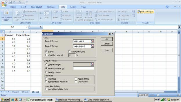
421
422 Step 5: Click OK. When you click ok the following regression results will appear.

423 The given above is Excel printout of regression results. Here we interpret the
424 key figures of this table. 1. The regression line is. The interpretation of Y-intercept is when income is zero on an average expenditure will be lakh i.e thousand in a year which is not consistent with economic logic. Interpretation of slope coefficient is when income increases by 1 lakh rupees on an average expenditure will increase by 0.47 lakh rupees i.e. 47 thousands. 2. To get a point forecast, simply plug the value of X in the regression line. For example, if income = 5 lakhs, the predicted value for expenditure is
425 2.35 lakhs. 3. R 2 = 0.82, which means that independent variable income (X) explain 82 percent of total variation in dependent variable expenditure (Y). Running Multiple Regression using Excel Regression analysis can be done by Excel with the help of Data Analysis. Select Tools on the menu bar and choose Data Analysis from the drop down menu. Next, select Regression from the Data Analysis dialog box. Enter the dependent variable into Input Y Range. Enter the independent variables in Input X Range. Here independent variable X
426 range may include a number of columns. Excel decides the number of explanatory variables from the number of columns entered in Input X Range. Select Labels, if you have labels for series. If you want regression through origin, click Constant is Zero otherwise leave it blank. Excel also provides residuals, standardized residuals, residual plots and fine fits plots. If you are interested in these items then select them from regression dialog box. Click OK. The standard excel regression output gives coefficient of determination (R 2 ), Standard error of estimate and an ANOVA table. It also provides F statistic to assess the overall
427 significance and t-statistic to assess the significance of marginal contribution by independent variables with associated p-values. Step 1: Enter the data in excel as shown below:
428 Step 2: Go to data analysis. When you click data analysis the following dialog
429 box will come:

430
431 Step 3: Select regression and click ok. When you click ok the following dialog box will appear.
432 Step 4: Enter the dependent variable in Input Y Range and independent variables
433 in Input X range that is, $B$1:$C$11. Select labels if it has label for your variables.
434
435 Step 5: After this when you click ok. The following results will be given by excel.

436 Reading the Computer Output The given below is an output of a
2 Exploring Univariate Data
 2 Exploring Univariate Data A good picture is worth more than a thousand words! Having the data collected we examine them to get a feel for they main messages and any surprising features, before attempting
Dot Plot: A graph for displaying a set of data. Each numerical value is represented by a dot placed above a horizontal number line.
 Introduction We continue our study of descriptive statistics with measures of dispersion, such as dot plots, stem and leaf displays, quartiles, percentiles, and box plots. Dot plots, a stem-and-leaf display,
CHAPTER 2 Describing Data: Numerical
 CHAPTER Multiple-Choice Questions 1. A scatter plot can illustrate all of the following except: A) the median of each of the two variables B) the range of each of the two variables C) an indication of
Descriptive Statistics
 Chapter 3 Descriptive Statistics Chapter 2 presented graphical techniques for organizing and displaying data. Even though such graphical techniques allow the researcher to make some general observations
Math 2311 Bekki George Office Hours: MW 11am to 12:45pm in 639 PGH Online Thursdays 4-5:30pm And by appointment
 Math 2311 Bekki George bekki@math.uh.edu Office Hours: MW 11am to 12:45pm in 639 PGH Online Thursdays 4-5:30pm And by appointment Class webpage: http://www.math.uh.edu/~bekki/math2311.html Math 2311 Class
MBEJ 1023 Dr. Mehdi Moeinaddini Dept. of Urban & Regional Planning Faculty of Built Environment
 MBEJ 1023 Planning Analytical Methods Dr. Mehdi Moeinaddini Dept. of Urban & Regional Planning Faculty of Built Environment Contents What is statistics? Population and Sample Descriptive Statistics Inferential
Categorical. A general name for non-numerical data; the data is separated into categories of some kind.
 Chapter 5 Categorical A general name for non-numerical data; the data is separated into categories of some kind. Nominal data Categorical data with no implied order. Eg. Eye colours, favourite TV show,
DATA SUMMARIZATION AND VISUALIZATION
 APPENDIX DATA SUMMARIZATION AND VISUALIZATION PART 1 SUMMARIZATION 1: BUILDING BLOCKS OF DATA ANALYSIS 294 PART 2 PART 3 PART 4 VISUALIZATION: GRAPHS AND TABLES FOR SUMMARIZING AND ORGANIZING DATA 296
PSYCHOLOGICAL STATISTICS
 UNIVERSITY OF CALICUT SCHOOL OF DISTANCE EDUCATION B Sc COUNSELLING PSYCHOLOGY (2011 Admission Onwards) II Semester Complementary Course PSYCHOLOGICAL STATISTICS QUESTION BANK 1. The process of grouping
Lecture 2 Describing Data
 Lecture 2 Describing Data Thais Paiva STA 111 - Summer 2013 Term II July 2, 2013 Lecture Plan 1 Types of data 2 Describing the data with plots 3 Summary statistics for central tendency and spread 4 Histograms
GovernmentAdda.com. Data Interpretation
 Data Interpretation Data Interpretation problems can be solved with little ease. There are of course some other things to focus upon first before you embark upon solving DI questions. What other things?
Chapter 3. Numerical Descriptive Measures. Copyright 2016 Pearson Education, Ltd. Chapter 3, Slide 1
 Chapter 3 Numerical Descriptive Measures Copyright 2016 Pearson Education, Ltd. Chapter 3, Slide 1 Objectives In this chapter, you learn to: Describe the properties of central tendency, variation, and
Graphical and Tabular Methods in Descriptive Statistics. Descriptive Statistics
 Graphical and Tabular Methods in Descriptive Statistics MATH 3342 Section 1.2 Descriptive Statistics n Graphs and Tables n Numerical Summaries Sections 1.3 and 1.4 1 Why graph data? n The amount of data
Descriptive Statistics (Devore Chapter One)
") Descriptive Statistics (Devore Chapter One) 1016-345-01 Probability and Statistics for Engineers Winter 2010-2011 Contents 0 Perspective 1 1 Pictorial and Tabular Descriptions of Data 2 1.1 Stem-and-Leaf
Descriptive Statistics (Devore Chapter One) 1016-345-01 Probability and Statistics for Engineers Winter 2010-2011 Contents 0 Perspective 1 1 Pictorial and Tabular Descriptions of Data 2 1.1 Stem-and-Leaf
Exploring Data and Graphics
 Exploring Data and Graphics Rick White Department of Statistics, UBC Graduate Pathways to Success Graduate & Postdoctoral Studies November 13, 2013 Outline Summarizing Data Types of Data Visualizing Data
Fundamentals of Statistics
 CHAPTER 4 Fundamentals of Statistics Expected Outcomes Know the difference between a variable and an attribute. Perform mathematical calculations to the correct number of significant figures. Construct
Frequency Distribution and Summary Statistics
 Frequency Distribution and Summary Statistics Dongmei Li Department of Public Health Sciences Office of Public Health Studies University of Hawai i at Mānoa Outline 1. Stemplot 2. Frequency table 3. Summary
STAB22 section 1.3 and Chapter 1 exercises
 STAB22 section 1.3 and Chapter 1 exercises 1.101 Go up and down two times the standard deviation from the mean. So 95% of scores will be between 572 (2)(51) = 470 and 572 + (2)(51) = 674. 1.102 Same idea
3.1 Measures of Central Tendency
 3.1 Measures of Central Tendency n Summation Notation x i or x Sum observation on the variable that appears to the right of the summation symbol. Example 1 Suppose the variable x i is used to represent
Summarising Data. Summarising Data. Examples of Types of Data. Types of Data
 Summarising Data Summarising Data Mark Lunt Arthritis Research UK Epidemiology Unit University of Manchester Today we will consider Different types of data Appropriate ways to summarise these data 17/10/2017
Lecture 1: Review and Exploratory Data Analysis (EDA)
") Lecture 1: Review and Exploratory Data Analysis (EDA) Ani Manichaikul amanicha@jhsph.edu 16 April 2007 1 / 40 Course Information I Office hours For questions and help When? I ll announce this tomorrow
Lecture 1: Review and Exploratory Data Analysis (EDA) Ani Manichaikul amanicha@jhsph.edu 16 April 2007 1 / 40 Course Information I Office hours For questions and help When? I ll announce this tomorrow
Lecture Week 4 Inspecting Data: Distributions
 Lecture Week 4 Inspecting Data: Distributions Introduction to Research Methods & Statistics 2013 2014 Hemmo Smit So next week No lecture & workgroups But Practice Test on-line (BB) Enter data for your
Data that can be any numerical value are called continuous. These are usually things that are measured, such as height, length, time, speed, etc.
 Chapter 8 Measures of Center Data that can be any numerical value are called continuous. These are usually things that are measured, such as height, length, time, speed, etc. Data that can only be integer
Stat 101 Exam 1 - Embers Important Formulas and Concepts 1
 1 Chapter 1 1.1 Definitions Stat 101 Exam 1 - Embers Important Formulas and Concepts 1 1. Data Any collection of numbers, characters, images, or other items that provide information about something. 2.
Basic Procedure for Histograms
 Basic Procedure for Histograms 1. Compute the range of observations (min. & max. value) 2. Choose an initial # of classes (most likely based on the range of values, try and find a number of classes that
GOALS. Describing Data: Displaying and Exploring Data. Dot Plots - Examples. Dot Plots. Dot Plot Minitab Example. Stem-and-Leaf.
 Describing Data: Displaying and Exploring Data Chapter 4 GOALS 1. Develop and interpret a dot plot.. Develop and interpret a stem-and-leaf display. 3. Compute and understand quartiles, deciles, and percentiles.
2CORE. Summarising numerical data: the median, range, IQR and box plots
 C H A P T E R 2CORE Summarising numerical data: the median, range, IQR and box plots How can we describe a distribution with just one or two statistics? What is the median, how is it calculated and what
34.S-[F] SU-02 June All Syllabus Science Faculty B.Sc. I Yr. Stat. [Opt.] [Sem.I & II] - 1 -
![34.S-[F] SU-02 June All Syllabus Science Faculty B.Sc. I Yr. Stat. [Opt.] [Sem.I & II] - 1 -](/thumbs/87/96342487.jpg "34.S-[F] SU-02 June All Syllabus Science Faculty B.Sc. I Yr. Stat. [Opt.] [Sem.I & II] - 1 -") [Sem.I & II] - 1 - [Sem.I & II] - 2 - [Sem.I & II] - 3 - Syllabus of B.Sc. First Year Statistics [Optional ] Sem. I & II effect for the academic year 2014 2015 [Sem.I & II] - 4 - SYLLABUS OF F.Y.B.Sc.
[Sem.I & II] - 1 - [Sem.I & II] - 2 - [Sem.I & II] - 3 - Syllabus of B.Sc. First Year Statistics [Optional ] Sem. I & II effect for the academic year 2014 2015 [Sem.I & II] - 4 - SYLLABUS OF F.Y.B.Sc.
32.S [F] SU 02 June All Syllabus Science Faculty B.A. I Yr. Stat. [Opt.] [Sem.I & II] 1
![32.S [F] SU 02 June All Syllabus Science Faculty B.A. I Yr. Stat. [Opt.] [Sem.I & II] 1](/thumbs/87/96342483.jpg "32.S [F] SU 02 June All Syllabus Science Faculty B.A. I Yr. Stat. [Opt.] [Sem.I & II] 1") 32.S [F] SU 02 June 2014 2015 All Syllabus Science Faculty B.A. I Yr. Stat. [Opt.] [Sem.I & II] 1 32.S [F] SU 02 June 2014 2015 All Syllabus Science Faculty B.A. I Yr. Stat. [Opt.] [Sem.I & II] 2 32.S
32.S [F] SU 02 June 2014 2015 All Syllabus Science Faculty B.A. I Yr. Stat. [Opt.] [Sem.I & II] 1 32.S [F] SU 02 June 2014 2015 All Syllabus Science Faculty B.A. I Yr. Stat. [Opt.] [Sem.I & II] 2 32.S
IOP 201-Q (Industrial Psychological Research) Tutorial 5
 Tutorial 5") IOP 201-Q (Industrial Psychological Research) Tutorial 5 TRUE/FALSE [1 point each] Indicate whether the sentence or statement is true or false. 1. To establish a cause-and-effect relation between two variables,
IOP 201-Q (Industrial Psychological Research) Tutorial 5 TRUE/FALSE [1 point each] Indicate whether the sentence or statement is true or false. 1. To establish a cause-and-effect relation between two variables,
Description of Data I
 Description of Data I (Summary and Variability measures) Objectives: Able to understand how to summarize the data Able to understand how to measure the variability of the data Able to use and interpret
Chapter 4-Describing Data: Displaying and Exploring Data
 Chapter 4-Describing Data: Displaying and Exploring Data Jie Zhang, Ph.D. Student Account and Information Systems Department College of Business Administration The University of Texas at El Paso jzhang6@utep.edu
Chapter 4-Describing Data: Displaying and Exploring Data
 Chapter 4-Describing Data: Displaying and Exploring Data Jie Zhang, Ph.D. Student Account and Information Systems Department College of Business Administration The University of Texas at El Paso jzhang6@utep.edu
Section 6-1 : Numerical Summaries
 MAT 2377 (Winter 2012) Section 6-1 : Numerical Summaries With a random experiment comes data. In these notes, we learn techniques to describe the data. Data : We will denote the n observations of the random
St. Xavier s College Autonomous Mumbai STATISTICS. F.Y.B.Sc. Syllabus For 1 st Semester Courses in Statistics (June 2015 onwards)
") St. Xavier s College Autonomous Mumbai STATISTICS F.Y.B.Sc Syllabus For 1 st Semester Courses in Statistics (June 2015 onwards) Contents: Theory Syllabus for Courses: S.STA.1.01 Descriptive Statistics
St. Xavier s College Autonomous Mumbai STATISTICS F.Y.B.Sc Syllabus For 1 st Semester Courses in Statistics (June 2015 onwards) Contents: Theory Syllabus for Courses: S.STA.1.01 Descriptive Statistics
Software Tutorial ormal Statistics
 Software Tutorial ormal Statistics The example session with the teaching software, PG2000, which is described below is intended as an example run to familiarise the user with the package. This documented
You should already have a worksheet with the Basic Plus Plan details in it as well as another plan you have chosen from ehealthinsurance.com.
 In earlier technology assignments, you identified several details of a health plan and created a table of total cost. In this technology assignment, you ll create a worksheet which calculates the total
DATA HANDLING Five-Number Summary
 DATA HANDLING Five-Number Summary The five-number summary consists of the minimum and maximum values, the median, and the upper and lower quartiles. The minimum and the maximum are the smallest and greatest
CABARRUS COUNTY 2008 APPRAISAL MANUAL
 STATISTICS AND THE APPRAISAL PROCESS PREFACE Like many of the technical aspects of appraising, such as income valuation, you have to work with and use statistics before you can really begin to understand
SUMMARY STATISTICS EXAMPLES AND ACTIVITIES
 Session 6 SUMMARY STATISTICS EXAMPLES AD ACTIVITIES Example 1.1 Expand the following: 1. X 2. 2 6 5 X 3. X 2 4 3 4 4. X 4 2 Solution 1. 2 3 2 X X X... X 2. 6 4 X X X X 4 5 6 5 3. X 2 X 3 2 X 4 2 X 5 2
Summary of Statistical Analysis Tools EDAD 5630
 Summary of Statistical Analysis Tools EDAD 5630 Test Name Program Used Purpose Steps Main Uses/Applications in Schools Principal Component Analysis SPSS Measure Underlying Constructs Reliability SPSS Measure
Measures of Central tendency
 Elementary Statistics Measures of Central tendency By Prof. Mirza Manzoor Ahmad In statistics, a central tendency (or, more commonly, a measure of central tendency) is a central or typical value for a
How Wealthy Are Europeans?
 How Wealthy Are Europeans? Grades: 7, 8, 11, 12 (course specific) Description: Organization of data of to examine measures of spread and measures of central tendency in examination of Gross Domestic Product
y axis: Frequency or Density x axis: binned variable bins defined by: lower & upper limits midpoint bin width = upper-lower Histogram Frequency
 Part 3 Displaying Data Histogram requency y axis: requency or Density x axis: binned variable bins defined by: lower & upper limits midpoint bin width = upper-lower 0 5 10 15 20 25 Density 0.000 0.002
M249 Diagnostic Quiz
 THE OPEN UNIVERSITY Faculty of Mathematics and Computing M249 Diagnostic Quiz Prepared by the Course Team [Press to begin] c 2005, 2006 The Open University Last Revision Date: May 19, 2006 Version 4.2
MULTIPLE CHOICE. Choose the one alternative that best completes the statement or answers the question.
 Exam Name The bar graph shows the number of tickets sold each week by the garden club for their annual flower show. ) During which week was the most number of tickets sold? ) A) Week B) Week C) Week 5
MgtOp 215 TEST 1 (Golden) Spring 2016 Dr. Ahn. Read the following instructions very carefully before you start the test.
 Spring 2016 Dr. Ahn. Read the following instructions very carefully before you start the test.") MgtOp 15 TEST 1 (Golden) Spring 016 Dr. Ahn Name: ID: Section (Circle one): 4, 5, 6 Read the following instructions very carefully before you start the test. This test is closed book and notes; one summary
MgtOp 15 TEST 1 (Golden) Spring 016 Dr. Ahn Name: ID: Section (Circle one): 4, 5, 6 Read the following instructions very carefully before you start the test. This test is closed book and notes; one summary
DESCRIPTIVE STATISTICS
 DESCRIPTIVE STATISTICS INTRODUCTION Numbers and quantification offer us a very special language which enables us to express ourselves in exact terms. This language is called Mathematics. We will now learn
Chapter 6 Simple Correlation and
 Contents Chapter 1 Introduction to Statistics Meaning of Statistics... 1 Definition of Statistics... 2 Importance and Scope of Statistics... 2 Application of Statistics... 3 Characteristics of Statistics...
Describing Data: One Quantitative Variable
 STAT 250 Dr. Kari Lock Morgan The Big Picture Describing Data: One Quantitative Variable Population Sampling SECTIONS 2.2, 2.3 One quantitative variable (2.2, 2.3) Statistical Inference Sample Descriptive
XLSTAT TIP SHEET FOR BUSINESS STATISTICS CENGAGE LEARNING
 XLSTAT TIP SHEET FOR BUSINESS STATISTICS CENGAGE LEARNING INTRODUCTION XLSTAT makes accessible to anyone a powerful, complete and user-friendly data analysis and statistical solution. Accessibility to
The Normal Distribution & Descriptive Statistics. Kin 304W Week 2: Jan 15, 2012
 The Normal Distribution & Descriptive Statistics Kin 304W Week 2: Jan 15, 2012 1 Questionnaire Results I received 71 completed questionnaires. Thank you! Are you nervous about scientific writing? You re
Math 2200 Fall 2014, Exam 1 You may use any calculator. You may not use any cheat sheet.
 1 Math 2200 Fall 2014, Exam 1 You may use any calculator. You may not use any cheat sheet. Warning to the Reader! If you are a student for whom this document is a historical artifact, be aware that the
MAS187/AEF258. University of Newcastle upon Tyne
 MAS187/AEF258 University of Newcastle upon Tyne 2005-6 Contents 1 Collecting and Presenting Data 5 1.1 Introduction...................................... 5 1.1.1 Examples...................................
Measures of Dispersion (Range, standard deviation, standard error) Introduction
 Introduction") Measures of Dispersion (Range, standard deviation, standard error) Introduction We have already learnt that frequency distribution table gives a rough idea of the distribution of the variables in a sample
Measures of Dispersion (Range, standard deviation, standard error) Introduction We have already learnt that frequency distribution table gives a rough idea of the distribution of the variables in a sample
St. Xavier s College Autonomous Mumbai F.Y.B.A. Syllabus For 1 st Semester Course in Statistics (June 2017 onwards)
") St. Xavier s College Autonomous Mumbai Syllabus For 1 st Semester Course in Statistics (June 2017 onwards) Contents: Theory Syllabus for Courses: A.STA.1.01 Descriptive Statistics (A). Practical Course
St. Xavier s College Autonomous Mumbai Syllabus For 1 st Semester Course in Statistics (June 2017 onwards) Contents: Theory Syllabus for Courses: A.STA.1.01 Descriptive Statistics (A). Practical Course
Master of Science in Strategic Management Degree Master of Science in Strategic Supply Chain Management Degree
 CHINHOYI UNIVERSITY OF TECHNOLOGY SCHOOL OF BUSINESS SCIENCES AND MANAGEMENT POST GRADUATE PROGRAMME Master of Science in Strategic Management Degree Master of Science in Strategic Supply Chain Management
Diploma in Financial Management with Public Finance
 Diploma in Financial Management with Public Finance Cohort: DFM/09/FT Jan Intake Examinations for 2009 Semester II MODULE: STATISTICS FOR FINANCE MODULE CODE: QUAN 1103 Duration: 2 Hours Reading time:
Random Variables and Probability Distributions
 Chapter 3 Random Variables and Probability Distributions Chapter Three Random Variables and Probability Distributions 3. Introduction An event is defined as the possible outcome of an experiment. In engineering
SAMPLE. HSC formula sheet. Sphere V = 4 πr. Volume. A area of base
 Area of an annulus A = π(r 2 r 2 ) R radius of the outer circle r radius of the inner circle HSC formula sheet Area of an ellipse A = πab a length of the semi-major axis b length of the semi-minor axis
Spreadsheet Directions
 The Best Summer Job Offer Ever! Spreadsheet Directions Before beginning, answer questions 1 through 4. Now let s see if you made a wise choice of payment plan. Complete all the steps outlined below in
MATHEMATICS APPLIED TO BIOLOGICAL SCIENCES MVE PA 07. LP07 DESCRIPTIVE STATISTICS - Calculating of statistical indicators (1)
") LP07 DESCRIPTIVE STATISTICS - Calculating of statistical indicators (1) Descriptive statistics are ways of summarizing large sets of quantitative (numerical) information. The best way to reduce a set of
LP07 DESCRIPTIVE STATISTICS - Calculating of statistical indicators (1) Descriptive statistics are ways of summarizing large sets of quantitative (numerical) information. The best way to reduce a set of
starting on 5/1/1953 up until 2/1/2017.
 An Actuary s Guide to Financial Applications: Examples with EViews By William Bourgeois An actuary is a business professional who uses statistics to determine and analyze risks for companies. In this guide,
MEASURES OF DISPERSION, RELATIVE STANDING AND SHAPE. Dr. Bijaya Bhusan Nanda,
 MEASURES OF DISPERSION, RELATIVE STANDING AND SHAPE Dr. Bijaya Bhusan Nanda, CONTENTS What is measures of dispersion? Why measures of dispersion? How measures of dispersions are calculated? Range Quartile
Example: Histogram for US household incomes from 2015 Table:
 1 Example: Histogram for US household incomes from 2015 Table: Income level Relative frequency $0 - $14,999 11.6% $15,000 - $24,999 10.5% $25,000 - $34,999 10% $35,000 - $49,999 12.7% $50,000 - $74,999
A LEVEL MATHEMATICS ANSWERS AND MARKSCHEMES SUMMARY STATISTICS AND DIAGRAMS. 1. a) 45 B1 [1] b) 7 th value 37 M1 A1 [2]
![A LEVEL MATHEMATICS ANSWERS AND MARKSCHEMES SUMMARY STATISTICS AND DIAGRAMS. 1. a) 45 B1 [1] b) 7 th value 37 M1 A1 [2]](/thumbs/81/83043398.jpg "A LEVEL MATHEMATICS ANSWERS AND MARKSCHEMES SUMMARY STATISTICS AND DIAGRAMS. 1. a) 45 B1 [1] b) 7 th value 37 M1 A1 [2]") 1. a) 45 [1] b) 7 th value 37 [] n c) LQ : 4 = 3.5 4 th value so LQ = 5 3 n UQ : 4 = 9.75 10 th value so UQ = 45 IQR = 0 f.t. d) Median is closer to upper quartile Hence negative skew [] Page 1 . a) Orders
1. a) 45 [1] b) 7 th value 37 [] n c) LQ : 4 = 3.5 4 th value so LQ = 5 3 n UQ : 4 = 9.75 10 th value so UQ = 45 IQR = 0 f.t. d) Median is closer to upper quartile Hence negative skew [] Page 1 . a) Orders
KARACHI UNIVERSITY BUSINESS SCHOOL UNIVERSITY OF KARACHI BS (BBA) VI
 VI") 88 P a g e B S ( B B A ) S y l l a b u s KARACHI UNIVERSITY BUSINESS SCHOOL UNIVERSITY OF KARACHI BS (BBA) VI Course Title : STATISTICS Course Number : BA(BS) 532 Credit Hours : 03 Course 1. Statistical
88 P a g e B S ( B B A ) S y l l a b u s KARACHI UNIVERSITY BUSINESS SCHOOL UNIVERSITY OF KARACHI BS (BBA) VI Course Title : STATISTICS Course Number : BA(BS) 532 Credit Hours : 03 Course 1. Statistical
Numerical Descriptive Measures. Measures of Center: Mean and Median
 Steve Sawin Statistics Numerical Descriptive Measures Having seen the shape of a distribution by looking at the histogram, the two most obvious questions to ask about the specific distribution is where
Lecture Slides. Elementary Statistics Tenth Edition. by Mario F. Triola. and the Triola Statistics Series. Slide 1
 Lecture Slides Elementary Statistics Tenth Edition and the Triola Statistics Series by Mario F. Triola Slide 1 Chapter 6 Normal Probability Distributions 6-1 Overview 6-2 The Standard Normal Distribution
STATS DOESN T SUCK! ~ CHAPTER 4
 CHAPTER 4 QUESTION 1 The Geometric Mean Suppose you make a 2-year investment of $5,000 and it grows by 100% to $10,000 during the first year. During the second year, however, the investment suffers a 50%
ESTIMATING THE DISTRIBUTION OF DEMAND USING BOUNDED SALES DATA
 ESTIMATING THE DISTRIBUTION OF DEMAND USING BOUNDED SALES DATA Michael R. Middleton, McLaren School of Business, University of San Francisco 0 Fulton Street, San Francisco, CA -00 -- middleton@usfca.edu
CSC Advanced Scientific Programming, Spring Descriptive Statistics
 CSC 223 - Advanced Scientific Programming, Spring 2018 Descriptive Statistics Overview Statistics is the science of collecting, organizing, analyzing, and interpreting data in order to make decisions.
9/17/2015. Basic Statistics for the Healthcare Professional. Relax.it won t be that bad! Purpose of Statistic. Objectives
 Basic Statistics for the Healthcare Professional 1 F R A N K C O H E N, M B B, M P A D I R E C T O R O F A N A L Y T I C S D O C T O R S M A N A G E M E N T, LLC Purpose of Statistic 2 Provide a numerical
THE UNIVERSITY OF TEXAS AT AUSTIN Department of Information, Risk, and Operations Management
 THE UNIVERSITY OF TEXAS AT AUSTIN Department of Information, Risk, and Operations Management BA 386T Tom Shively PROBABILITY CONCEPTS AND NORMAL DISTRIBUTIONS The fundamental idea underlying any statistical
Math Take Home Quiz on Chapter 2
 Math 116 - Take Home Quiz on Chapter 2 Show the calculations that lead to the answer. Due date: Tuesday June 6th Name Time your class meets Provide an appropriate response. 1) A newspaper surveyed its
Section-2. Data Analysis
 Section-2 Data Analysis Short Questions: Question 1: What is data? Answer: Data is the substrate for decision-making process. Data is measure of some ad servable characteristic of characteristic of a set
Statistics, Measures of Central Tendency I
 Statistics, Measures of Central Tendency I We are considering a random variable X with a probability distribution which has some parameters. We want to get an idea what these parameters are. We perfom
Introduction to Descriptive Statistics
 Introduction to Descriptive Statistics 17.871 Types of Variables ~Nominal (Quantitative) Nominal (Qualitative) categorical Ordinal Interval or ratio Describing data Moment Non-mean based measure Center
LAB 2 INSTRUCTIONS PROBABILITY DISTRIBUTIONS IN EXCEL
 LAB 2 INSTRUCTIONS PROBABILITY DISTRIBUTIONS IN EXCEL There is a wide range of probability distributions (both discrete and continuous) available in Excel. They can be accessed through the Insert Function
UNIVERSITY OF CAMBRIDGE INTERNATIONAL EXAMINATIONS General Certificate of Education Ordinary Level STATISTICS 4040/01
 UNIVERSITY OF CAMBRIDGE INTERNATIONAL EXAMINATIONS General Certificate of Education Ordinary Level STATISTICS 4040/01 Paper 1 Additional Materials: Answer Booklet/Paper Graph paper (2 sheets) Mathematical
KING FAHD UNIVERSITY OF PETROLEUM & MINERALS DEPARTMENT OF MATHEMATICAL SCIENCES DHAHRAN, SAUDI ARABIA. Name: ID# Section
 KING FAHD UNIVERSITY OF PETROLEUM & MINERALS DEPARTMENT OF MATHEMATICAL SCIENCES DHAHRAN, SAUDI ARABIA STAT 11: BUSINESS STATISTICS I Semester 04 Major Exam #1 Sunday March 7, 005 Please circle your instructor
1. In a statistics class with 136 students, the professor records how much money each
 so shows the data collected. student has in his or her possession during the first class of the semester. The histogram 1. In a statistics class with 136 students, the professor records how much money
Full file at Chapter 2 Descriptive Statistics: Tabular and Graphical Presentations
 Descriptive Statistics: Tabular and Graphical Presentations Learning Objectives 1. Learn how to construct and interpret summarization procedures for qualitative data such as : frequency and relative frequency
Time allowed : 3 hours Maximum marks : 100. Total number of questions : 8 Total number of printed pages : 7 PART A
 : 1 : Roll No... Time allowed : 3 hours Maximum marks : 100 Total number of questions : 8 Total number of printed pages : 7 PART A (Answer Question No.1 which is compulsory and any two of the rest from
BUSINESS MATHEMATICS & QUANTITATIVE METHODS
 BUSINESS MATHEMATICS & QUANTITATIVE METHODS FORMATION 1 EXAMINATION - AUGUST 2009 NOTES: You are required to answer 5 questions. (If you provide answers to all questions, you must draw a clearly distinguishable
Descriptive Statistics
 Petra Petrovics Descriptive Statistics 2 nd seminar DESCRIPTIVE STATISTICS Definition: Descriptive statistics is concerned only with collecting and describing data Methods: - statistical tables and graphs
Exploratory Data Analysis
 Exploratory Data Analysis Stemplots (or Stem-and-leaf plots) Stemplot and Boxplot T -- leading digits are called stems T -- final digits are called leaves STAT 74 Descriptive Statistics 2 Example: (number
Rational Decision Making
 Department of Decision Sciences Rational Decision Making Only study guide for DSC2602 University of South Africa Pretoria c 2010 University of South Africa All rights reserved. Printed and published by
2 2 In general, to find the median value of distribution, if there are n terms in the distribution the
 THE MEDIAN TEMPERATURES MEDIAN AND CUMULATIVE FREQUENCY The median is the third type of statistical average you will use in his course. You met the other two, the mean and the mode in pack MS4. THE MEDIAN
2 DESCRIPTIVE STATISTICS
 Chapter 2 Descriptive Statistics 47 2 DESCRIPTIVE STATISTICS Figure 2.1 When you have large amounts of data, you will need to organize it in a way that makes sense. These ballots from an election are rolled
STATISTICAL DISTRIBUTIONS AND THE CALCULATOR
 STATISTICAL DISTRIBUTIONS AND THE CALCULATOR 1. Basic data sets a. Measures of Center - Mean ( ): average of all values. Characteristic: non-resistant is affected by skew and outliers. - Median: Either
ECON 214 Elements of Statistics for Economists
 ECON 214 Elements of Statistics for Economists Session 7 The Normal Distribution Part 1 Lecturer: Dr. Bernardin Senadza, Dept. of Economics Contact Information: bsenadza@ug.edu.gh College of Education
1 Describing Distributions with numbers
 1 Describing Distributions with numbers Only for quantitative variables!! 1.1 Describing the center of a data set The mean of a set of numerical observation is the familiar arithmetic average. To write
Standardized Data Percentiles, Quartiles and Box Plots Grouped Data Skewness and Kurtosis
 Descriptive Statistics (Part 2) 4 Chapter Percentiles, Quartiles and Box Plots Grouped Data Skewness and Kurtosis McGraw-Hill/Irwin Copyright 2009 by The McGraw-Hill Companies, Inc. Chebyshev s Theorem
Exam 1 Review. 1) Identify the population being studied. The heights of 14 out of the 31 cucumber plants at Mr. Lonardo's greenhouse.
 Identify the population being studied. The heights of 14 out of the 31 cucumber plants at Mr. Lonardo's greenhouse.") Exam 1 Review 1) Identify the population being studied. The heights of 14 out of the 31 cucumber plants at Mr. Lonardo's greenhouse. 2) Identify the population being studied and the sample chosen. The
Exam 1 Review 1) Identify the population being studied. The heights of 14 out of the 31 cucumber plants at Mr. Lonardo's greenhouse. 2) Identify the population being studied and the sample chosen. The
Chapter 5: Summarizing Data: Measures of Variation
 Chapter 5: Introduction One aspect of most sets of data is that the values are not all alike; indeed, the extent to which they are unalike, or vary among themselves, is of basic importance in statistics.
Measures of Central Tendency Lecture 5 22 February 2006 R. Ryznar
 Measures of Central Tendency 11.220 Lecture 5 22 February 2006 R. Ryznar Today s Content Wrap-up from yesterday Frequency Distributions The Mean, Median and Mode Levels of Measurement and Measures of Central
GETTING STARTED. To OPEN MINITAB: Click Start>Programs>Minitab14>Minitab14 or Click Minitab 14 on your Desktop
 Minitab 14 1 GETTING STARTED To OPEN MINITAB: Click Start>Programs>Minitab14>Minitab14 or Click Minitab 14 on your Desktop The Minitab session will come up like this 2 To SAVE FILE 1. Click File>Save Project
the display, exploration and transformation of the data are demonstrated and biases typically encountered are highlighted.
 1 Insurance data Generalized linear modeling is a methodology for modeling relationships between variables. It generalizes the classical normal linear model, by relaxing some of its restrictive assumptions,
Monte Carlo Simulation (Random Number Generation)
") Monte Carlo Simulation (Random Number Generation) Revised: 10/11/2017 Summary... 1 Data Input... 1 Analysis Options... 6 Summary Statistics... 6 Box-and-Whisker Plots... 7 Percentiles... 9 Quantile Plots...
Monte Carlo Simulation (Random Number Generation) Revised: 10/11/2017 Summary... 1 Data Input... 1 Analysis Options... 6 Summary Statistics... 6 Box-and-Whisker Plots... 7 Percentiles... 9 Quantile Plots...